Two Points.Net returns to the pages of ESPN's magazine with a bold new typeface
In our experience writing about creative projects, a number of our favourite collaborations are from brands and studios with an ongoing relationship. Considering the trust that begins to develop, it’s a process which makes way for heightened exploration – and often experimentation – allowing exciting projects to come into fruition. One partnership we particularly love is between ESPN and Barcelona-based studio Two Points.Net, which can often be found translating sports stories into typography.
Working on fonts for ESPN’s magazine, Two Points’ relationship first began with a font for the NFL issue, followed by an NBA issue and another on the Olympic Games. More recently, the studio returned to the pages of the publication, working on a typeface to describe the next generation of sporting stars, aptly titled “Next”.
“Our relationship has been very relaxed from the start,” Martin Lorenz from the studio tells us of this ongoing collaboration. Designing fonts is never an easy task, but due to ESPN and Two Points’ close relationship, “the process never feels unproductive and frustrating.”
Martin puts this down to the skill of a good creative or art director, working with those at ESPN who “know how, when and where to push you,” with critique which “has to be comprehensible,” he points out. “It has to make you see that you are able to improve what you have developed so far. Having worked together already a couple of times always helps though. You have mutual trust.”
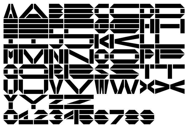
Two Points.Net: Next typeface for ESPN
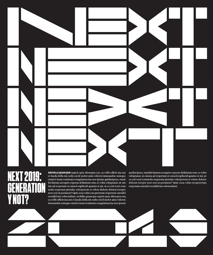
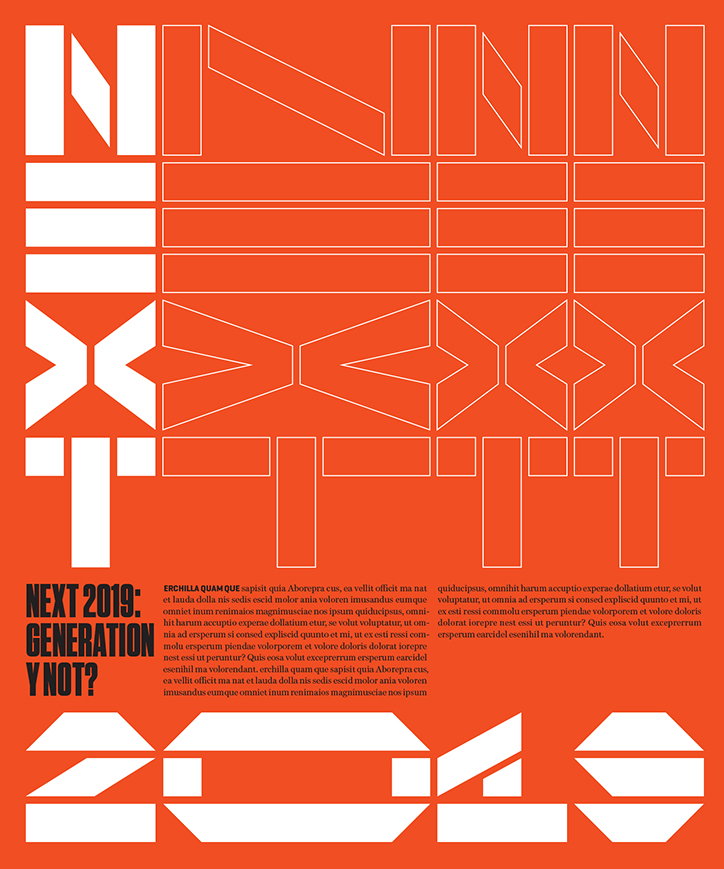
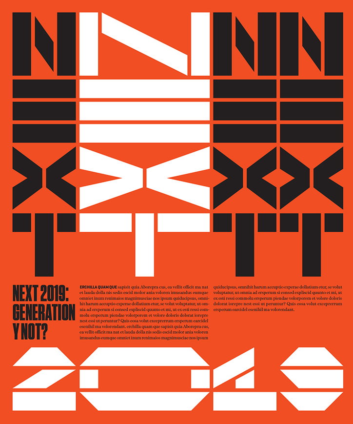
In terms of this most recent project, the aesthetics of the font on the surface hark back to the ESPN logo, building upon this structure with more experimental forms. In the process, “we recognised that the ‘X’ could be made of two very abstract arrows, which could be used to represent the idea of Next,” the subject matter of the issue where ESPN recognises “an elite group of emerging athletes to watch in the year ahead.”
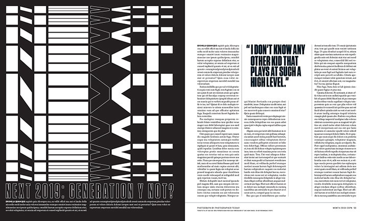
Iterating different examples of how such a bold font could be used, Two Points considered how Next would actually be applied in print, designing two monospaced fonts with two alternate widths giving “the design team at ESPN more flexibility to play with the typography.” One letter in the extended version of the monospaced font is also the same width of two letters in a regular size, allowing “the letters to always keep aligned horizontally and vertically,” in turn, making room for a playful composition. “I guess this is also what it communicates,” Martin concludes. “It is a robust modular font which wants to played with.”
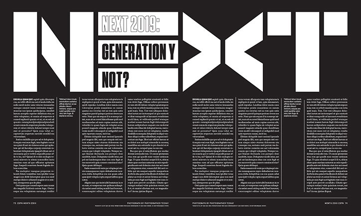
The result is a font which dominates the page, while displaying the editorial information required aptly. As it shape-shifts through spreads, its experimental forms can even be seen nudging into and dictating the editorial design too.
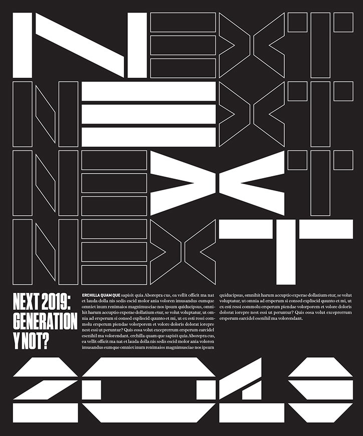
Two Points.Net: ESPN
Two Points.Net: ESPN
Two Points.Net: ESPN
Two Points.Net: ESPN
Two Points.Net: ESPN
Two Points.Net: ESPN
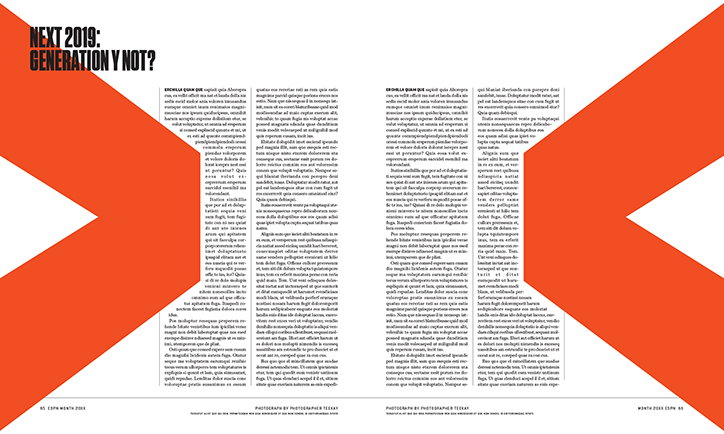
Two Points.Net: ESPN
Share Article
Further Info
About the Author
—
Lucy (she/her) was part of the It’s Nice That team from 2016–2025, first joining as a staff writer after graduating from Chelsea College of Art with a degree in Graphic Design Communication, eventually becoming a senior editor on our editorial team, and most recently at Insights, a research-driven department with It’s Nice That.