“Divine intervention”: Universal Favourite overhauls a butt hygiene brand from top to bottom
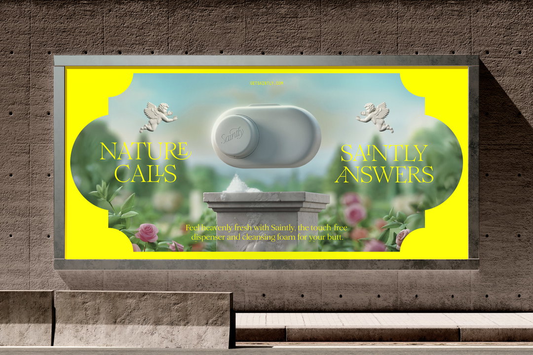
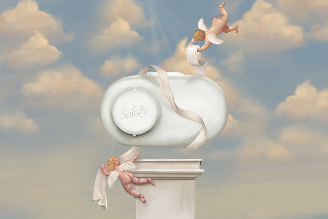
The new identity for Saintly is Renaissance-inspired, with ornate typography, delicate tones and bare-bottomed cherubs.
Share
Universal Favourite has rebranded Saintly, previously named FOHM, in a complete visual overhaul. In wiping the slate clean, so to speak, the Sydney-based design studio strategically and aesthetically realigned the wet wipe alternative brand for a younger and more creative audience, distancing the product from its sanitary context for an altogether more playful tone. “They wanted to go beyond the category functional cliche of ’a better way to wipe’, and instead focus on the power and confidence of a clean butt,” creative director Ali Ozden says.
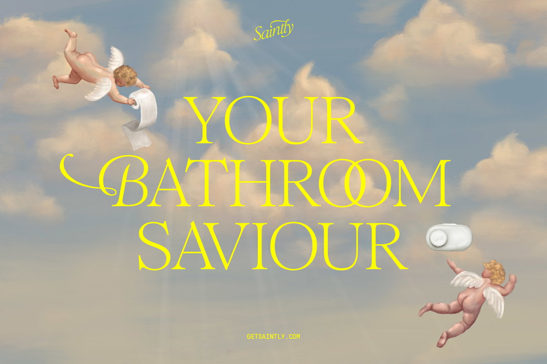
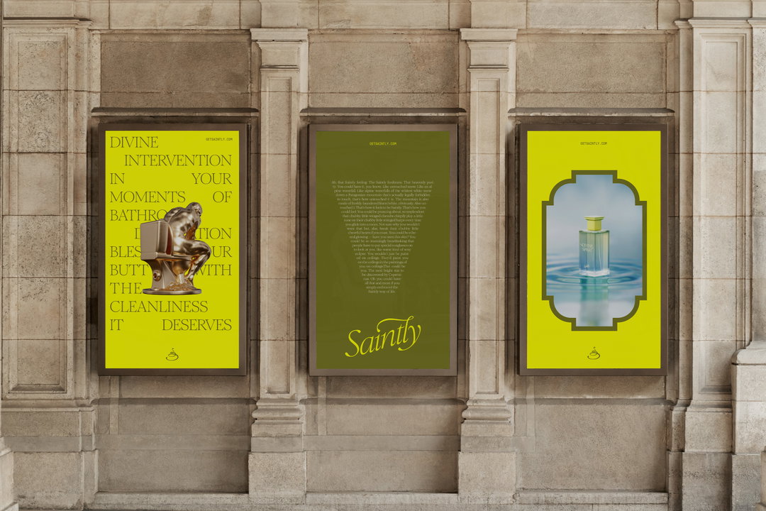
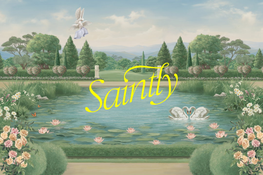
This began with a new name, a revised tone of voice, and a Renaissance-inspired philosophy, playing with the period’s terminology and associations across the brand. “Our concept was rooted in the Renaissance, as there’s nothing quite so heavenly as that feeling of Saintly freshness, and you don’t get much fresher than fresco,” Ali says. “Think divine intervention in your moments of bathroom desperation – it’s the kind of glorious treatment your butt deserves.”
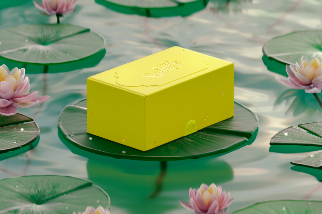
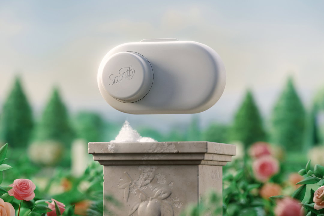
The studio also collaborated with the product development agency Doris Dev, to create the hero product itself, that being the Divine Dispenser – a wall-mounted object for dispensing sanitary soap onto your toilet paper. Albeit contemporary in its design, the product’s soft, bulbous curves complement the ornate, decorative identity.
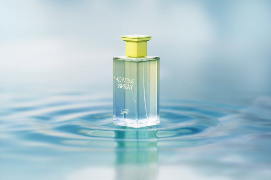
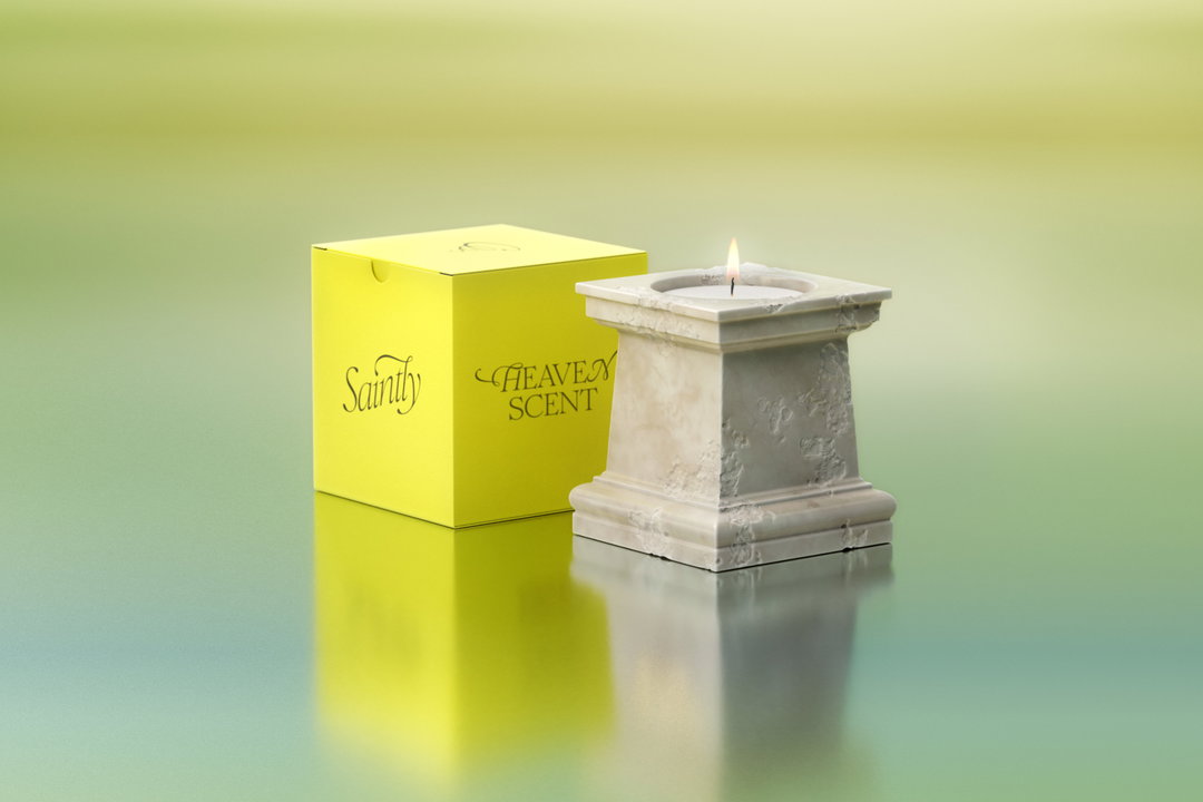
The visual world’s glorious, righteous tone is partly due to its opulent colour palette, leaning into warm yellow and khaki tones. “It’s a playful yet unexpected nod to the bathroom experience,” says Ali. “These hues break away from the sterile whites and blues of competitors, instead embracing warmth, personality, and a sense of refined humour.” This approach is mirrored across Saintly’s typographic voice; alongside Pressura Mono from Grilli Type for the brand’s details, Margot Lévêque Studio’s Romie spearheads the brand – utilised across its wordmark, body copy and headlines. “We loved Romie’s flair and calligraphy-inspired features,” referencing the period’s stone-carved typography. “With a mix of regular and italic for headlines, the mix of type gives the brand a very crafted and classic feel with a modern twist,” Ali ends.
GalleryUniversal Favourite: Saintly (Copyright © Universal Favourite, 2025)
Hero Header
Universal Favourite: Saintly (Copyright © Universal Favourite, 2025)
Share Article
Further Info
About the Author
—
Hailing from the West Midlands, and having originally joined It’s Nice That as an editorial assistant in March 2020, Harry is a freelance writer and designer – running his own independent practice, as well as being one-half of the Studio Ground Floor.