Virgile Flores on his new fluid typeface DaVinci and moving toward a more physical design approach
Alongside creating the elegant and dramatic DaVinci type, the designer has been crafting high-fashion look books and gothic album identities.
Since we last caught up, designer Virgile Flores has been busy. Very busy. In 2019 we discussed the designs for Syncope, a vinyl design for his upcoming EP, Opticks. Since that first EP design release, Virgile's practice has become even more dictated by the production and printed side of his projects. “I’m not the best designer out there,” he says candidly, “but I’m very good at enhancing my projects through real life materials and process. Even though I’m often impressed by digital images, I always feel like my work lacks something when there’s nothing to touch and smell at the end of the process.”
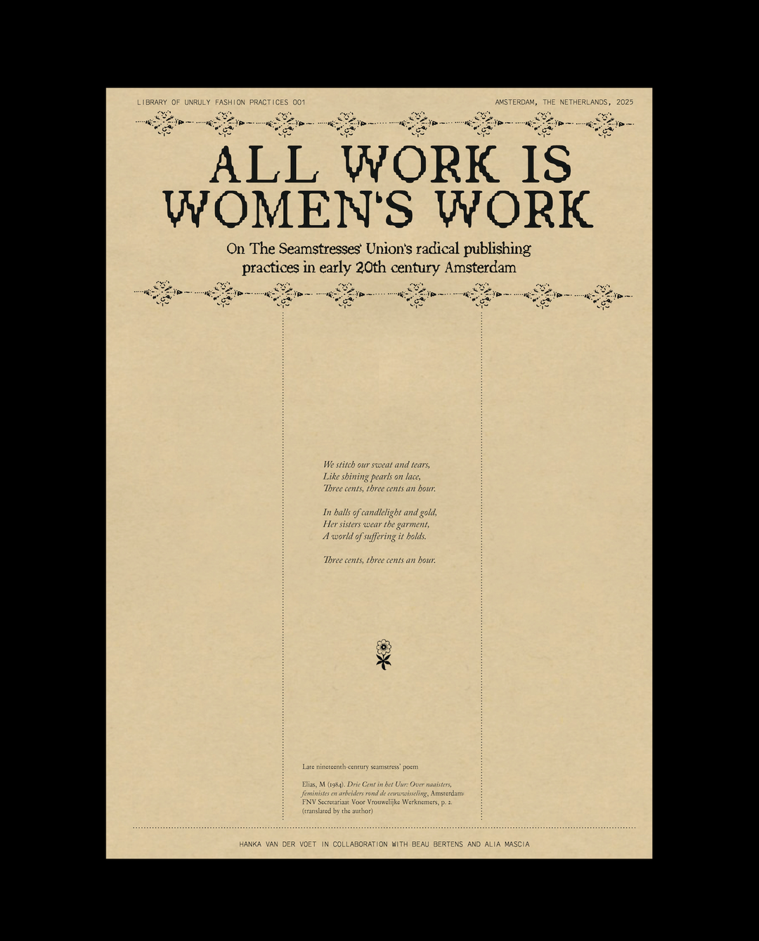
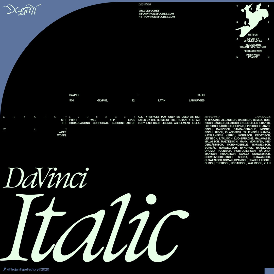
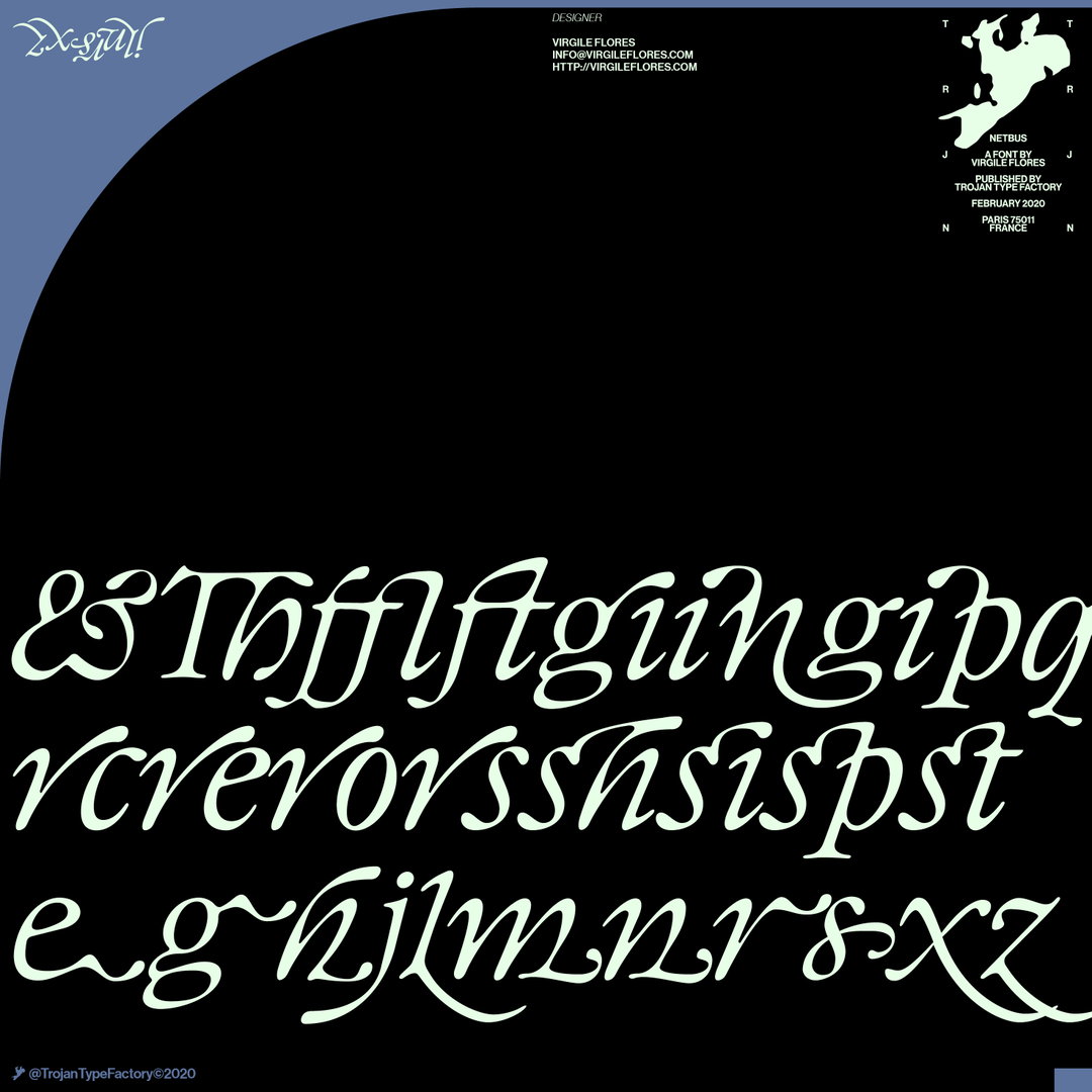
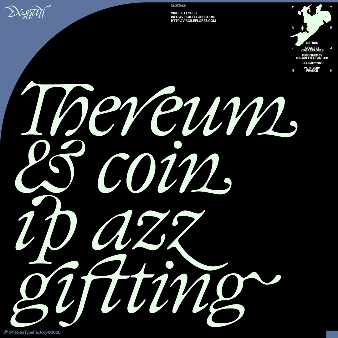
This focus on physical, printed objects also inspired Virgile’s recently released typeface, DaVinci. The type is based off the Regular Display font Virgile designed a few years ago, which he describes as “a revival of a Garamond cut I found in an old book”. He adds: “When you do this sort of type exercise – based on printed letters – it gives a very organic shape and form, in opposition to the very metallic sharp shape from type materials.” Furthering this organic look by pushing the fluidity curse at its maximum, Virgile ended with a design “which is very historical, yet with a contemporary twist”. Later on, Virgile received a message from Zolo Press and Base Design who needed an italic typeface for Sydney’s Biennale. With the theme of the biennale being “water and fluidity”, Virgile decided it was the “perfect opportunity” to bring DaVinci fully into fruition. The end result – with tastefully curved edges and with each glyph artfully flowing into the other – is a typeface with a modern yet deeply classic feel.
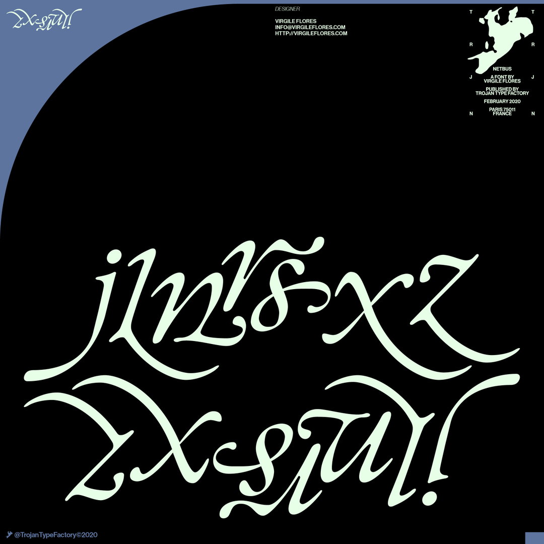
Virgile Flores: DaVinci Italic (Copyright © Virgile Flores, 2021)
Discussing the visual media that has been influencing his work recently, Virgile says it's largely cinematography. Recently visiting the Rizzoli bookshop in New York, Virigle was particularly intrigued by More Sex, Better Zen, Faster Bullets, a book about “stereotyped Hong Kong movie from the 80s and 90s, with crazy posters, movie names and Jackie Chan all over the place”. Alongside this, he's also been enamoured with a “giant book” that focused on vintage Godzilla movie shots with zero text: “printed in either black and white or red and black, the book had a nice dark blood colour, and texture on the fore edge of the book”.
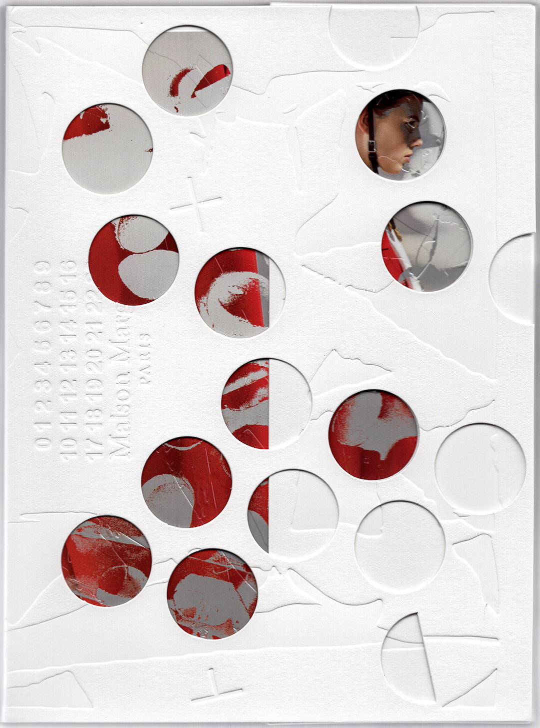
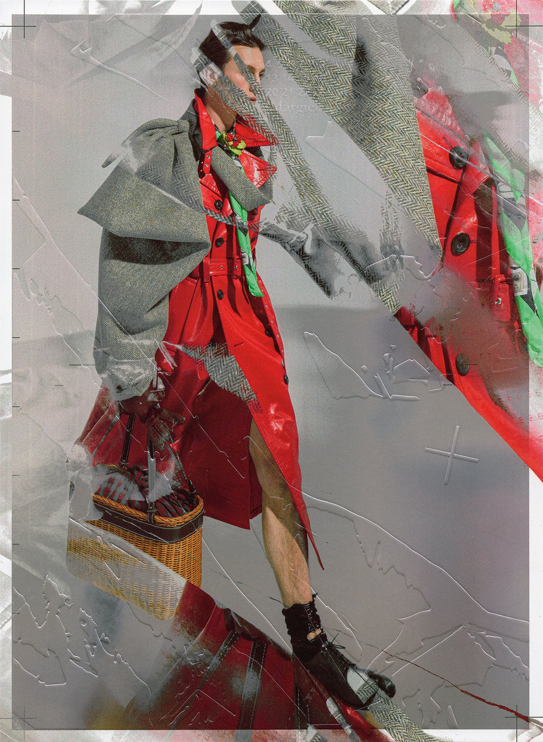
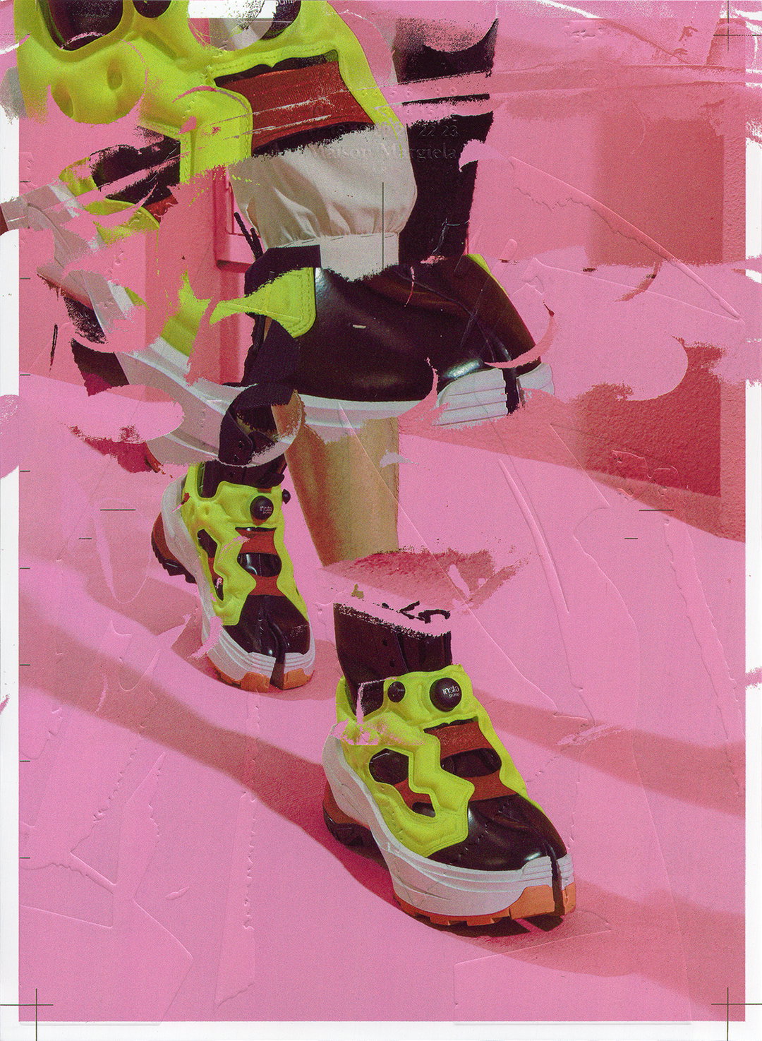
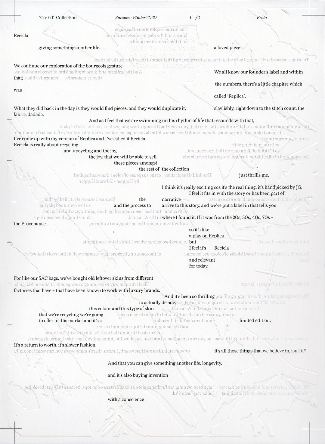
This dual focus on cinema and publications directly feeds into one of Virgile’s recent projects with fashion brand Maison Margiela. Tasked with creating a look book to present three of their collections, the book was a high-end printed object, with the intention of being an extension of the collection, “with a real aesthetic purpose, more than a functional vocation”. With this in mind, Virgile wanted the book to exist as something like a “movie sequel” to the collections. “It should work as part of the story, and continue the conversation the first movie started with the audience. But it should also work well on its own, and come up with new questions to challenge questions from the first movie, while being very respectful of the original material,” Virgile explains. Taking into account objects and methods from the collection, Virgile included rounded holes, transparency and multiplication of layers to create a truly dynamic publication.
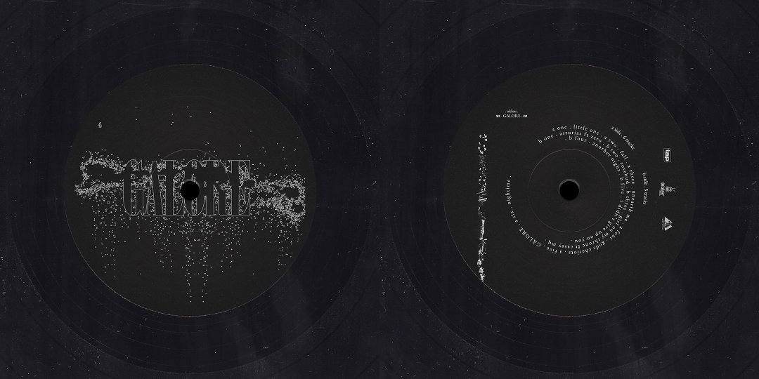
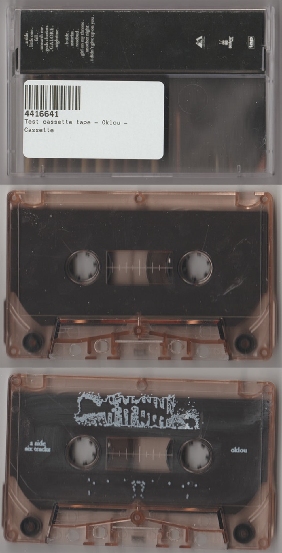
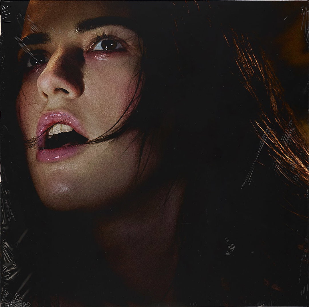
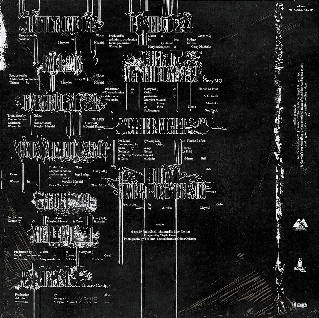
Recently, Virgile worked with the French musical artist Oklou on a “graphic realm” for her debut mixtape, Galore. Virile decided to do a small illustration for each song and merge it with the text and a single font. And, to match the organic and natural nature of Oklou’s music, Virgile aimed for the illustrations to look as natural as possible, “like if it was designed by branches and roots”. He continues: “When put outline, the whole thing looks super cohesive, yet you can feel you have for each song a thing that is singular." Realised with fine white lines and detailed silhouettes against black backdrop, the end result is delicately and artfully simplistic. And so, whilst Virgile may have spent the past few years expanding his design work into other creative industries, he certainly hasn’t neglected his love of working with music.
GalleryVirgile Flores: DaVinci Italic (Copyright © Virgile Flores, 2021)
GalleryVirgile Flores: Margiela (Copyright © Virgile Flores, 2021)
GalleryVirgile Flores: Oklou (Copyright © Virgile Flores, 2021)
Hero Header
Virgile Flores: DaVinci Italic (Copyright © Virgile Flores, 2021)
Share Article
Further Info
About the Author
—
Olivia (she/her) is associate editor of the website, overseeing the day-to-day editorial projects as well as Nicer Tuesdays events. She joined the It’s Nice That team in 2021. ofh@itsnicethat.com
To submit your work to be featured on the site, see our Submissions Guide.