Graphic designer Virgile Flores on custom typefaces and visualising statistics
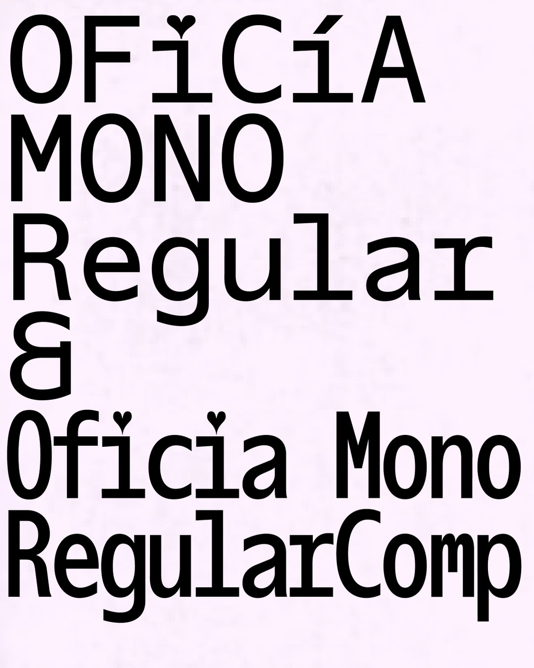
Paris-based graphic designer Virgile Flores is a typeface specialist. Two of his latest text-heavy projects, the immaculate Twelve Angry Men publication and the sleek Pirelli typeface, are just the tip of his font fascination. Design, however, wasn’t always on the cards for Virgile who completed his undergraduate degree in sports studies. After realising that athletics weren’t for him, Virgile took a year out of education to reconsider his choices only to return to university to study graphic design. “I started focusing on type design last year. I felt that I needed to be better equipped at choosing typefaces for my projects. I also wanted to create my own letters and customise existing ones for logotypes. There is a real synergy between graphic and type design. It is also very satisfying to use text that has been drawn by yourself,” Virgile tells It’s Nice That.
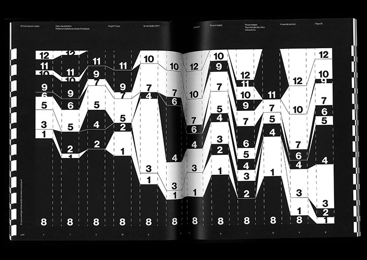
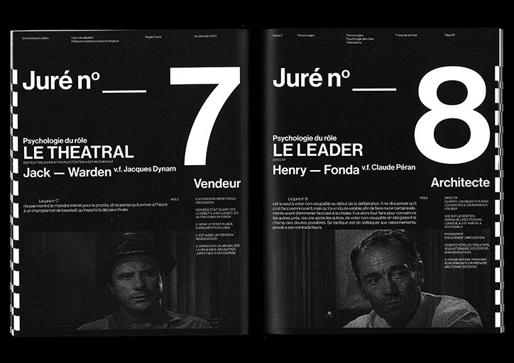
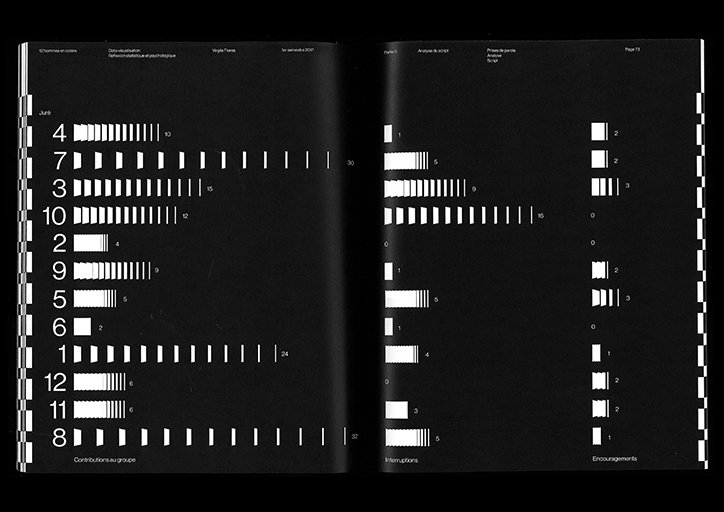
His latest project, Twelve Angry Men, visualises statistics from Sidney Lumet’s 1957 film of the same title, such as how many times different characters talk and what they talk about. After watching the film at least ten times and accumulating a sufficient amount of data, Virgile set to work. “The book is black and white to represent the racial issues that permeate the movie. I also wanted to punctuate the layout with black shapes to evoke feelings of confinement and mirror the emotions of the movie like the fear of prison,” Virgile explains. Twelve Angry Men is based on the visualisation of data and statistics because the film itself is centred around language and numerics. In transcending the aesthetics of classic data visualisation like cheerful colours and pictograms, Virgile reimagines how statistics can be communicated.
Another example of Virgile’s interest in typography is his typeface Pirelli, a collaboration with his friend Valentin Bajolle. Pirelli looks at renowned tyre manufacturer Pirelli’s visual identity and the brand’s visual heritage. The two designers went on to create two widths of the font based on the iconic logo. They also created posters using the typeface alongside speed diagrams, patterns and schematic plans. “We only went for the uppercases, kept the display, statuary look of the logo and assumed the clumsiness of certain shapes. Pirelli ads are aseptic and sterile so we tried to inject some life into the identity.”
Each project requires a few days of research, Virgile explains, before he begins to draw rough ideas on paper. After repeated tweaks and adjustments, Virgile transfers it to Photoshop where he finalises the design. “A friend of mine once told me my designs were harsh. Perhaps this is because I work with a lot of regulations; I often use the same typefaces, black and white colour pallets and bold arrangements. Although I don’t lay out these rules formally, I tend to comply with them because I consider them visually emphatic. It gives me a direction that allows my creations to be as loud as possible.”

Virgile Flores: Twelve Angry Men
Virgile Flores: Twelve Angry Men
Virgile Flores: Twelve Angry Men
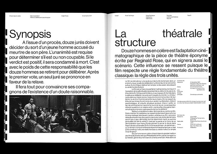
Virgile Flores: Twelve Angry Men
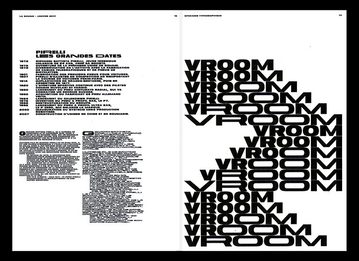
Virgile Flores: Pirelli
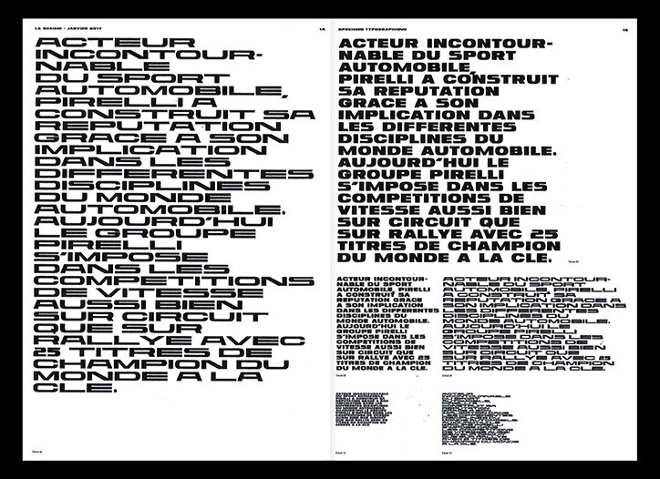
Virgile Flores: Pirelli
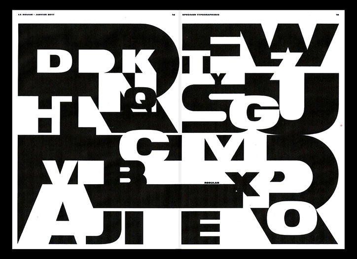
Virgile Flores: Pirelli
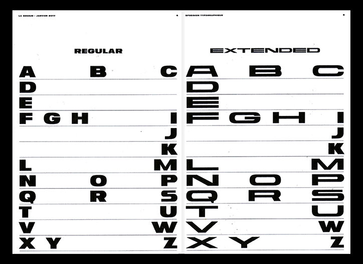
Virgile Flores: Pirelli
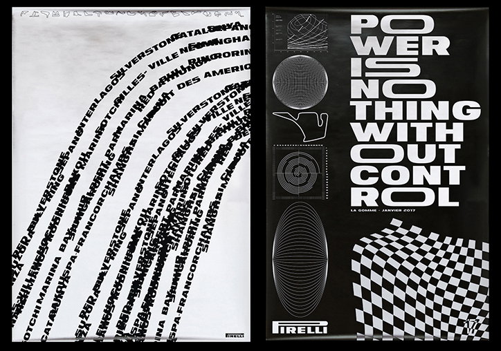
Virgile Flores: Pirelli
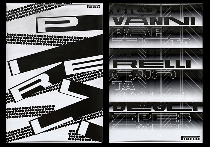
Virgile Flores: Pirelli
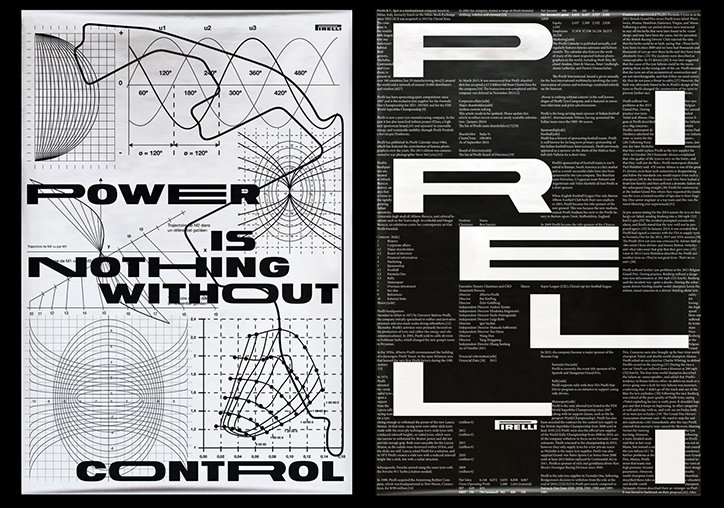
Virgile Flores: Pirelli
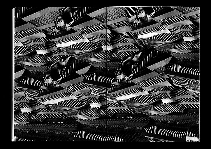
Virgile Flores: Diploma
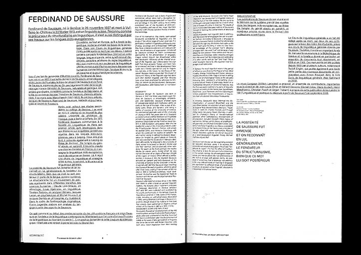
Virgile Flores: Diploma
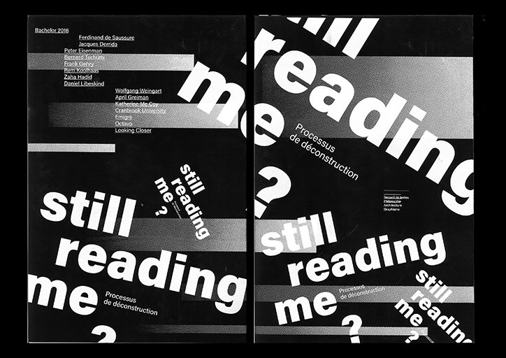
Virgile Flores: Diploma
Share Article
Further Info
About the Author
—
Daphne has worked for us for a few years now as a freelance writer. She covers everything from photography and graphic design to the ways in which artists are using AI.