Launch Recite Me assistive technology
An animation in which bold blue text reads “Diana’s Seafood” against a pale yellow background. The words tilt slightly before returning to a flat position.

Wedge’s brand for Diana’s Seafood turns a new tide for the company

The new look brings together contrasting typography and nostalgic illustration to forge an identity that honours tradition while welcoming a new generation to the table.

—
Date
14 April 2025

“Where most have a founding father, Diana’s has a founding mother,” Wedge’s chief design officer, Justin Lortie, says. This fact became the overarching creative concept behind the studio’s rebrand of Diana, that being: The Mother of Seafood. “That difference became our opportunity to create a brand with an insatiable energy, ferocious care, sense of nourishment, and beautiful vibrancy that only a mother can give,” Justin says. “It’s all of these things in the foundational strategy that guided the world and work you see.” 

The Canadian seafood brand is trusted across the country by Michelin star kitchens and home cooks alike, and has been for almost half a century. Turning to Wedge, the Montreal and LA based design studio envisioned and crafted an all-encompassing brand strategy that would shake any sleepy expectations of the company, usher in a new audience and a new brand experience.
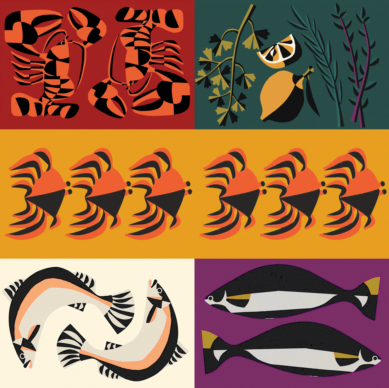
An animation of bold, graphic illustrations in a limited colour palette. It cycles through stylized depictions of lobsters, a lemon with botanical sprigs, shrimp, and fish against contrasting backgrounds.
Above

Wedge: Diana Seafood (Copyright © Wedge, 2025)

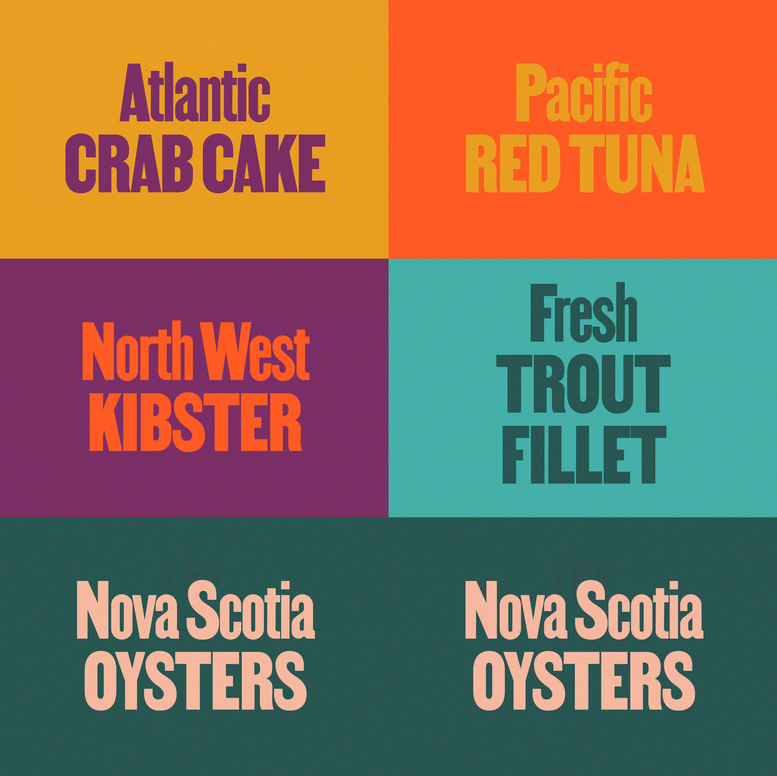
This began with a refreshing, research-led reimagining of Diana’s typographic approach, with Vocal Type’s Martin as the hero typeface of choice. The condensed sans serif, which alone packs a powerful punch, was tweaked to introduce small fins to the letterforms, nodding to the fish themselves. Alongside Martin, Wedge added Alex Lescieux’s variable typeface, Milano, as the supporting font – a variable slab serif that offers a distinctive contrast in weight and width compared to Martin. Sitting alongside the blue-heavy colour palette, the nostalgic, heritage-laced forms of both typefaces forge a charming voice emblematic of Diana’s legacy without feeling at all stuffy or stuck-in-its-ways. “In design research and cultural foraging, the team came across these amazing old fisherman crates with handwritten type,” says Justin. “Milano carried this spirit with its variable nature spanning five fun widths from compressed to extended, giving us the flexibility to mix and match and create a playful system with a new energy that’s also rooted in tradition.”

Similarly, the brand’s approach to illustration strikes a satisfying balance between familiarity and modernity, courtesy of LA-based artist and illustrator Bill Rebholz, whose work tonally reflects the values behind Diana’s brand – charming, yet fresh. “Bill’s work brings a craft, bold charm, and warm quality. His work brings that feeling of stepping into an authentic fish market,” Justin says. “It’s tradition, reimagined,” he ends, “it’s perfect!”

GalleryWedge: Diana Seafood (Copyright © Wedge, 2025)
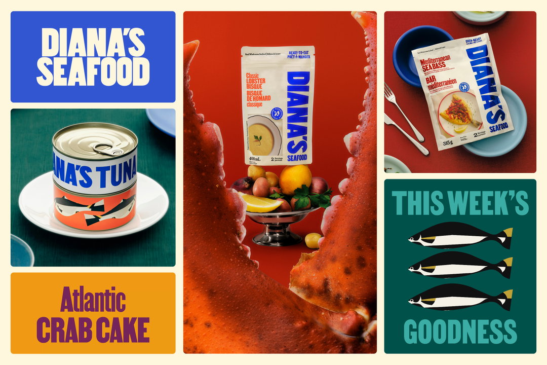
A collage of promotional images for Diana’s Seafood. The visuals include a tin of tuna, a packet of sea bass, a carton of lobster bisque, and a graphic reading “This week’s goodness” featuring three fish.
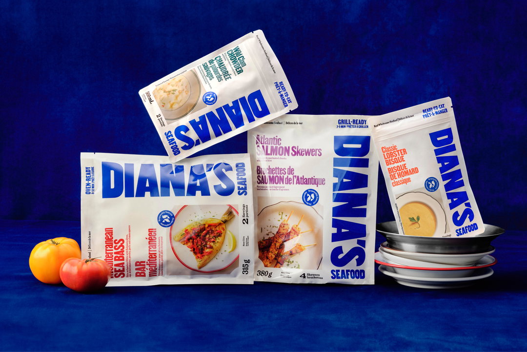
Three packets of Diana’s Seafood products are arranged against a deep blue backdrop. The packaging is white and blue, featuring the brand name “Diana’s” in bold blue type. A yellow tomato and a red apple sit to the left, while a stack of grey bowls sits to the right.
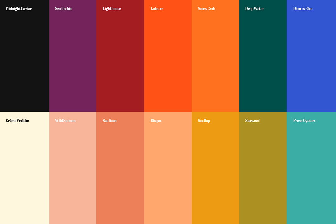
A colour palette of 14 vertical stripes arranged in two rows. Each stripe is labelled with a name, including “Midnight Caviar”, “Lobster”, “Deep Water” and “Fresh Oysters”.
An animation in which bold text and background colours shift rapidly. The screens read “Atlantic CRAB CAKE”, “Pacific RED TUNA”, “North West KIBSTER”, “Fresh TROUT FILLET” and “Nova Scotia OYSTERS”.
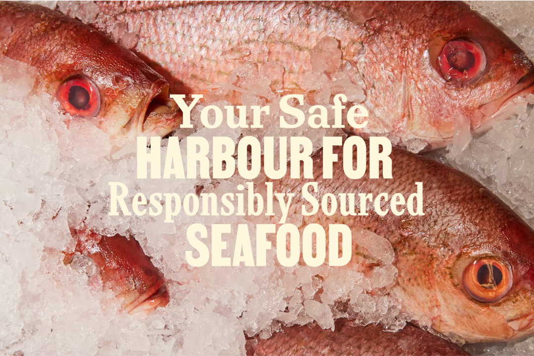
Several red fish lie on a bed of crushed ice. Bold text laid over the centre reads “Your Safe HARBOUR FOR Responsibly Sourced SEAFOOD”.
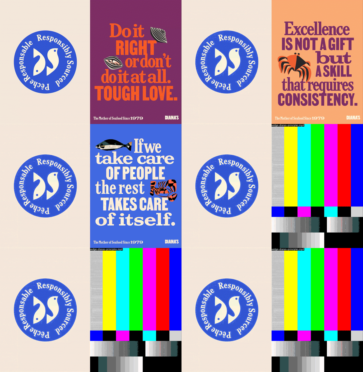
An animation in which a blue circular seal reading “Responsibly Sourced” and “Pêche Responsable” remains static on the left. On the right, a series of bold, colourful posters for Diana’s seafood cycle through, featuring phrases such as “Tough Love” and “No shortcuts to quality”, before ending on a television test pattern.
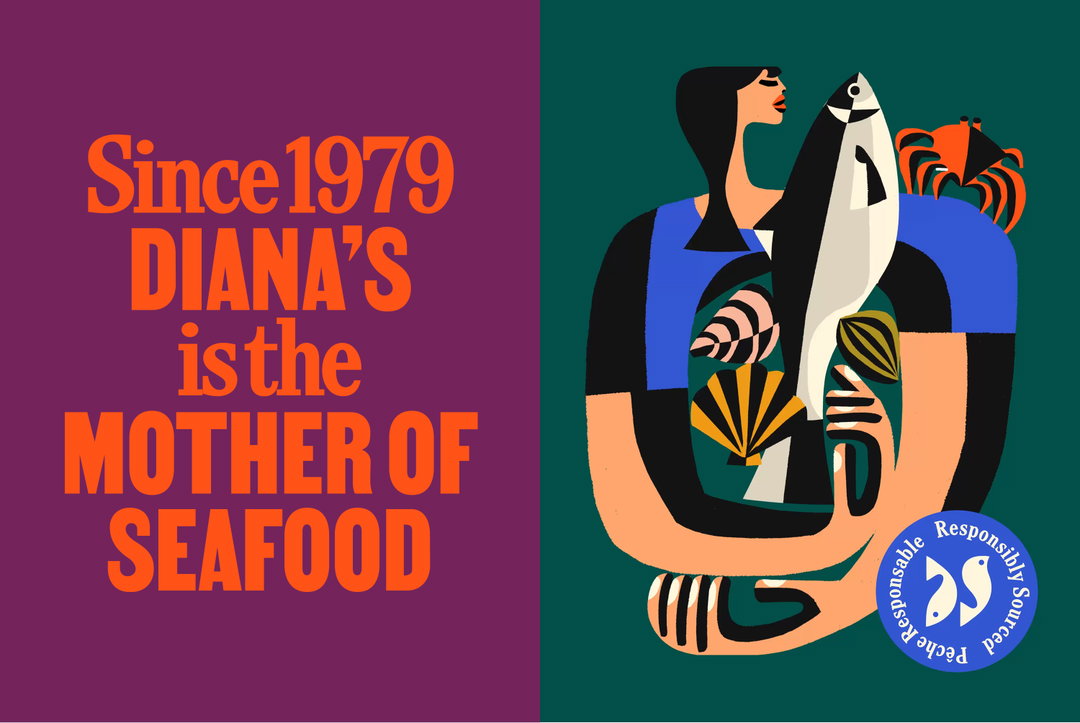
An illustration for a seafood brand. On the left, orange text on a purple background reads “Since 1979 DIANA’S is the MOTHER OF SEAFOOD”. On the right, a person holds a large fish and various shellfish against a dark green backdrop.
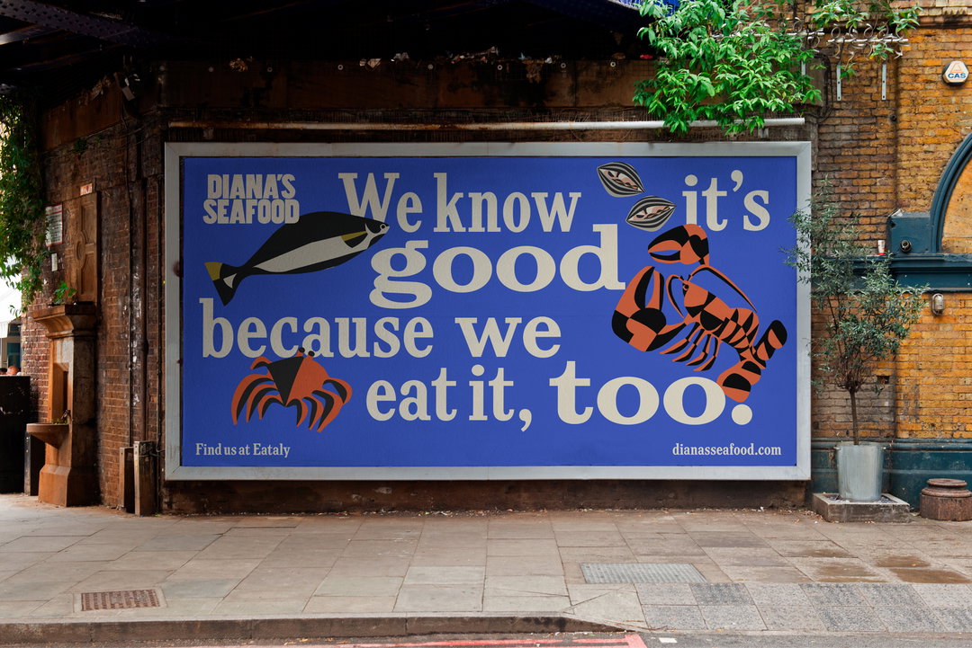
A blue billboard on a brick wall reads “We know it’s good because we eat it, too.” The text is surrounded by stylised illustrations of a fish, a lobster and a crab. The top left corner features the “Diana’s Seafood” logo. Small text at the bottom reads “Find us at Eataly” and “dianasseafood.com”.
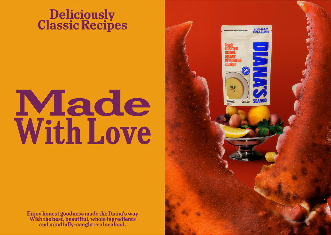
An advertisement for Diana’s seafood. The left side is a yellow background with purple text that reads “Deliciously Classic Recipes” and “Made With Love”. On the right, a carton of “Diana’s Classic Lobster Bisque” sits on a silver platter of fruit, framed by two giant lobster claws.
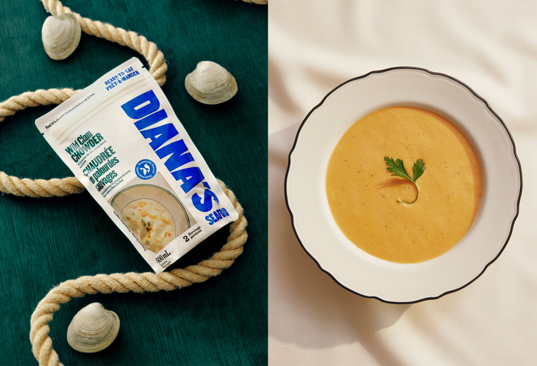
A split image showing a packet of “Diana’s Seafood” clam chowder and a bowl of the prepared soup. The packet is laid on a dark green surface alongside a thick rope and seashells. To the right, the creamy orange soup is served in a white bowl with a black rim and garnished with a sprig of parsley.
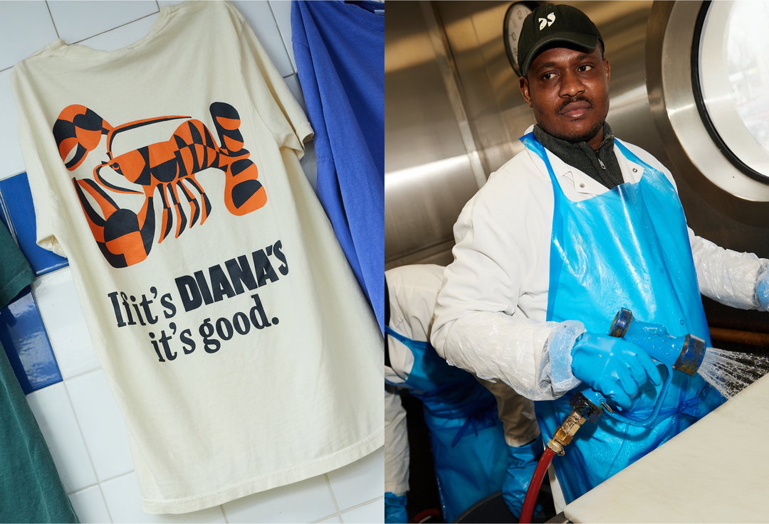
A cream T-shirt features a graphic of a lobster in orange and black. Below the image, bold text reads “If it’s DIANA’S it’s good.” Beside it, a person in a white coat and blue waterproof apron holds a high-pressure hose in a kitchen.

Hero Header

Wedge: Diana Seafood (Copyright © Wedge, 2025)
Share Article

About the Author

Harry Bennett

—

Hailing from the West Midlands, and having originally joined It’s Nice That as an editorial assistant in March 2020, Harry is a freelance writer and designer – running his own independent practice, as well as being one-half of the Studio Ground Floor.

It's Nice That Newsletters

Fancy a bit of It's Nice That in your inbox? Sign up to our newsletters and we'll keep you in the loop with everything good going on in the creative world.