William Lyall combines the contemporary graphic design landscape with historical references
When describing his work, London-based graphic designer William Lyall often, and aptly, uses the term “sensitive”. Within his portfolio of typographically-led, pared-back design pieces, William signifies he’s a designer with a goal “to create work that does not overpower the subject matter but supports and enhances the content, through sensitive design approaches and principles,” he tells It’s Nice That. He wants his work to be honest too, communicating the message at the heart of what he is creating through graphic design. Yet, all the while, the designer’s work still fits in nicely amongst “a contemporary graphic design landscape” he points out, “whilst referencing historical values and remaining independent from stylistic trends and aesthetics that swamp our feeds”. Put simply – he’s not a designer who designs for design’s sake.
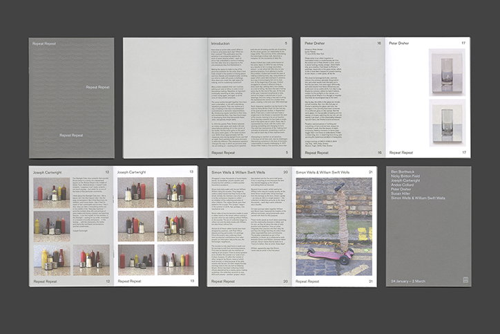
Previously working in-house at design studio Utile, William has recently taken the leap to go freelance, and is already busy, regularly working with his old employers and Josh Epstein-Richards’ design studio, 12b. An example of his ongoing work with Utile is a recent publication design he completed for a multidisciplinary exhibition run by the Freelands Foundation. An organisation which provides support for artists and cultural institutions, Utile has worked with it to identify its brand identity, website and exhibition work for the past three years.
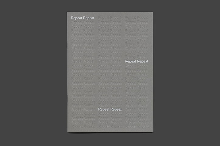
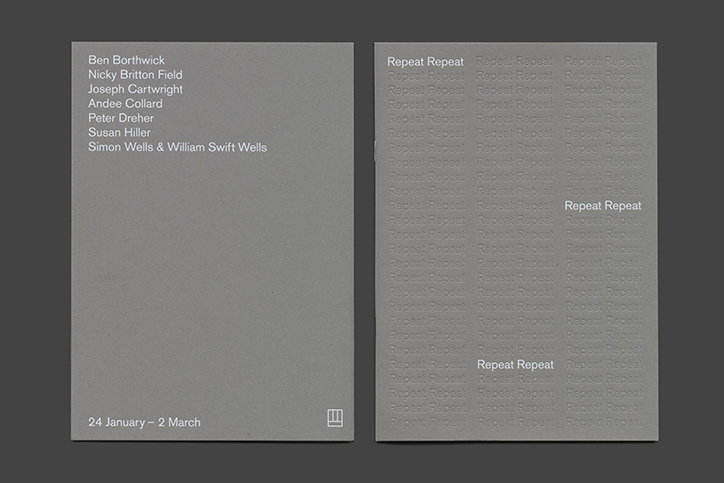
Considering the theme of the artists’ work featured in the show “investigates the ideas of daily practice and repeated routine”, William’s design translates this practice by debossing the word “repeat” multiple times on its dark grey cover, rendering it barely visible. In communicating the themes of the exhibition the designer’s approach not only represents the work of the artists but “firstly engages the audience and secondly uses devices to reflect the title without overpowering the artists’ content.”
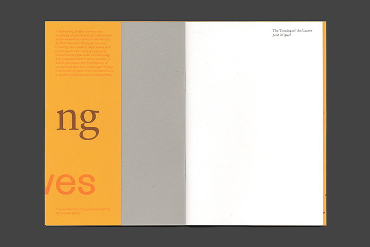
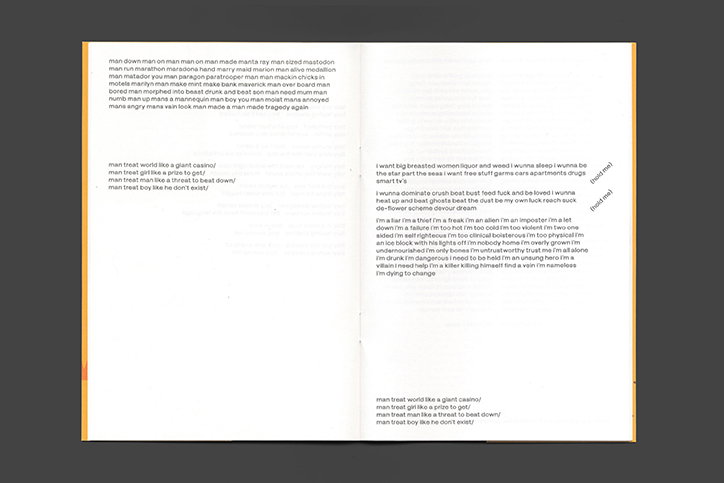
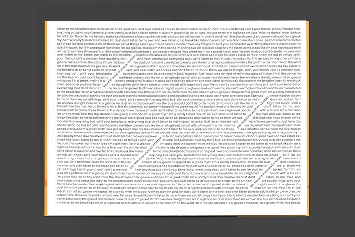
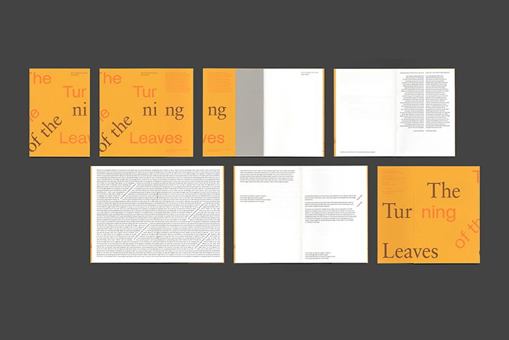
A further example of William’s ability to find a hook in a cultural or artistic output and format it into graphic design is The Turning of the Leaves, a publication produced for a multi-screen audio, visual installation by artist Jack Miguel. As Jack’s piece is “a meditation on the subject of masculinity with reference to the First World War and the phenomenon of intergenerational trauma,” its title is taken from a ceremony at Manchester Cathedral in which “a page is turned in the Book of Remembrance on alternate Wednesdays,” William describes.
As so much thought when into the piece’s title, William’s design approach “emulates the title of the book itself”, he says. Consequently its cover “uses a dust jacket with burgundy and orange links, subtly inviting the reader to interact with the format, structure and physical ‘leaves’ of the publication”. To complete the design aesthetic within the publication William worked closely with the artist himself, sitting side-by-side to run “through the flow and arrangement of each spread”, highlighting words or phrases by satisfyingly rotating them within paragraphs of text. The concept of the work if only furthered through William’s typographic choices, pairing a British typeface, PM Grotesk made by 12b in 2018 and a German typeface, Sabon, made in 1987.
A more recent identity by William is Kinoh, a wordmark created for “a new platform for small format filmmaking” founded just last year and based between London and Glasgow. To create the distinctive wordmark, the designer dived deep into historical references he felt were apt, first looking at “Bauhaus’ geometric system and further blending the form of Japanese hiragana and katakana alphabets,” he describes. The final result is one William feels is “reminiscent of the typeface developed by Charles Rennie Mackintosh” in its reference of “the historical past of analogue film making whilst maintaining a modernised style”.
Still settling into the freelance world, William is looking forward to getting his teeth stuck into developing his personal practice. Hoping a future of working with “artists, galleries, cultural institutions, magazine and publishers” is on the horizon, as well as cultivating “a typographic and considerate approach to all projects and a wide range of audiences”. This designer is certainly carving out a considered path for himself, and it’s one we’ll be sure to follow him down.
William Lyall: Freelands Foundation
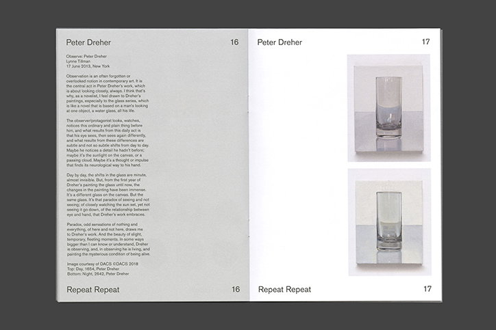
William Lyall: Freelands Foundation
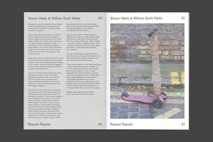
William Lyall: Freelands Foundation
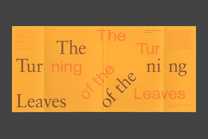
William Lyall: The Turning of the Leaves
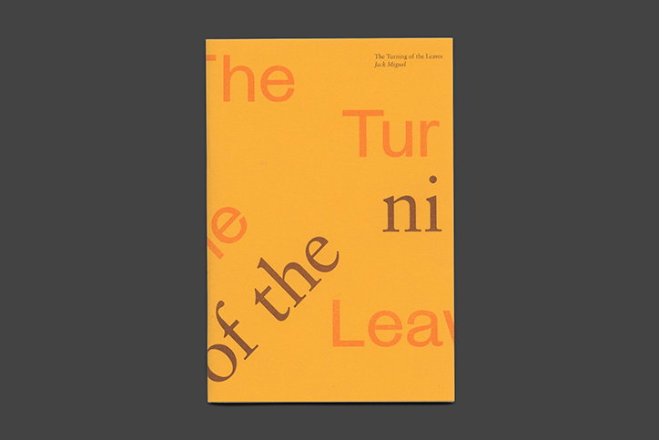
William Lyall: The Turning of the Leaves
William Lyall: The Turning of the Leaves
William Lyall: The Turning of the Leaves
William Lyall: The Turning of the Leaves
William Lyall: The Turning of the Leaves
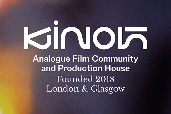
William Lyall: Kinoh
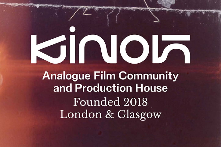
William Lyall: Kinoh
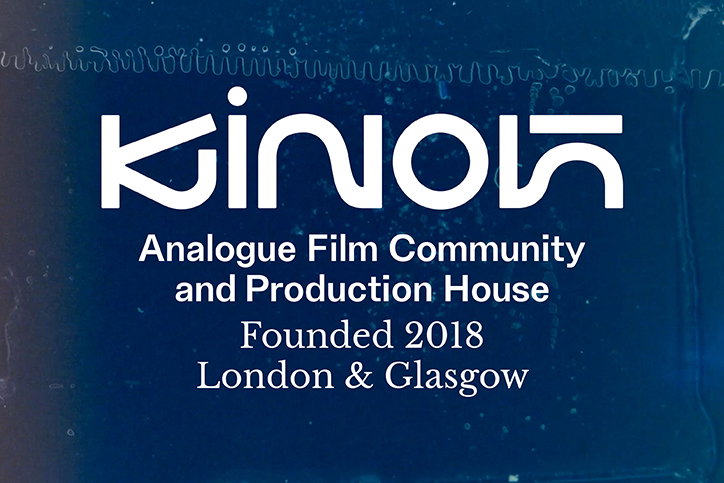
William Lyall: Kinoh
Share Article
Further Info
About the Author
—
Lucy (she/her) was part of the It’s Nice That team from 2016–2025, first joining as a staff writer after graduating from Chelsea College of Art with a degree in Graphic Design Communication, eventually becoming a senior editor on our editorial team, and most recently at Insights, a research-driven department with It’s Nice That.