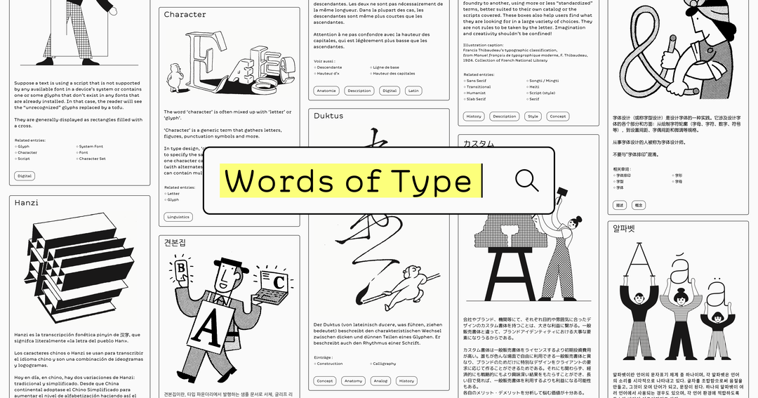
Words of Type opens up the multicultural typographic landscape for the better
Dissecting, destigmatising and discussing typographic terms, Words of Type from French-Chinese creative Lisa Huang is an accessible, extensive encyclopaedia of all things type.
“From my studies on typography in different places, I started learning all I could about typography and type design in French,” Lisa Huang tells us, before she realised that the resources simply weren’t up to scratch. “Very quickly I realised that most knowledge is either only available in English, or not so well translated in French.” The Nantes-based designer says that when she started to learn about Chinese typography, “the issues were even greater”, with information surrounding the subject’s past and present trends extremely scarce. That’s without even mentioning the out-of-print, extremely expensive or widely non-translated books that could be tremendous help to those starting out or refining their practice. Having previously had the idea of a ‘graphic design dictionary’ whilst studying, Lisa continued to notice the information gap for years afterwards, and whatever resources of glossaries were available seemed to either be only in English or only about Latin scripts. “So, slowly and surely, I worked at gathering words, found their (accurate and comprehensive) translations,” she details, and Words of Type started to come together, working with close partners and calling on her extended network to make it happen.
GalleryLisa Huang: Words of Type (Copyright © Lisa Huang, 2023)
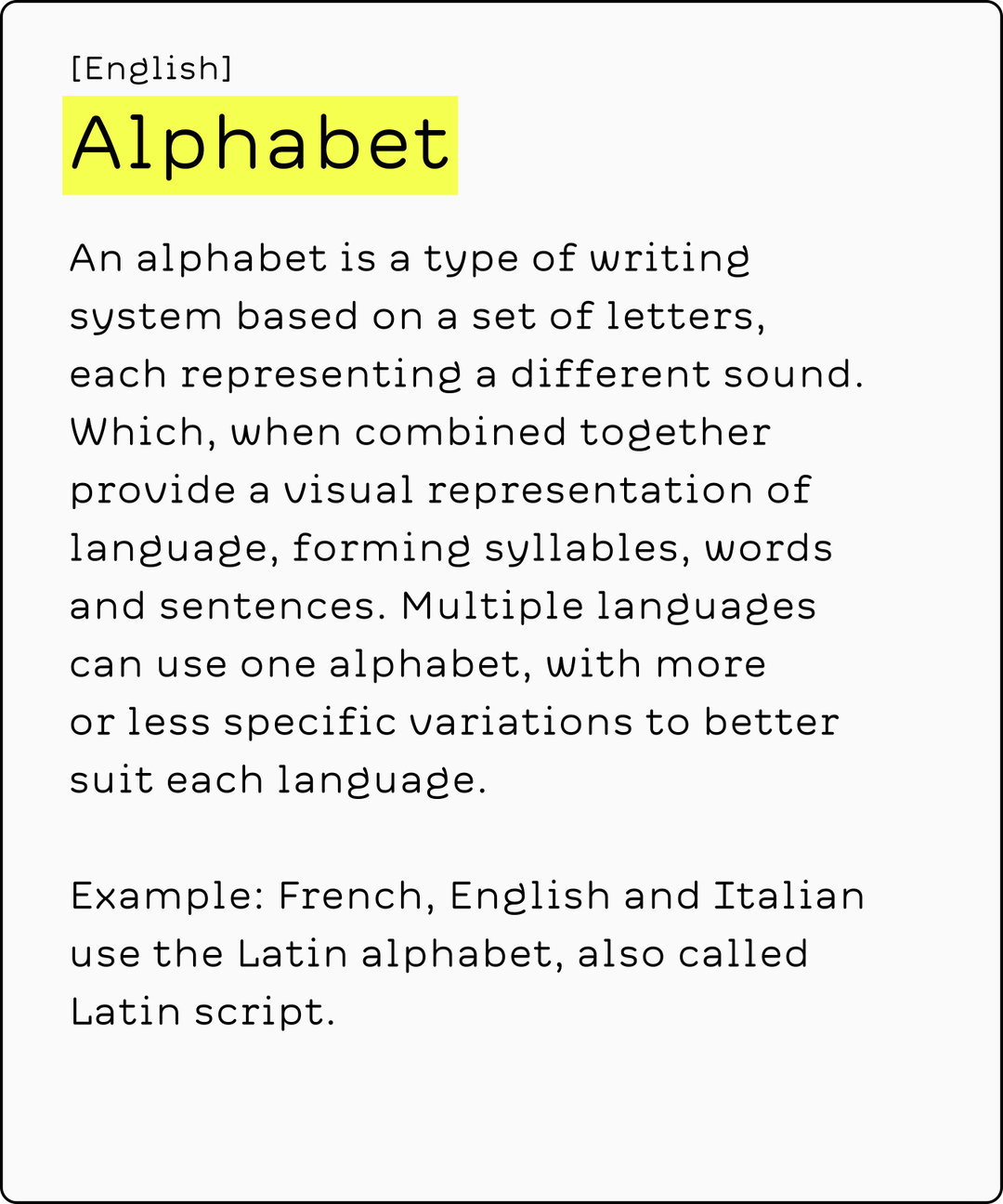
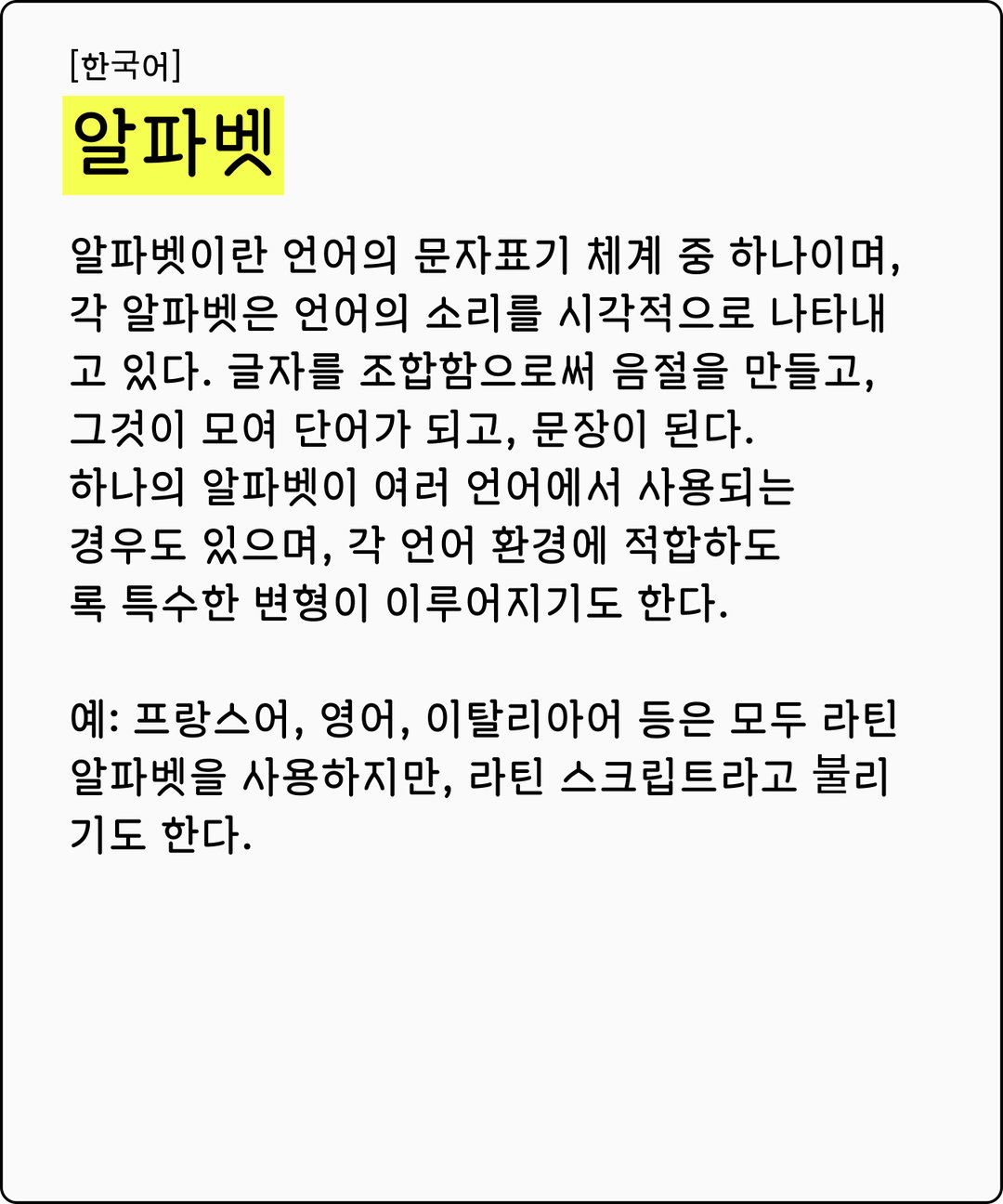
“Words of Type can be a resource where people can browse and look around to better understand typographic terms, in their own language,” Lisa explains, or likewise in a different language if they’re collaborating, learning or teaching. “Having easy access – from everywhere, at any time – to a website like Words of Type would make interactions between international teams much easier and better,” whilst also opening one’s minds. “It will make more people realise that typographic culture is not only about Latin script and Euro-centric culture,” Lisa suggests, “that every culture has something to offer and to learn,” – something which the greater community can greatly benefit from. “Words of Type wouldn’t make the world a better place on its own,” she tells us, but would give “a little push towards better international communications,” showcasing typographic cultures, and cultures as a whole, better – “one word at a time,” Lisa adds.
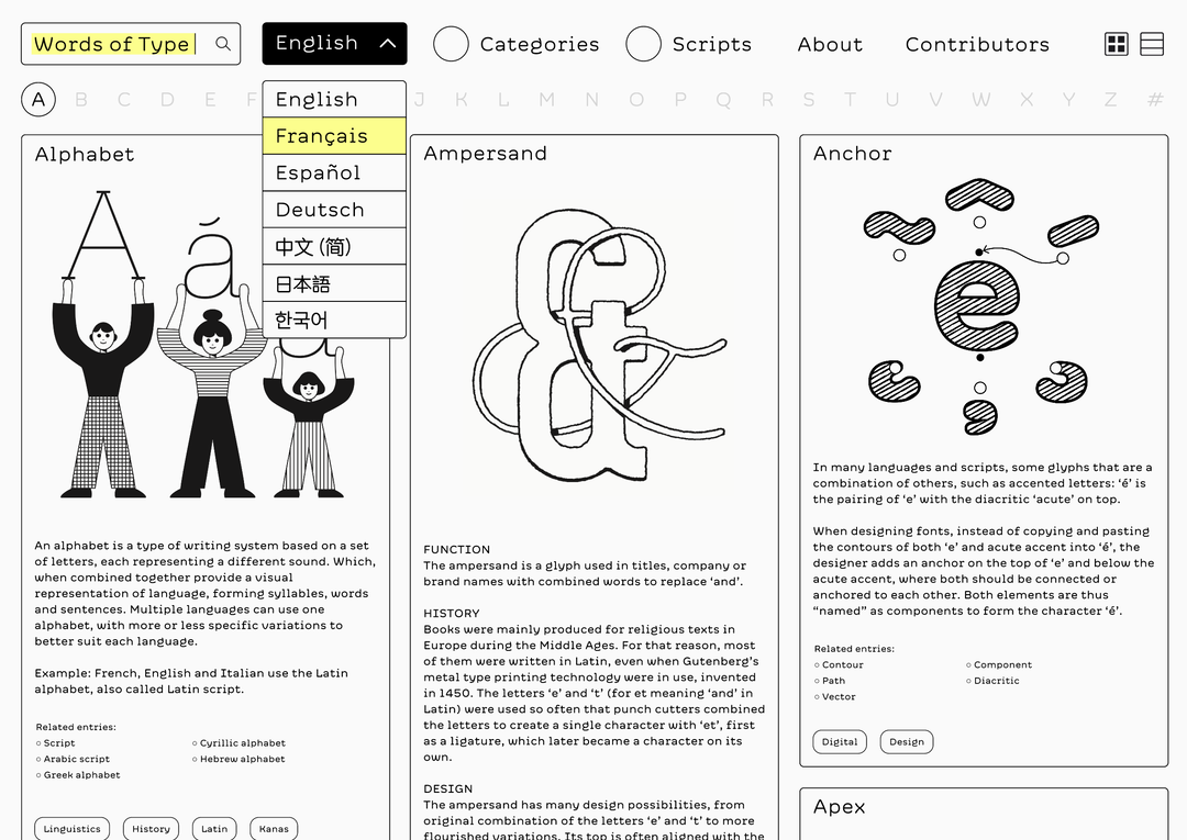
Lisa Huang: Words of Type (Copyright © Lisa Huang, 2023)
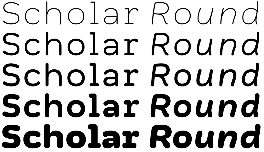
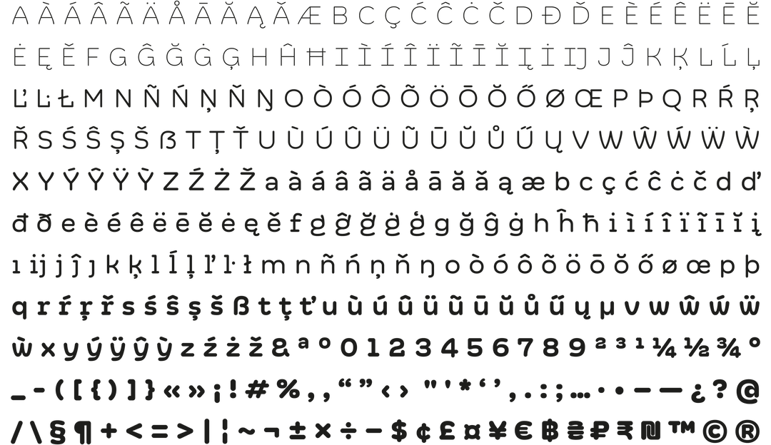
The fundamentally open and forward-thinking context of the project was expanded even further across the academic-meets-adorable visuals behind it, led by Words of Type’s bespoke typeface, Scholar Round, crafted to make typographic knowledge as accessible as possible. “It was all about finding the good balance between concise and casual without falling into childishness,” Lisa recalls, speaking of both the rounded sans serif and the website’s design as a whole, needing to speak to type designers and non type designers collectively. “So I went for a rounded style, with proportions close to a Mono typeface,” she notes, excited by not only the typewriter-like similarities of the typeface but the informational, pragmatic context of when this visual style would be seen. “Rounded style typefaces are also used in many school books around the world, so I thought that this was a great reference too.” The type therefore balances this functionality and educational associations through Scholar Rounded’s playful italic cuts.
Implementing Scholar Round, Lisa worked alongside internationally-based graphic designer Grégory Taniguchi Ambos to shape the visual language of Words of Type, utilising a limited colour palette and studious typographic hierarchy to craft an easily comprehended aesthetic – one that happily copes with the programme’s varied scripts. “To match with the diversity of languages, cultures, etc.,” Lisa recalls, “Grégory thought that it could be a great thing to have multiple illustrators in Words of Type,” with each practitioner bringing their own unique voice to address different typographic discussions, while staying consistent within the mostly-monochromatic palette. Subsequently, Lisa and Grégory collaborated with Manx illustrator Jay Cover, Tokyo-born creative Tezzo Suzuki, London-based illustrator James Graham and The Hague-based typeface designer, educator and head teacher of TypeMedia at The Netherlands’ Royal Academy of Art, Erik van Blokland, to share the illustrative output of the project.
GalleryLisa Huang: Words of Type (Copyright © Lisa Huang, 2023)
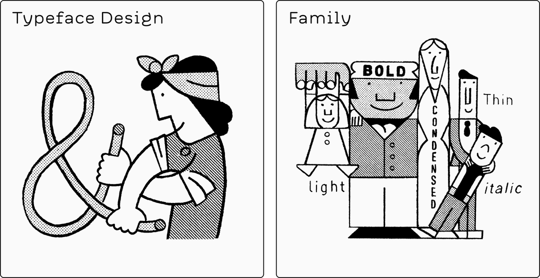
Lisa Huang: Words of Type, Illustration: Jay Cover (Copyright © Lisa Huang and Jay Cover, 2023)
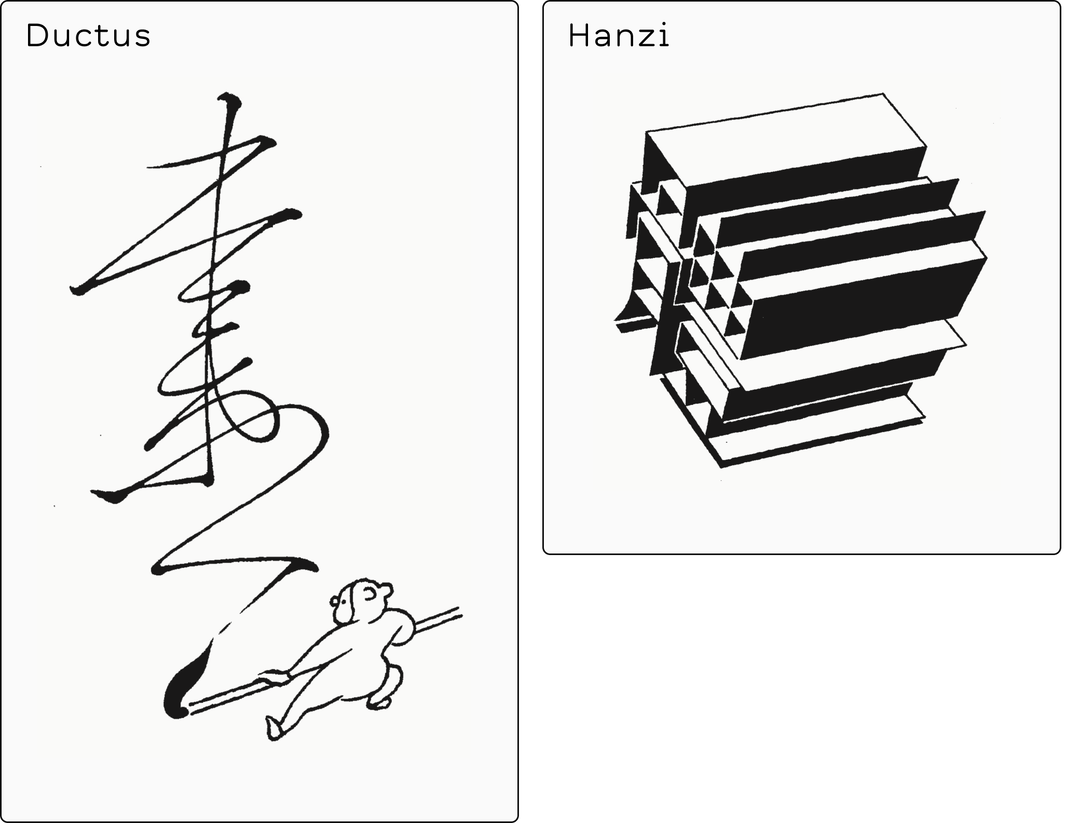
Lisa Huang: Words of Type, Illustration: Tezzo Suzuki (Copyright © Lisa Huang and Mezzo Suzuki, 2023)
You can support Words of Type’s Kickstarter here to learn more about how to help fund the project’s continued production, where the database is set to be launched and expanded. Moreover, Scholar Round isn’t done yet, as Seoul-based type designer Mingoo Yoon is set to begin work on the typeface’s Hangul script following the campaign’s success, with further expansions on the cards. “Right now, Japanese and Chinese texts are using M+ Rounded 1c and SC Yuanti,” she details, “it’s not perfect, but for the time being,” as Words of Type continues to gather funding. “I wanted to give Words of Type the chance to be initially funded by people,” Lisa concludes, “and then, if it goes well, I can go on and convince companies to sponsor the project so it can grow and evolve,” intending to forever keep the project free-to-access, helping to keep the creative scene as informed a space as possible.
GalleryLisa Huang: Words of Type (Copyright © Lisa Huang, 2023)
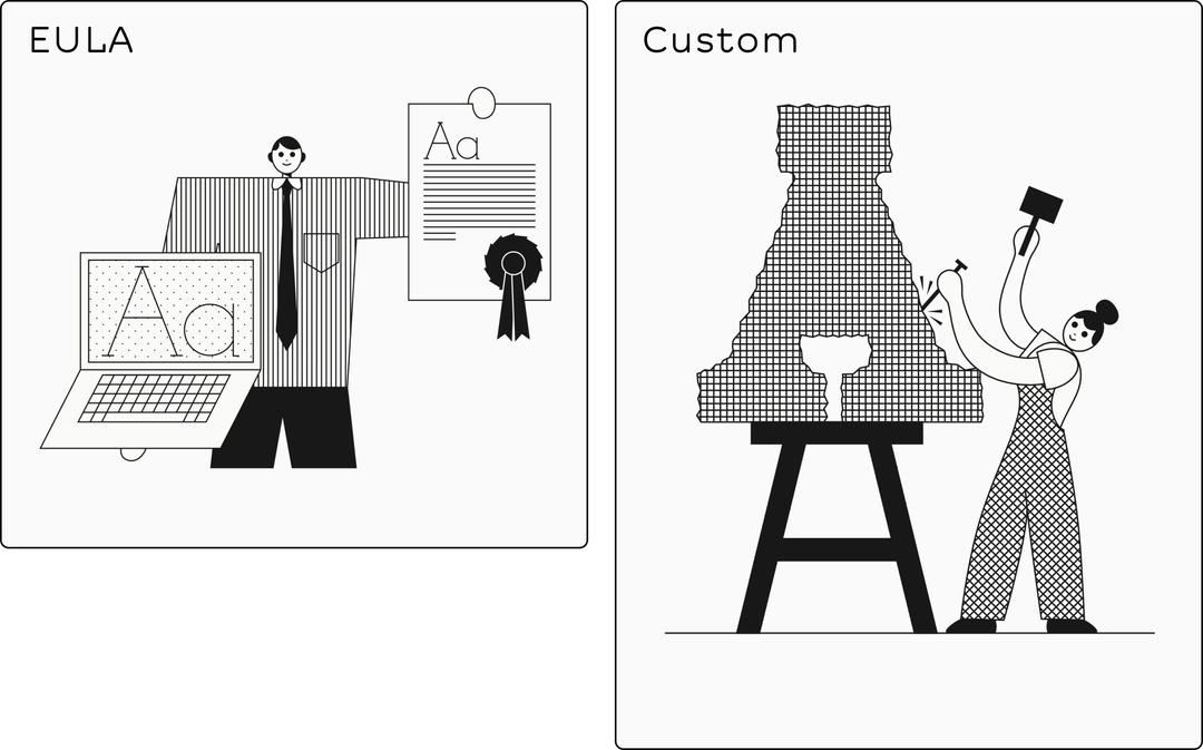
Lisa Huang: Words of Type, Illustration: James Graham (Copyright © Lisa Huang and James Graham, 2023)
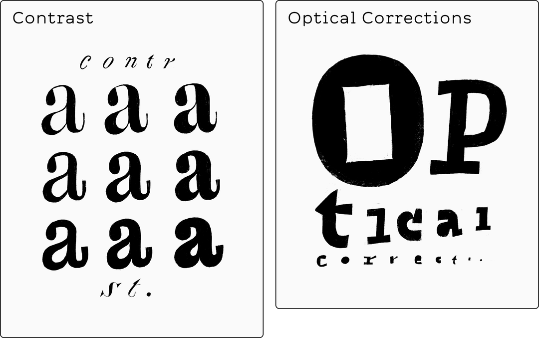
Lisa Huang: Words of Type, Illustration: Erik van Blokland (Copyright © Lisa Huang and Erik van Blockland, 2023)
Share Article
Further Info
About the Author
—
Hailing from the West Midlands, and having originally joined It’s Nice That as an editorial assistant in March 2020, Harry is a freelance writer and designer – running his own independent practice, as well as being one-half of the Studio Ground Floor.