




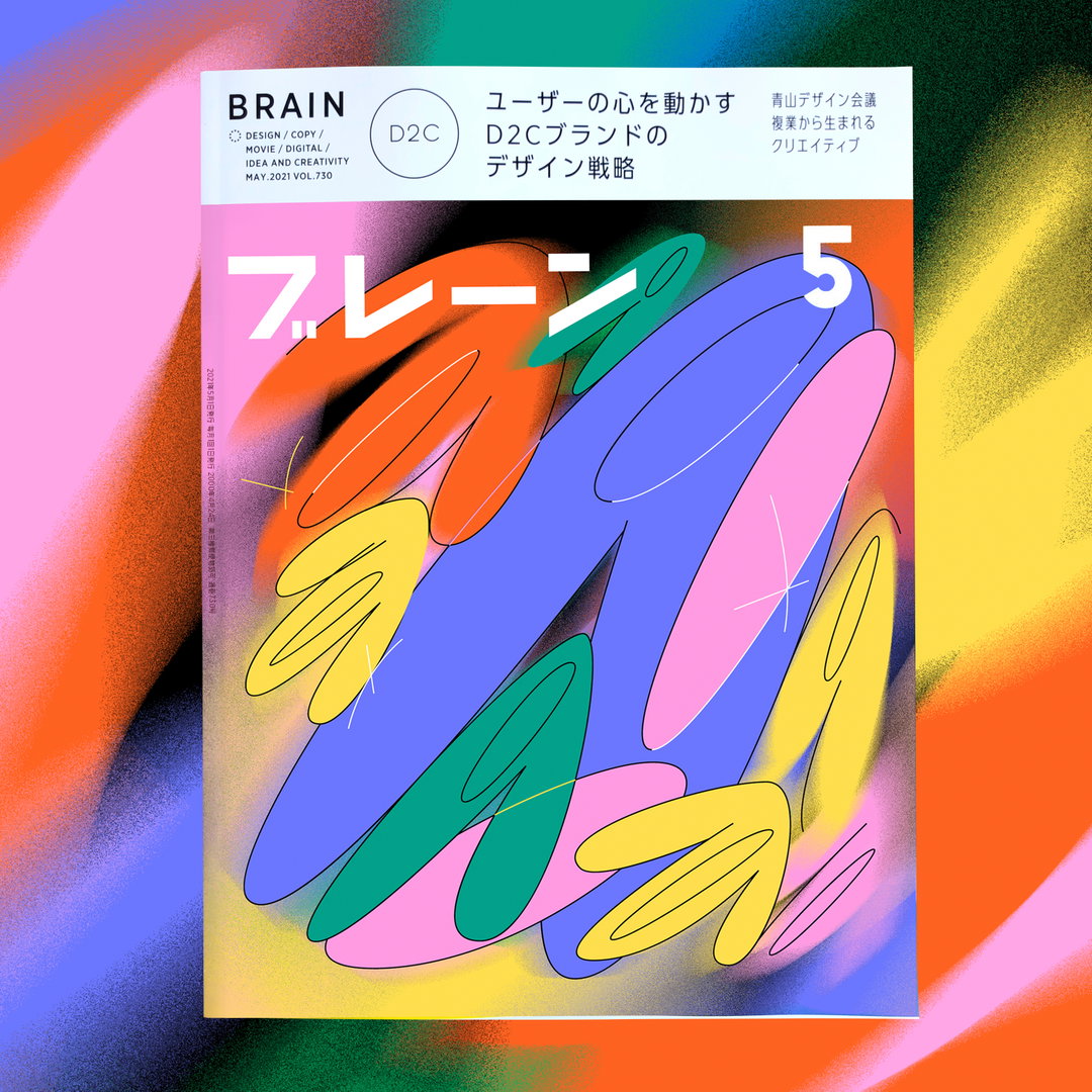
Rhythmic and fluid, Zuzanna Rogatty’s design practice is likened to a dance
Based between New York and Hawaii, the Polish graphic designer applies her experimental and detailed approach to both freelance projects and her role at Collins.
Playful and functional graphics collide in the work of Zuzanna Rogatty, a Polish designer and art director based between New York and Hawaii. Abound with colourful swathes, illustrative blobs and expressive typography, it’s the type of portfolio that visually hooks you in all but a second. And when it does, an instant smile is brought to your face as you meander through her various works for Bon Appetit, Esprit, Match, Google, Dropbox, M.AD School of Ideas and AIGA New York.
You can tell that Zuzanna has spent many years fine-tuning her craft, flitting between all sorts of artistic disciplines including painting, drawing, typography and calligraphy – “you name it”, she says, “I don’t like my life to be too easy or uneventful.” This means that Zuzanna is more than keen to take on various projects in synchronicity, and is often happily designing for brands during the day, while simultaneously working on her MFA or personal projects at night. “Or finally, if it’s working at Collins New York and living a surfer’s life on a far tropical Hawaiian island at the same time – I’m in!”
“I’m all about reaching for impossible,” she continues. "I feel the most alive when I have too much stuff going on, which also taught me to be well organised. FOMO would be my chronic disease if we looked at it from a dark side. But as an optimist, I see it as evergreen excitement about my life and work. I haven’t slept much in my 20s honestly, but I don’t regret any second. It brought me to where I am now.”
Working across a whole host of projects, it’s safe to say that Zuzanna has her creative fingers in many pies. She’s an ambitious designer first and foremost, meaning she will always make the time to add to her personal portfolio. And when doing so, her main focus is to express herself and place emphasis on the more experimental, playful ideas – like a recent cover for Bon Appetit that saw her toy with bold typography and a fully open brief. Beyond her selected freelance endeavours is her role as a designer at Collins, during which she delves into a variety of larger and more long-term projects. “The diversity between these two design worlds keeps me excited,” she says.
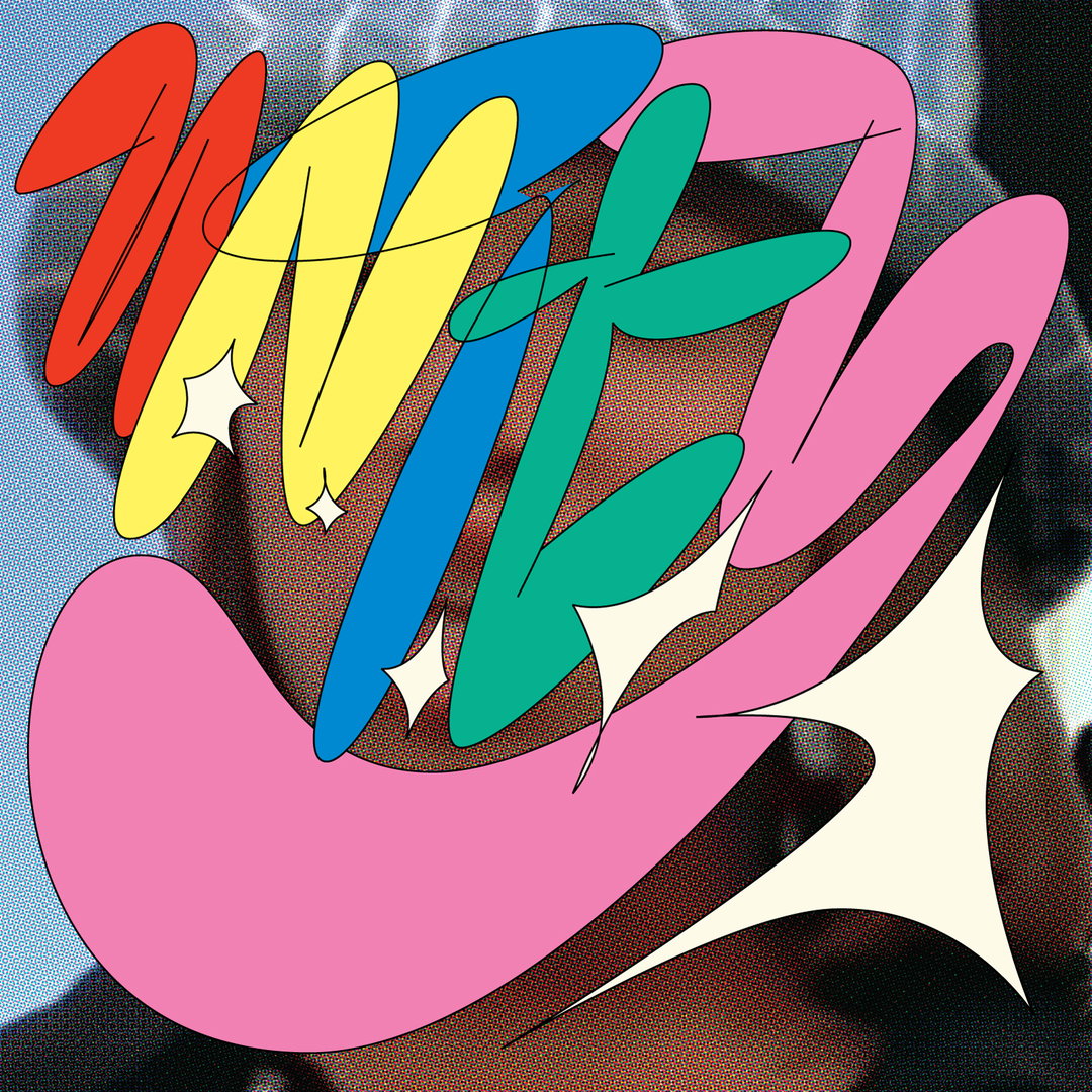
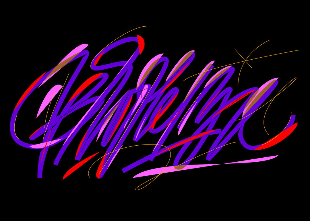
Zuzanna Rogatty: U.N.I.T.Y. (Copyright © Zuzanna Rogatty, 2021)
It might be unsurprising to hear that Zuzanna’s preferred type of project is one that gives her an element of spontaneity – the ones that she crafts in the spur of the moment. She seems quite impulsive when it comes to the ideation process, but even so, this only adds to her flair as a designer. After rough sketching her ideas, Zuzanna will move onto the digital segment of the process and work in her designs. “I try not to be precious about them, and honestly, I don’t like to stare at them for too long,” she notes. “If I hone them too much they lose their pure, dynamic energy and sharpness.” This approach also informs her work at Collins, even when she’s working with a wider team on the project at hand.
Recent examples of Zuzanna’s far-reaching (and characteristically joyful) designs take shape in many forms, like a recent project with Heart Directors Club run by Nikolai Dobreff. Along with 12 international designers, Zuzanna was tasked to interpret a song from a female musician – that song was U.N.I.T.Y by Queen Latifah. Employing a more simple approach in comparison to her other pieces, this one was steered by a primary colour palette, plus a chunky, hand-written style typeface that instantaneously adds to the fun and drama.
In other news, she also completed her first “big-scale” project at Collins, working with the Miami Ad School as it evolved into the M. AD School of Ideas, a network of 15 schools around the world with programmes in art direction, copywriting, creative technology, design, photography and video, social strategy, strategic planning and UX design. Zuzanna and the Collins team opted for an optimistic, rhythmic identity, plus a fluid symbol brought to life through animation by Aran Quinn, Tomas Markevicius and Eric Park at the firm. “We call it the M-dot and it has two parts: the 'M' is a liquid, calligraphic form that’s always recreating itself. And the 'Dot' is an always present, steadfast counterpart. They’re never without each other – they reflect the dance of the process.”
And Zuzanna’s practice can very much be likened to a dance, the type that switches between long, intensive projects and the more fleeting pieces in a flash. We’re looking forward to seeing where she takes things next, and if her future plans are anything to go by, it might involve the release of her display typeface Smutek, “which is very different from anything I’ve done before”.
GalleryCopyright © Zuzanna Rogatty, 2021
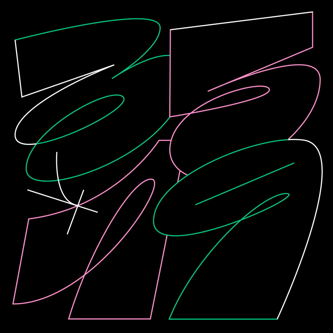
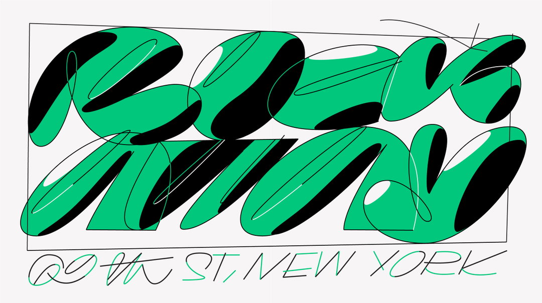
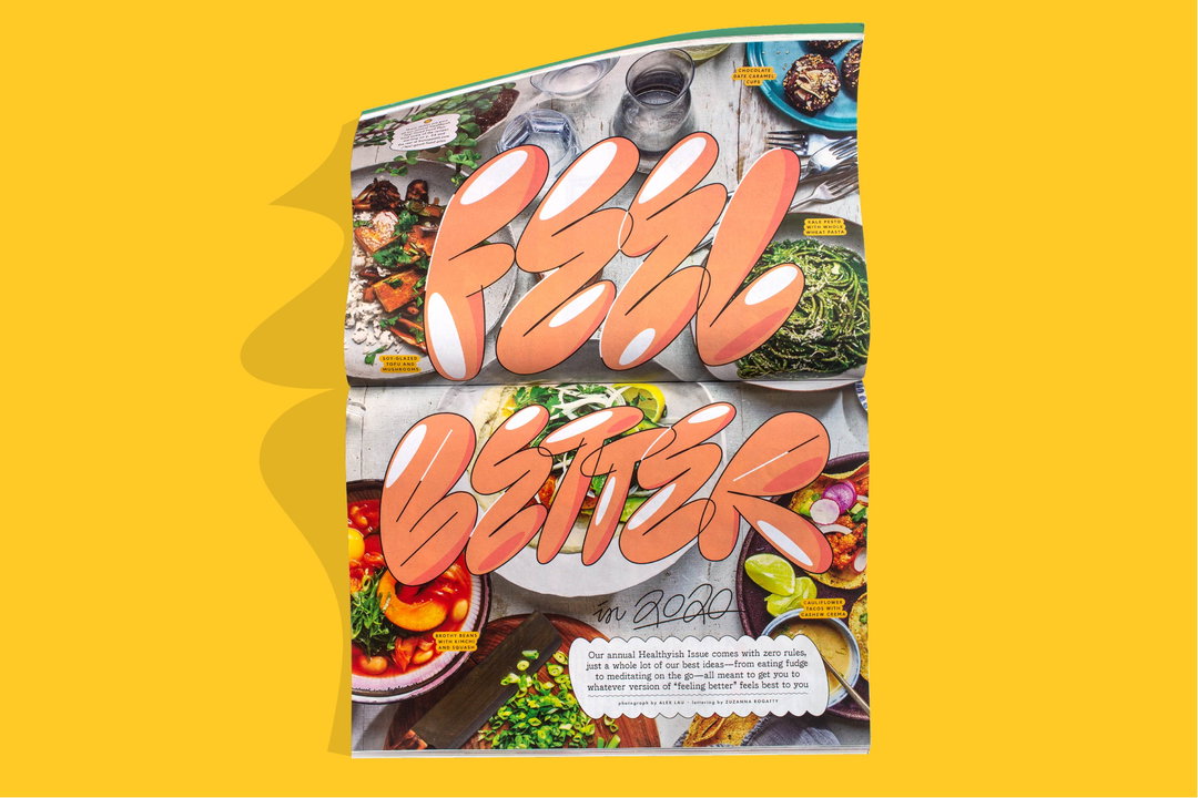
Bon Appetit
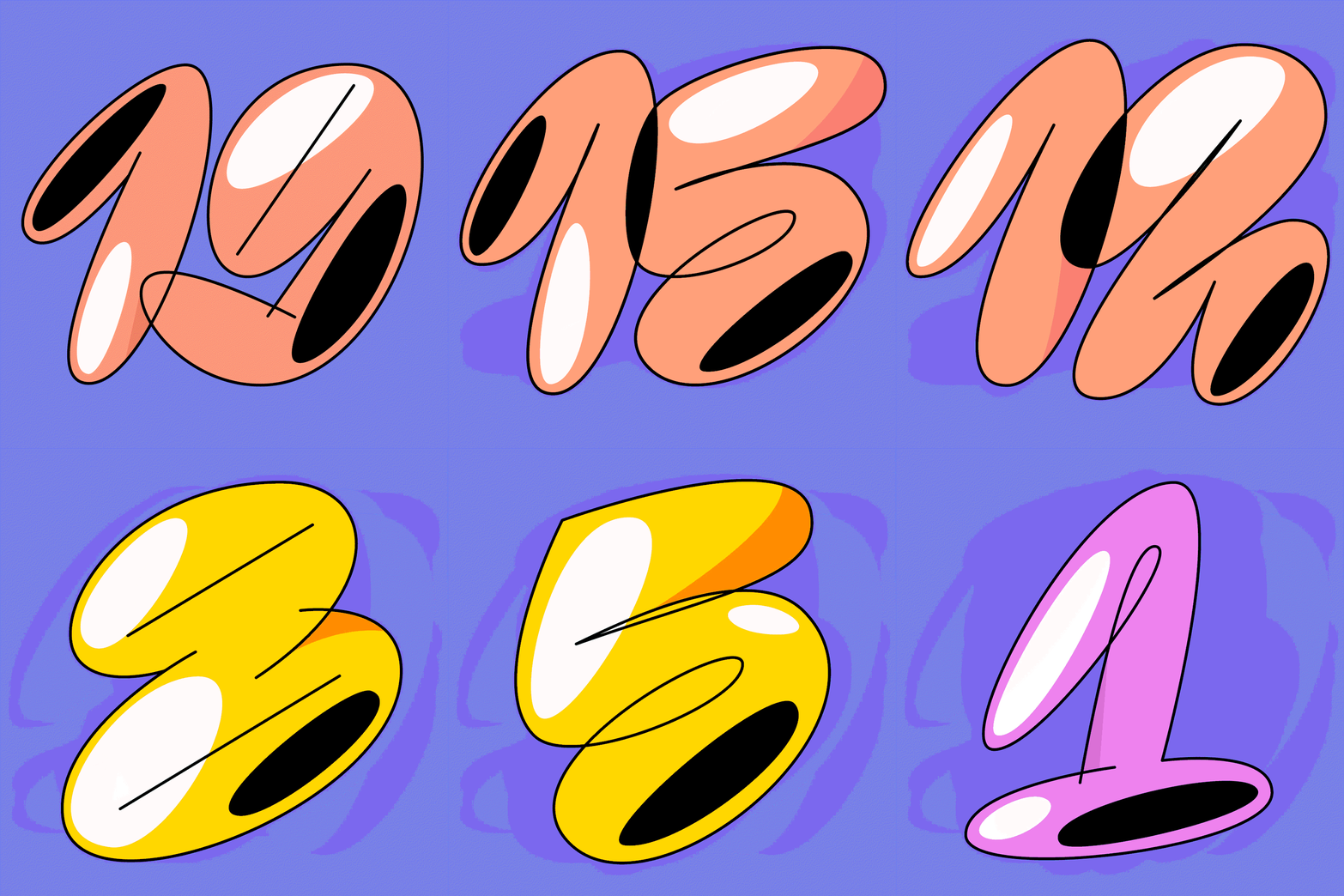
Bon Appetit
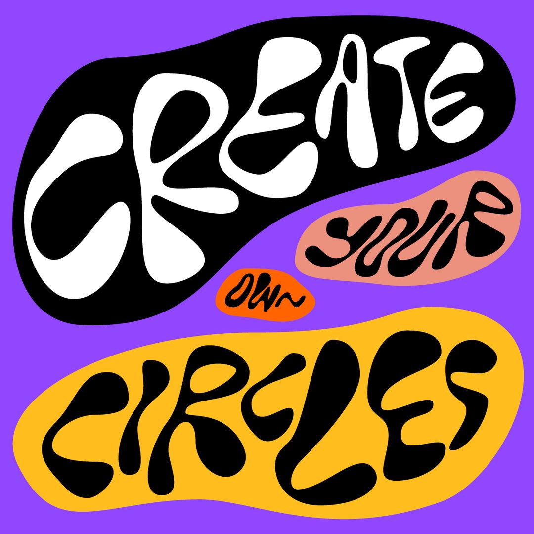
Collins Ideas
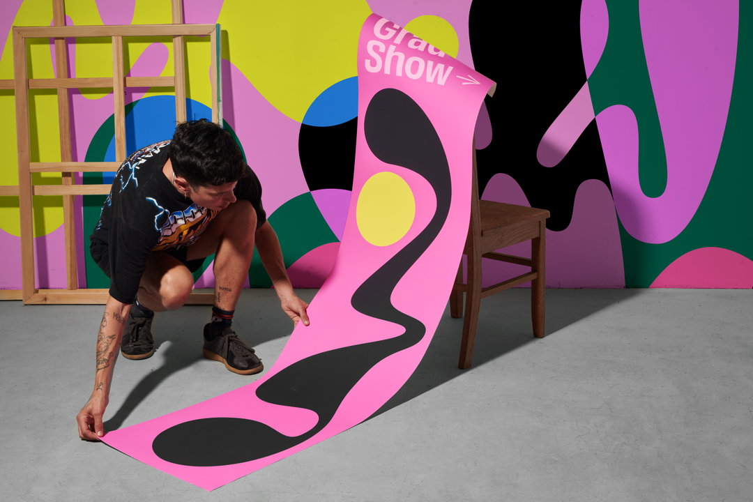
Collins, M.AD School of Ideas
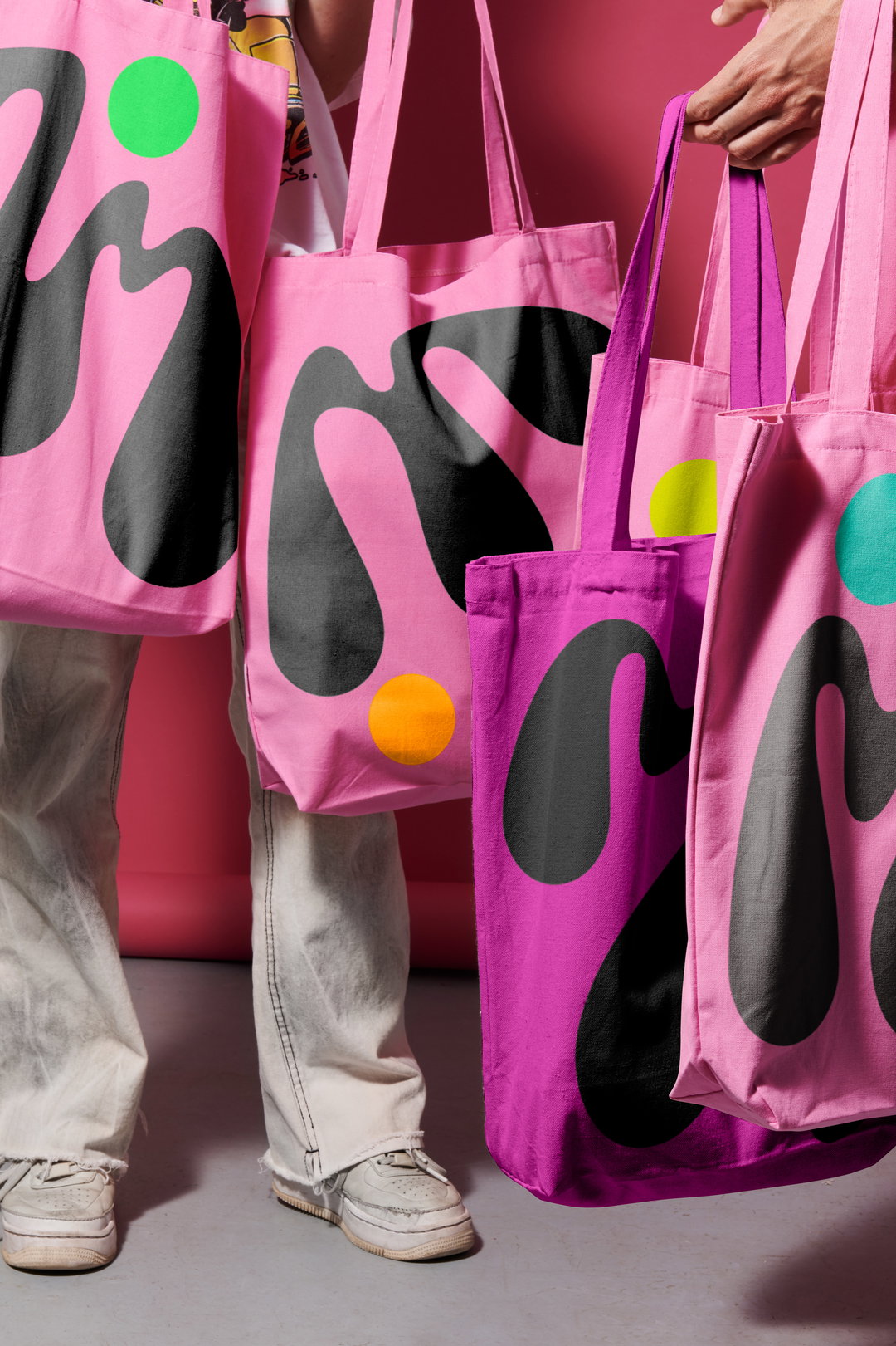
Collins, M.AD School of Ideas
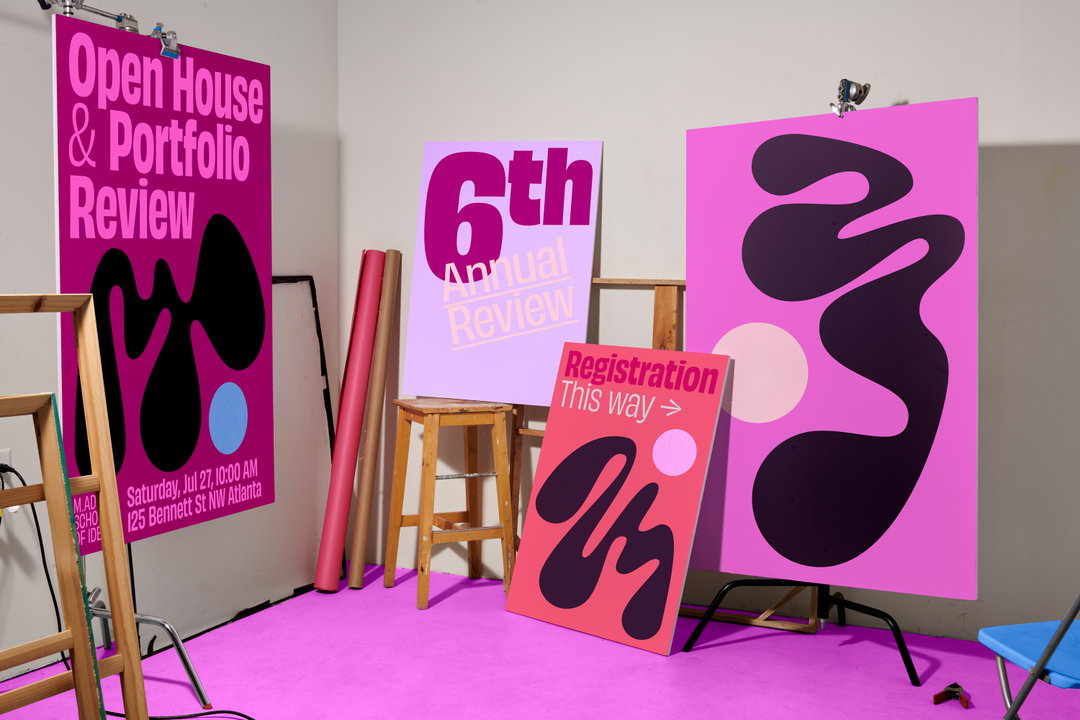
Collins, M.AD School of Ideas
Hero Header
Zuzanna Rogatty: Brain Magazine (Copyright © Zuzanna Rogatty, 2021)
Share Article
Further Info
About the Author
—
Ayla is a London-based freelance writer, editor and consultant specialising in art, photography, design and culture. After joining It’s Nice That in 2017 as editorial assistant, she was interim online editor in 2022/2023 and continues to work with us on a freelance basis. She has written for i-D, Dazed, AnOther, WePresent, Port, Elephant and more, and she is also the managing editor of design magazine Anima.