Tat* presents the glorious detail of thrown away graphic ephemera
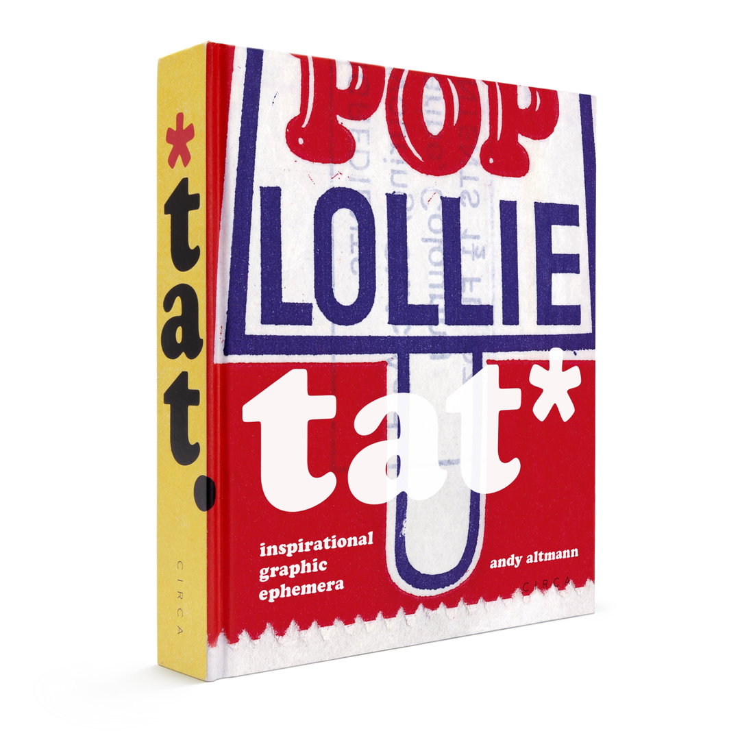
A treasure trove for any creative, Andy Altmann’s book is “a visual rollercoaster” through his collection of tat.
Designer Andy Altmann is a big fan of tat. Throughout his career – notably as one of the founders of Why Not Associates, an agency which closed its doors just before the pandemic – collecting bits and bobs of graphic ephemera has been a consistent part of his practice. In fact, he can trace filing clippings all the way back to his interview for the then-named Saint Martins School of Art, choosing to present a scrapbook of his growing tat collection rather than a traditional sketchbook.
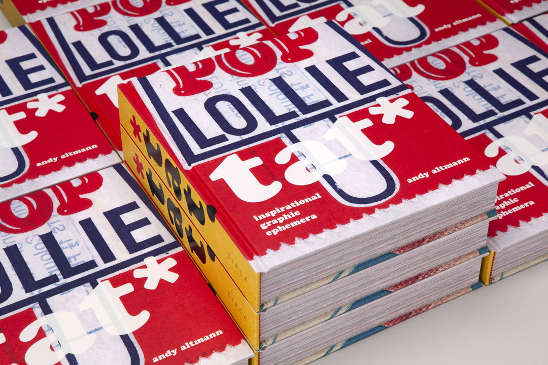
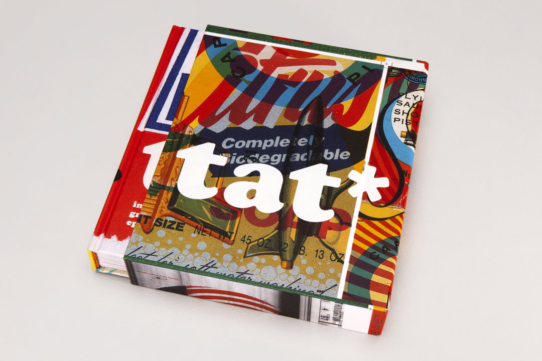
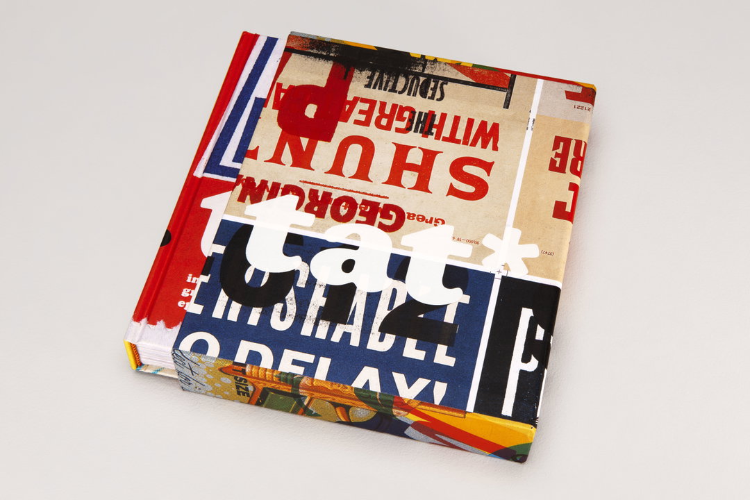
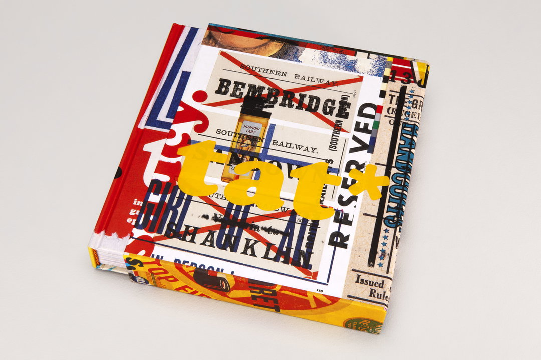
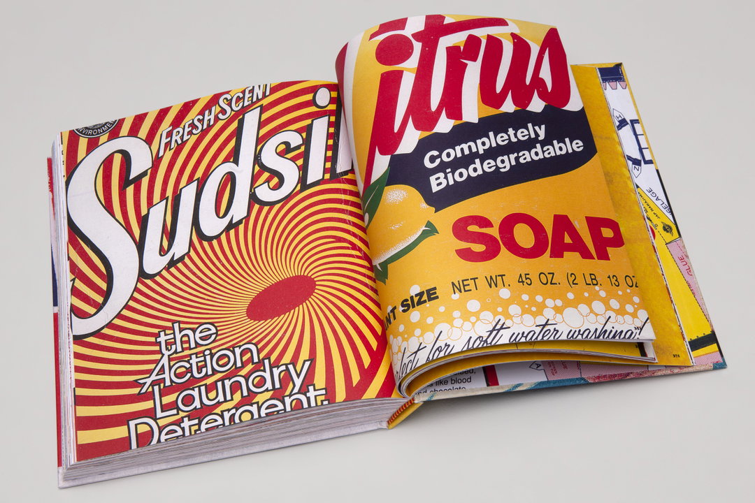
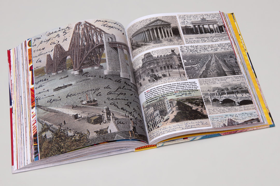
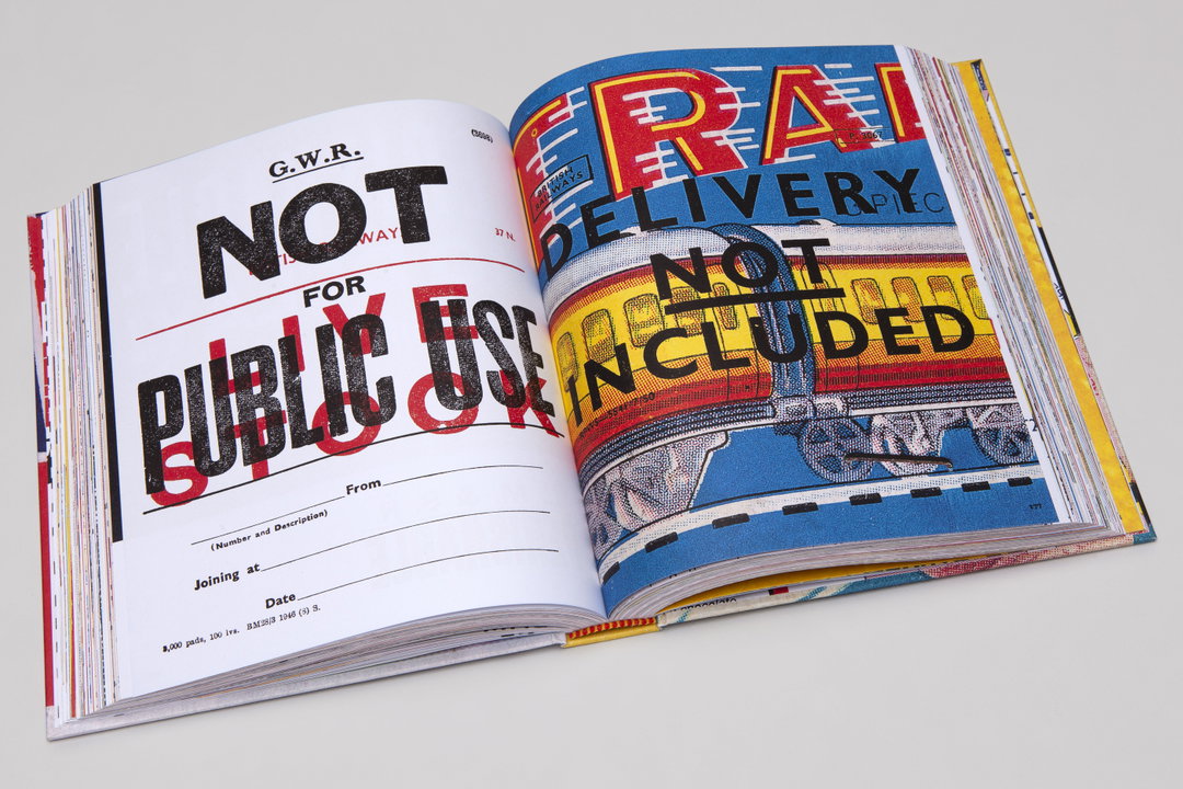
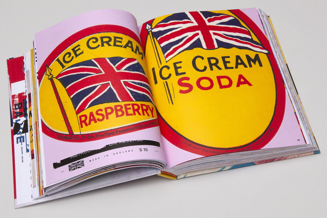
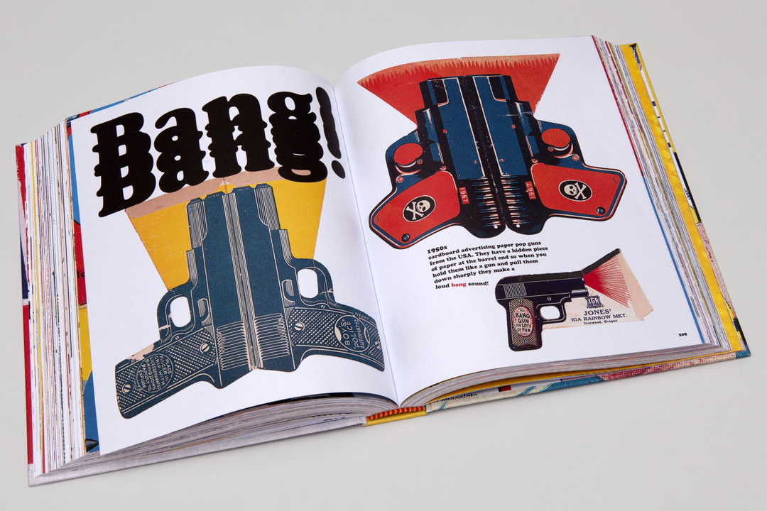
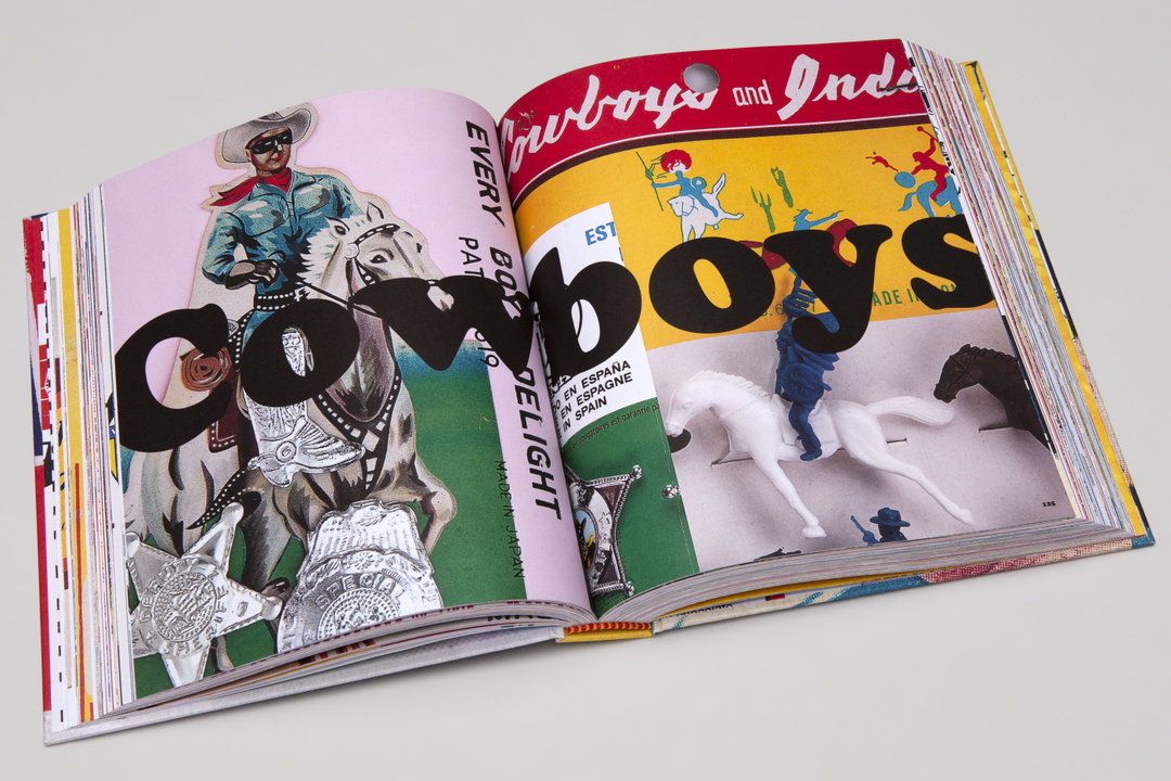
Closing Why Not Associates to focus on personal projects last year, the first of Andy’s projects is a book that acts like a catalogue of his findings, aptly titled Tat* – inspirational graphic ephemera. A doorstop of a book that blows up his findings from ticket stubs to soap boxes, the tome zooms in on the details – especially the typographic ones.
“Nearly every piece of tat I have collected over the years contains some form of typography,” Andy tells It’s Nice That when discussing a commonality in his collection. “At heart, I’m a typographer and I think it’s always the typography that draws me in.” Aside from these details it’s the literal texture which tends to catch Andrew’s eye too – the “tactile quality” of printed ephemera. Usually the two go hand in hand, especially if a piece has been letter-pressed: “it’s just very satisfying to run your fingers over the indentations of the print – every graphic designer loves that feeling,” he adds.
It’s this exact feeling that leads Andy to point out some of his favourite gems in the book. One piece dates back to his time at St Martins during the 1980s, collected on one evening at the greyhound racing at Harringay Stadium. “In the darkness of the winter evenings it was an incredibly atmospheric place, with the bookmakers side by side around the edge of the track,” the designer describes. “The floor was full of discarded betting slips from disgruntled punters. I discovered that these slips were beautiful in their design and colour combinations. They were letterpress printed, and many had wonderful numerals that included the word of the number integrated into their design. This helped to give them a unique graphic language of their own.”
Within Tat* it’s easy to imagine the following narratives behind the collection of graphic ephemera: “Utter tat to the majority of the people there,” Andy says, “but treasured trash to me.” In this sense the title also links back to the pastime of scrapbooking – or as Andy describes “the Instagram of its day,” – where personal collections were painstakingly arranged and stuck together.
The level of detail which goes into scrapbooking, collecting and even hoarding is very relatable to designers, creatives who file away ideas and influences for possible inspiration. “I’m hoping that this book can help designers see the magic in the mundane and inspiration in the ordinary,” adds Andy on what he hopes Tat* will offer for designers. “This type of commercial graphic design is often conveyed to graphic design students as ‘bad’ design. But there is genuine beauty in it, if you take the time to look.” By collating 400 pages together, Tat* offers the perfect opportunity to do so via “a visual rollercoaster” in graphic ephemera.
“Fundamentally it’s a scrapbook that I hope designers will dip into now and again and find something new,” concludes Andy. “The book is also scattered with various anecdotes and historical details that might inspire designers to research more about their subjects, as there is always an interesting story or fact to be discovered even through a fragment of tat.”
GalleryAndy Altmann: Tat (Copyright © Andy Altmann, 2021)
Hero Header
Andy Altmann: Tat (Copyright © Andy Altmann, 2021)
Share Article
About the Author
—
Lucy (she/her) was part of the It’s Nice That team from 2016–2025, first joining as a staff writer after graduating from Chelsea College of Art with a degree in Graphic Design Communication, eventually becoming a senior editor on our editorial team, and most recently at Insights, a research-driven department with It’s Nice That.