Jell-O serves nostalgia in first packaging redesign in a decade
Branding agency BrandOpus has traded in the old medicinal boxes to embrace the fun at the core of Jell-O.
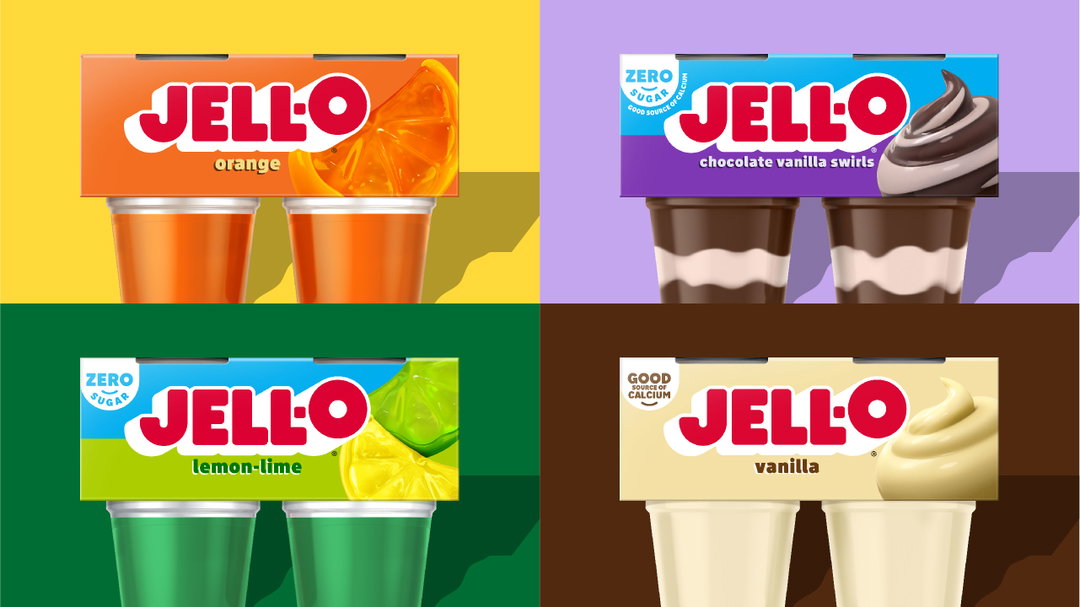
Jell-O, the American brand whose trademark dates back to 1897, has redesigned its packaging and logo with BrandOpus. The old Jell-O boxes featured a soft gradient to denote the dessert’s flavour; now the packaging relies on block colours and simple shapes to express its personality as “America’s most famous dessert”. It’s the first time in a decade that Jell-O has refreshed its packaging.
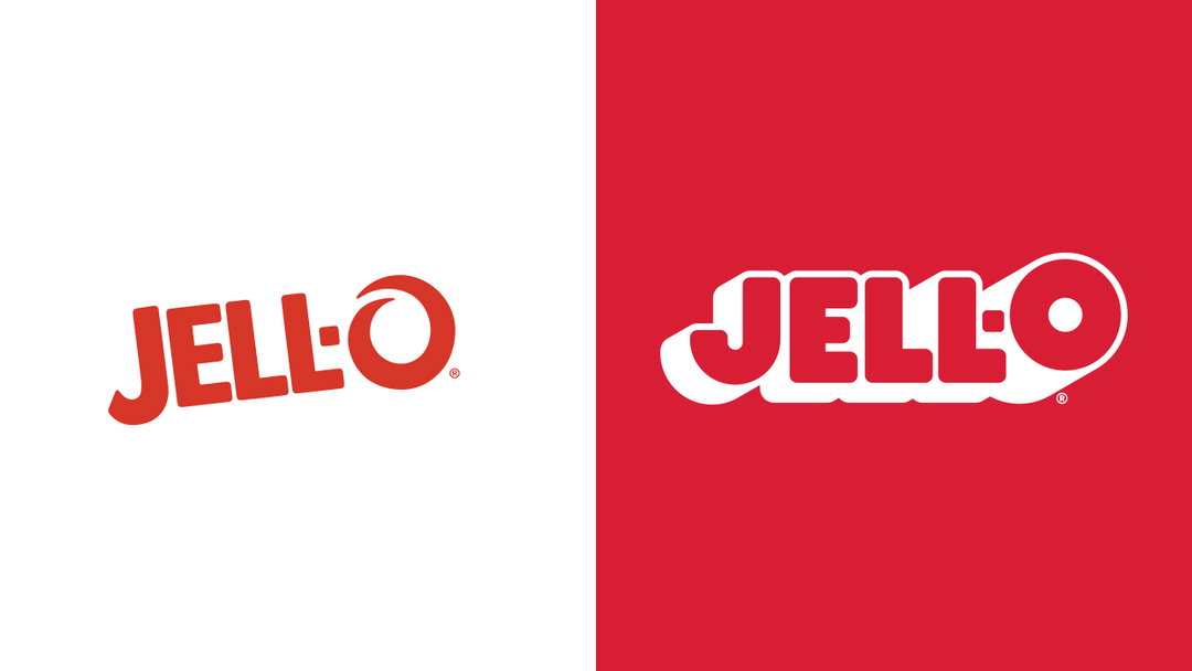
One of the most recognisable elements of the previous brand, the ‘O’ in Jell-O, now sits further in the limelight. In the logo, the calligraphic ‘O’ has been replaced with a fuller typeface that extends upwards in a bubbly fashion. The ‘O’ is also incorporated throughout the new identity as a framing device and pattern, in text and motion assets. “There might be other gelatines out there, but there is only one Jell-O. We focused on one of the many things that makes them unique,” says BrandOpus.

BrandOpus: Jell-O (Copyright © BrandOpus, 2023)
Stylistically, it’s an interesting shift for a brand with as much longevity as Jell-O. Like countless other food and drink brands this year, the identity plays on a trend of elevated nostalgia. But BrandOpus has been bolder than most of its competitors with its palette and play on retro Americana. Jell-O’s new packaging also features 3D illustrations of fruits with a gummy finish.
In the past, BrandOpus has worked with numerous brands looking to reinvent themselves in the food market, including McCain, who moved in a more “homegrown” direction following a slump in sales for fast food brands.
GalleryBrandOpus: Jell-O (Copyright © BrandOpus, 2023)



Hero Header
BrandOpus: Jell-O (Copyright © BrandOpus, 2023)
Share Article
Further Info
About the Author
—
Liz (she/they) is the senior editor at Insights, a research-driven department within It’s Nice That. They previously ran the news section of the website. Get in contact with them for potential Insights collaborations or to discuss Insights’ public-facing reports.