Launch Recite Me assistive technology

The Asics rebrand by Bruce Mau Design aims to convey "joy and positivity"
—
Date
2 August 2017
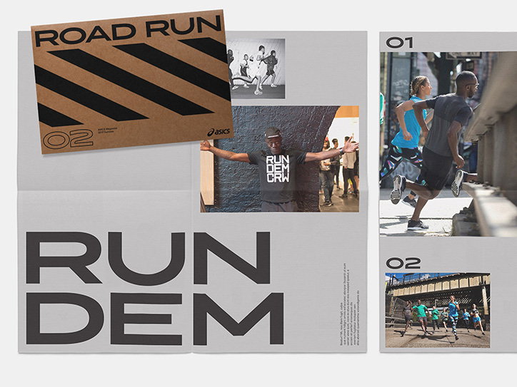
A layout of magazine pages and a brown cardboard cover for “Road Run”. The cover features bold black diagonal stripes and the number “02”. The open pages show a person in a “Run Dem CRW” T-shirt and photos of people running in a city. Large, bold typography across the bottom reads “RUN DEM”.

Bruce Mau Design has completed a global brand redesign for sportswear company Asics. The project covers packaging guidelines, graphic and photographic language, a footwear style guide, brand book and a custom typeface developed in collaboration with Kontrapunkt. The redesign, which was developed over two years in partnership with the team at Asics, retains the historic spiral logo and seeks to “position Asics as a lifestyle athletic brand while still staying true to its core performance heritage”.

“The new identity and brand system are inspired by the joy and positivity that sports bring to all aspects of life, as well as by the galvanising spirit of the athletes who drive the energy of ASICS,” says the agency. “The global brand refresh redefines how contemporary design can be applied to a heritage brand to convey a cultural and emotional message to consumers.”

The rebrand was launched to coincide with the 2017 International Association of Athletics Federation World Championships in London this week alongside a new ad campaign titled I Move Me.

Bruce Mau Design has previously worked with Asics Tiger on a rebrand project in 2016.
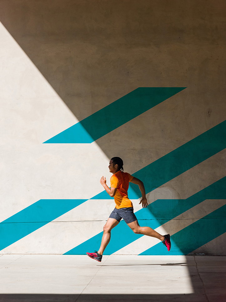
A person in an orange T-shirt and dark shorts runs across a sunlit concrete space. Behind them, a grey wall is decorated with bold, diagonal teal stripes.
Above

Bruce Mau Design: Asics

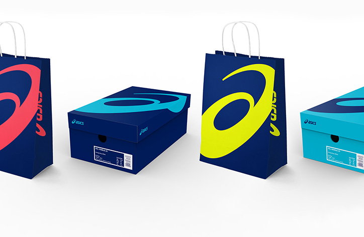
A 3D render of Asics packaging and shopping bags in deep blue. The items feature the brand logo in contrasting pink, yellow and light blue.
Above

Bruce Mau Design: Asics

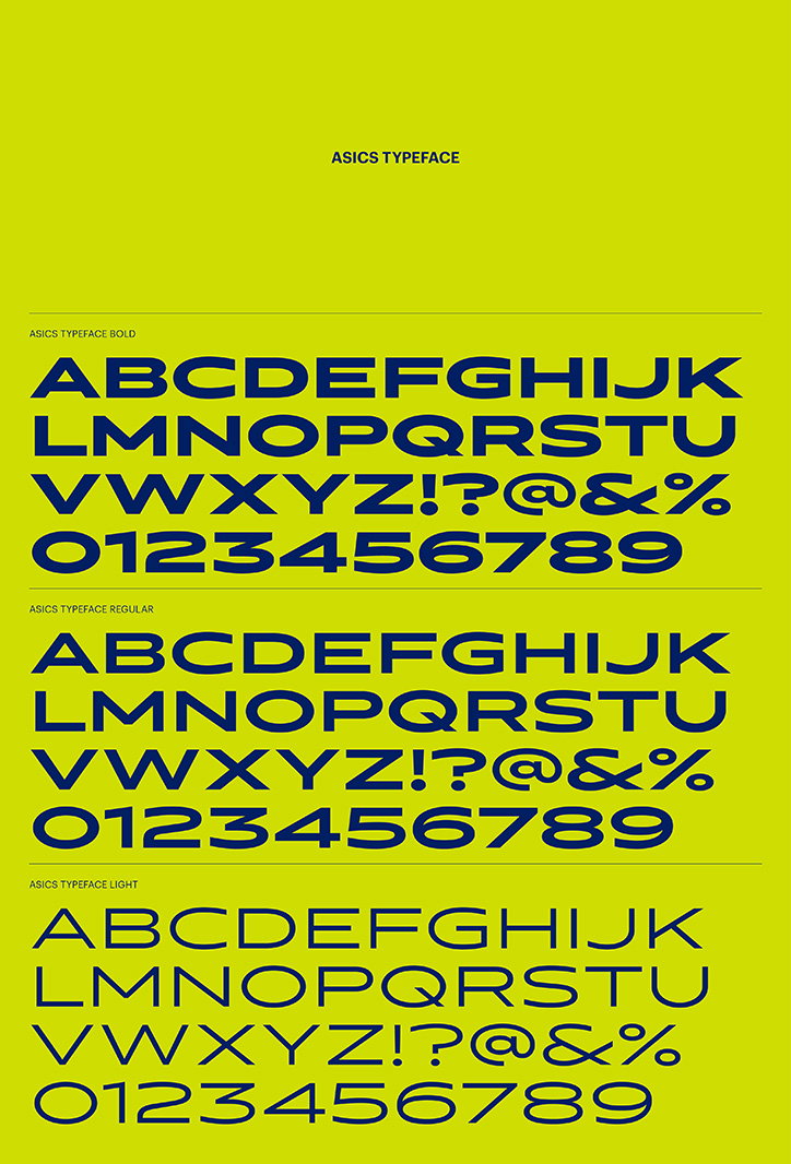
A typographic specimen for the “Asics Typeface” set against a bright yellow background. The alphabet, numbers and symbols are shown in three weights: “Bold”, “Regular” and “Light”.
Above

Bruce Mau Design: Asics

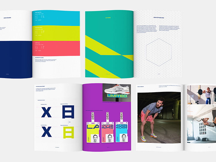
A series of open spreads from a brand guidelines book. The pages feature colour palettes, geometric patterns, typographic grids and photographs of footwear and people.
Above

Bruce Mau Design: Asics

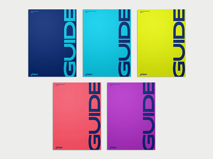
Five brightly coloured guides in blue, cyan, yellow, red and purple. Each cover features the word “GUIDE” in large, vertical, dark blue typography and the Asics logo.
Above

Bruce Mau Design: Asics

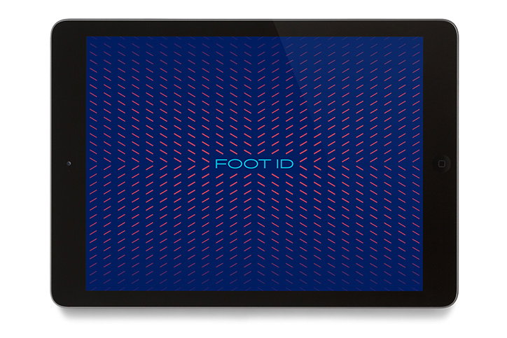
A tablet displays a dark blue screen filled with a pattern of small, red diagonal lines. The words “FOOT ID” appear in a light blue sans-serif font at the centre.
Above

Bruce Mau Design: Asics

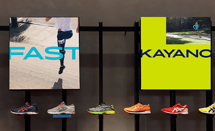
Two Asics advertising posters hang above a row of six running shoes in various colours. The first poster shows a person running with the word “FAST” in blue, while the second is bright yellow and reads “KAYANO”.
Above

Bruce Mau Design: Asics

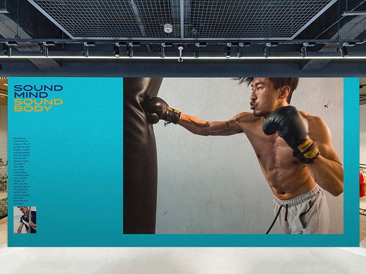
A large blue banner features a person wearing boxing gloves punching a heavy bag. Bold text on the left reads “SOUND MIND SOUND BODY”, followed by a short paragraph of body copy.
Above

Bruce Mau Design: Asics

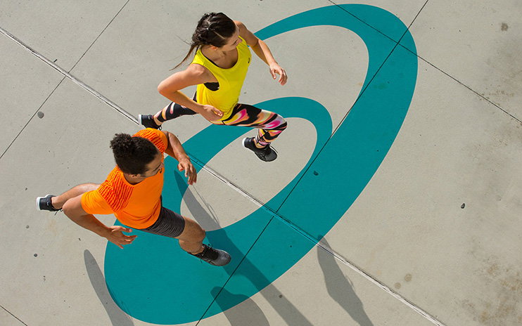
Two people in bright athletic wear run across a concrete plaza. They are positioned within a large, teal-coloured oval painted on the ground.
Above

Bruce Mau Design: Asics

Share Article

About the Author

Owen Pritchard

—

Owen joined It’s Nice That as Editor in November of 2015 leading and overseeing all editorial content across online, print and the events programme, before leaving in early 2018.

It's Nice That Newsletters

Fancy a bit of It's Nice That in your inbox? Sign up to our newsletters and we'll keep you in the loop with everything good going on in the creative world.