Channel 4 tells us about its just rolled out cross-network rebrand
Channel 4
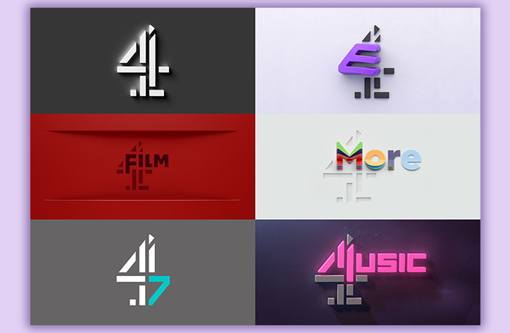
“I don’t think the general public will notice much of the rebrand,” isn’t the kind of thing you expect to hear coming out of the mouth of someone just a day away from a visual re-rub of an entire network of TV channels. Channel 4’s group business director Matt Berry tells It’s Nice That, “when we did research into the logos, a lot of people thought these new logos were already in existence.”
You, the discerning viewer, likely will realise that this new brand positioning — which stretches across Channel 4, E4, Film4, 4Music, 4Seven and More4, and incorporates logos and idents — is different. Especially if you’re someone who regularly tunes into the near-perpetually purple youth-orientated platform, E4.
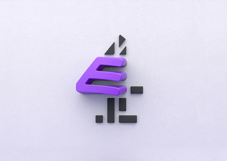
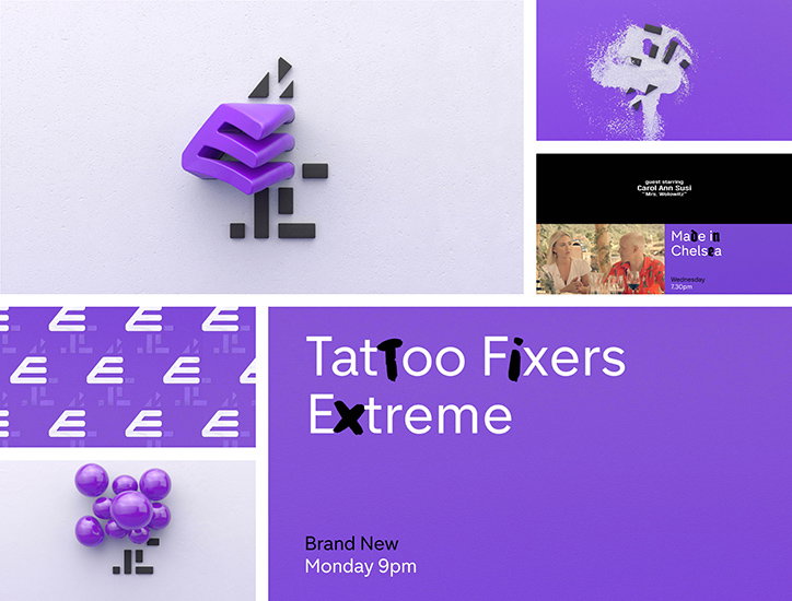
That channel’s logo will stay the familiar shade of aubergine that’s made it stand out in the TV schedules, but will be supported with “eight new opticals” aimed at showcasing it’s “mischievous, rebellious personality.”
Channel 4
E4’s creative director Will Clark explains that he and his team scoured the length and breadth of the country in a search for the best creative talent possible, with the intention of creating a series of fun, zippy idents which lend a sense of the endless possibility of life spent scrolling online to the slightly more stationary medium that is television. “TV, because it is linear and structured, can feel quite repetitive. I wanted to create something that felt like it wasn’t repeating itself. The idents are all completely unique an individual, rather than being a set of six that all look the same,” he says.
Will goes on to say that, “I wanted them to feel like every time you turned on E4 you were getting something new. It has a scrapbook feel to it, rather than a repetitive feel,” adding, “We set a brief that was, we will support you, and your amazing creative ideas if they fit the ethos. We want stuff that’s a bit quirky.”
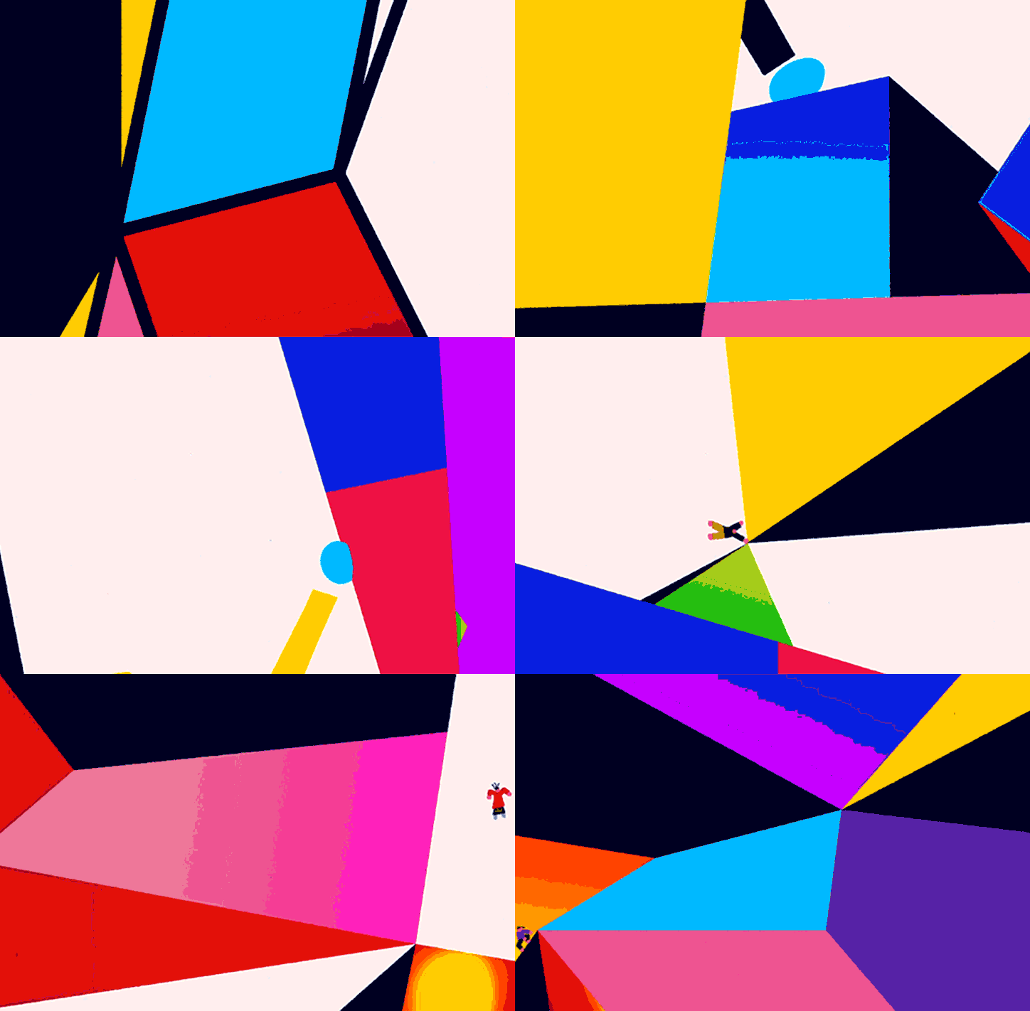
The idents, which include the surprisingly sober “Space Station” and the lion heavy and oddly saucy “New Breed”, embody this interest in the unique and the unusual.
This new look extends across the whole of the Channel 4 network, and it comes at an interesting, exciting, and slightly strange time for TV broadcasters. As Matt puts it, using what is very much the language of television professionals, “all the well known major broadcasters — like the BBC, like ITV, like Channel 4 — are under increased pressure because our share of voice is dropping.” What this means in layman’s terms, is that the rise and rise of online steaming services means broadcasters see less of viewers and vice versa.
The decision to rebrand as a totality stems from this. Launching a cohesive identity across channels which show everything from Dispatches to Four in a Bed via Grand Designs and All Star Driving School isn’t an easy ask but the team we spoke to believe that it creates an attachment to the broadcaster — and the brand.
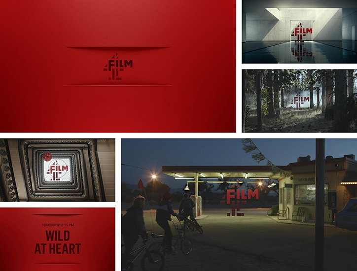
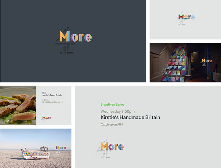
“So wherever someone’s experiencing something from the Channel 4 network — be it C4, E4, Film4, More 4, or 4 Music — they understand it is content from Channel 4, and it is content imbued with those values of experimentation and creative risk and innovation we’ve had since we launched back in 1982,” Matt says.
The rebrand rolls out today in full. Check out a series of videos and images from it below.
Channel 4
Building: Alex Grigg, Blinkink
Channel 4
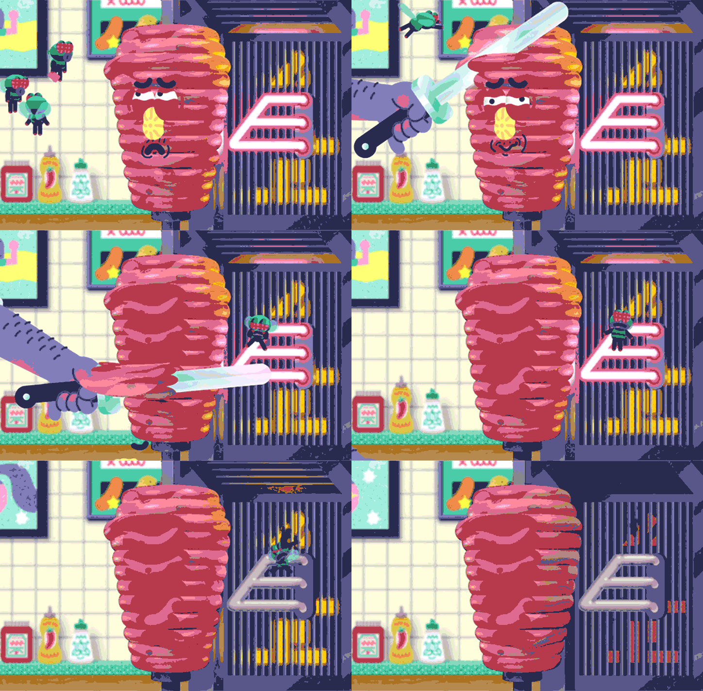
Kebab: Layzell Bros, Blinkink
Share Article
Further Info
About the Author
—
Josh Baines joined It's Nice That from July 2018 to July 2019 as News Editor, covering new high-profile projects, awards announcements, and everything else in between.