




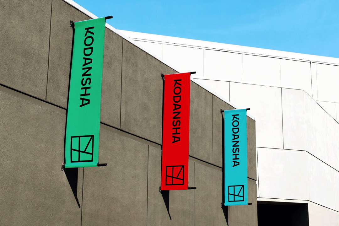
New York studio Gretel partners with Japan’s largest publisher Kodansha to update its identity and logo
After 112 years since the launch, the renowned publishers has updated its identity to reach a more global audience.
Share
For the first time in 112 years since its founding, Japanese publishers Kodansha has released a new brand identity and logo, conceived in partnership with New York-based branding studio Gretel.
Kodansha is Japan’s largest publisher known for many acclaimed stories such as Akira and Pretty Guardian Sailor Moon, plus countless children’s books and pieces of non-fiction. It also kicked off the careers of storytellers like Haruki Murakami, and released countless manga magazines including Nakayoshi, Afternoon, Evening, Weekly Shōnen Magazine, plus literary titles such as Gunzō and Shúkan Gendai.
Kodansha launched in 1909 by Seiji Noma, making its debut with the literary magazine Yūben. For many years, the prestigious publishing house has continued to build a name for itself. And only now – over a century later – it has decided to update its identity, reaching a more global audience to better reflect its varied content.
Teaming up with Gretel was therefore a fitting choice; a branding agency working with a diverse range of disciplines including strategy, research, copywriting, art direction, live-action production, design and motion. It also boasts a client list ranging from Apple, Netflix, The New York Times to MoMA and Noma, and in 2019 we saw the studio update Nike’s consumer-led sub-brand Nike ID to By You – reflecting its wide array of customisation options.
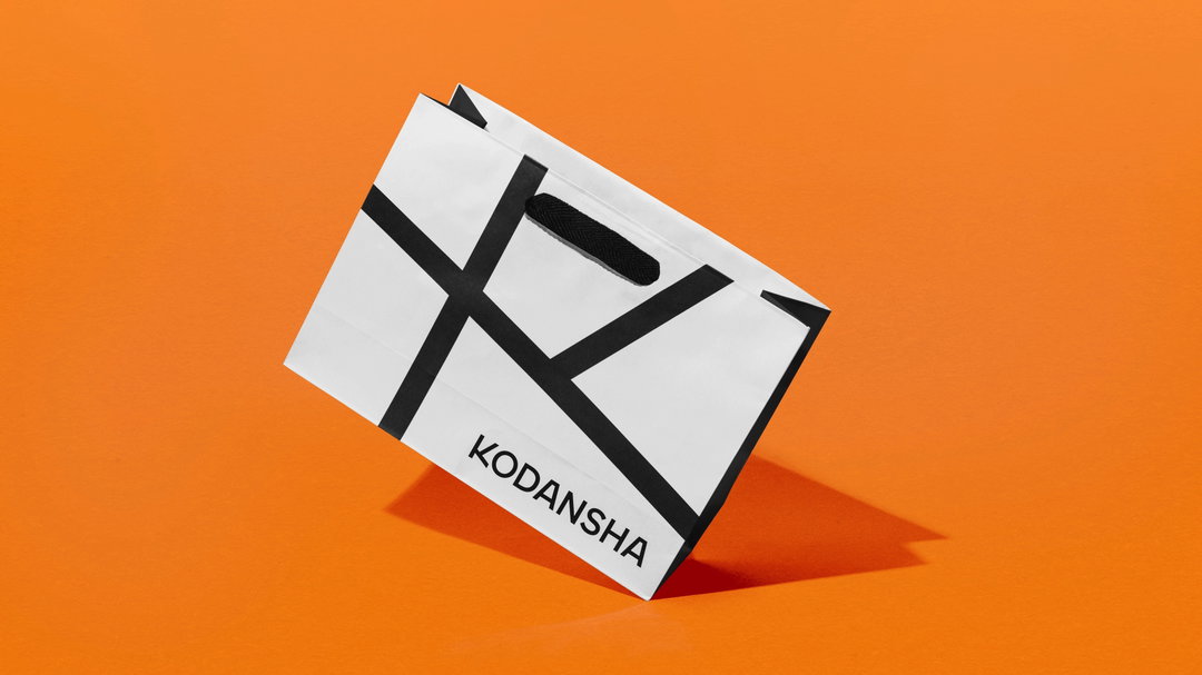
Copyright © Gretel and Kodansha, 2021
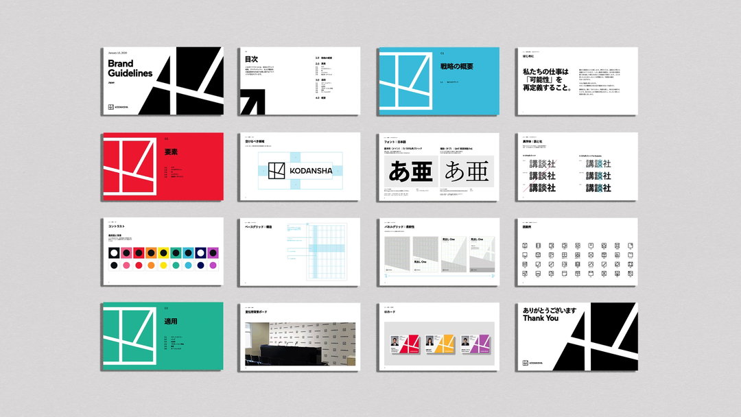
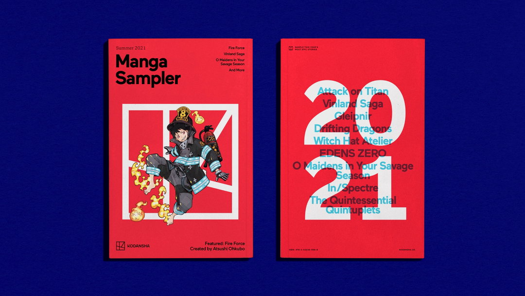
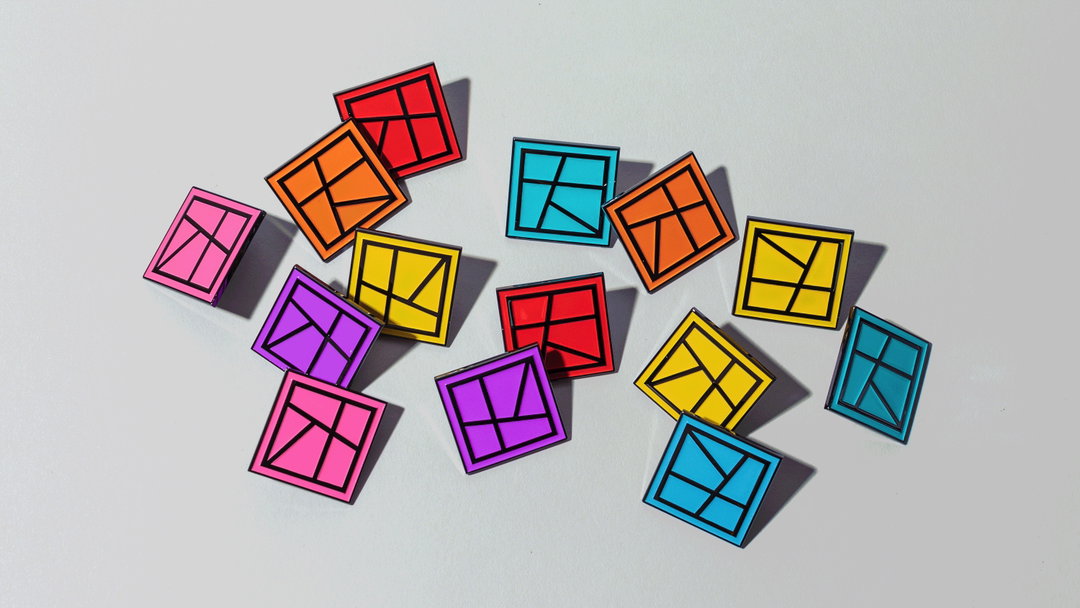
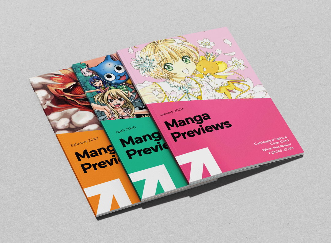
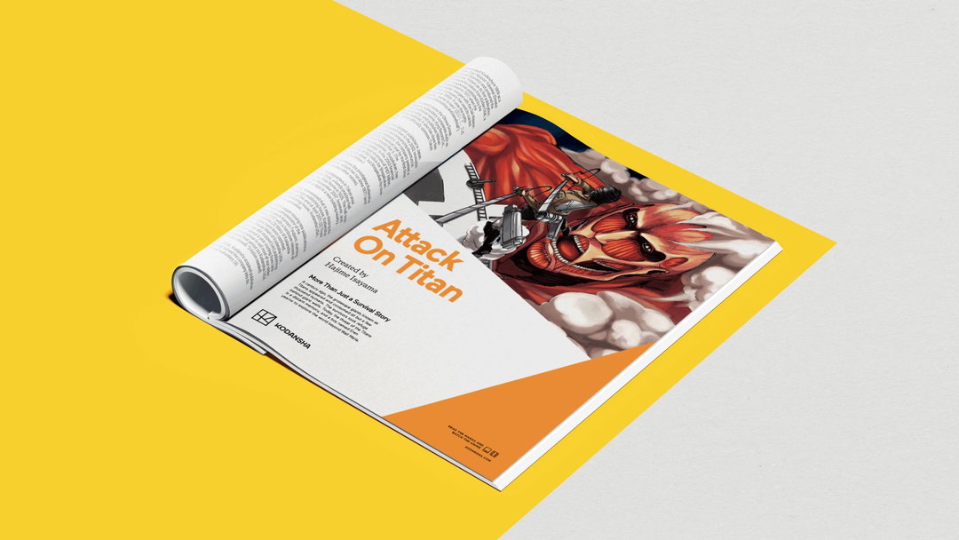
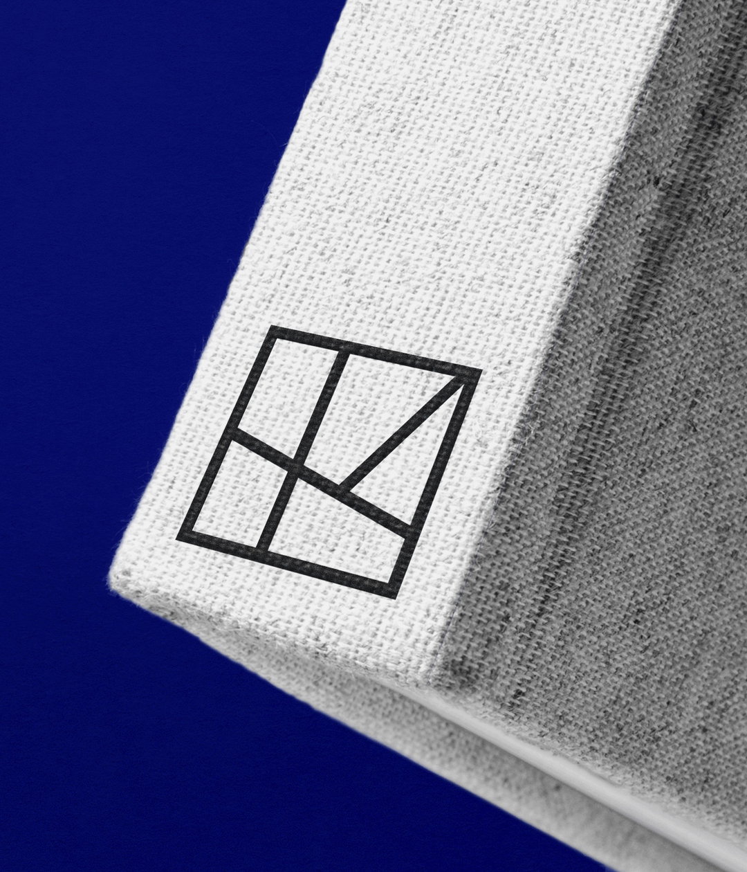
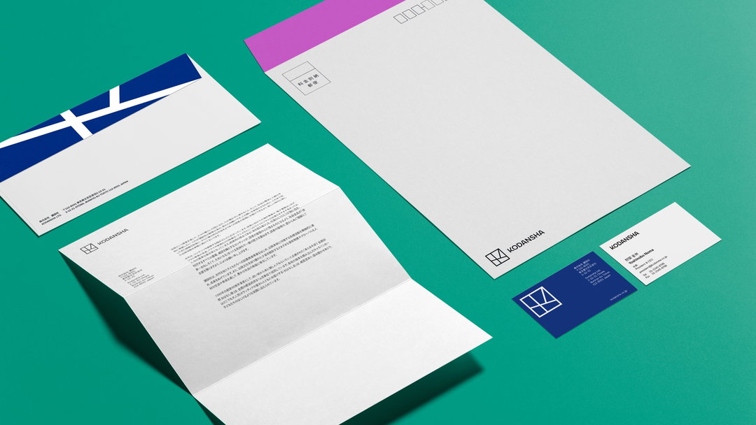
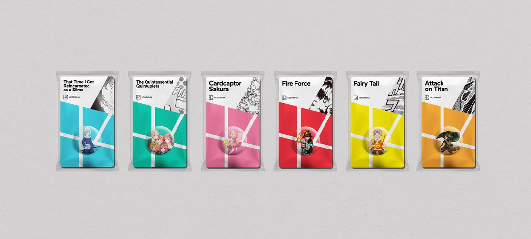
The new Kodansha identity touches all aspects of its visual presence from the branding to the finer details like the spine of the book, as well as trade show designs, the logo refresh, brand launches and a film titled Taking Flight. The latter created by Gretel and directed by award-wining director Juan Cabral, known for working with brands such as Sony, Apple and Ikea. “Taking Flight emphasises the boundlessness of Kodansha’s creativity and ability to excite all kinds of fans from all over the world through omoshirokute tame ni naru stories,” says Gretel’s creative director Sue Murphy, meaning “interesting and useful – a common motto at Kodansha.”
Both Gretel and Kodansha worked closely with Japanese entry partner Anchorstar to bring the Tokyo and New York divisions of the company together, which Yoshinobu Noma, CEO of Kodansha, describes as being “a refreshing surprise”. But in doing so, the new identity has seen the publisher unveil a new logo that represents this merging of cultures. “The brand logo represents Kodansha’s position at the crossroad of all cultures – where many ideas, voices and stories intersect,” adds Sue. “It’s also inspired by Japanese hankos, acting as a stamp of quality on Kodansha content, as well as a monogram.”
“With this new brand we’ve achieved both simplicity and depth – and triggered a chance in mindset for Kodansha, externally and internally,” says Yoshinobu, CEO of Kodansha in a statement. “Our new identity and strategy allow us to communicate who we are on a global scale, and give us the tools to fill the world with inspiring, impossible stories.”
Taking Flight can be watched below.
GalleryCopyright © Gretel and Kodansha, 2021

Hero Header
Copyright © Gretel and Kodansha, 2021
Share Article
Further Info
About the Author
—
Ayla is a London-based freelance writer, editor and consultant specialising in art, photography, design and culture. After joining It’s Nice That in 2017 as editorial assistant, she was interim online editor in 2022/2023 and continues to work with us on a freelance basis. She has written for i-D, Dazed, AnOther, WePresent, Port, Elephant and more, and she is also the managing editor of design magazine Anima.


