Amphico’s rebrand spotlights the outdoor industry’s recycling problem and the material tackling it
The humble lotus leaf helped Amphico founder Jun Kamei discover a new sustainable material, so How&How drew on it for the brand’s identity too.
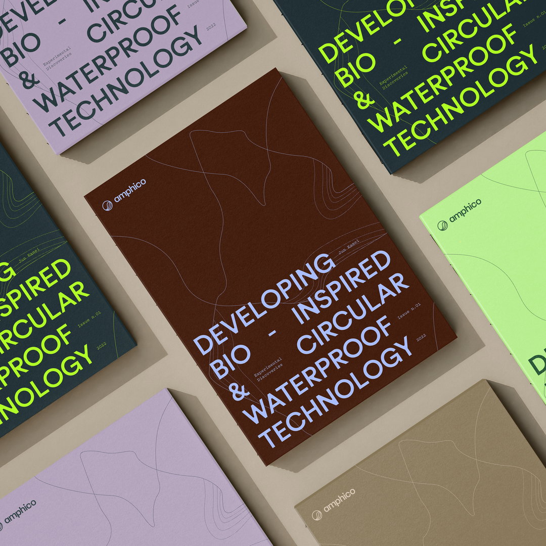
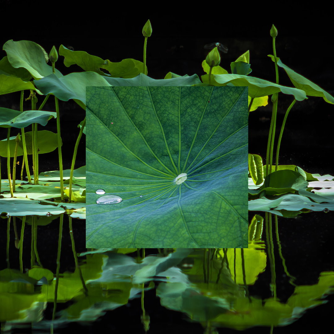
How&How – the London, Lisbon, LA studio behind a number of environmental and sustainability-based branding projects – has produced the brand identity and website for outdoors start-up Amphico. The studio sets the scene on the project, explaining that, right now, the outdoors industry is lagging when it comes to sustainability. “The products that enable us to endure harsh weather conditions are often the same ones putting toxic chemicals into our waterways and landfills; unrecyclable and unacceptable,” a release states. With Amphico working to make the market more circular, How&How focuses on the science and story behind the brand with the identity, namely through elements such as a lotus leaf motif.
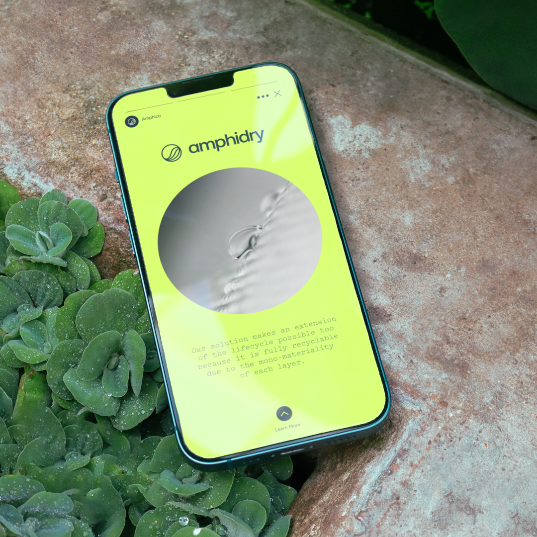
The material that makes Amphico products more sustainable – known as Amphitex – was actually discovered by founder Jun Kamei when he was developing an amphibious gill for humans. Like the lotus leaf’s naturally water-repellent properties, Amphitex is waterproof. But unlike other materials on the market, such as Gore-Tex, which are made of layers of different plastics and chemical coatings, Amphitex is a mono-material or same-source polymer, which makes it easier to recycle. In the future, whatever product Amphico is making, it’ll use this fabric.
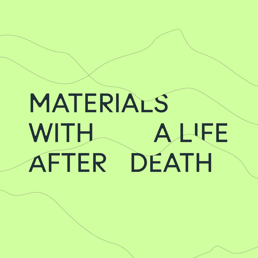
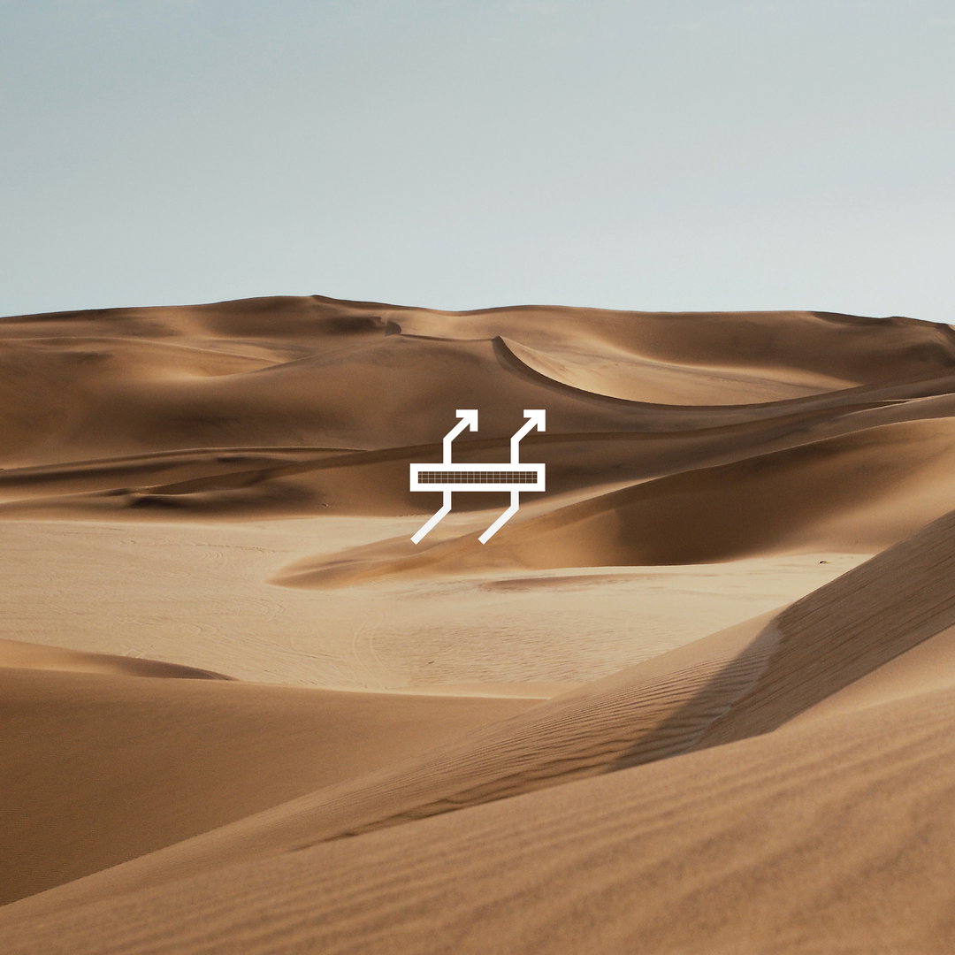
Amphibious gills and outdoors jackets, however, span broad territory. So to unite all the products Amphico will create, How&How focuses on the versatile nature of the material with the identity and new brand idea: “Everything One Thing”. The design system features fluid lines that can represent myriad of forms, functioning as lines from a lotus leaf while also referencing the mesh of the Amphitex fabric. When paired with brand photography showing mountain ranges, these lines also mimic topography and water, meaning the identity can tell the story of the product from inspiration, to conception to use in nature.
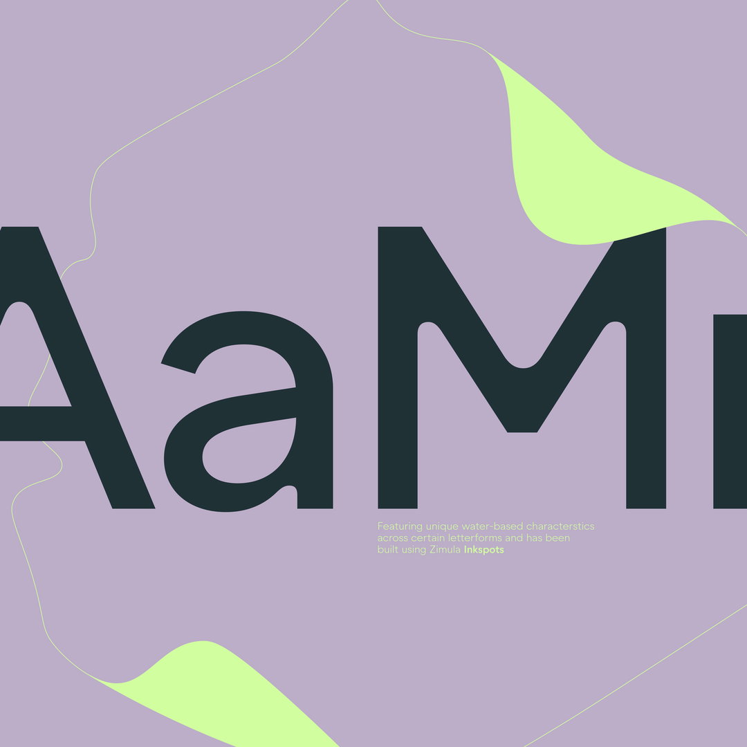
How&How adds: “Zimula by La Bolde Vita foundry was chosen as the primary typeface due to its soft-edge, ‘watery’ inktraps and circular letterforms.” Turning to the lotus leaf for the colour palette too, the studio summarises the identity is “rooted in science and reflected in nature”.
GalleryHow&How: Amphico (Copyright © How&How / Amphico, 2022)


Hero Header
How&How: Amphico (Copyright © How&How / Amphico, 2022)
Share Article
Further Info
About the Author
—
Liz (she/they) is the senior editor at Insights, a research-driven department within It’s Nice That. They previously ran the news section of the website. Get in contact with them for potential Insights collaborations or to discuss Insights’ public-facing reports.