




Koto rebrands student-driven coffee start-up Brewbike
The studio has taken a playful and flexible approach to the brand, which offers students the chance to start their own micro-businesses on campus.
Share
Design agency Koto has rebranded Brewbike, a student start-up launched at Northwestern University in 2016. The idea behind the company revolves around offering students at various universities the opportunity to set up their own micro-business, delivering and serving coffee to their peers. While “encouraging employees to build invaluable skills for life after graduation,” the process also allows “consumers to feel good about investing in a transformative experience for ambitious undergrads, while enjoying top-notch coffee,” says Koto’s design director Dave Raxworthy.
Working with the brand since the spring of this year, Koto has delivered the strategy, marker language and new branding for Brewbike in a flexible design outcome. Working closely with the brand’s leadership team, who are also recent graduates themselves, “the Brewbike team embodies the company’s mission to inspire young people to become leaders.” Representing this anti top-down approach in its design, Koto’s rebrand showcases how Brewbike hands “the keys to students” and is “preparing them for the real world”.
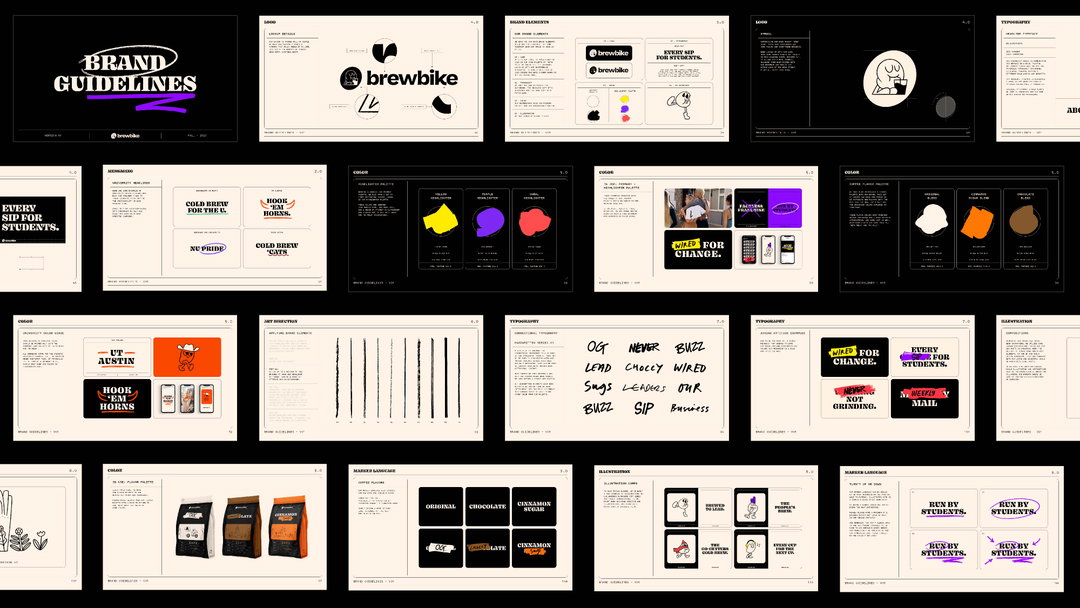
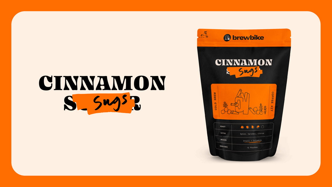
Keen to create an identity which felt like it was co-authored, Koto’s marker language first showcases how Brewbike’s university locations are growing. In turn, it was important for each campus or student to have the tools to “make this brand their own, on campus and online,” says Dave. Keeping a muted cream and black colour palette across its key design outcomes, wider colour options are offered that are tied to each university, as well as a mascot to play with in a “toolkit of expressions that reflect each campus and the students’ hand in business”.
Typographically the rebrand features three varying fonts. First is the word mark of Brewbike designed in Blazeface by Oh No Type Company, chosen for “its fresh character and modern boldness,” Dave tells It’s Nice That. This is accompanied by Pitch Sans from Klim Type Foundry to sit beside “this expressive headline typeface, grounding the brand’s body copy,” as well as handwritten notes and expressions applied by the Koto design team.
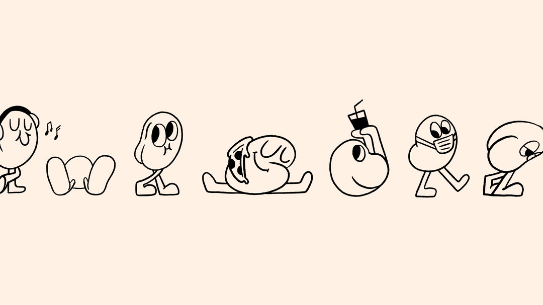
Lastly at the centre of the rebrand is Brewbike’s mascot (“It wouldn’t be college without a mascot”) who is a Mr.Men-like coffee bean character who morphs into various personalities given the context of its application. Adding both “a touch of playfulness, quirk, and edge to the brand,” there are 50 beans in total, from expressive and university-themed ones through to being “dressed for a day out, or just straight up chillin’,” as Dave puts it. Each of these applications has then been applied in an additional new Brewbike website, designed by Love and Money.
A broad rebrand, which we assume will continue to expand as Brewbike does as a business, Koto’s design reflects the varying groups that will benefit from the brand’s product in a playful, lighthearted way that still means big business.
Koto: Brewbike (Copyright © Koto, 2020)
Koto: Brewbike (Copyright © Koto, 2020)
Koto: Brewbike (Copyright © Koto, 2020)
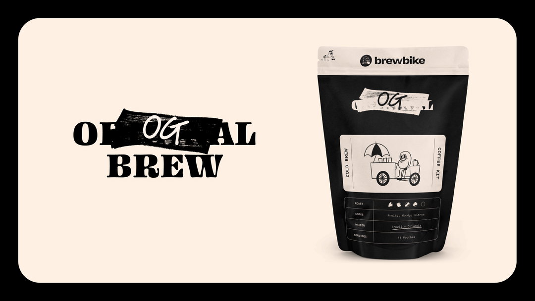
Koto: Brewbike (Copyright © Koto, 2020)
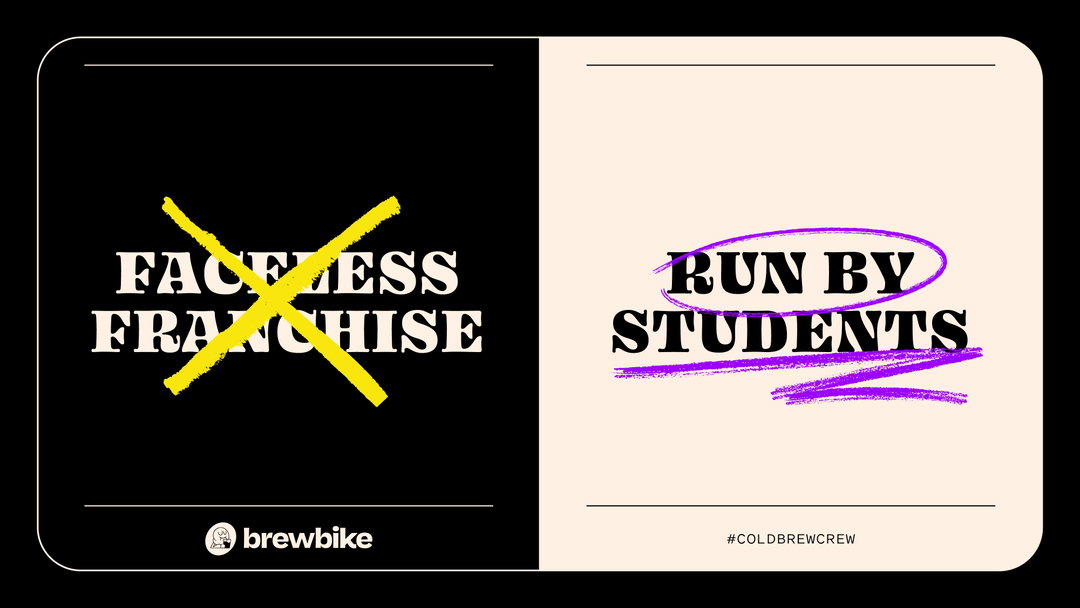
Koto: Brewbike
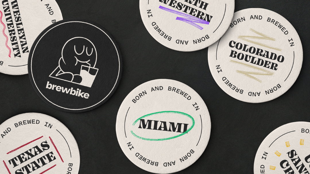
Koto: Brewbike (Copyright © Koto, 2020)
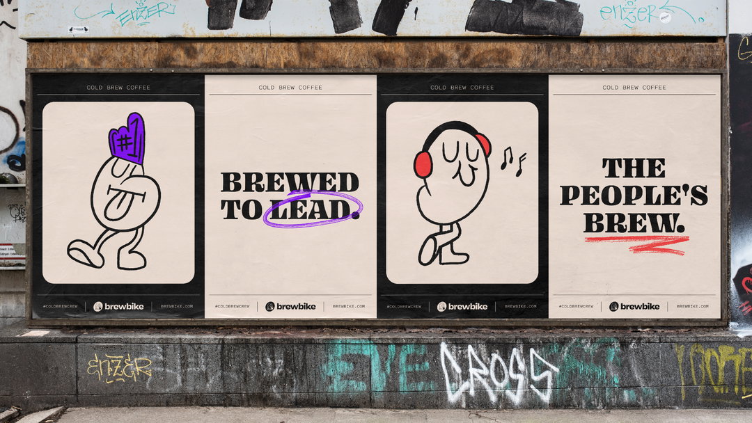
Koto: Brewbike (Copyright © Koto, 2020)
Hero Header
Koto: Brewbike (Copyright © Koto, 2020)
Share Article
Further Info
About the Author
—
Lucy (she/her) was part of the It’s Nice That team from 2016–2025, first joining as a staff writer after graduating from Chelsea College of Art with a degree in Graphic Design Communication, eventually becoming a senior editor on our editorial team, and most recently at Insights, a research-driven department with It’s Nice That.

