Carnegie Museum of Art’s new look is built on an approachable typeface
The Museum collaborated with Laura Coombs, Meg Forsyth, Berton Hasebe and Folder Studio on the update, seeking to prioritise legibility.
Carnegie Museum of Art recently unveiled its new identity which relies on a straightforward use of colour and typography. The Museum’s in-house design team, led by Aryn Beitz, developed the system with designer and creative director Meg Forsyth and Laura Coombs, who were recently featured as one of 50 winners in AIGA’s annual book and book cover design competition.
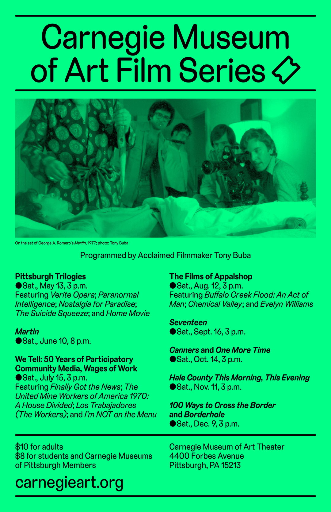
The refresh launches with an initial core set of bright colours which can also be seen in-person across the Museum’s steps. This colour system will expand over time, with some hues retired and others introduced. Carnegie Soft, the custom typeface for the Museum by Berton Hasebe, is a key part of the work and is given central focus. With its rounded edges and full bowls, the typeface reflects growing calls for designers to leverage similar fonts in the name of accessibility, as well as the Museum’s aim to centre its visitors.
“A visual identity isn’t just a logo – it’s a dynamic, holistic design system,” says Aryn Beitz, director of design and publishing at the museum. “At Carnegie Museum of Art, we wanted our new visual identity to communicate who we are, what we do and what we stand for. Our initial brief was to create a contemporary yet friendly visual identity that was welcoming, legible and easy to maintain. With that in mind, we imagined the museum as a tide pool that surfaces information and ideas. Our visual identity brings all the things we create at the museum – including art, programmes, events, design and so much more – to the surface, making them more visible and within reach for our visitors.”
Elsewhere, Folder Studio has redesigned the Museum’s website, harnessing Carnegie Soft and the remodelled colour palette. It features 1,000 reinterpreted webpages from the museum’s former site, as well as 150 new webpages inclusive of original copy, images and video.
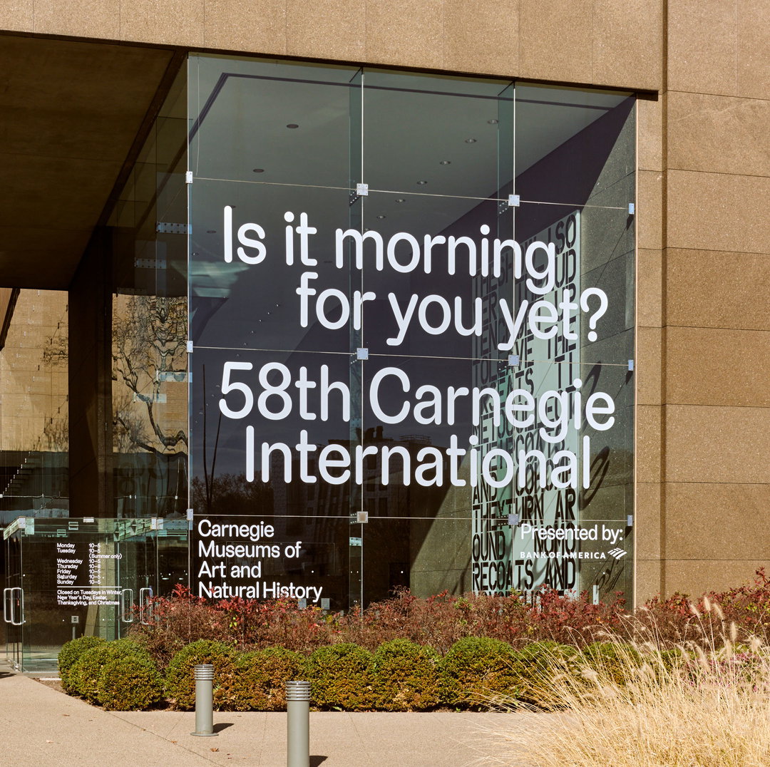
Laura Coombs / Meg Forsyth / Carnegie Museum of Art: Carnegie Museum of Art, typeface by Berton Hasebe, web design and development by Folder Studio, photography by Sean Eaton (Copyright © Carnegie Museum of Art, 2023)
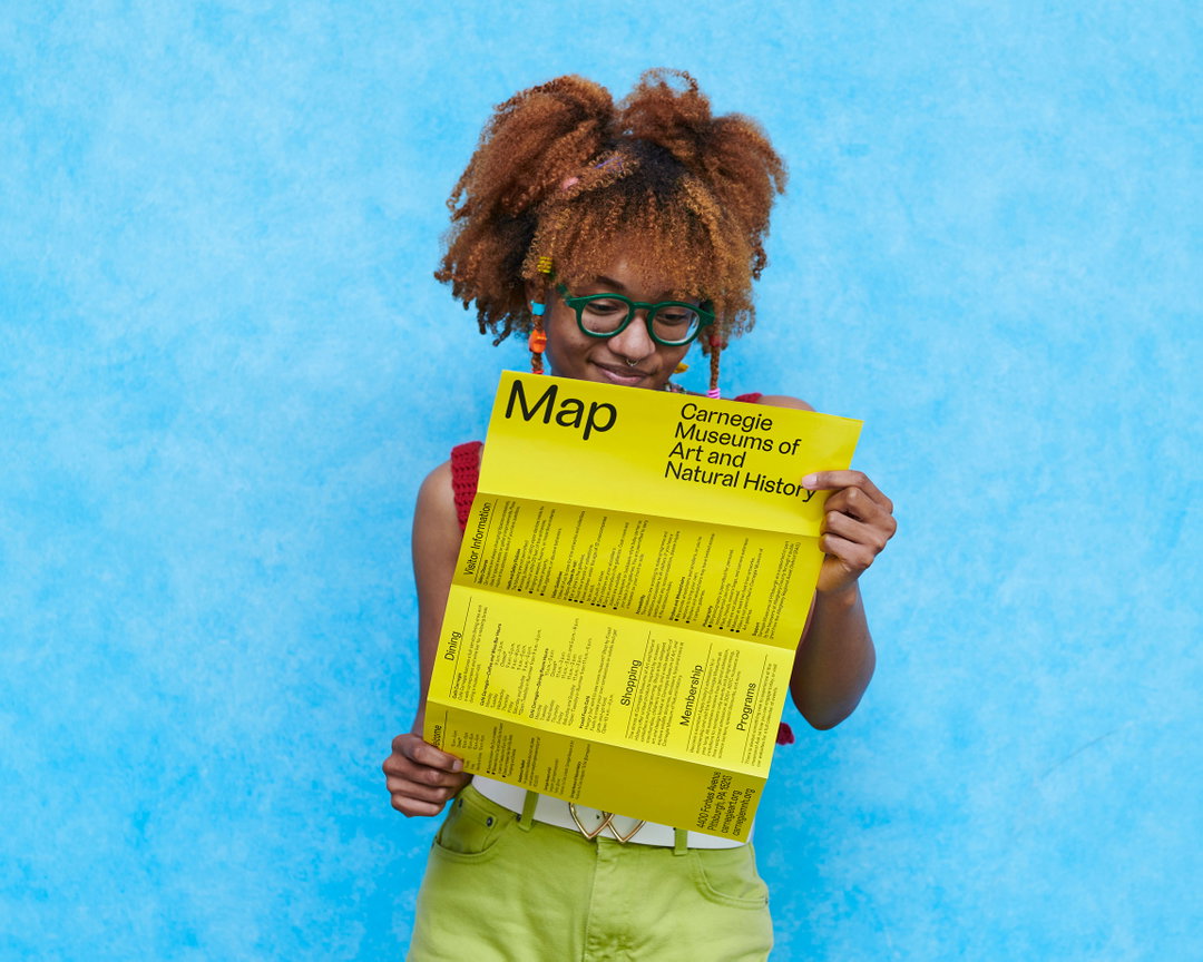
Laura Coombs / Meg Forsyth / Carnegie Museum of Art: Carnegie Museum of Art, typeface by Berton Hasebe, web design and development by Folder Studio, photography by Sean Eaton (Copyright © Carnegie Museum of Art, 2023)
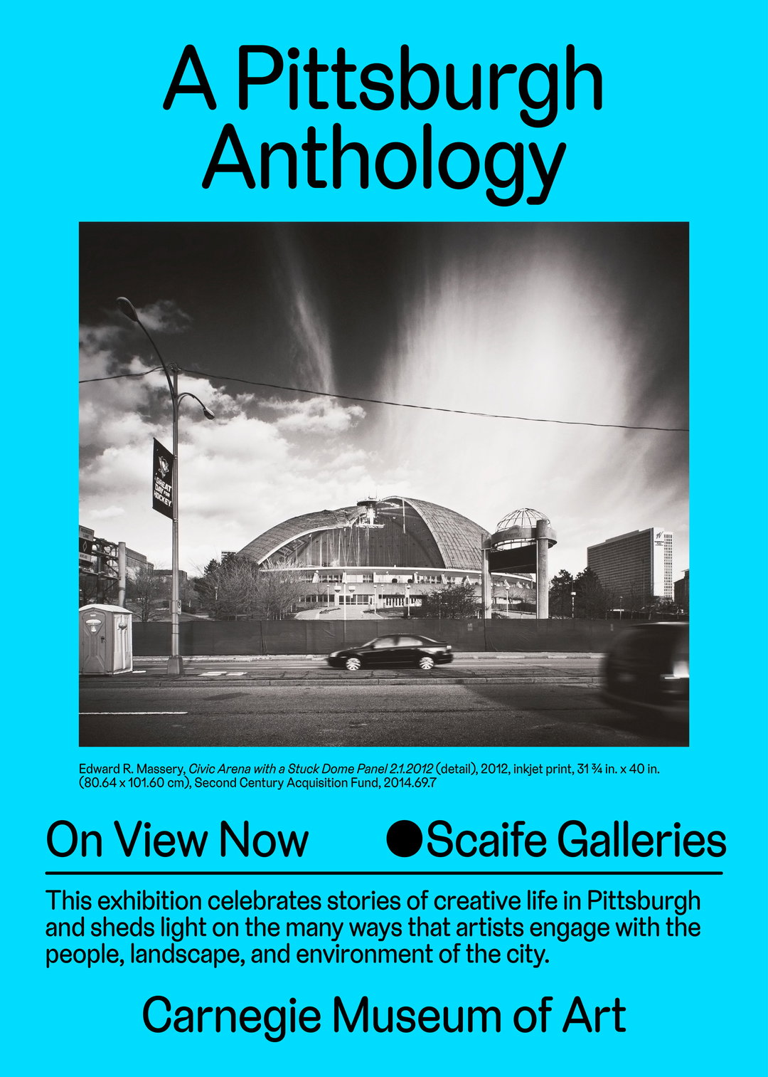
Laura Coombs / Meg Forsyth / Carnegie Museum of Art: Carnegie Museum of Art, typeface by Berton Hasebe, web design and development by Folder Studio (Copyright © Carnegie Museum of Art, 2023)
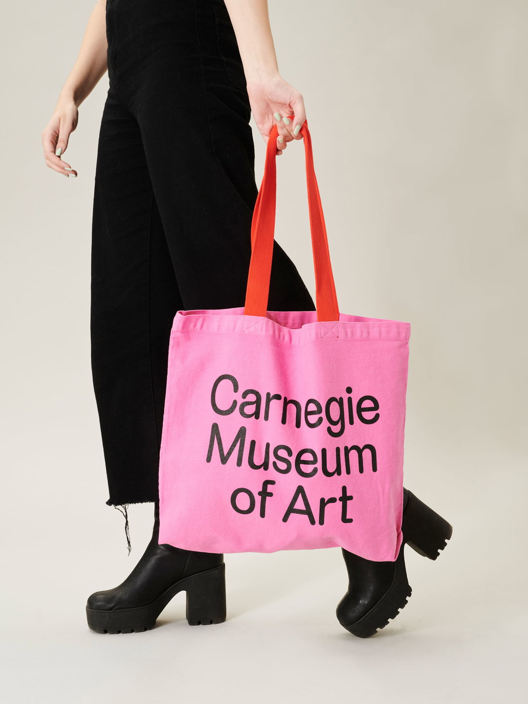
Laura Coombs / Meg Forsyth / Carnegie Museum of Art: Carnegie Museum of Art, typeface by Berton Hasebe, web design and development by Folder Studio, photography by Sean Eaton (Copyright © Carnegie Museum of Art, 2023)
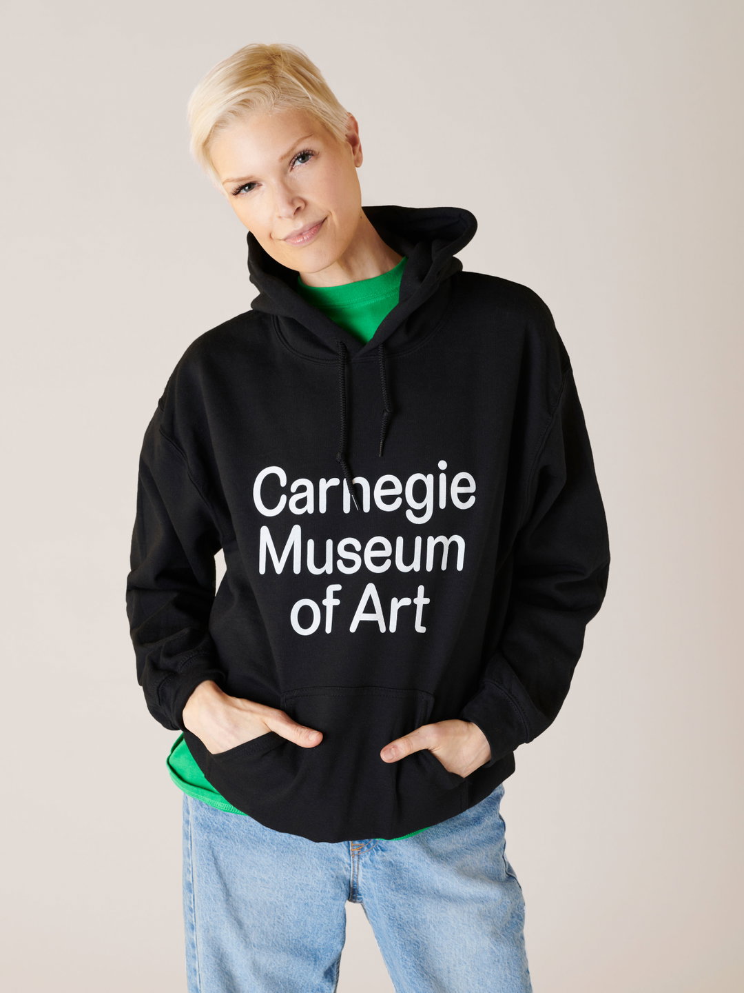
Laura Coombs / Meg Forsyth / Carnegie Museum of Art: Carnegie Museum of Art, typeface by Berton Hasebe, web design and development by Folder Studio, photography by Sean Eaton (Copyright © Carnegie Museum of Art, 2023)
Hero Header
Laura Coombs / Meg Forsyth / Carnegie Museum of Art: Carnegie Museum of Art, typeface by Berton Hasebe, web design and development by Folder Studio (Copyright © Carnegie Museum of Art, 2023)
Share Article
About the Author
—
Liz (she/they) is the senior editor at Insights, a research-driven department within It’s Nice That. They previously ran the news section of the website. Get in contact with them for potential Insights collaborations or to discuss Insights’ public-facing reports.