




Ljudje and Nejc Prah give software brand Celtra a totally bonkers but brilliant rebrand
With sugary neon tones, a highly unusual custom variable font and divergent illustration styles, this redesign is unlike anything we’ve seen before.
Share
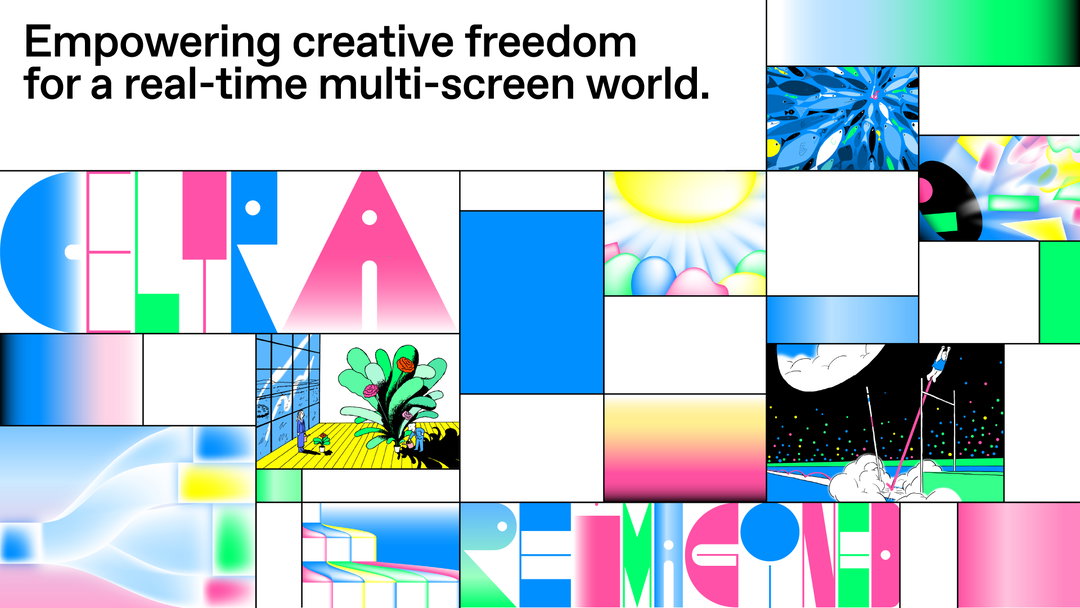
Software company Celtra says that it set out to create a new visual identity that was, above all, unexpected – and boy has it delivered. Working with fellow Slovenians, design studio Ljudje and graphic designer Nejc Prah, the company wanted to revamp its branding to “resonate with its open creative culture,” balancing human and high-tech. The result uses a highly unusual custom variable typeface, a palette of sugary neon colours, two different illustration styles and a range of attention-grabbing animations, coming together to make something brilliantly bonkers.
“Celtra’s brief was to surprise them with a visual language they hadn’t seen before,” Ljudje’s Emil Kozole tells It’s Nice That. Nejc Prah adds that since Celtra is a pioneer in creative automation, the identity was inspired by “the multi-screen world where you have seconds to attract someone’s attention”. The designers, therefore, put together a brazenly vivid and bold visual language that Prah says “steps away from the cliches most tech company identities are based on. Pretty much everything has been redesigned, I think the only element of the old brand that has survived are the two main colours – pink and blue.”
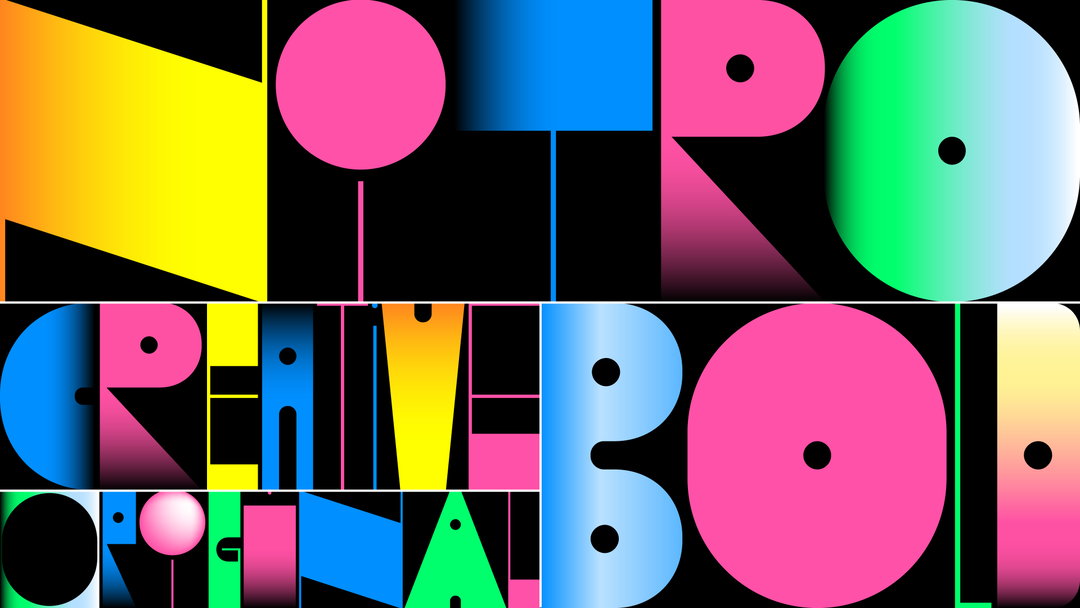
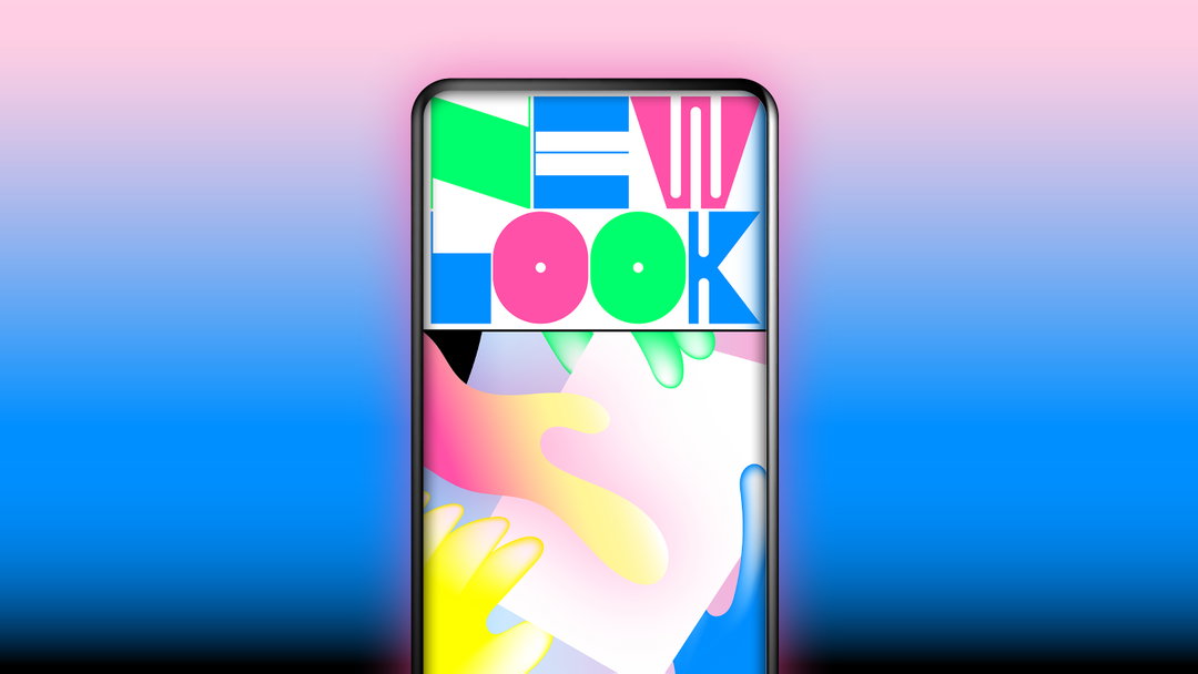
Every element of the identity is a reference to a part of Celtra, Kozole explains. The “funky” custom variable typeface Nitro adapts to formats, like Celtra’s products. Graphics are “abstract explanations of its features,” the grid is a representation of the multiscreen world, while the gradients and colours “are just very nice to look at,” he says. There is order in the chaos, however. “While the graphics and the display typeface are a bit wilder, the grid functions as an organisational device that gives the identity more structure and clarity. It also makes identity easier to work with,” he adds.
Ljudje and Nejc Prah: Celtra rebrand (Copyright © Celtra, 2020)
Nitro, the display typeface, is a variable typeface with three different axes. Letters can change their width, contrast, and counter shapes, so the word always fits into a grid. Celtra’s products, which automate creative production for various uses, screens, and markets, essentially work in the same way. “Also, it’s easy to get bored with a single display typeface so the variation helps make the font different every time you use it,” Prah explains.
“Celtra’s reaction to our initial presentations was even better than we expected,” he continues. “Our initial proposal used Nitro typeface only occasionally, and except for a few graphics, most of them were a bit more reserved. But they loved those the most and they were really excited about Nitro, so when they asked us to enhance those elements, we went all in.”
The graphics that Kozole mentioned use two different styles of illustration. One set was developed by Ljudje and Prah, while the editorial blog illustrations were made by Slovenian illustrators Matija Medved and David Krančan. Ljudje created a pack of 40 initial graphics, and plans to commission more illustrators for future editorial content.
Usually, by this point in a rebrand story we’ll have unpacked the design of the logo, but this project – as you’ve gathered already – is not usual. Kozole says a central part of this rebrand was to move away from the idea of having the logo be the core element of the identity. “The logo is intentionally less imposing so that it works as a constant to more vibrant and playful elements,” he says, adding that the identity really comes to life in animations by Jure Lavrin. “That’s where the graphics and the Nitro font turn the identity into something that almost feels like a video game.”
GalleryLjudje and Nejc Prah: Celtra rebrand (Copyright © Celtra, 2020)
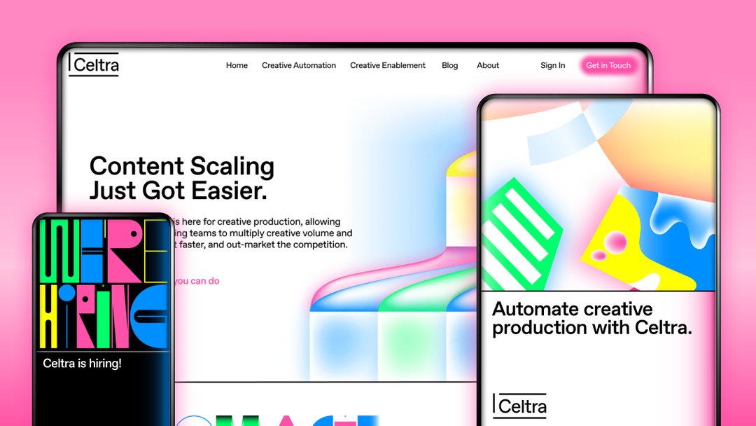
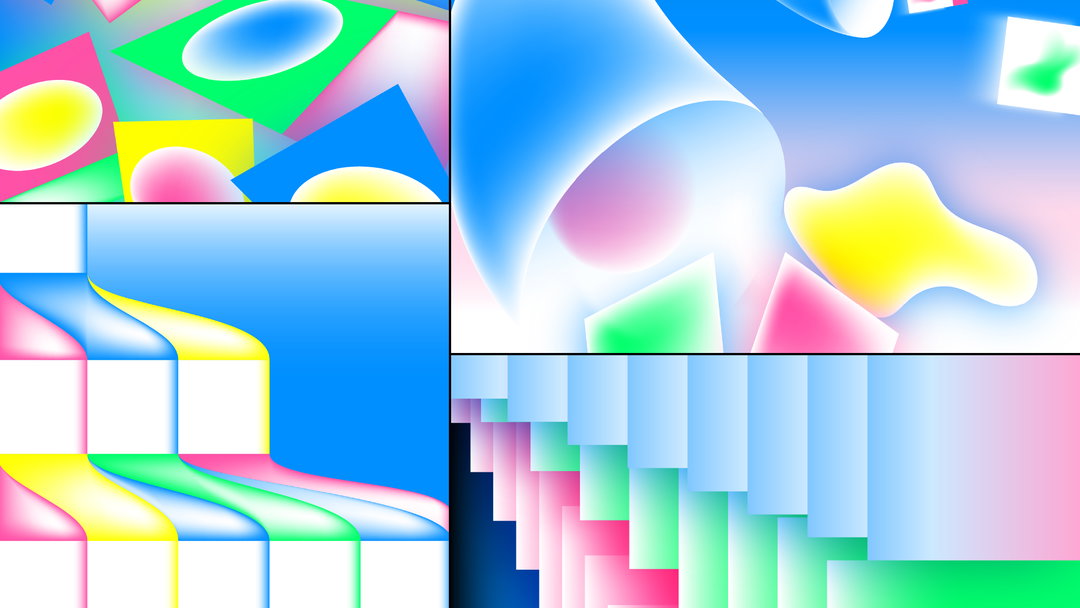
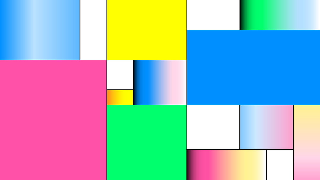
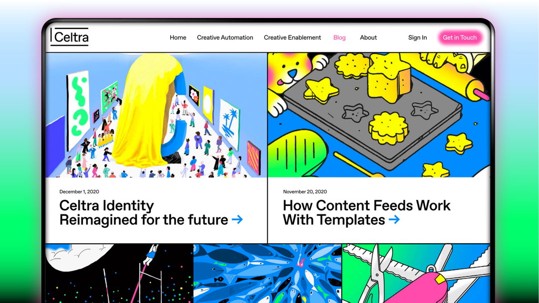
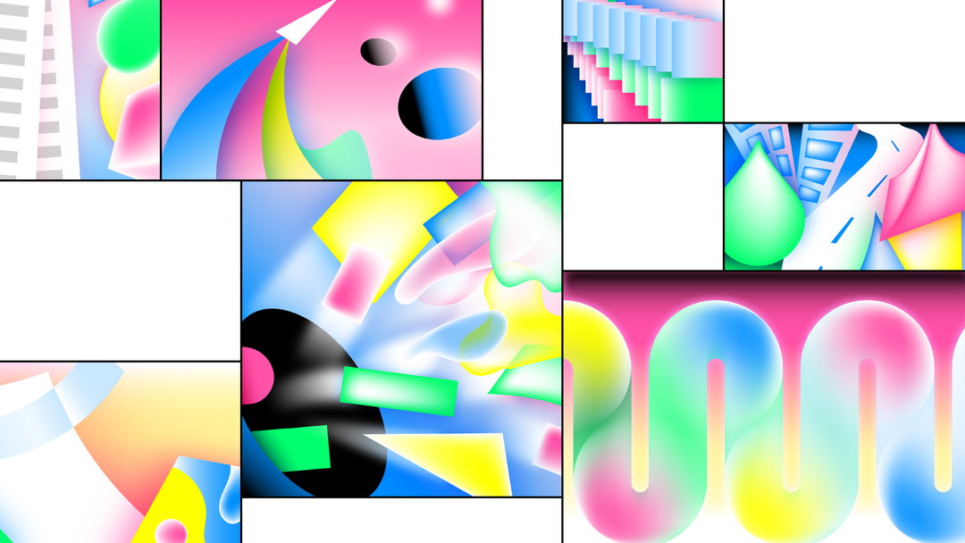
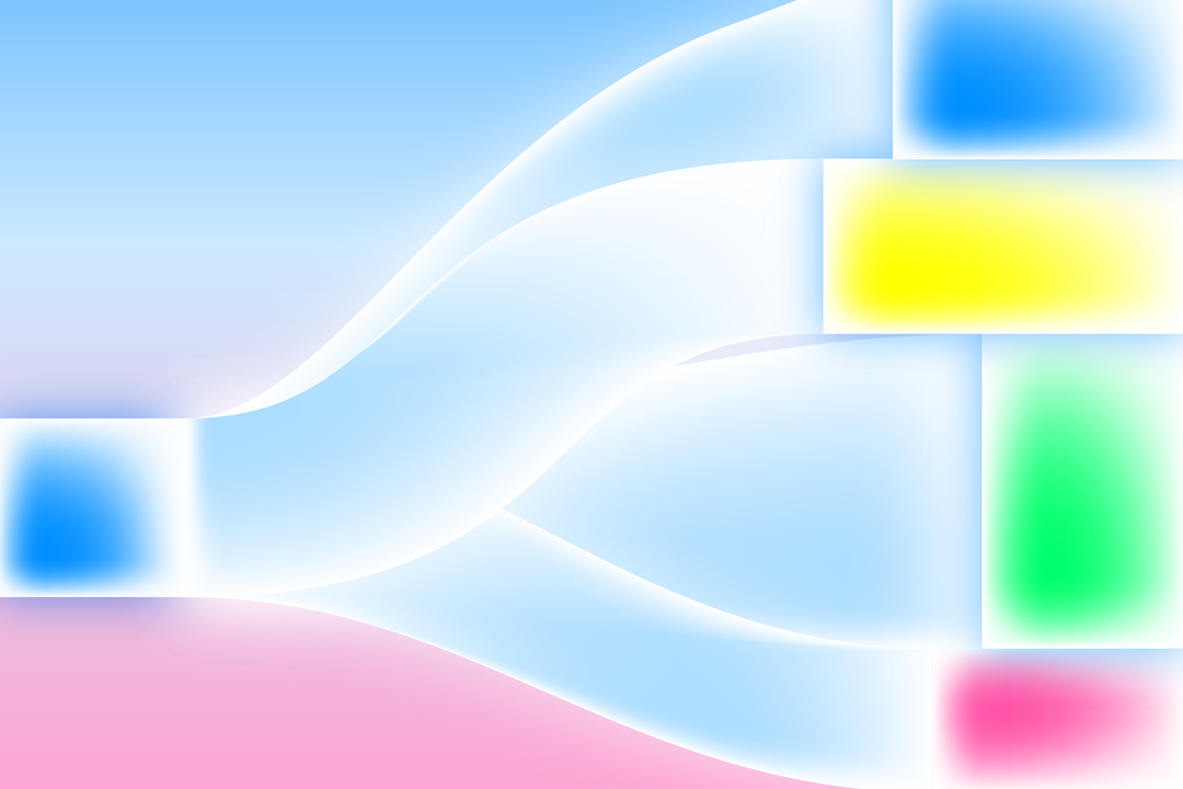
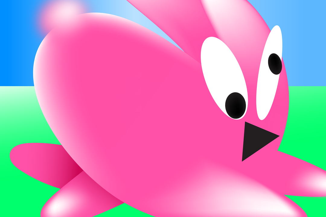

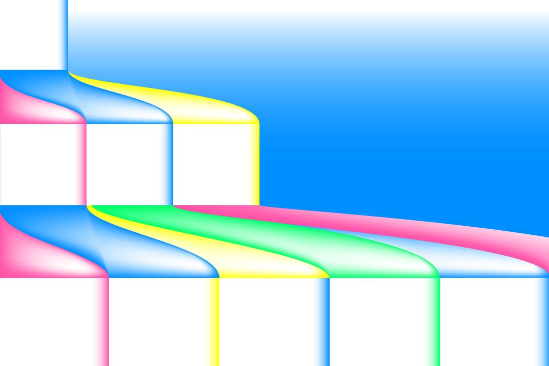
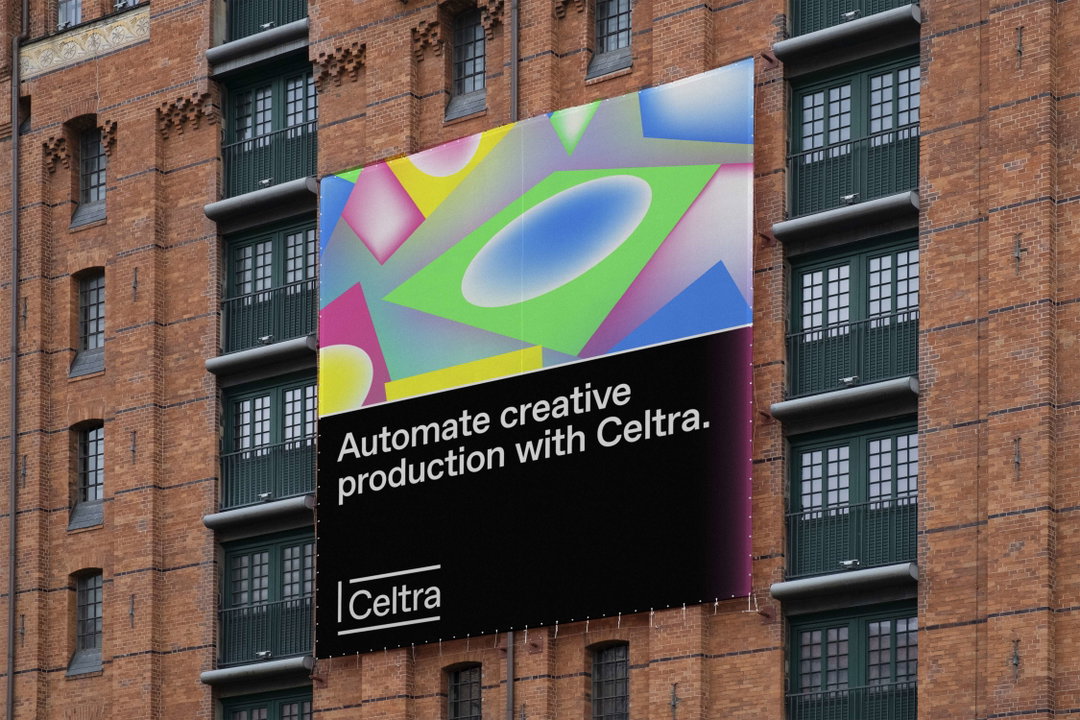
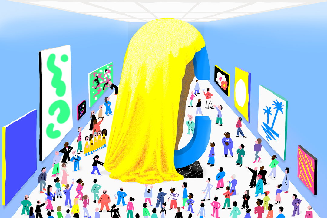
Illustration: Matija Medved
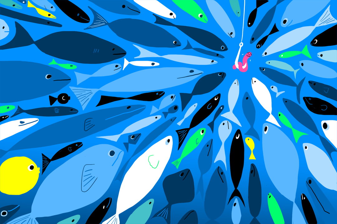
Illustration: Matija Medved
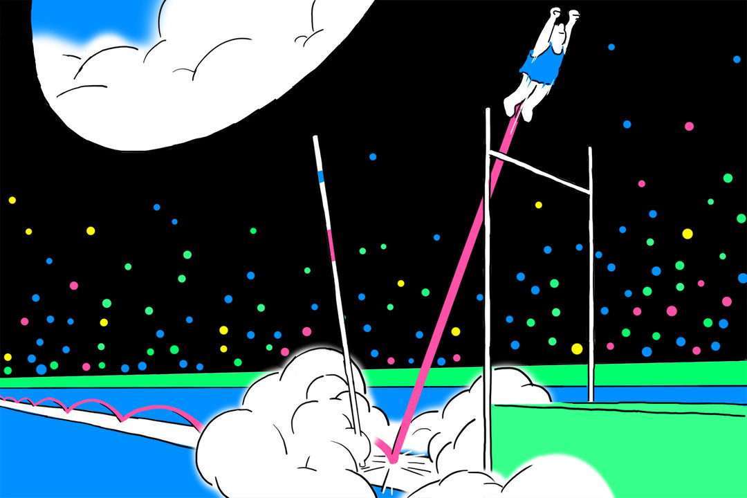
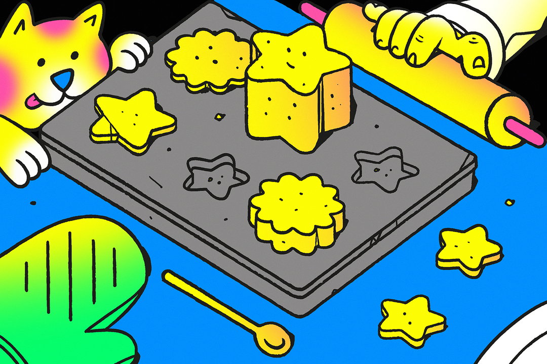
Illustration: David Krancan
Become an Extra Nice Supporter and unlock a new way to explore It’s Nice That, get your hands on exclusive perks, and help bring meaningful projects to life.
Hero Header
Ljudje and Nejc Prah: Celtra rebrand (Copyright © Celtra, 2020)
Share Article
Further Info
About the Author
—
Jenny oversees editorial output across It’s Nice That. Get in touch with writing pitches for features or opinion pieces, big creative story tips, or questions about all things editorial. jb@itsnicethat.com
To submit your work to be featured on the site, please see our Submissions Guide.


