Pentagram’s Marina Willer makes an identity from “building blocks” for cultural tech company Manuvo
The Mexican tech company needed an accessible, dynamic new look to help share their cultural resources with marginalised communities around the world.
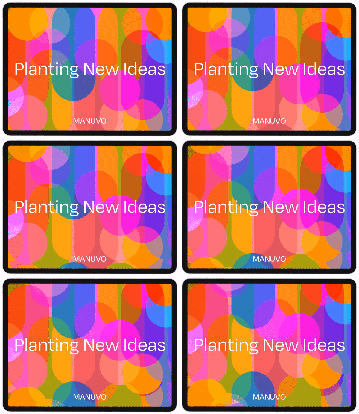
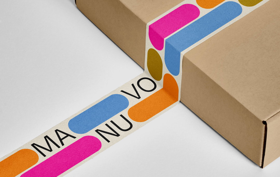
In 2021, Manuvo began its new initiative to position culture as a “catalyst” for social change. Pentagram partner Marina Willer was approached to lead a total rebrand of the company’s image on this basis, re-imagining their logotype, logo animation, typography, colour palette, graphic language and composition. For this dynamic new look, Marina and her team built the entire visual identity out of moving parts. These “building blocks” represent the programmes and apps offered by Manuvo – the necessary tools to “elevate people, using culture and education”, the designer tells us.
“The blocks are used in the logo to show the dynamism needed to reach Manuvo’s goal of being cultural changemakers,” Marina continues. Since 2010, Manuvo has been a leading light in preserving Latin American culture and bringing it into public education. To reflect a new stage in its development with improved international partnerships, online resources and programmes, the company needed a “complete rebrand”, Marina says. “We did not retain any elements of the previous identity.”
A bright colour scheme was chosen to reflect the brand’s Mexican roots and the “joy and colourfulness of Latin America”. This palette helped to capture the company’s hopeful, “forward-thinking” aims, Marina explains. The team used the “down-to-earth” typeface Degular throughout the identity. Designed by James Edmondson and published through Oh No Type Co, the conventional lettering has a “modern twist”, helping to reflect Manuvo’s goal to inject traditional education with new cultural possibilities.
Marina and the team created an animation of these elements to be used across Manuvo’s website and social channels. The colourful building blocks slide in and out of view, adding playfulness and dynamism to the overall user experience. Coming up with this versatile visual was key in making the identity flexible enough to be used across Manuvo’s numerous educational courses and online resources. Keeping accessibility as its guiding principle, the rebrand captures Manuvo’s hopeful aim to create a “better and more culturally accepting world”.
Marina Willer: Manuvo rebrand (Copyright © Manuvo, 2022)
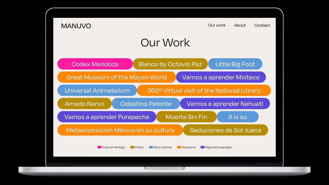
Marina Willer: Manuvo rebrand (Copyright © Manuvo, 2022)
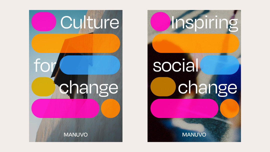
Marina Willer: Manuvo rebrand (Copyright © Manuvo, 2022)
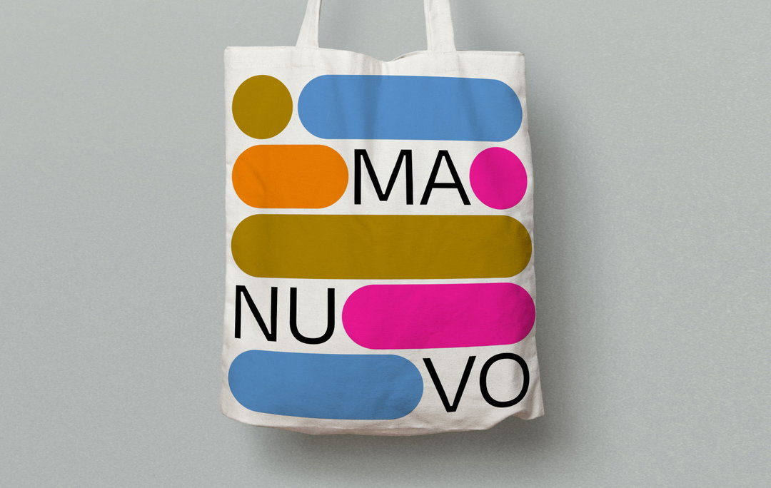
Marina Willer: Manuvo rebrand (Copyright © Manuvo, 2022)
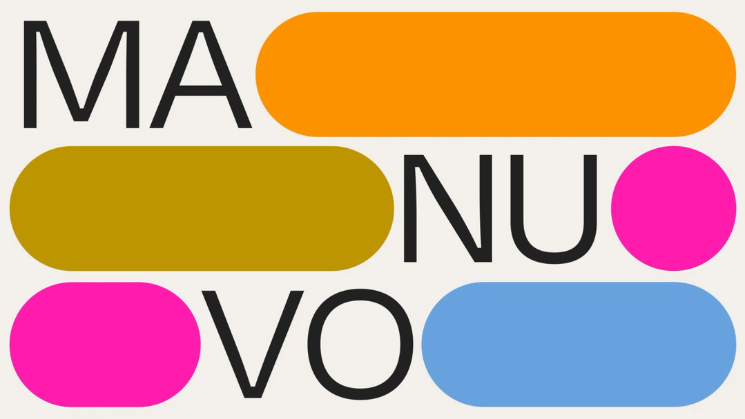
Marina Willer: Manuvo rebrand (Copyright © Manuvo, 2022)
Hero Header
Marina Willer: Manuvo rebrand (Copyright © Manuvo, 2022)
Share Article
Further Info
About the Author
—
Elfie joined It’s Nice That as an editorial assistant in November 2021 after finishing an art history degree at Sussex University. She is particularly interested in creative projects which shed light on histories that have been traditionally overlooked or misrepresented.