Mother Design’s quaffable identity for cannabis craft beer Ceria mixes ancient mythology with a smooth finish
Frothing with hoppy motifs and nods to Ancient Rome, the identity manages to straddle two spaces with style: the non-alcoholic and cannabis beer market.
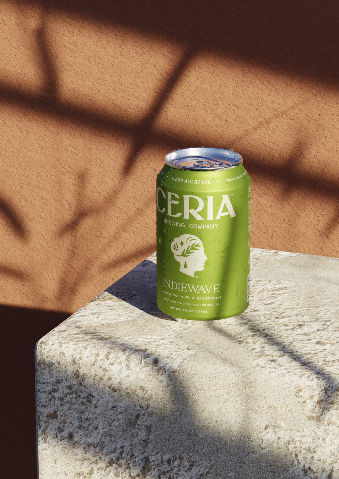
Mother Design’s latest work for Ceria is understated, but don’t let that fool you; it’s also tantalising – which is the only essential requirement when branding a drink. Ceria is a brewing company that produces two of the few truly alcohol-free (0.0% ABV) beers on the market, Grainwave and Indiewave. But it also sells both varieties as cannabis beers, infused with levels of THC and CBD. While the alcohol-free space is, as Mark Sloan, head of design at Mother Design puts it, stuffed “full of every graphic approach imaginable”, the cannabis side of the market is more sparse. Mother Design had to find an approach to fit both.
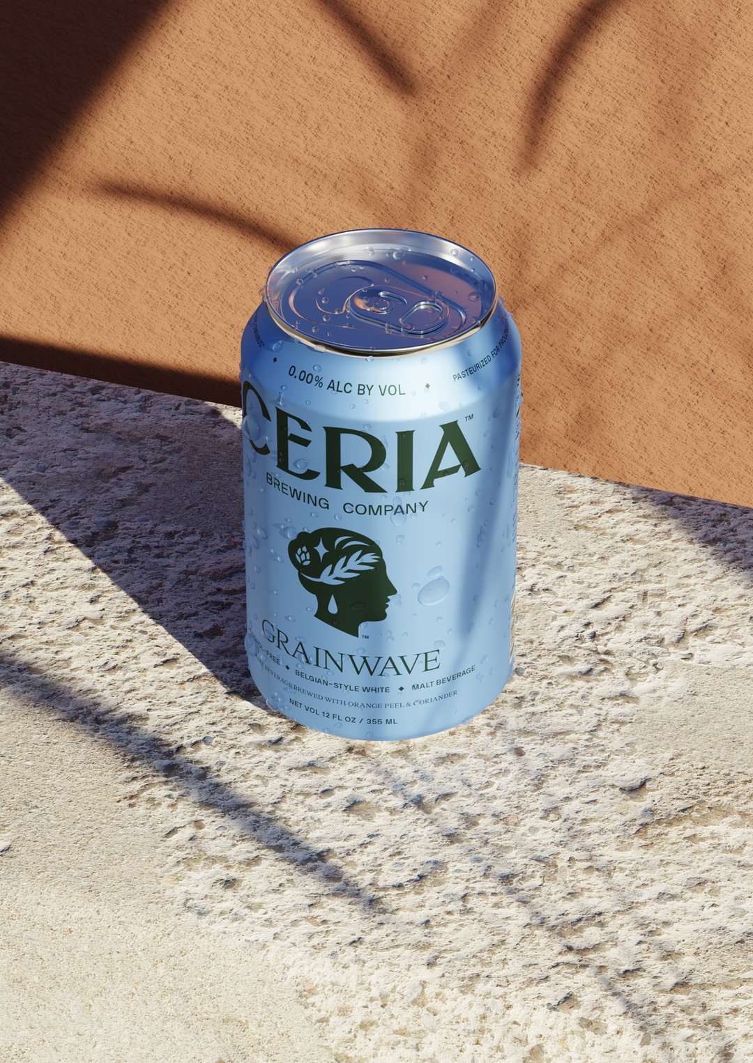
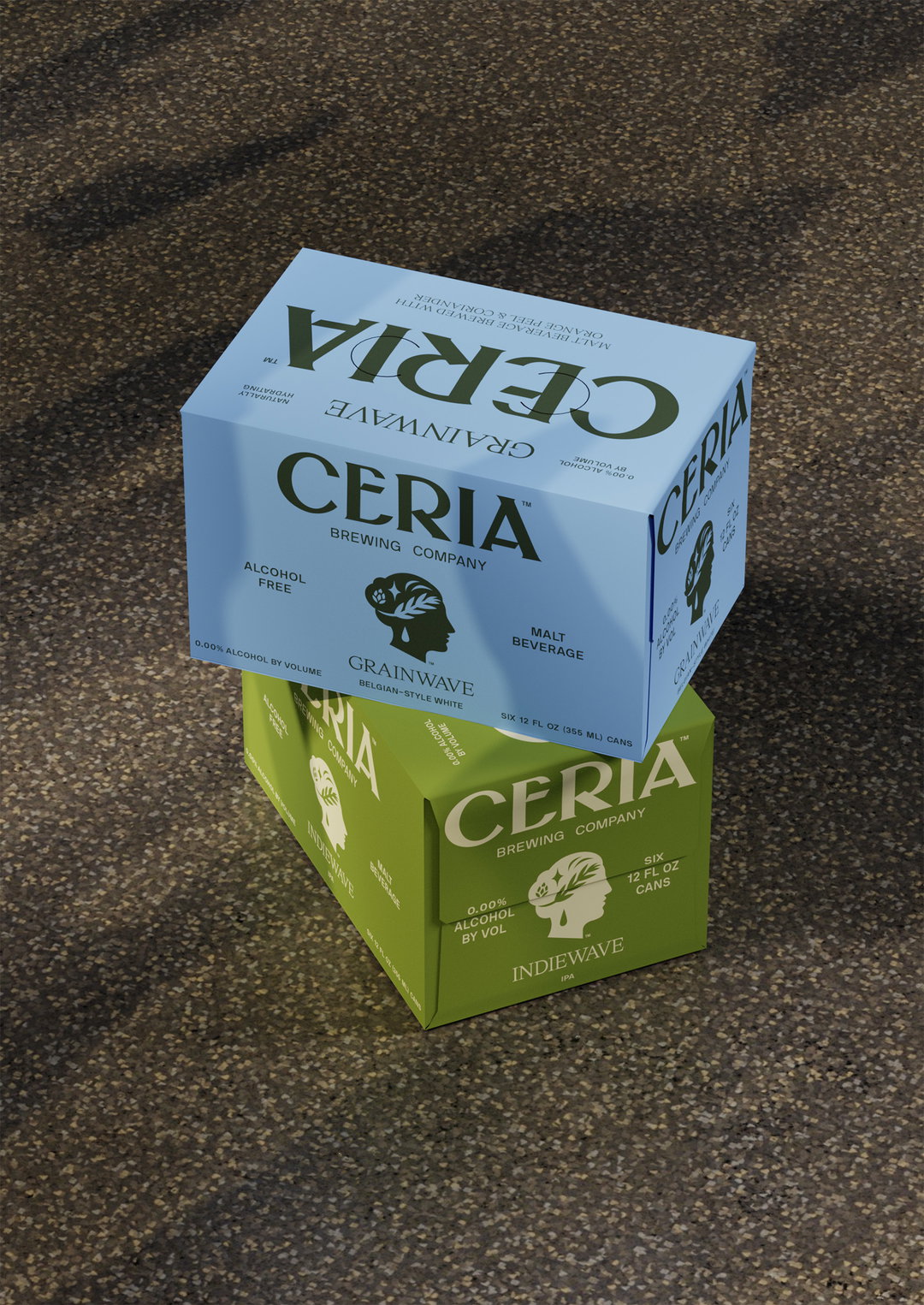
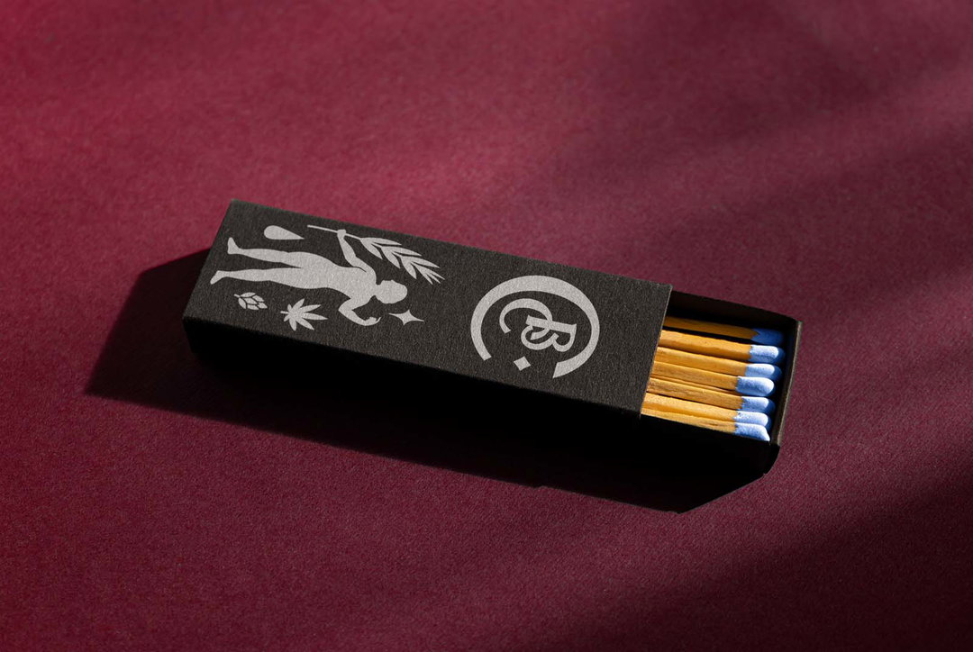
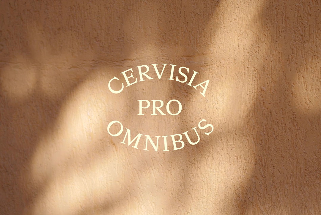
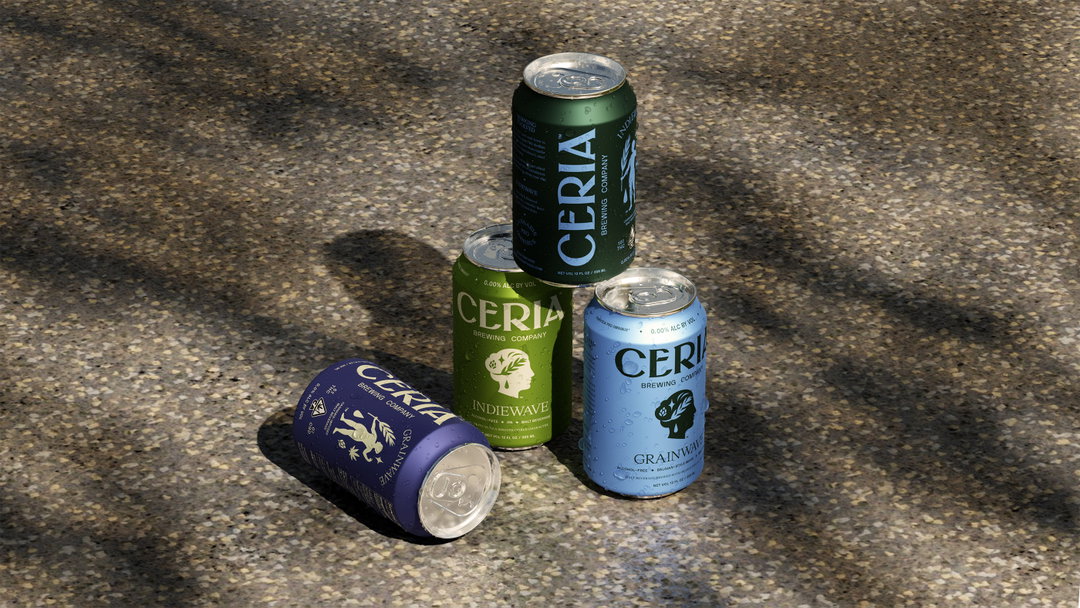
For context, Ceres, the Goddess of agriculture and grain crops, had already been a brand symbol for the brewer for several years. To connect the cannabis and alcohol-free worlds, Mother Design brought visual refinements to the existing Ancient Rome iconography – plus some new symbols. For the alcohol-free cans, the studio depicts the head of Ceres, but adds the star Polaris, a hop flower, and a droplet earring to her “crown of wheat”. Meanwhile, for cannabis products, a full-body representation of Ceres appears, with the addition of a cannabis leaf.
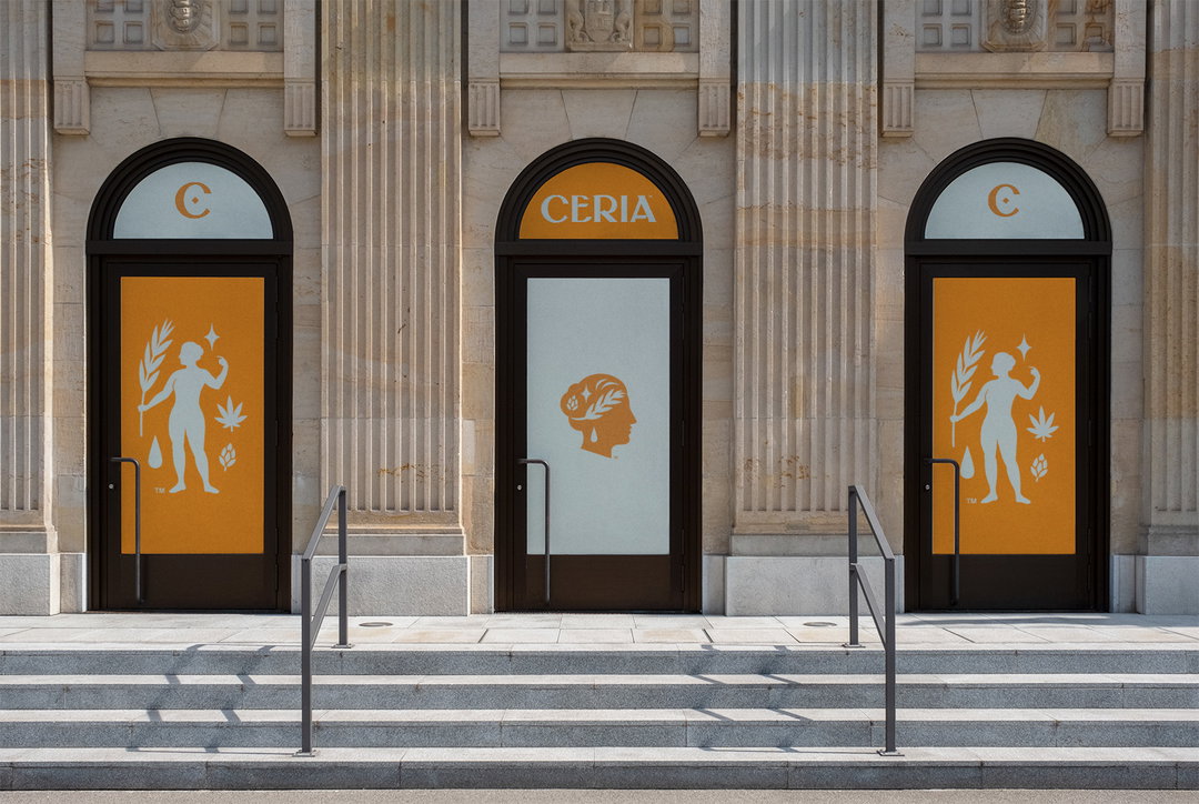
Mother Design: Ceria (Copyright © Ceria, 2022)
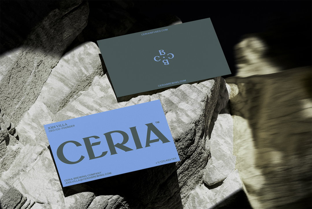
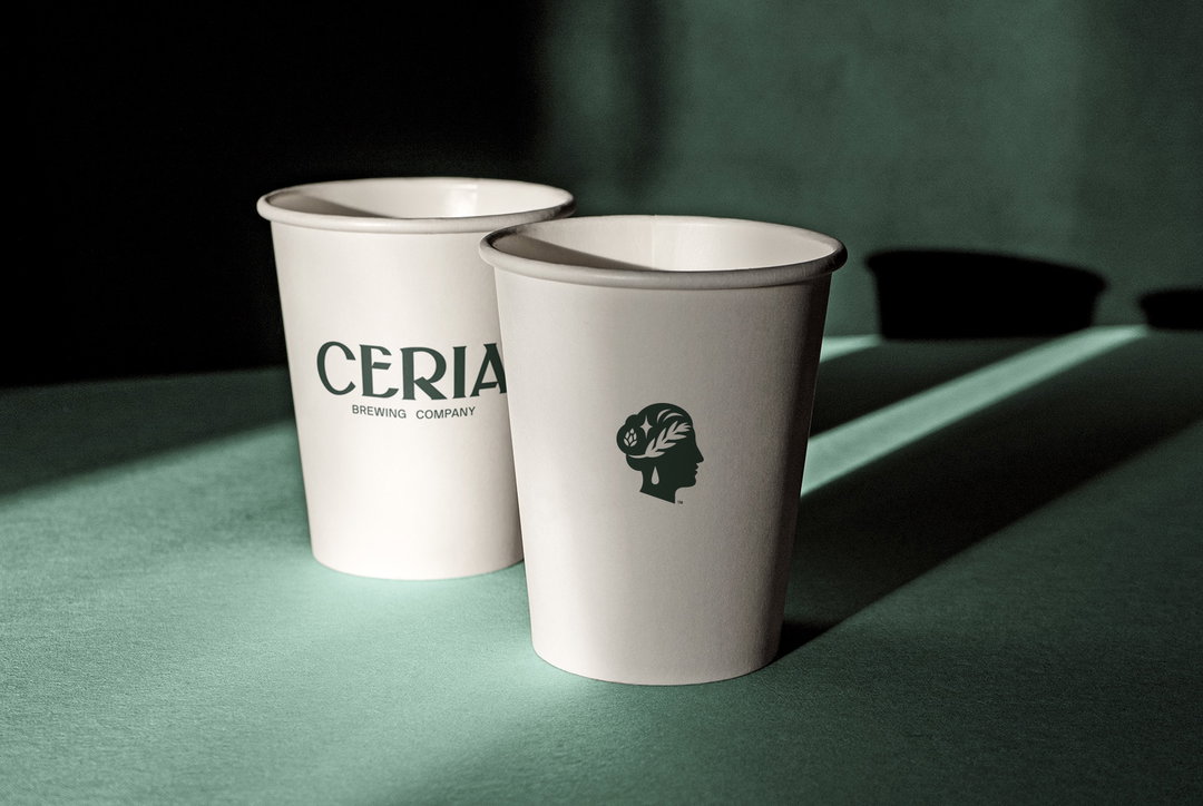
Even with this wealth of detail, the illustrations are used minimally; subtlety is a major focus for the studio on the project. In a brewing market which can be overwrought with cluttered details, Ceria’s visuals “connote quality [...] without having to shout,” says Mark. Logos and illustrations can also be inverted to keep colour options focused and largely monochromatic per product.
Motion design was also kept minimal. Mark explains: “Much of the motion in competitors’ worlds can be quite intense and frivolous, so our goal was to subtly infuse our elements with a sense of liquidity and quiet magic.”
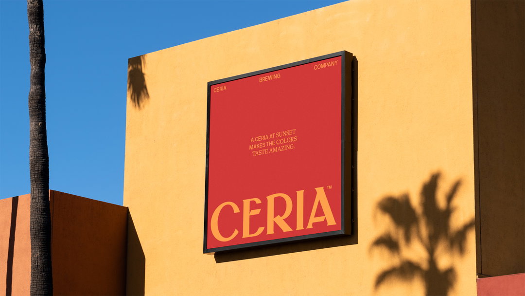
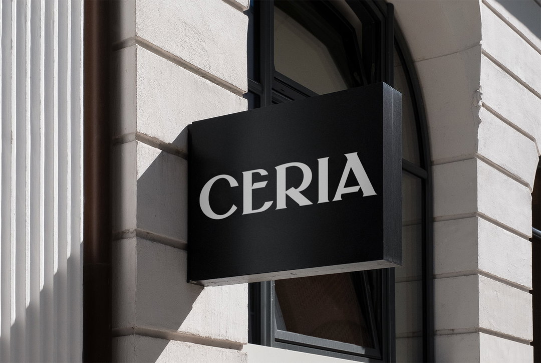
The wordmark and supporting typefaces – HW Cigars and NB International, respectively – all speak to another of Mother Design’s goals for Ceria; “striking a balance between the past and the future”, Mark highlights. While incorporating undoubtedly ancient motifs, the studio still hopes to suggest the modernity of Ceria’s brewing process to any thirsty customers considering a can this summer.
GalleryMother Design: Ceria (Copyright © Ceria, 2022)

Hero Header
Mother Design: Ceria (Copyright © Ceria, 2022)
Share Article
Further Info
About the Author
—
Liz (she/they) is the senior editor at Insights, a research-driven department within It’s Nice That. They previously ran the news section of the website. Get in contact with them for potential Insights collaborations or to discuss Insights’ public-facing reports.