Mouthwash and Jay Cover design a playable web identity for kids brand Woset
Looking to children’s literature as inspiration, illustrator Jay Cover and the LA-based studio emulated the brand’s playful side with some interactive website design.
Share
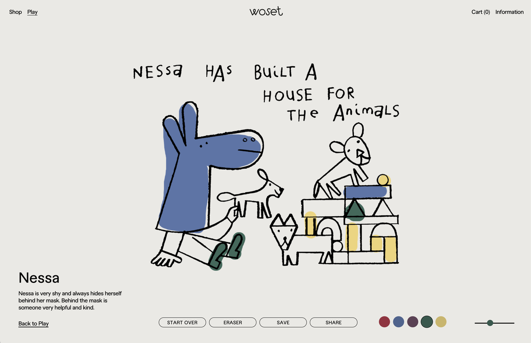
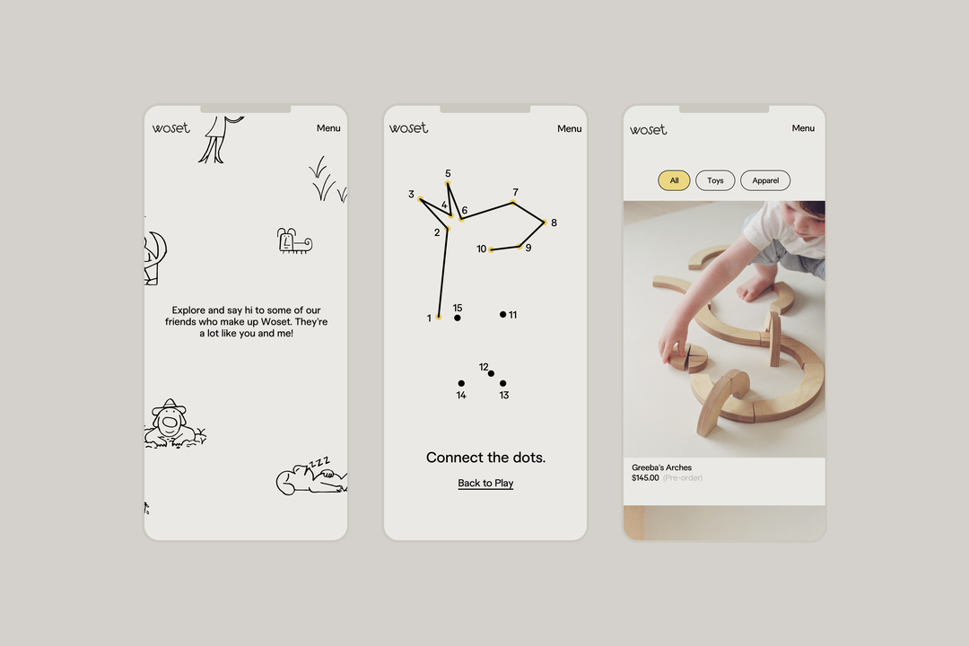
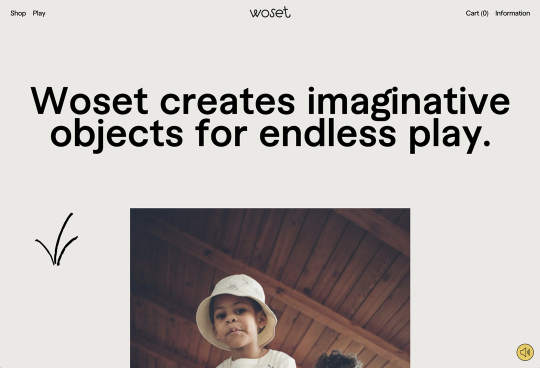
Woset is a brand that creates imaginative objects for endless play. And so, for its new identity, Mouthwash Studio has created a play-based website for the company which can be coloured in, featuring illustrations by Jay Cover, animation by Zac Waxman, web development by Rafa Cobiella and photography by Carissa Gallo.
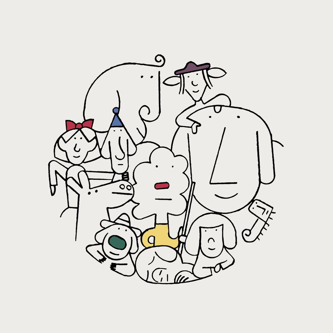
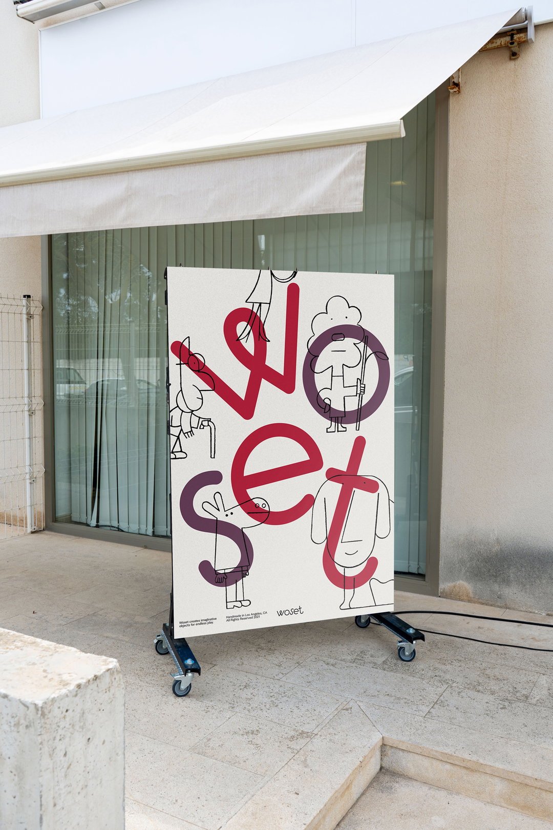
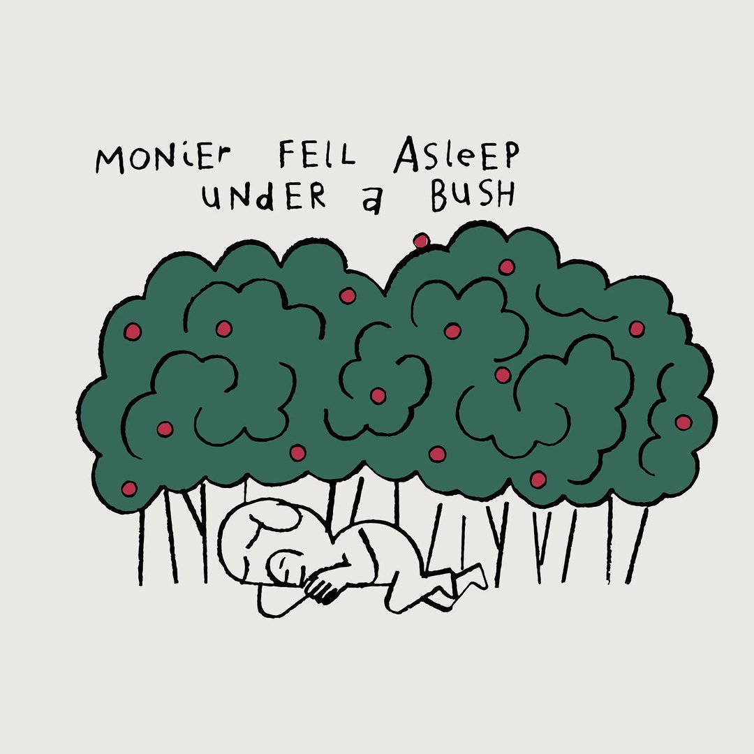
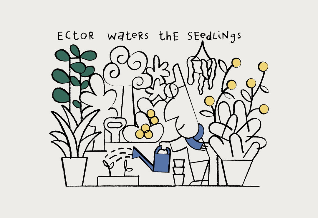
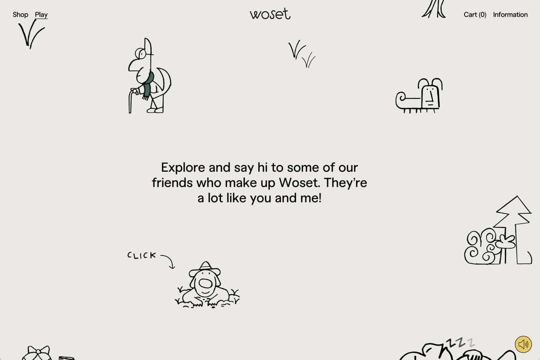
The tangible identity behind the web design was created by Jay Cover, who emulated a playful approach in the wider branding for the company by creating a narrative involving numerous recurring characters. With a cheery hat wearing dog, a baffled looking insect and a smiling donkey all realised in simple and charming line design, Cover has certainly created a land of endearing personalities. Present throughout the vast majority of the branding, Mouthwash tells us that “from socials to product web pages, and everywhere in between, the dwellers of Woset have their fingerprints all over our work.”
Throughout the identity its easy to see how Mouthwash and Cover gained inspiration from popular children's literature. Particularly influenced by the work of Maurience Sendak – who illustrated the renowned Where the Wild Things Are – Mouthwash hopes the Woset website “feels like a few pages out of a children’s book.” In making play such a central feature of the webpage, especially in its whimsical characters and subtly playful animations, the studio wants the site to leave “a lasting impression” so that both children and adults will leave the website with “a fondness of who the Woset-dwellers are and what makes them unique”.
Mouthwash: Woset (Copyright © Mouthwash, 2021)
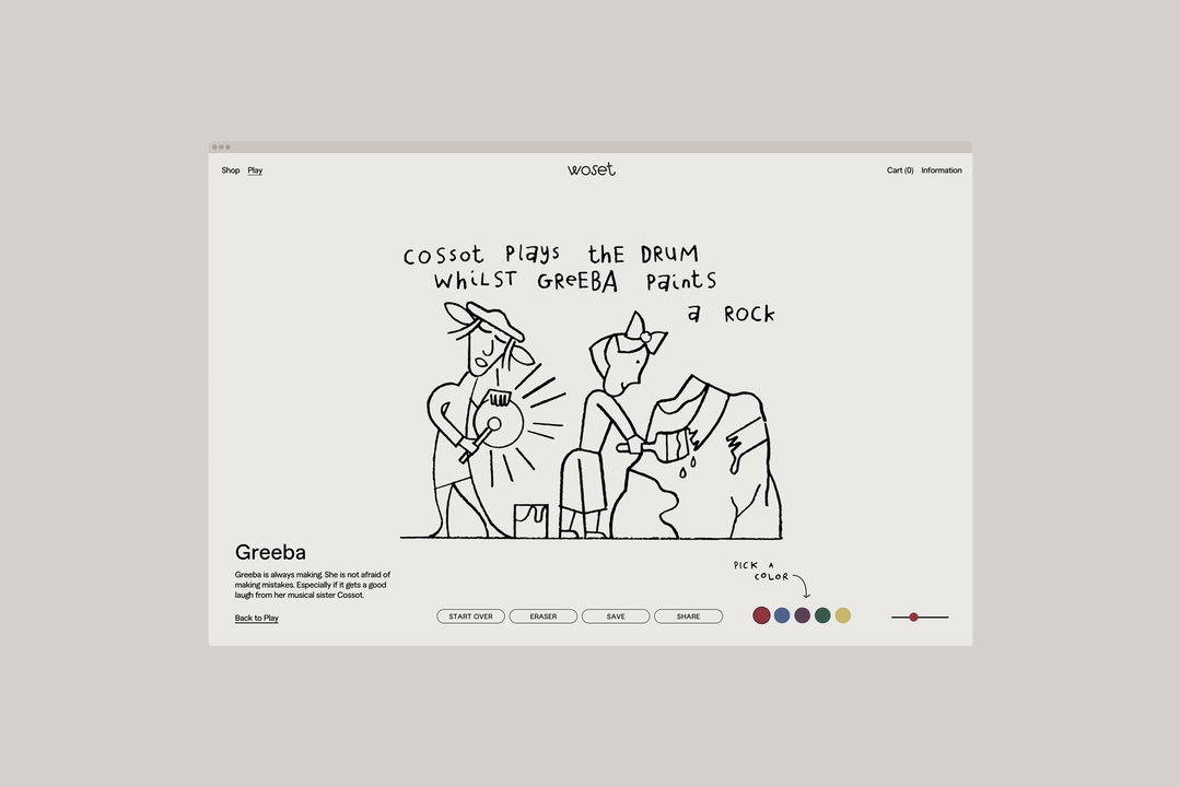
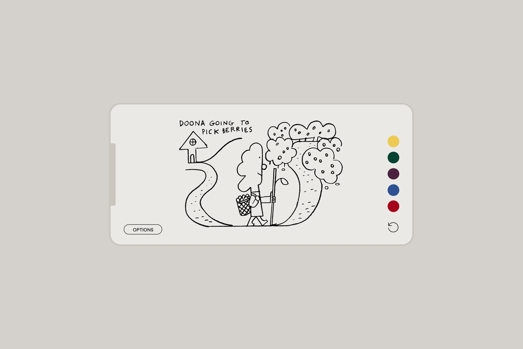
Perhaps the best example of the studio’s focus on play is the website's “play” page, which allows users to choose a character and colour it in. The studio has enjoyed seeing the colourful drawings the children have produced, and seeing how their minds work within the framework it has designed. “The beauty of the play page is that it doesn’t serve some ulterior motive other than being a playground for children on the internet”, Mouthwash conclude, “we’re excited to see how that continues to unfold as the Woset world grows and reaches other imaginative minds.”
The branding as a whole relied heavily on a team effort – “without the collaboration”, Mouthwash explain, “the Woset-world would surely feel flat and two dimensional. And, as a team, it decided to focus heavily on amplifying the “already-playful” elements of the brand, such as the whimsical product naming systems. Even its colour palette has paid close attention to the brand's ethos, with the “nature-oriented” palette paying homage to the company’s use of natural materials.
GalleryMouthwash: Woset (Copyright © Woset, 2021)
Hero Header
Mouthwash: Woset (Copyright © Woset, 2021)
Share Article
About the Author
—
Olivia (she/her) is associate editor of the website, overseeing the day-to-day editorial projects as well as Nicer Tuesdays events. She joined the It’s Nice That team in 2021. [email protected]
To submit your work to be featured on the site, see our Submissions Guide.