




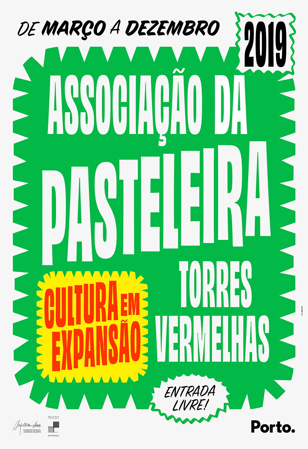
Typefaces which are all about having fun and good spacing: Ohno respects history without reinventing the wheel
Personality and spacing reign supreme in these wonderful typefaces by James Edmondson.
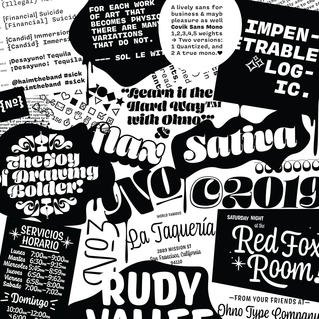
Born in 2015, Ohno was founded out of a deep appreciation for typefaces with personality. Created by James Edmondson, whose works have been featured in the likes of Anxy, Mailchimp and New York Magazine, he always had one goal in mind – to create unique typefaces highlighting under-appreciated genres, respecting history without reinventing the wheel. To that effect, “good spacing reigns supreme” is the eternal mantra at play.
Based in Oakland, James resides in sunny California with his wife and two-year-old who is “utterly bored by type design, but super chill otherwise”. When he first started out, James enrolled at the California College of Arts (CCA), where a bunch of teachers helped him realise what to do career-wise. James explains, “I vividly remember Jon Sueda pulling me aside and saying: ‘You look like you’re into this. Maybe just do it for like five years and see where it goes?’” And that’s exactly what he did.
When he looked around him CCA, he saw his peers taking their own photos, making their own illustrations, and so on and so forth. By logical extension, it was only natural for James to start designing his own typefaces. In particular, he was drawn to the idea of systems, and would endlessly copy and paste glyphs in order to create new ones. He marvelled at how easy it was to enter a flow state of mind when he was doing this kind of work, and coupled with a desire to make his art his business, James made his passion his career.
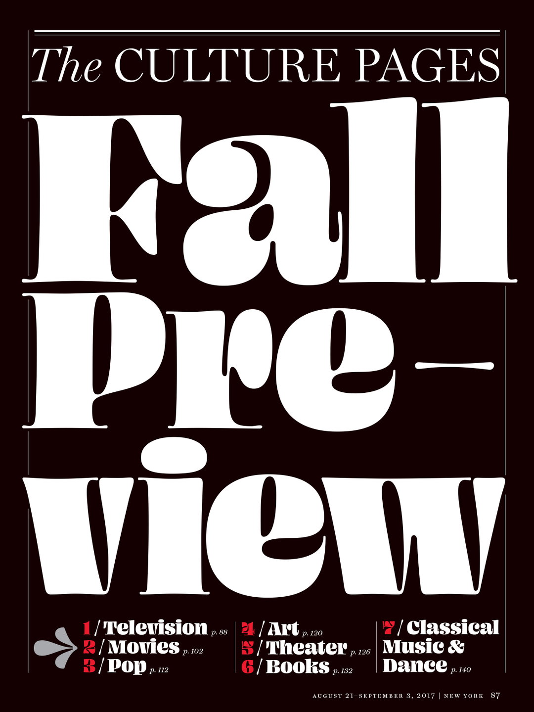
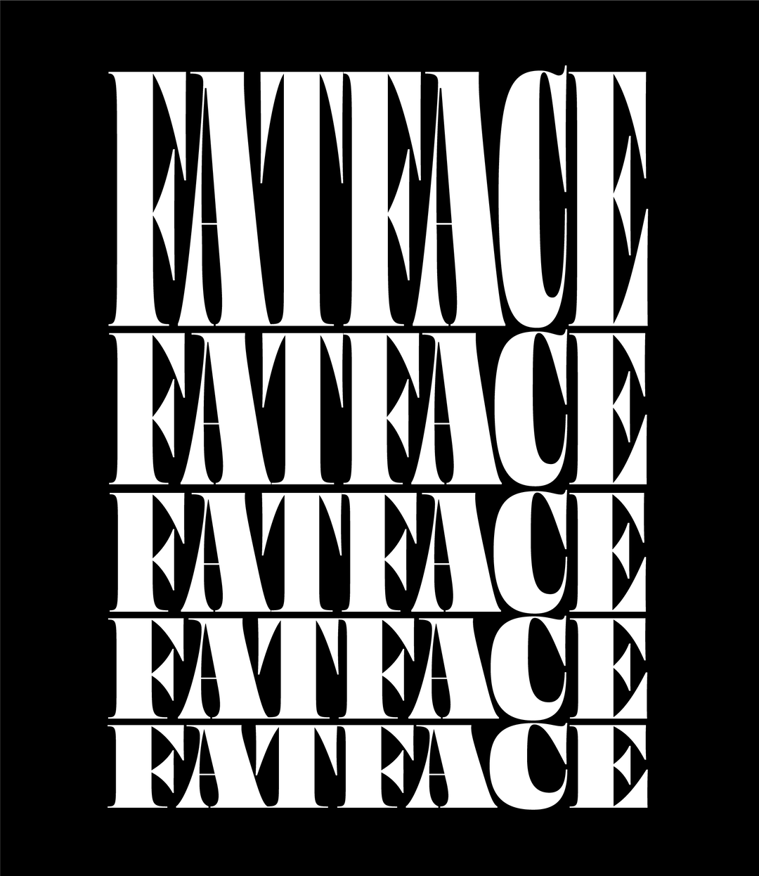
Ohno: NY Mag, Design in house - Blazeface
Over time, he crafted an original practice that remains unique to him. Informed by his time at TypeMedia in The Hague in particular, James recalls how he would sit in a room with seven other “incredibly hard working, brilliant type designers”, and was forced to figure out what he could do, that they couldn’t. There, he developed a love for Dutch type, a style he credits with “some of the most shining examples of warmth and emotion.” Steeped in Dutch culture while studying under some of his favourite designers in the world inevitably shaped him into the typographer he is today. And though he doesn’t think he has a signature visual language, he sticks to a fairly consistent list of priorities: “having fun, then good spacing.”
It’s an attitude emboldened throughout all of Ohno’s designs. Take Nonplus for instance, a particularly fun typeface that started out as a poster collaboration with James’ former teacher Bob Aufuldish. It started out by James sketching some counter-less shapes that pushed legibility, which he then made monospace, making the weight consistent, which was then digitised. Then, for some reason, he made the ‘O’ into a lovely Girardian sunburst, made an alternative version in script which eventually changed into a Black weight, which was then released as a project on Future Fonts.
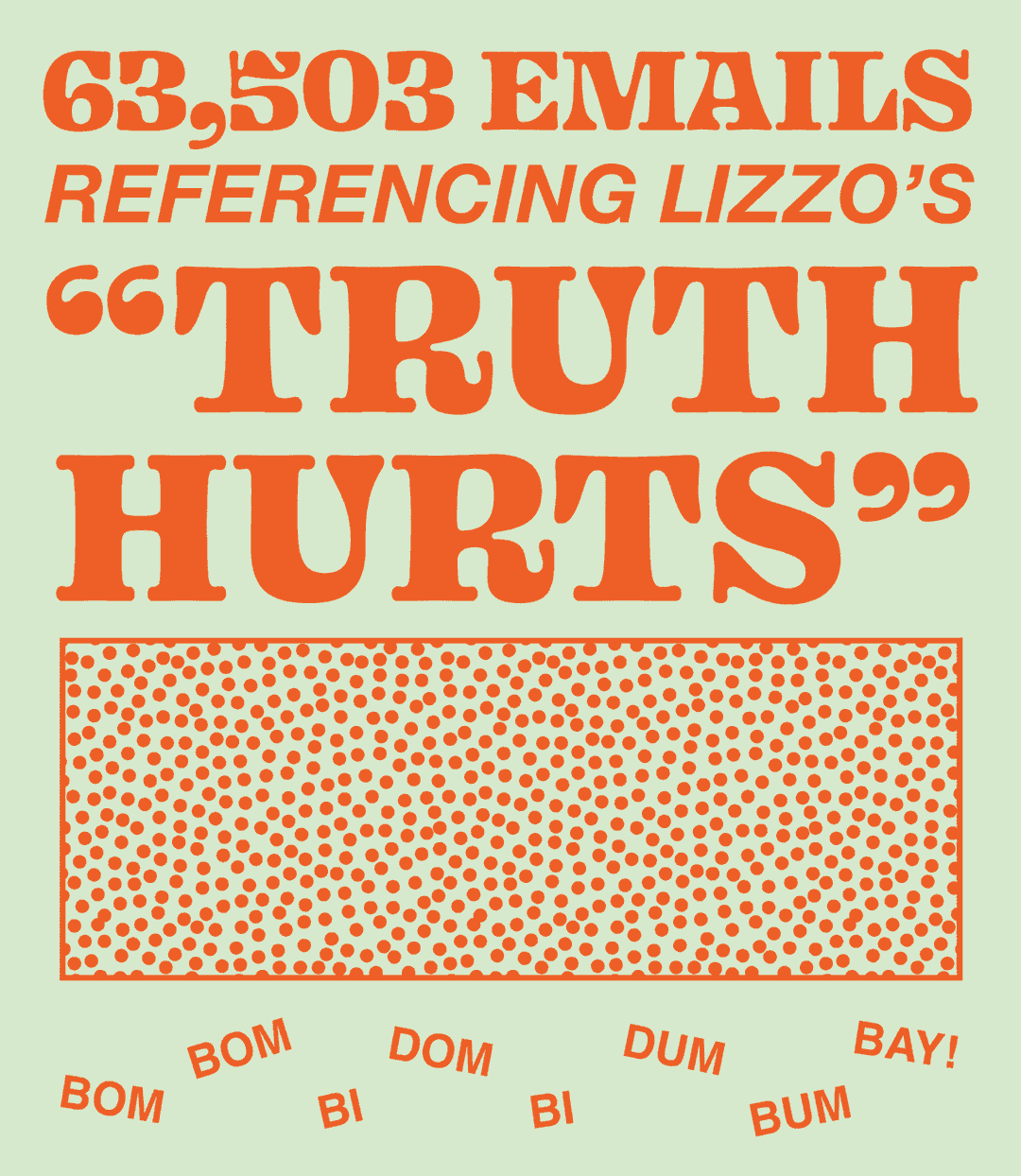
Ohno: Mailchimp Annual Report – Design in house, many
Elsewhere, James is pretty excited about his recent project, Swear. “I wanted a serif typeface that played with the flat brush,” he tells It’s Nice That. “I see the flat brush as the tool with the highest potential for expression, because it responds to pressure and you can control it quite a bit.” He’s seen quite a few typefaces perfectly executing “the almighty broad nib already,” but James is more interested in discovering the undiscovered stuff behind the potential of the flat brush.
First, he started out making some “boring sketches and lousy calligraphy” with the broad nib. Then, he started experimenting with the flat brush, crystallising some of his favourite ideas for an italic, then he digitised it in light and heavy weights. Those italics went on to inform the roman characters, which were a lot more standard, and now, he’s starting to play with a more hard-working italics, so it can function as a typeface one day. He hasn’t got that far yet though! With that to look forward to in the future, James also hopes to better connect with the people that use his typefaces. He finally goes on to say on that matter: “no one really cares about the mad scientist who’s always dreaming up wacky display fonts. I think there should be a place for that stuff, but it ought to be balanced out with something that works well, or makes designers’ jobs better in some way.” And most of all, James concludes, “I hope I can make enough cash to send my little girl to art school <3.”
GalleryOhno
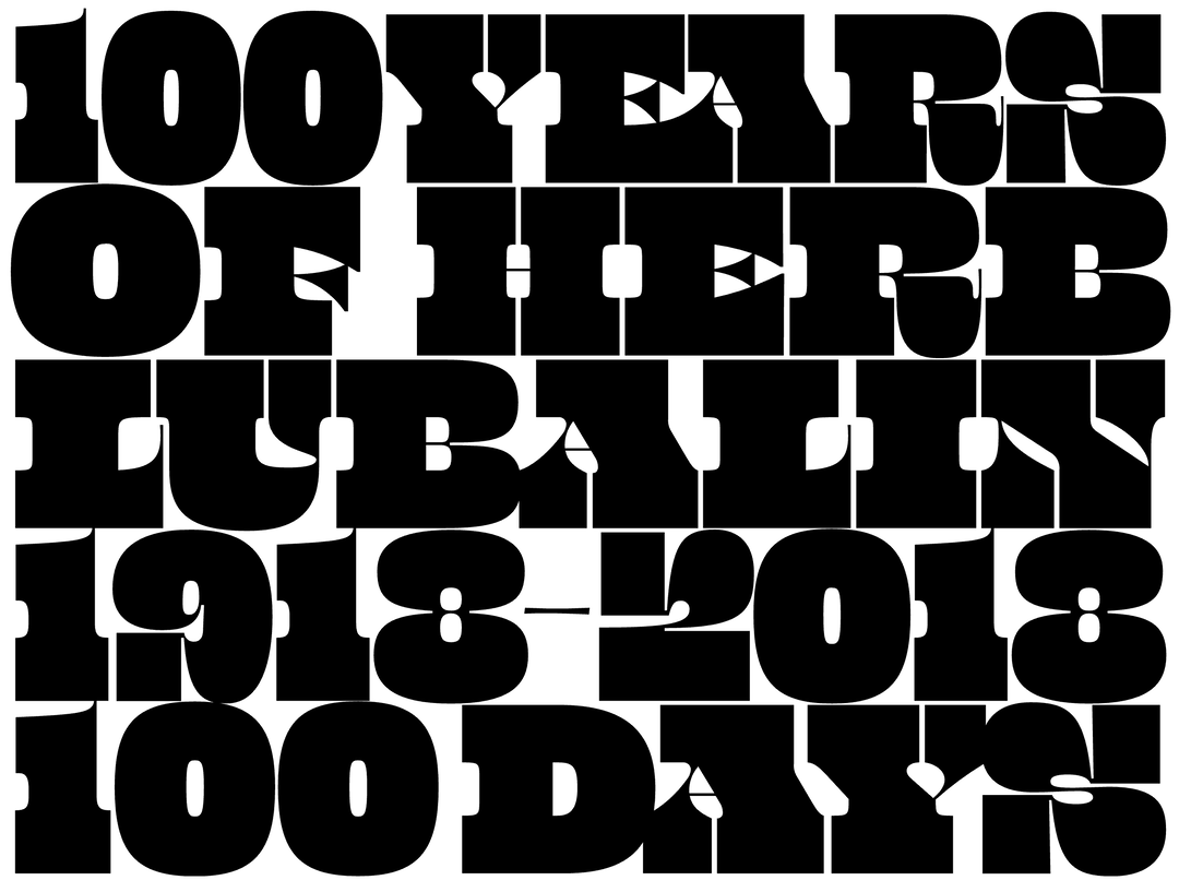
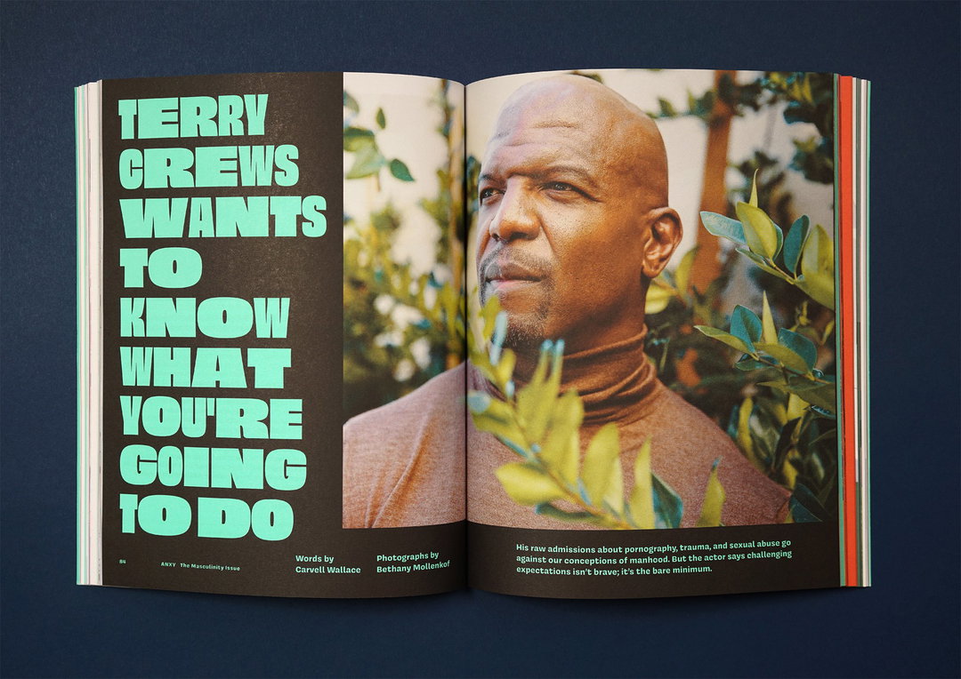
Anxy Mag: Design by Anagraph, Obviously, Covik Sans, Beastly
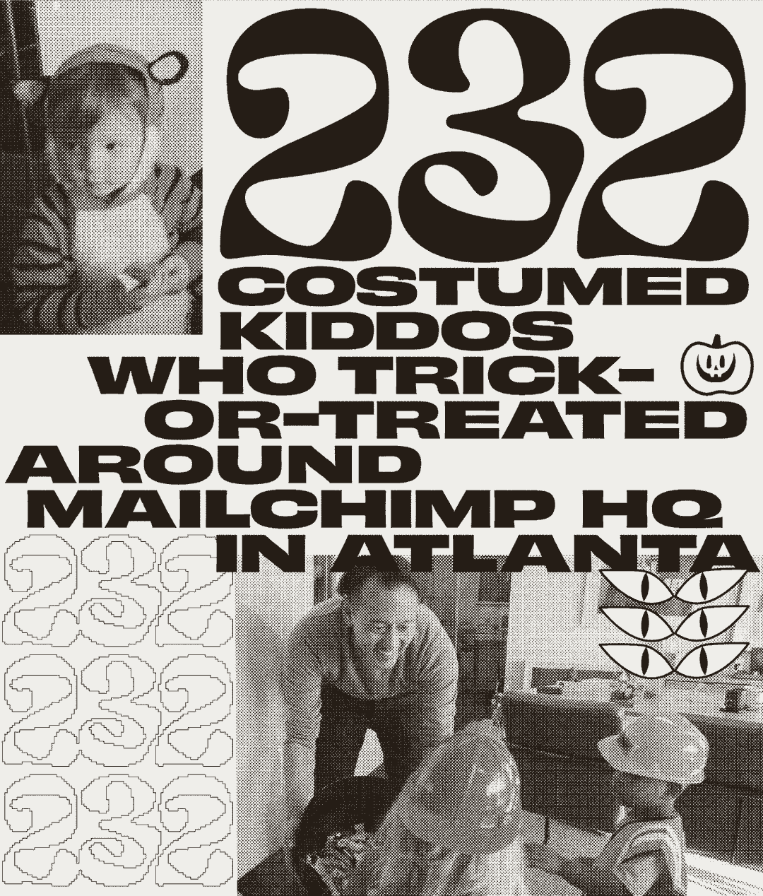
Ohno: Mailchimp Annual Report – Design in house, many
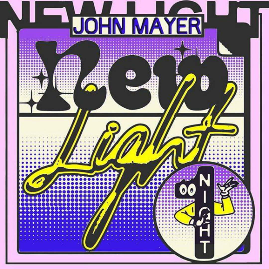
John Mayer New Light, Design by Online Ceramics, Eckmannpsych
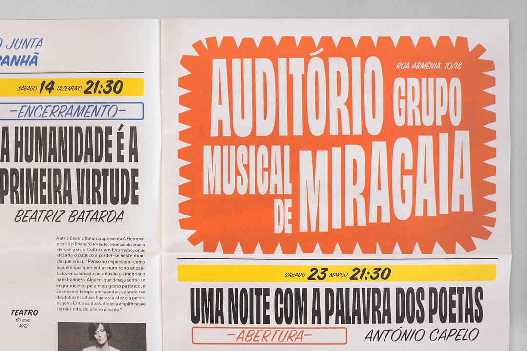
Cultura em Expansao, Design by Oscar Maia, Obviously
Hero Header
Cultura em Expansao, Design by Oscar Maia, Obviously
Share Article
Further Info
About the Author
—
Jynann joined It’s Nice That as an editorial assistant in August 2018 after graduating from The Glasgow School of Art’s Communication Design degree. In March 2019 she became a staff writer and in June 2021, she was made associate editor. She went freelance in 2022.

