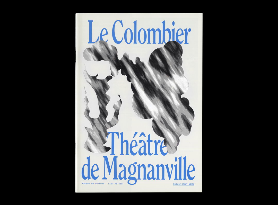
Pitchfork redesigns website and introduces new logotype
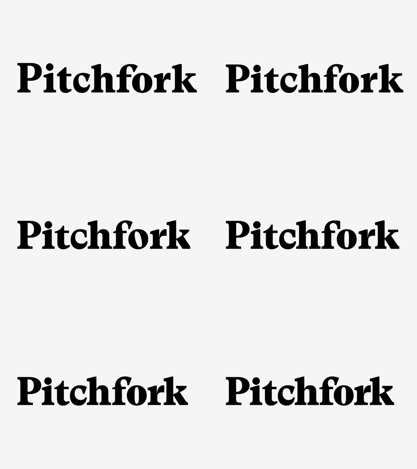
Music website Pitchfork has launched its newly designed website that overhauls the previous iteration that appeared in Autumn 2011. Alongside the new user interface that has simplified the reader experience so browsing, searching, listening and watching is easier, Pitchfork has unveiled a new logotype designed by Swiss type foundry Grilli.
Pitchfork Media was acquired by media conglomerate Condé Nast in October last year. At the time Condé Nast president and chief executive Bob Sauerberg said: “Pitchfork is a distinguished digital property that brings a strong editorial voice, an enthusiastic and young audience, a growing video platform and a thriving events business.”

Share Article
Further Info
About the Author
—
Owen joined It’s Nice That as Editor in November of 2015 leading and overseeing all editorial content across online, print and the events programme, before leaving in early 2018.