A new identity makes language learning a safe, friendly experience for Ukrainian children
Gestures, speech bubbles and the plus sides of communication form the basis of the work from Podpunkt, the studio behind the branding for Language Supp Ukraina.
Language Supp Ukraina is an initiative of free online language platforms; it supports children from refugee families who have fled Ukraine in learning a new language and, in this instance, with Polish lessons, to help aid in the transition to a new country. Warsaw-based Podpunkt is the design studio behind its identity. “It was created as a response to the urgent need to help refugees from Ukraine, therefore it required an unusual, dynamic model of work”, the studio tells It’s Nice That. The “greatest goal” on the project, though, was the introduction of “warmth” – to create a friendly and “slightly abstract” space for children, young people and their guardians to find familiarity in an unknown language.
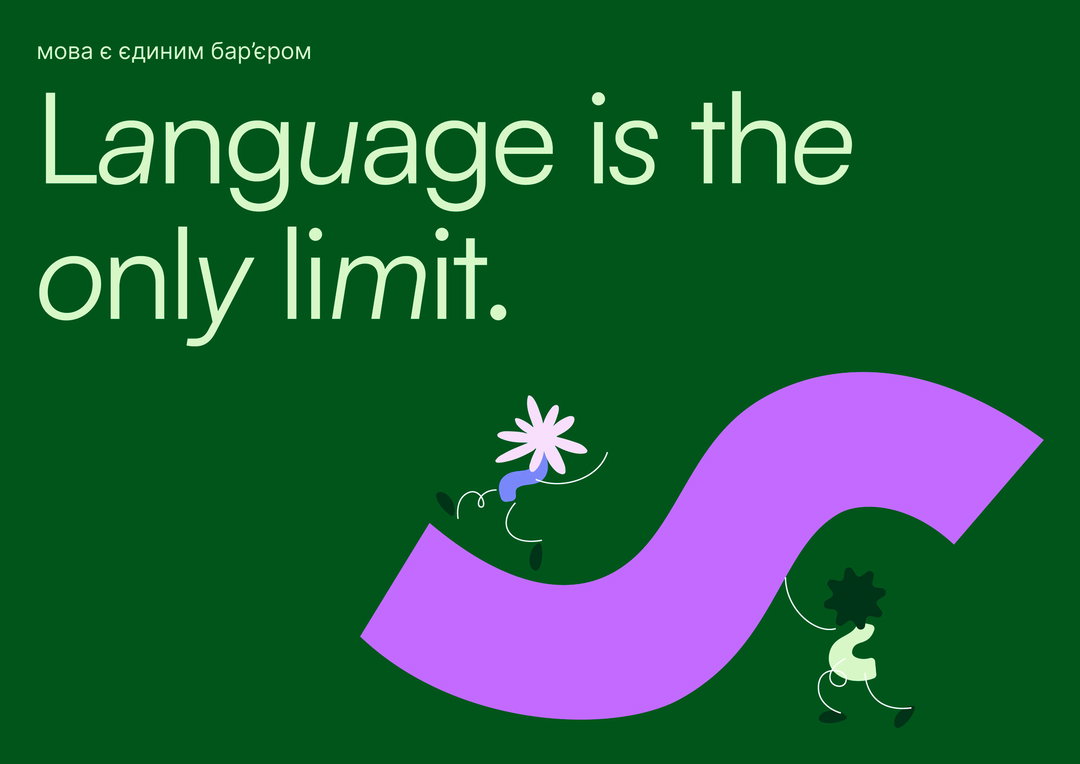
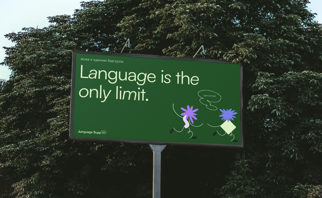
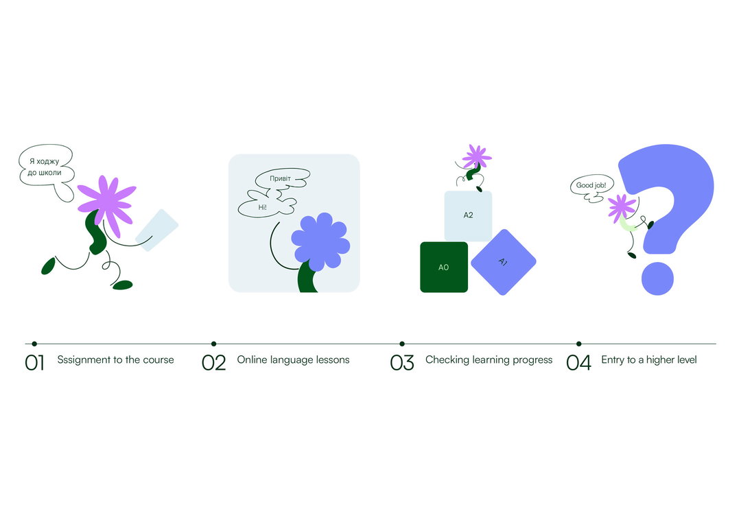
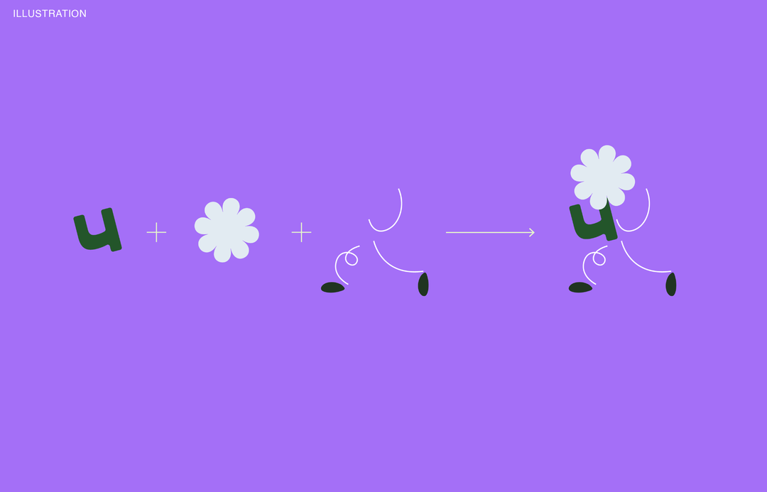
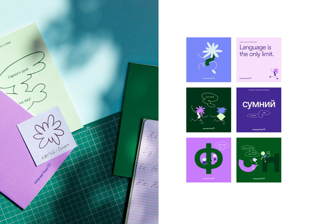
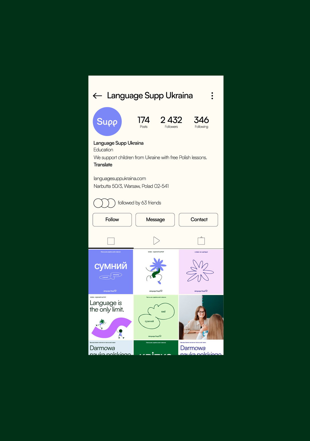
Language Supp Ukraina incorporates several intersecting symbols, all based around the concept of language as a mode of communication. Firstly, there are the “wordcreatures”: illustrated characters whose bodies are built from the letters and diacritics of various alphabets. By shifting between numerous alphabets, Podpunkt seeks to “build a sense of equality and community among different cultures”, but also signal the potential introduction of more languages to the platform. Another key symbol on the project is how the “wordcreatures” often communicate with each other via speech bubbles; they find mutual understanding with each other as the course progresses.
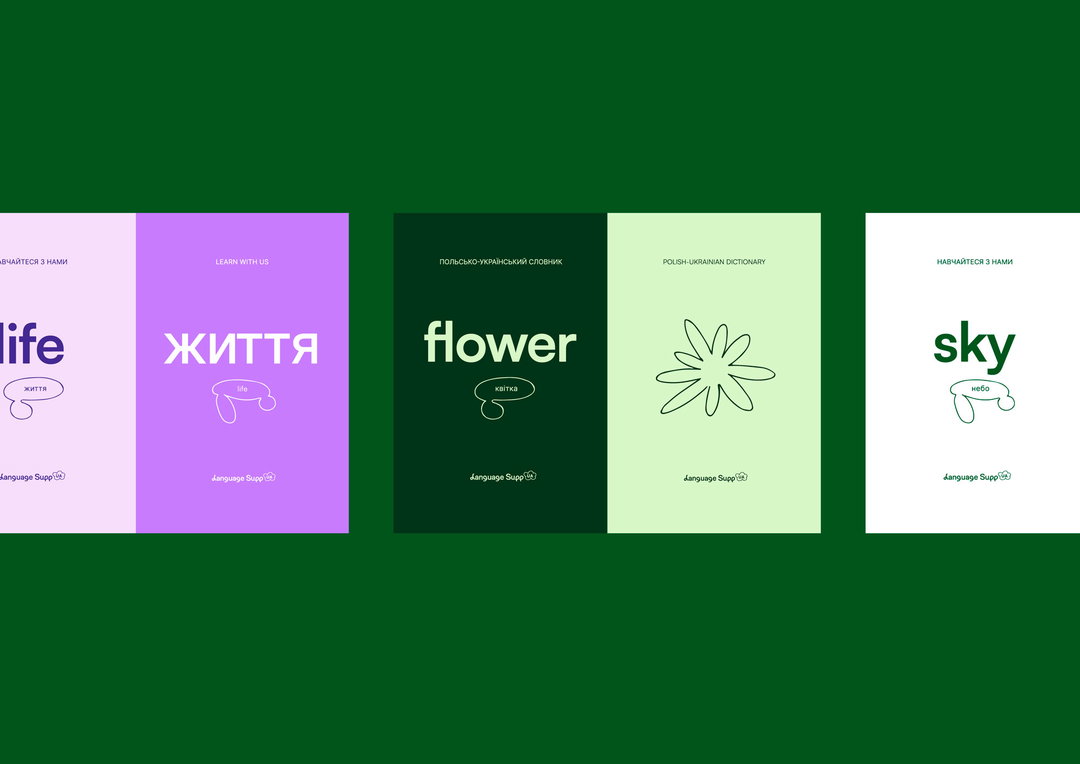
Alphabets and speech bubbles might all seem like an expected approach for branding language lessons, but making unrecognisable symbols of language seem less scary is important for a platform like Supp. While the “wordcreatures” bring a sense of the whimsical to unknown alphabets, “typography, handwriting, gestures, symbols and thoughts” are integrated to stress how important language is for interacting with the world around us. It also shows users how the work Supp produces will positively impact their daily lives.
Keeping things suitably kid-friendly, the concept of blossoming flowers has also been woven into the identity. This is achieved via the “wordcreatures”, where a diacritic of the user’s choice serves as the body of the character, while a hand-drawn head resembles a flower blossom and linear limbs provide dynamics and motion. “Flower heads refer to blossoming buds”, the studio affirms. Podpunkt reflects that just as flowers “show their true personality” when they blossom, “feelings of freedom and belonging grow within us when we are able to communicate with our peers in their native language.”
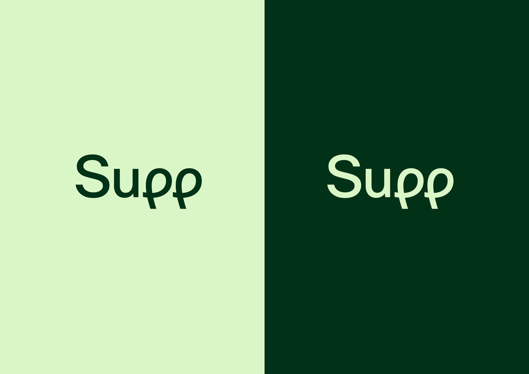
The Supp logo and typography is based on handwriting, and “the motion associated with putting letters on paper.” This means that irregular shapes pop up frequently, welcoming the method of trial and error that is equally important to the journey of language learning.
GalleryPodpunkt: Language Supp Ukraina (Copyright © Language Supp Ukraina, 2022)
Hero Header
Podpunkt: Language Supp Ukraina (Copyright © Language Supp Ukraina, 2022)
Share Article
Further Info
About the Author
—
Liz (she/they) is the senior editor at Insights, a research-driven department within It’s Nice That. They previously ran the news section of the website. Get in contact with them for potential Insights collaborations or to discuss Insights’ public-facing reports.