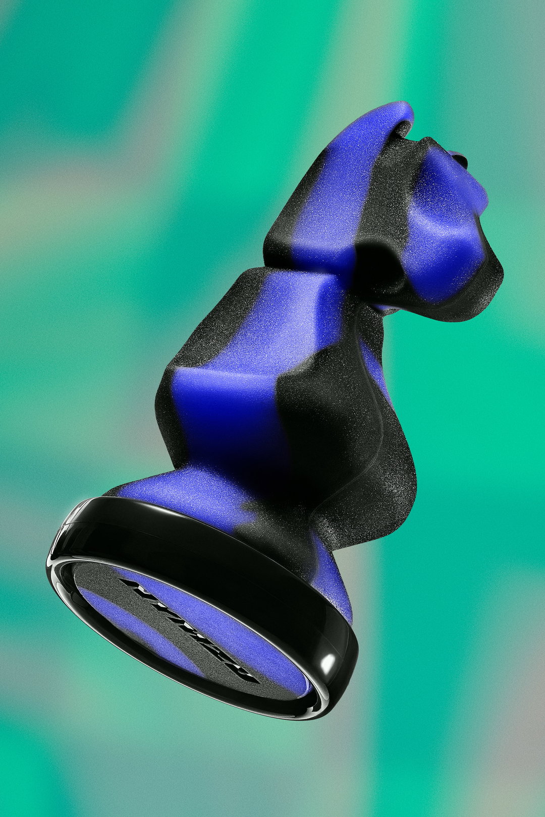
Ragged Edge rebrands fertility technology company Mylo to be perfectly imperfect
The London-based agency has rebranded the company from myLotus to Mylo, to better reflect the experience of trying to conceive.
London-based agency Ragged Edge has given a complete design overhaul to fertility technology company myLotus, relaunching as Mylo. In both a visual and tone of voice shift, the overall aim of the rebrand is to present a more truthful example of the experience family’s have while trying to conceive.
Mylo itself is “a lab quality ovulation tracker” which detects the luteinising hormone in a woman’s urine. In doing so it offers more precise knowledge to point user’s in the direction of their peak fertility day, and strengthen the chances of conception. As Ragged Edge point out, the conversation around fertility by brands traditionally romanticises this journey but, “that’s not reflective of what many women and men experience,” explains the agency. “There was a huge opportunity for the brand to recognise that, and to speak honestly and empathetically about the challenges around getting pregnant.”
The renaming from myLotus to Mylo is the first step in setting this tone for the future of the brand, described by the agency as: “A relatively small evolution that allows the brand to instantly feel more contemporary and non-gender specific.” Ragged Edge also continuously considered this in its design decisions, noting how the “identity is designed to get up close and personal.” Its colour palette for example is chosen to reflect skin tones, “complemented by a bright blue that delivers a sense of energy while subtly rooting it in the category,” further explains a release from Ragged Edge.
It’s chosen word mark for Mylo’s new logo and accompanying illustrations also features “handmade-looking edges”, a signifier of the brand’s “real talk” approach. For instance, rather than symbols or emoji-like faces, Mylo is purposefully direct and informative in a style Ragged Edge describes as “supportive without being saccharine.”
In a rebrand purposefully made to have an effect which is “‘perfectly imperfect’ and celebrates the idiosyncrasies that make us unique,” Ragged Edge have applied this to both Mylo’s strategic and visual approach. “There were genuinely revelatory moments in the strategy phase,” adds Penny McCormick, CEO at Mylo. “And what the creative team achieved in a matter of weeks is remarkable. Ragged Edge has continually pushed us to be brave not only for the sake of our brand, but for the sake of the women and men we serve.”
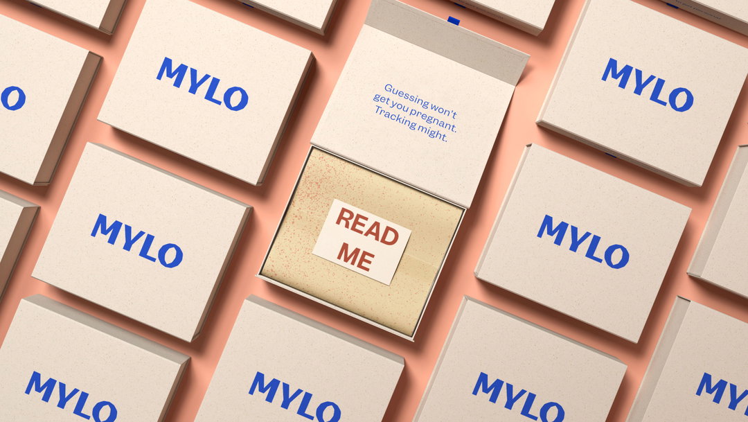
Ragged Edge: Mylo (Copyright © Ragged Edge, 2020)
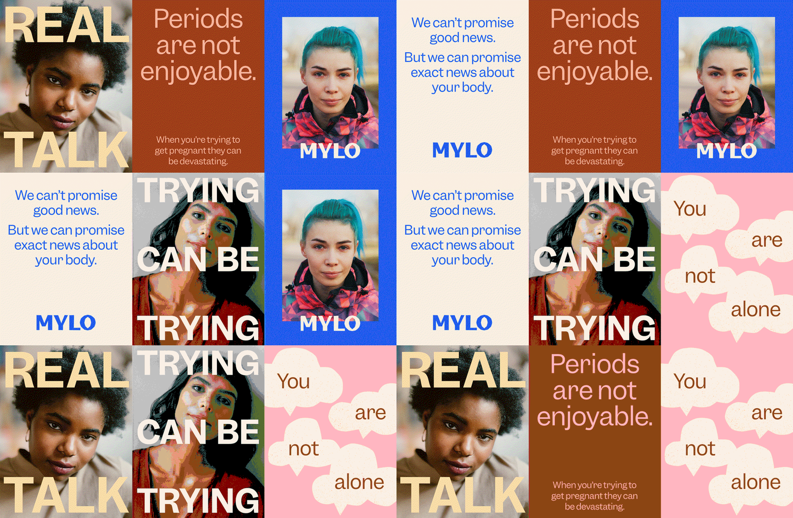
Ragged Edge: Mylo (Copyright © Ragged Edge, 2020)
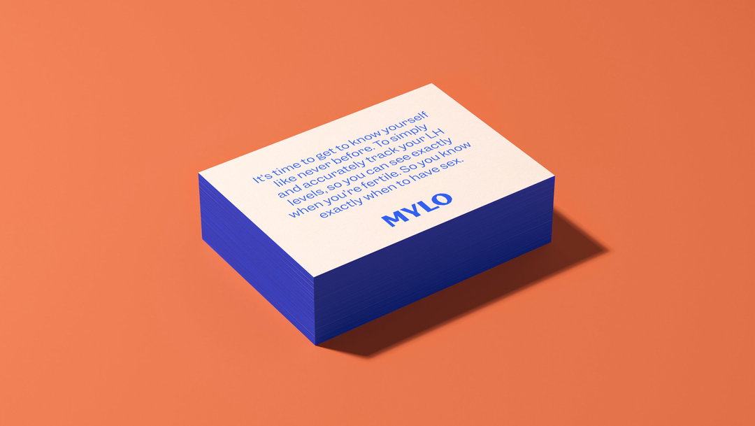
Ragged Edge: Mylo (Copyright © Ragged Edge, 2020)
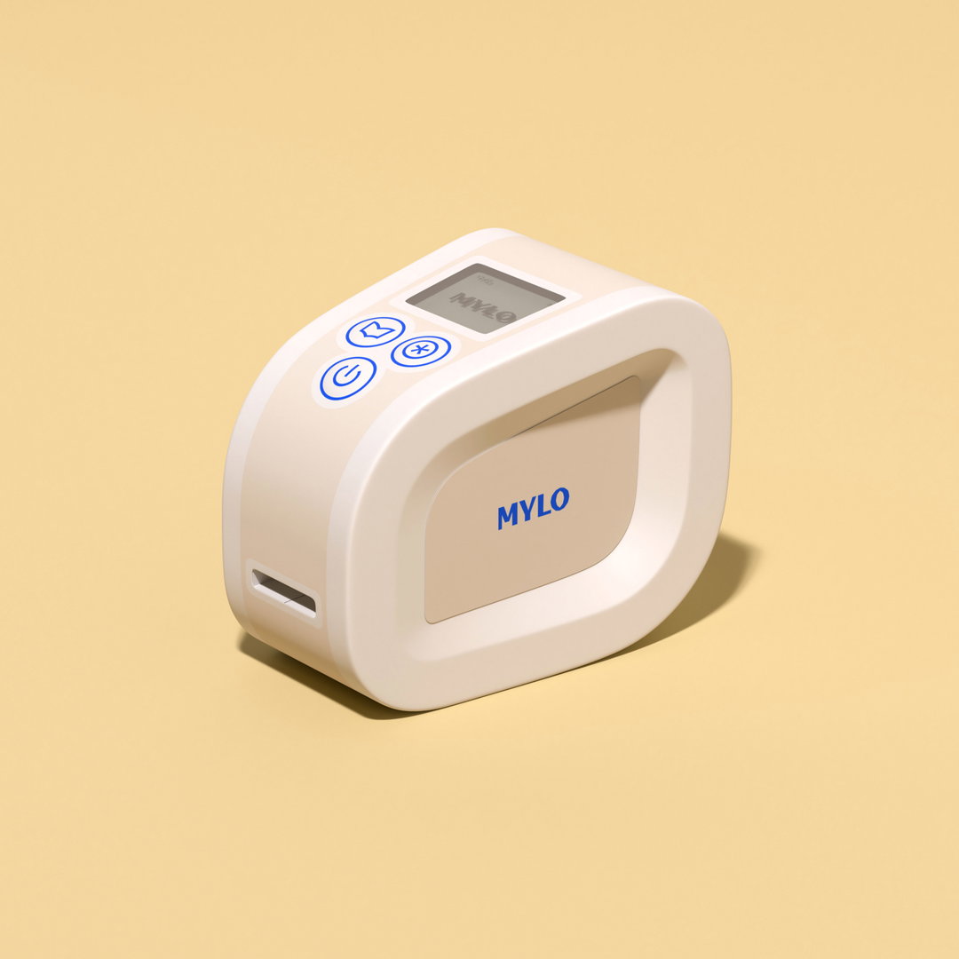
Ragged Edge: Mylo (Copyright © Ragged Edge, 2020)
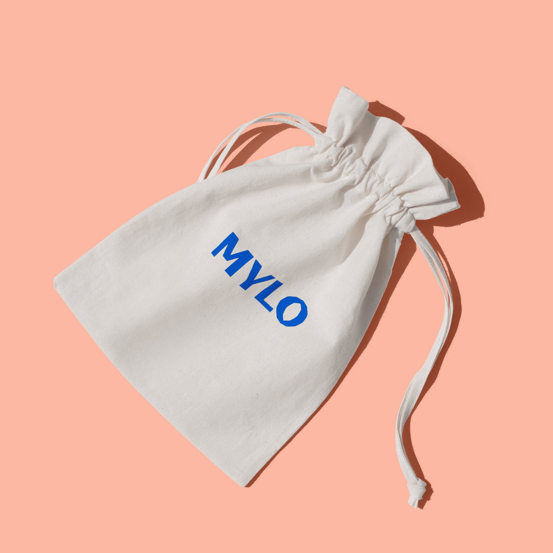
Ragged Edge: Mylo (Copyright © Ragged Edge, 2020)
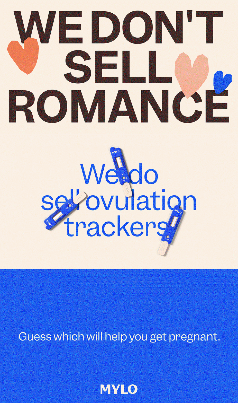
Ragged Edge: Mylo (Copyright © Ragged Edge, 2020)
Hero Header
Ragged Edge: Mylo (Copyright © Ragged Edge, 2020)
Share Article
Further Info
About the Author
—
Lucy (she/her) was part of the It’s Nice That team from 2016–2025, first joining as a staff writer after graduating from Chelsea College of Art with a degree in Graphic Design Communication, eventually becoming a senior editor on our editorial team, and most recently at Insights, a research-driven department with It’s Nice That.