ShopTalk creates a Swiss brand typeface that echoes the dynamic curves of a car for Piëch
The studio says Piëch Sans represents a departure “from the usual clichés and conventions of ‘classic’ car advertising”.
Share
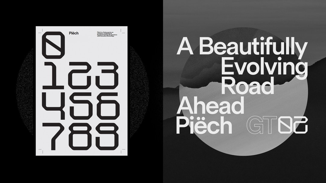
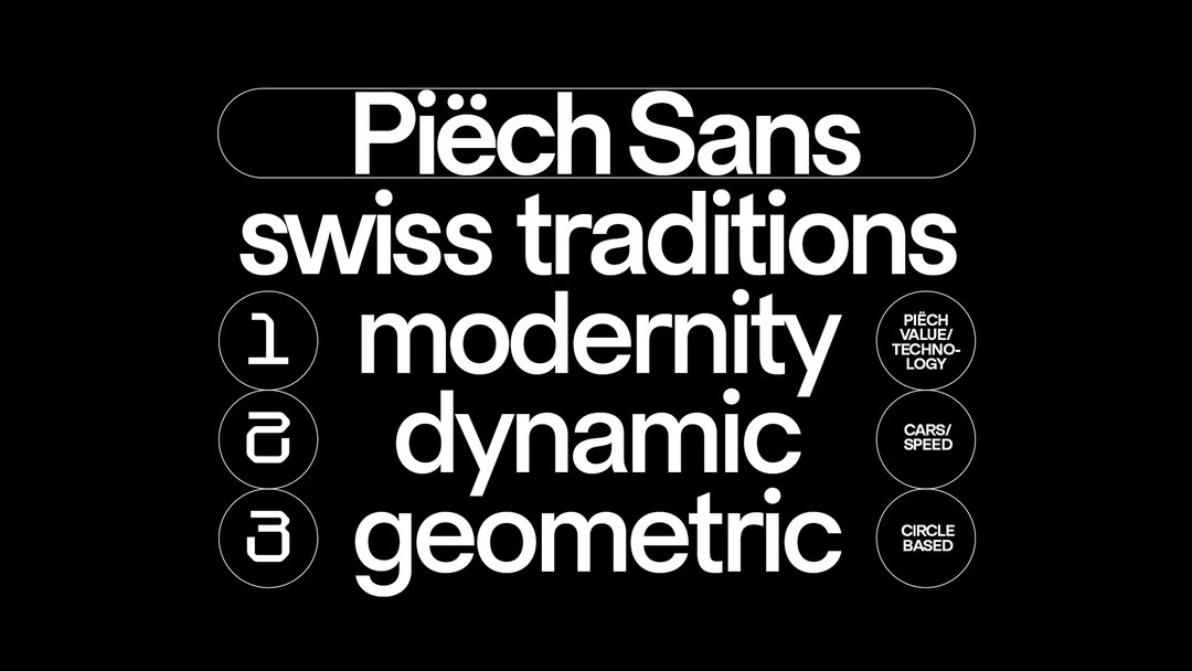
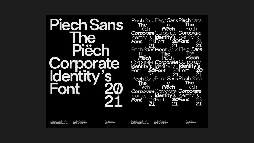
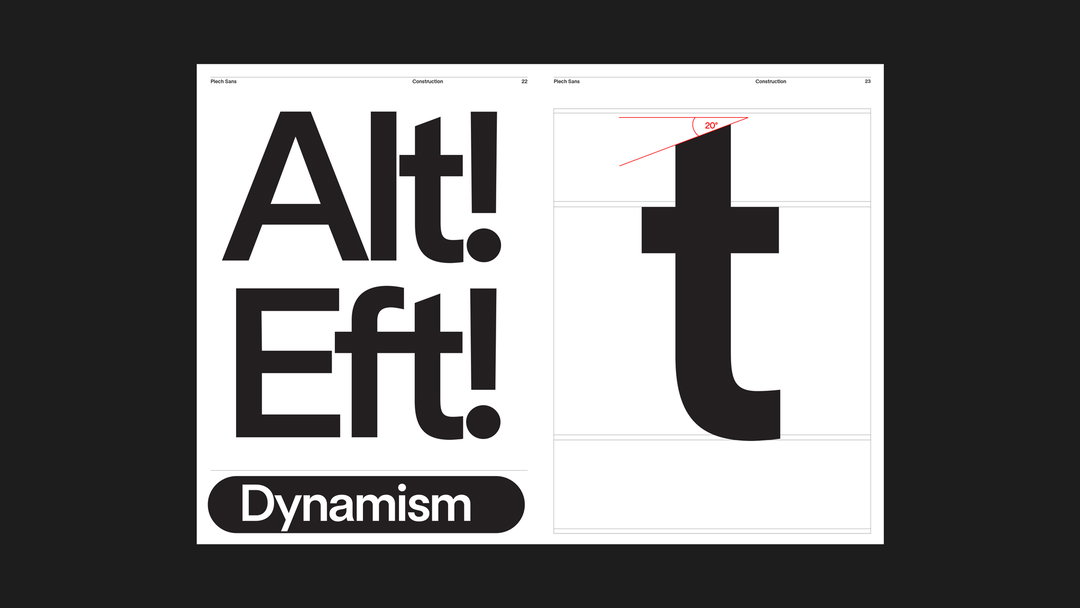
The London-based studio ShopTalk has collaborated with type designer Robin Eberwein and the Piëch Design Lab to create Piëch Sans: a brand typeface for the sports-car company Piëch. Like the car, the font takes inspiration from Swiss heritage, functioning as a “geometric sans serif font that marries European tradition and electric innovation,” explains a release. While the font’s form draws from traditional Swiss fonts or Swiss Style, a form of typography which emerged in Europe during the 1950s, it also borrows from the “dynamic curves” of the Piëch car itself.
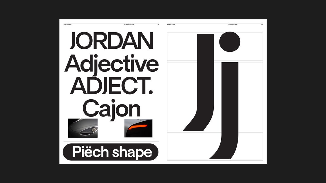
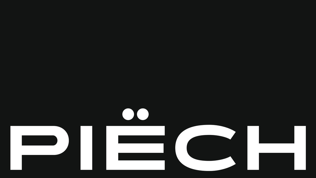
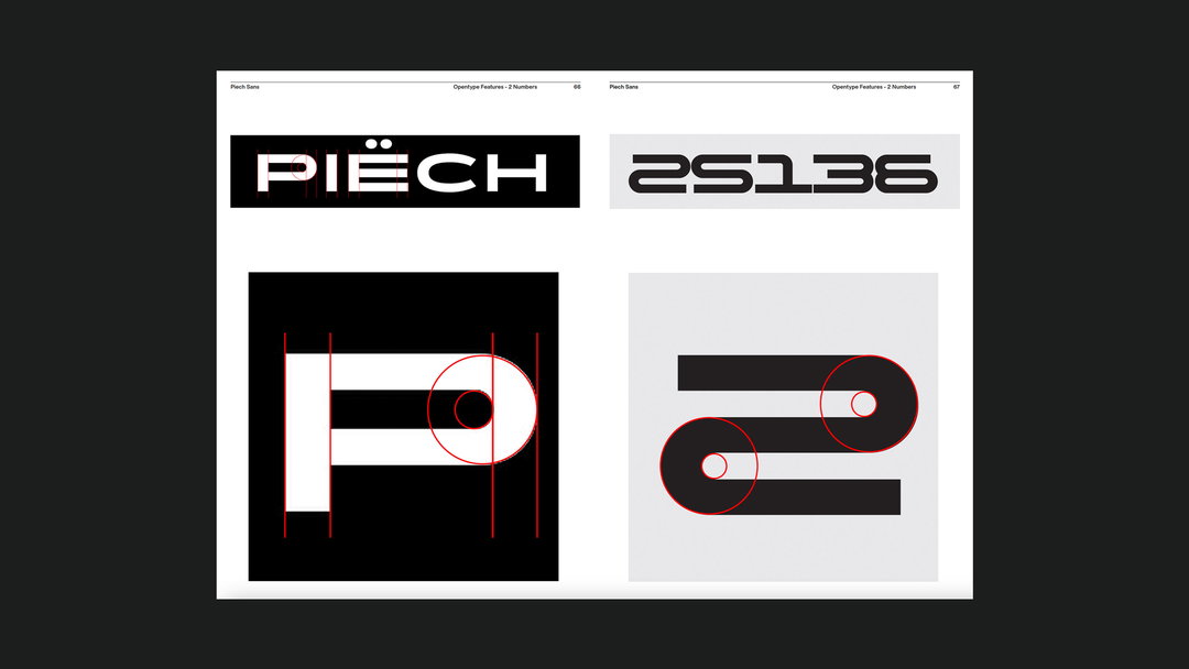
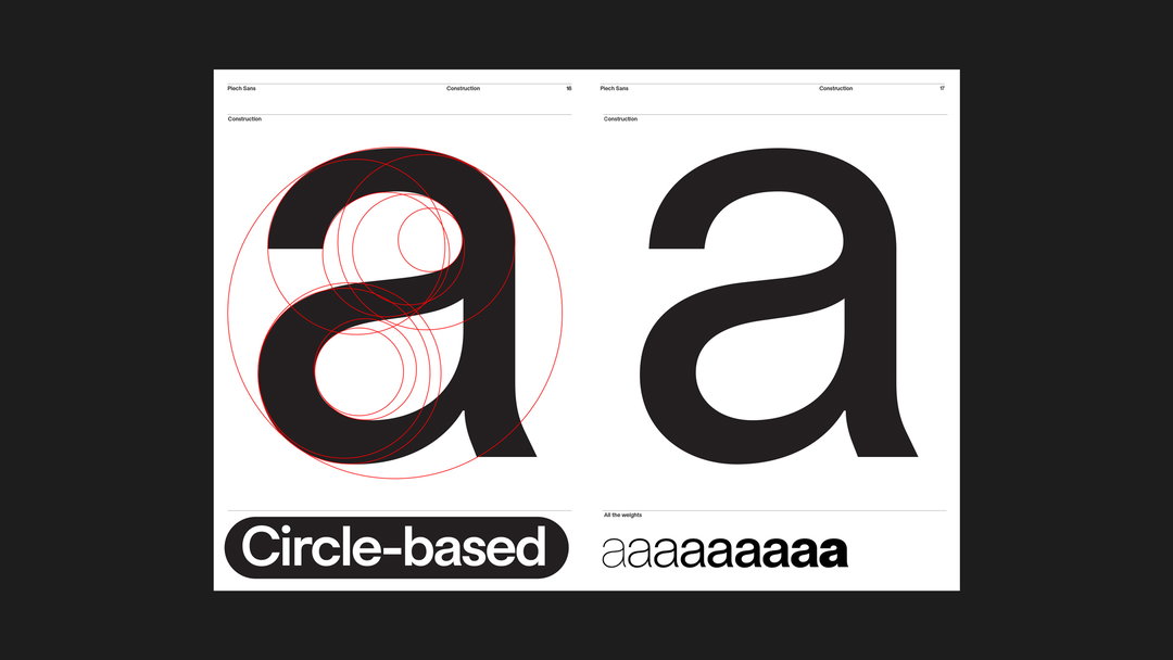
A number of clever visual references litter Piëch Sans: the curve of the ‘j’ references the cars’ lights while geometric alternates for numbers echo the digits found on vintage racing cars. Meanwhile, the letterforms are based on circles, nodding to the dieresis (the dots from the logomark) in the hero brand identity. While the font has been designed to “underscore the dynamism and modernity of the brand”, says ShopTalk in the release, it also draws on the heritage of European sports cars – which Piëch hopes to emulate – and of the Swiss fonts that came to define mid-century modernist graphic design.
GalleryShopTalk: Piëch Sans, car photography by Claude Gabriel (Copyright © Piëch, 2022)
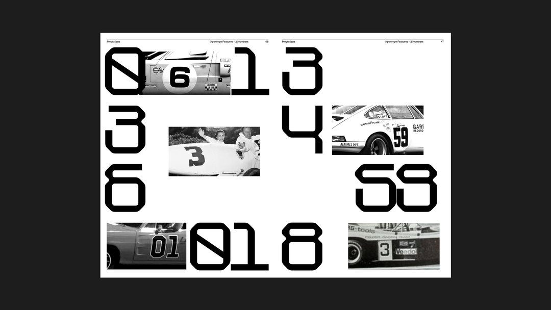
In its release, ShopTalk also explains that Piëch Sans offers a refreshing departure “from the usual clichés and conventions of ‘classic’ car advertising”. James Wood, creative director and co-founder at ShopTalk, tells It’s Nice That: “To start with, Piëch Sans was designed alongside the car itself. As the car’s forms and technology were taking shape, the typeface was being tweaked and adapted. Our attention to detail extends to the typeface’s numbers, which will be built into the car’s speedometer.”
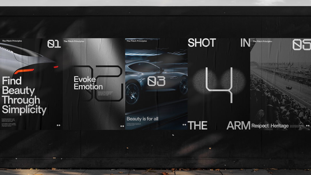
Piëch Sans has been designed in nine weights: Thin, Ultralight, Light, Book, Regular, Medium, Semibold, Bold and Superbold. The typeface currently features a total of 562 glyphs, spanning 94 different languages. It will be used as the foundation of the Piëch visual identity across all forms of product, design, marketing and communications. That said, the font is just one aspect of the wider branding that ShopTalk has created for Piëch for the launch of the car in 2024.
GalleryShopTalk: Piëch Sans, car photography by Claude Gabriel (Copyright © Piëch, 2022)
Hero Header
ShopTalk: Piëch Sans, car photography by Claude Gabriel (Copyright © Piëch, 2022)
Share Article
Further Info
About the Author
—
Liz (she/they) is the senior editor at Insights, a research-driven department within It’s Nice That. They previously ran the news section of the website. Get in contact with them for potential Insights collaborations or to discuss Insights’ public-facing reports.