Studio Nari’s new logo for a vegan platform is bunched together like a handful of veggies
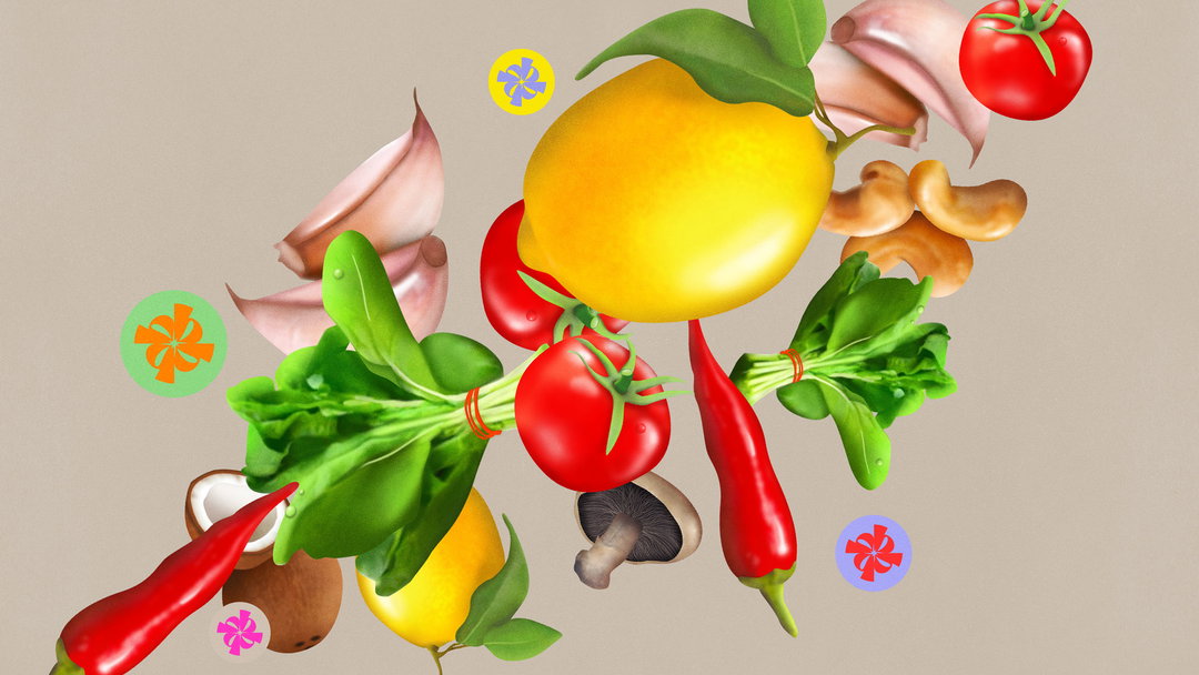
“We wanted people to feel like they could pick them up off the page and eat them!”; the design studio talks making an identity full of hyperreal ingredients for Bunch.
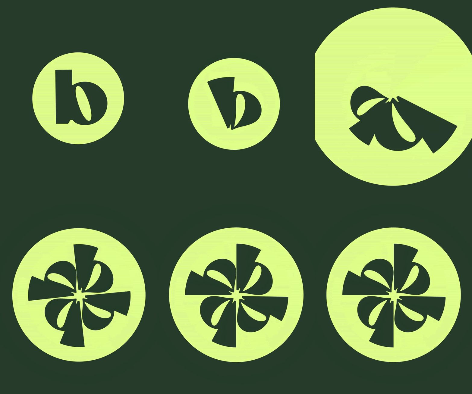
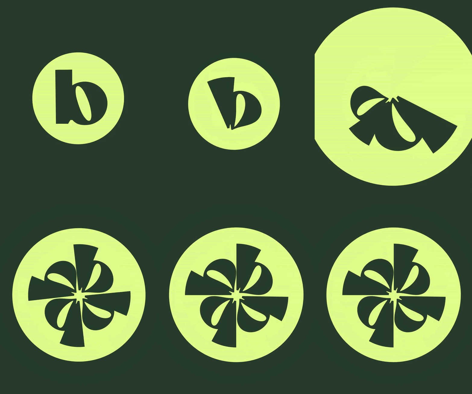
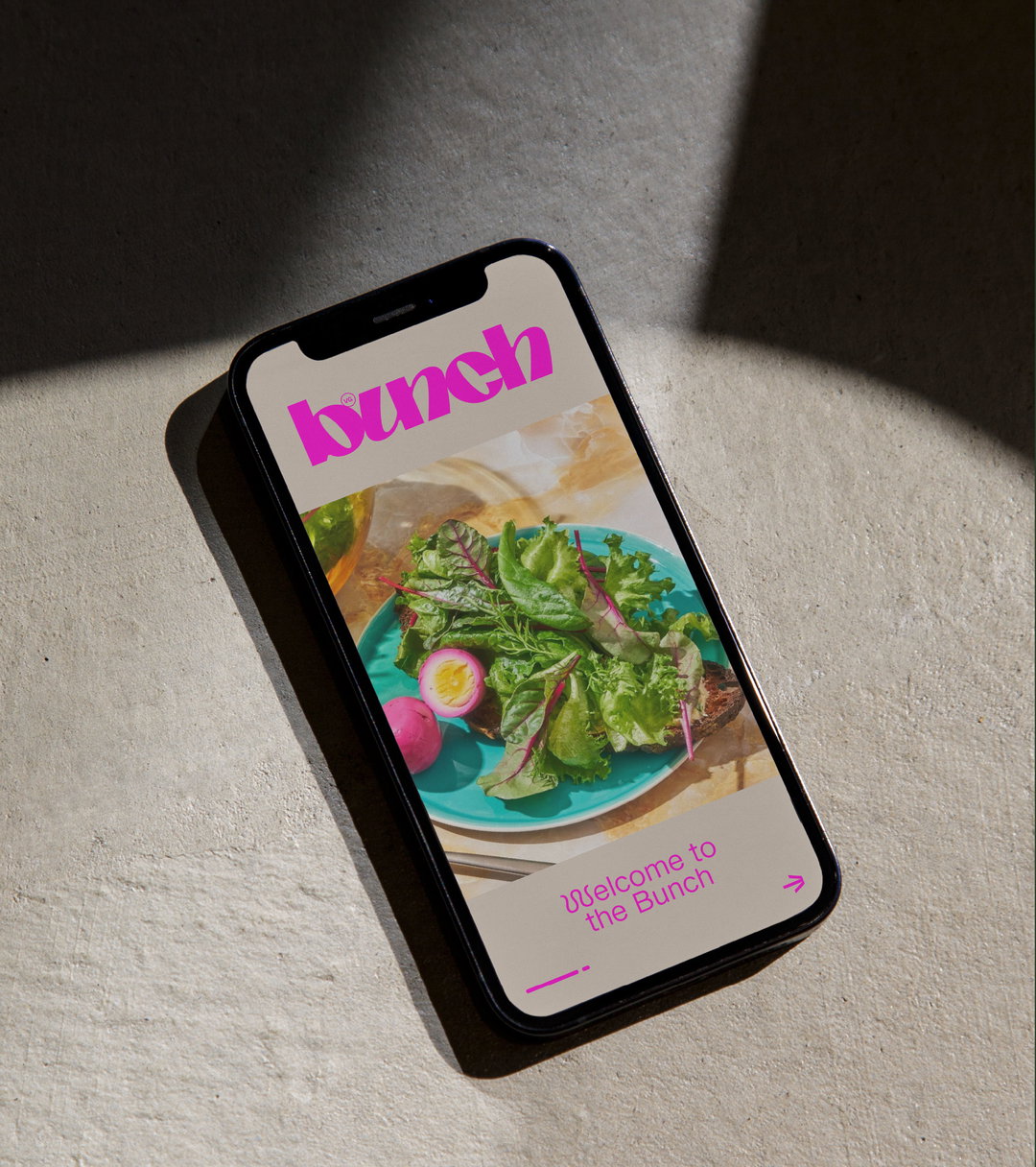
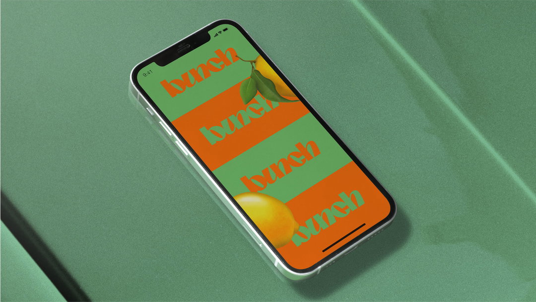
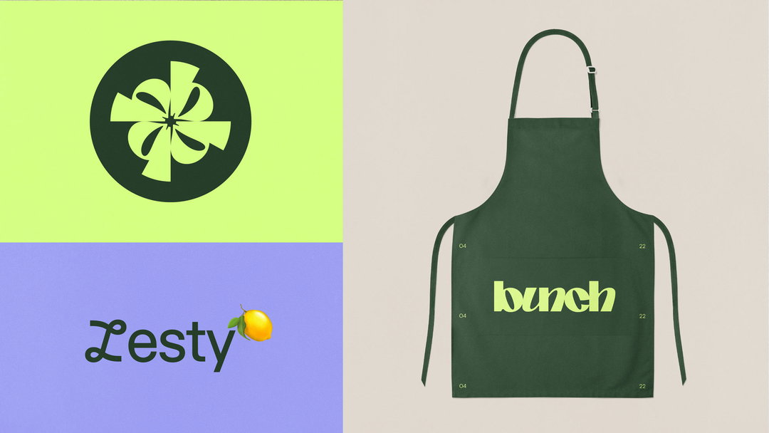
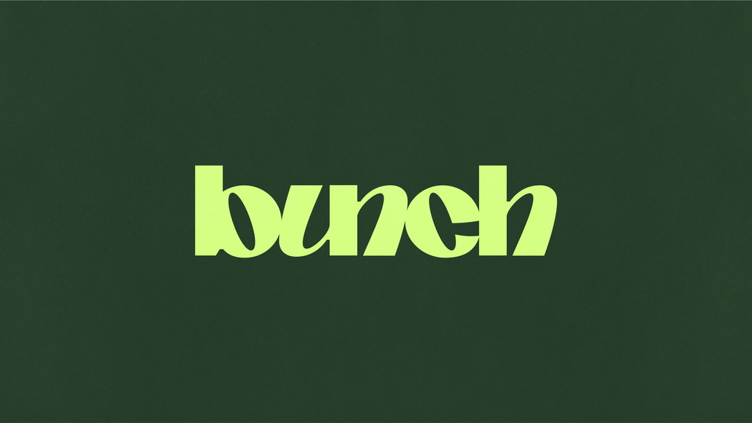
The humble vegetable provides ample inspiration for Studio Nari on its latest work, as studio founder Caterina Bianchini recently explained to It’s Nice That. The project is an identity for Bunch (previously Vegan Mob), a new plant-based platform avoiding vegan dupes – such as fake meat and burgers – for the original substitute: vegetables. With its branding, Nari attests to the endless ways ingredients can be interpreted and broken down visually. For example, with motion design from Connor Campbell, the Bunch identity frequently mimics motions like tumbling, combining and growing to reflect “ingredients coming together to create a dish,” Caterina says. But perhaps the best example of replicating how ingredients move appears in the brand mark, where a selection of “B” characters are bunched together “like grapes”.
Caterina explains that as the bundle of “B”s are pinched together, they create a “warped cyclical shape”. This, in turn, “subliminally references the inside of a vegetable when you cut it in half”, the founder adds, “it creates segments. In motion this becomes really expressive and beautiful.” The animation on the project certainly feels energetic, often referencing growth patterns or playful cooking moments.
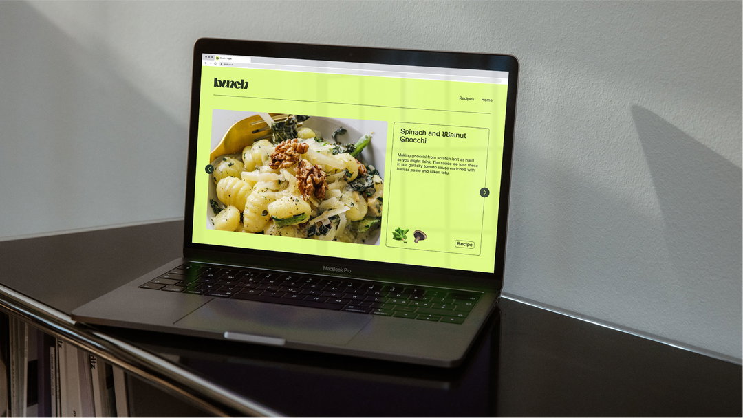
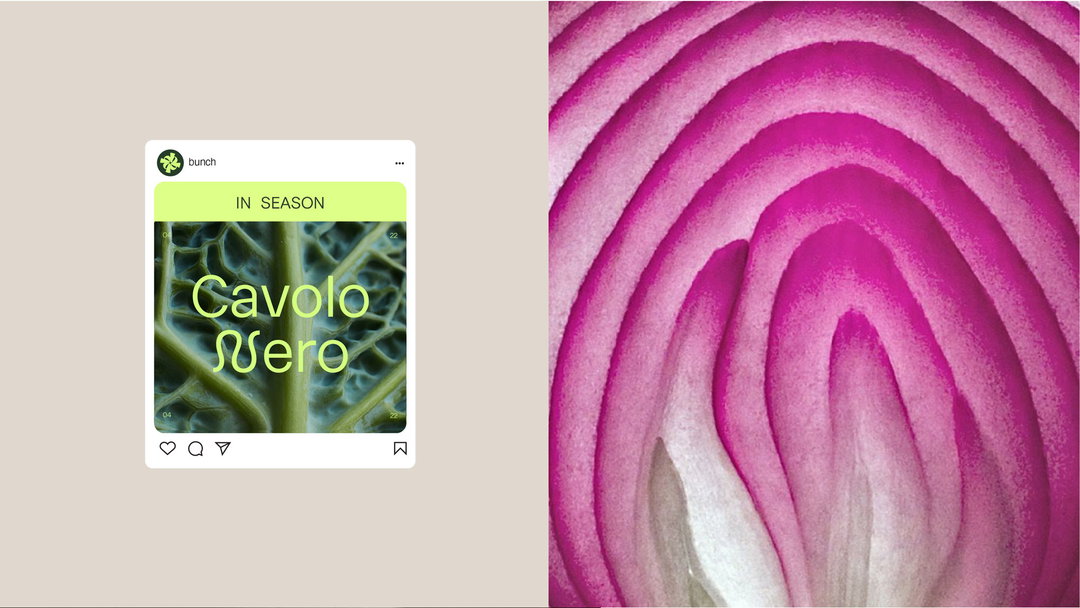
To depict the ingredients Bunch champions, Nari opts for a hyperreal illustrative style; “We wanted everything to look vibrant, delicious and ripe.” This approach also played into its “super vibrant colour palette”; vegetables and colours were made to look as “in season” as possible – when ingredients are at their most colourful (and most delicious).
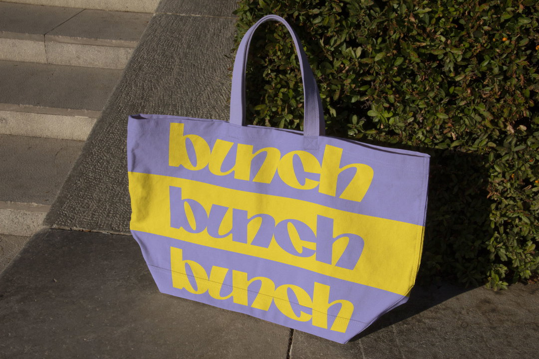
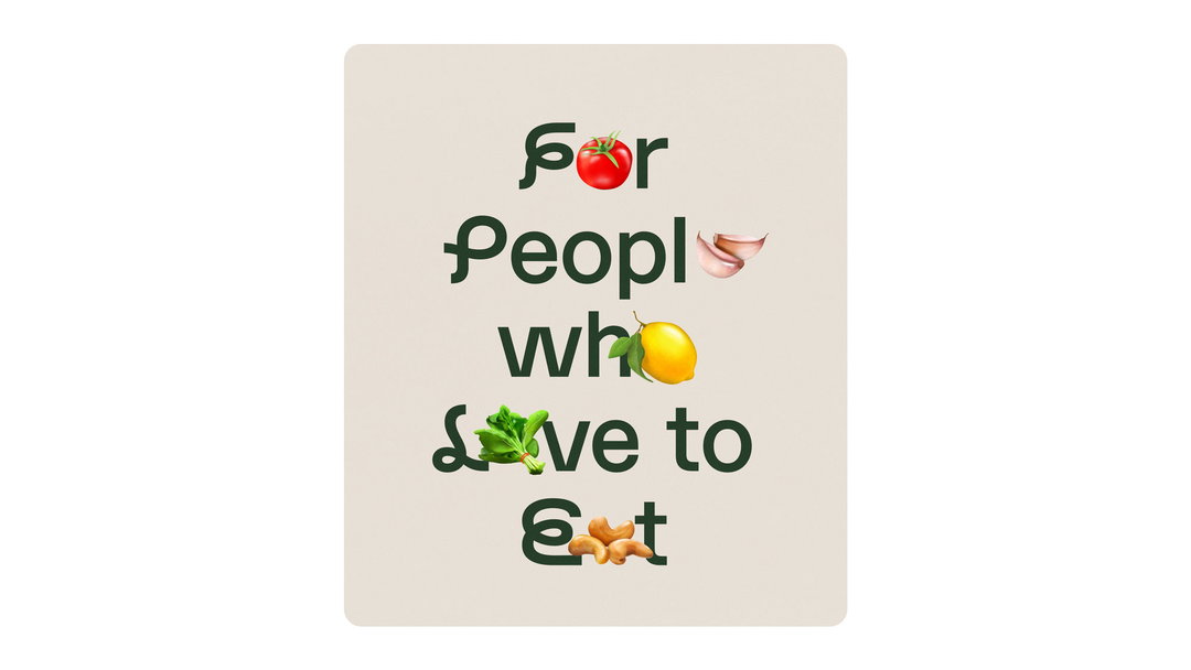
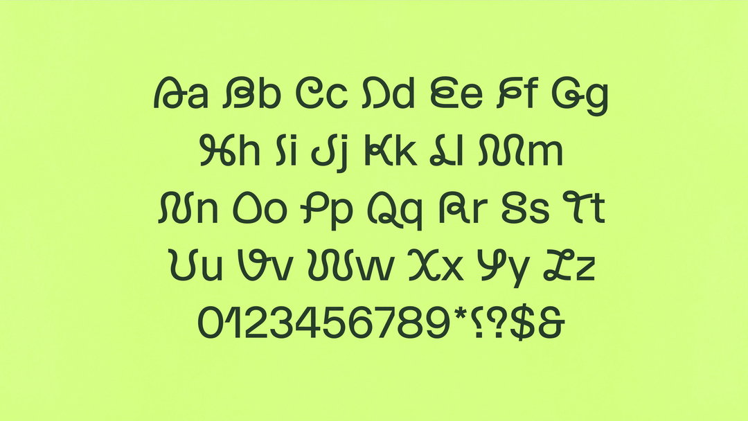
Studio Nari commissioned Elias Hanzer to create a bespoke cut of EH Normal for Bunch’s title case – in the original typeface, there are only around five glyphs in capitals, whereas the new cut represents the full alphabet in uppercase. These curly additions (seen below) crop up frequently, with the organic nature of the new glyphs juxtaposing the more reserved base characters of the typeface. Caterina continues: “This linked nicely to Bunch being about nature’s ingredients (veggies) but the platform being held digitally.”
The logotype embraces the organic too. For example, small inconsistencies have been added throughout the lettering to make it feel more textural and varied. Caterina confirms: “We began by drawing a logotype that felt human and not overly fussy, the typographic details were secondary rather than creating lettering that felt overly designed.” The final logo complements the ethos of Bunch nicely – a brand looking to elevate the original ingredient without too much added fuss.
GalleryStudio Nari: Bunch (Copyright © Studio Nari, 2022)
Hero Header
Studio Nari: Bunch (Copyright © Studio Nari, 2022)
Share Article
Further Info
About the Author
—
Liz (she/they) is the senior editor at Insights, a research-driven department within It’s Nice That. They previously ran the news section of the website. Get in contact with them for potential Insights collaborations or to discuss Insights’ public-facing reports.