Launch Recite Me assistive technology

The Counter Press rebrands Conran’s restaurant Bibendum based on its art nouveau home
—
Date
26 June 2017
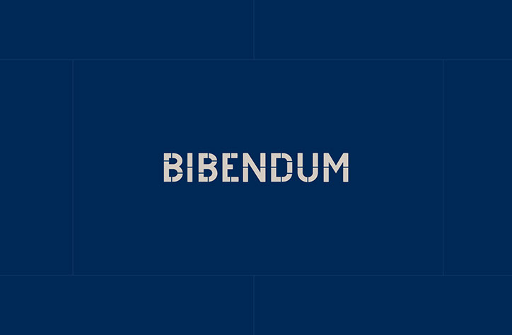
The word “Bibendum” appears in a bold, cream-coloured sans-serif typeface. It is centred against a deep blue background divided by thin, subtle lines.

London design and letterpress studio The Counter Press has rebranded Terence Conran and Paul Hamlyn’s restaurant Bibendum, with an identity designed to emulate and emphasise its surrounding architecture.

Since 1987 the restaurant has inhabited a landmark of London’s Chelsea, the art nouveau Michelin House designed by François Espinasse in 1911. Inspired by the structure’s decorative features, such as its mosaics, ironwork, tiles and stained glass windows, The Counter Press revamped Bibendum’s visual identity to become an “extension of, and complement to, the building”.

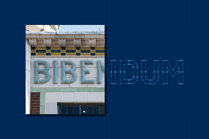
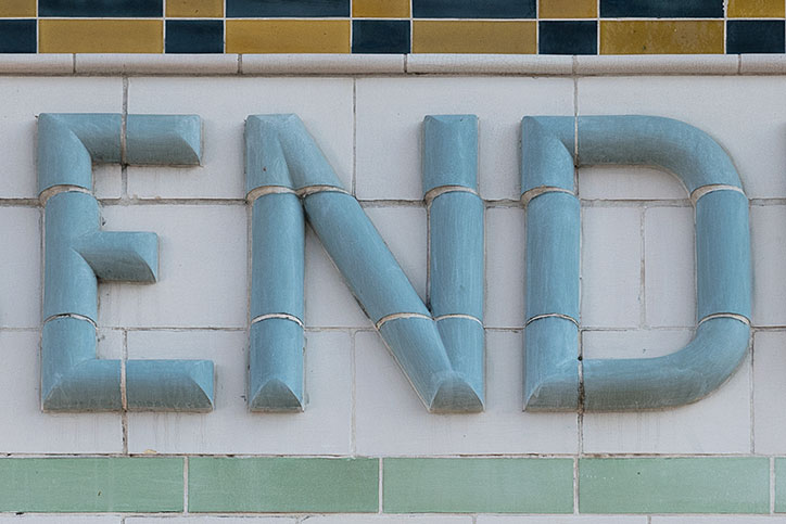
This began by basing the new logotype on the tiled sign on the building’s facade. “We started by tracing these 3D letterforms but then adjusted and simplified them so they would work better as a word mark, especially at small sizes,” say the designers. “It’s more of a faithful interpretation rather than a straightforward reproduction. Instead of creating a logo and turning it into new signage, we took old signage that was already there and turned it into the new logo.”

Similarly the identity’s grid pattern and colour palette were inspired by the brickwork and tiles, to “harmonise” with the building. It also keeps the Michelin Man character as a supporting element to the branding. The result is a sophisticated and “restrained” design that the studio hopes has “recaptured the original Bibendum magic” for the restaurant’s relaunch.
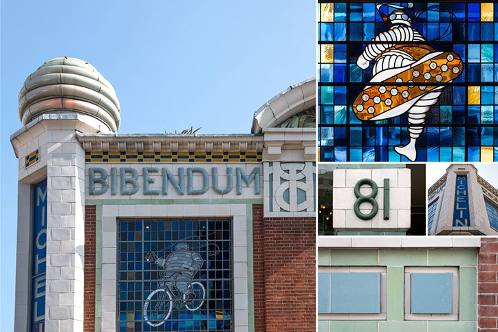
A collage of images showing the exterior of the Bibendum building. One shot shows the facade with the word “Bibendum” in large letters above a window featuring the Michelin Man on a bicycle. Other details include a mosaic of the character and the number “81” on a white wall.
Above

The Counter Press: Bibendum

A close-up of a building facade featuring the word “Bibendum” in large, light blue 3D letters. The first half of the word is physical masonry, while the second half is rendered as a blue digital outline.
Above

The Counter Press: Bibendum

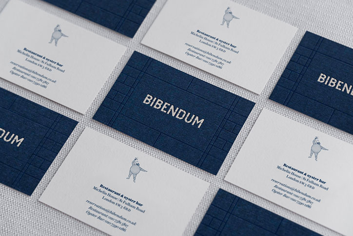
A collection of business cards for “Bibendum”, a restaurant and oyster bar. Some cards are navy blue with the name in gold, while others are white with a small illustration of a figure and contact details.
Above

The Counter Press: Bibendum

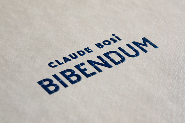
Dark blue text printed on a textured, beige paper surface. It reads “Claude Bosi” above the larger word “Bibendum”.
Above

The Counter Press: Bibendum

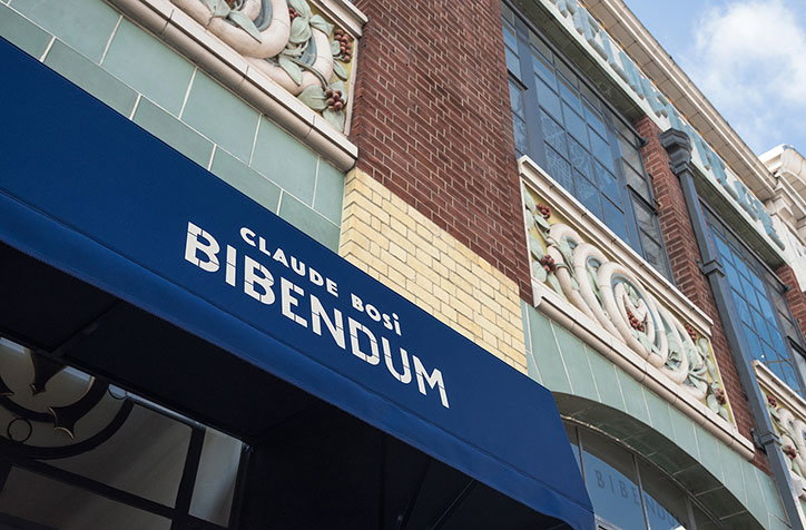
A blue awning over a storefront reads “CLAUDE BOSI BIBENDUM” in white capital letters. The building behind it features red brick and ornate, pale green architectural carvings.
Above

The Counter Press: Bibendum

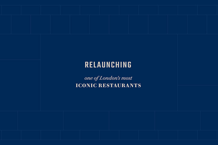
A dark blue background with a subtle brick pattern. Centred white text reads “RELAUNCHING one of London’s most ICONIC RESTAURANTS”.
Above

The Counter Press: Bibendum

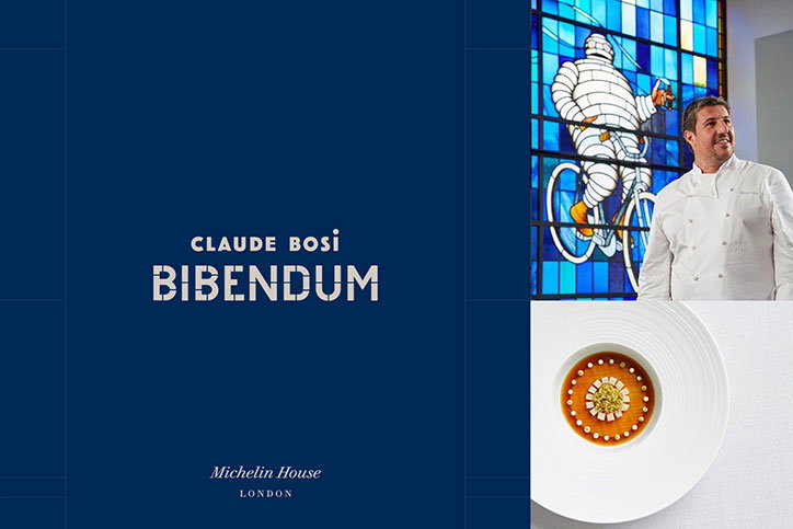
A blue graphic featuring the text “Claude Bosi BIBENDUM” and “Michelin House LONDON”. To the right, a chef in a white jacket stands before a stained-glass window of the Michelin Man on a bicycle. Below this is a close-up of a plated dish with a circular arrangement of sauce and garnish.
Above

The Counter Press: Bibendum

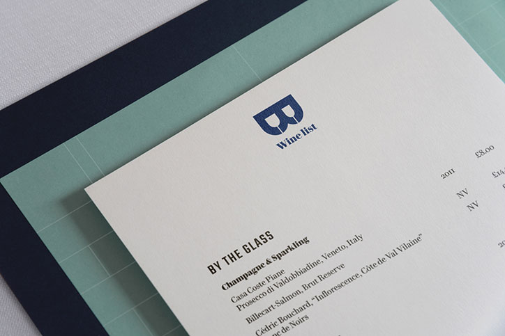
A close-up of a white “Wine list” featuring a blue logo at the top. The menu lists options “By the glass”, including a section for “Champagne & Sparkling”.
Above

The Counter Press: Bibendum

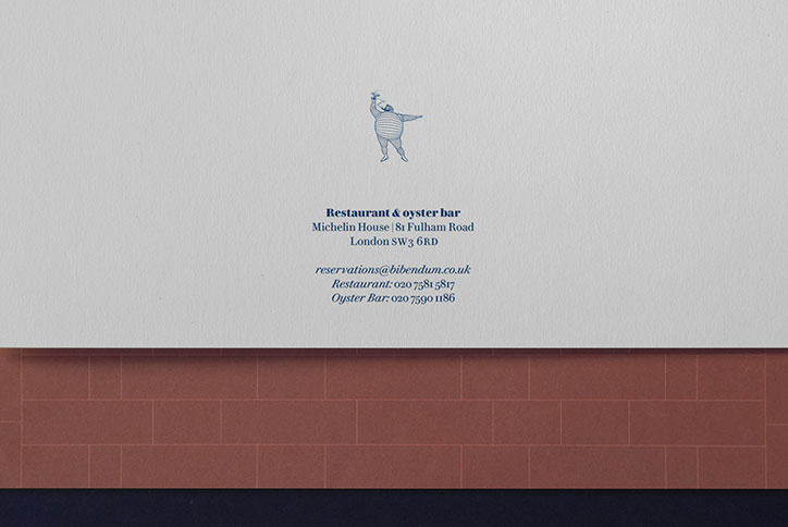
A minimalist business card for a restaurant and oyster bar. It features the Michelin Man illustration above the text “Restaurant & oyster bar”, an address in London and contact details.
Above

The Counter Press: Bibendum

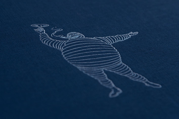
A white line drawing of a plump figure floating on a dark blue fabric background. The figure is rendered in a continuous spiral line, holding a small plate aloft in one hand.
Above

The Counter Press: Bibendum

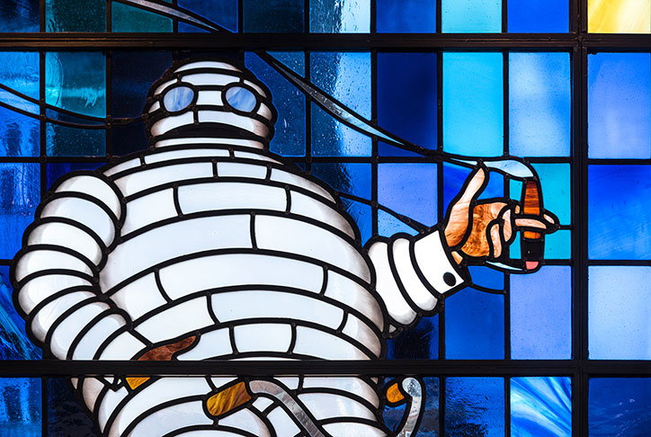
A stained glass window depicting a figure wrapped in white bandages like a mummy. The figure wears goggles and holds a small orange object in one hand against a background of blue glass panes.
Above

The Counter Press: Bibendum

Light blue ceramic tiles form the word “END” against a white tiled wall. A border of small yellow and dark blue tiles runs along the top.
Above

The Counter Press: Bibendum

Share Article

About the Author

Jenny Brewer

—

Jenny oversees editorial output across It’s Nice That. Get in touch with writing pitches for features or opinion pieces, big creative story tips, or questions about all things editorial. [email protected]

To submit your work to be featured on the site, please see our Submissions Guide.
It's Nice That Newsletters

Fancy a bit of It's Nice That in your inbox? Sign up to our newsletters and we'll keep you in the loop with everything good going on in the creative world.