Wedge flips perceptions of boxed wine with delightful packaging for Ami Ami
The design decision hinges on one important fact – that shipping wine and boxing it locally produces 50 per cent less carbon than shipping glass bottles.
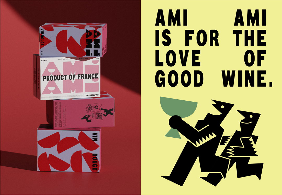
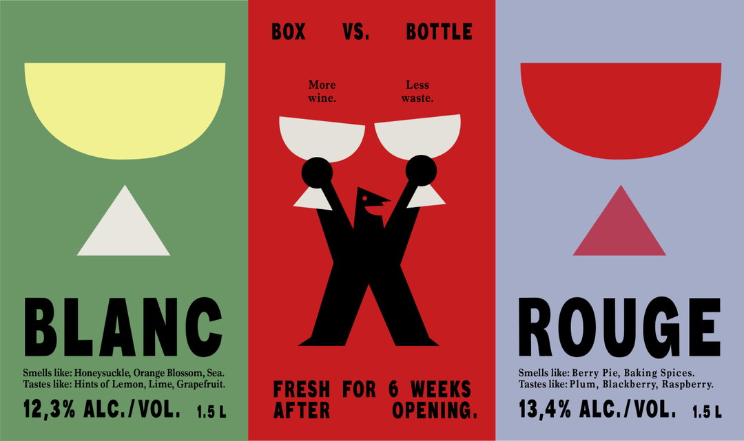
Ami Ami, a wine company founded by two friends in California, has tasked design studio Wedge with coming up with a new way to brand boxed wine. This required breaking down a few preconceptions: that boxed wine implies a lower quality; that wine culture has to come with the fanfare and tradition of opening a corked bottle; and that glass bottles are more sustainable than other packaging options. In fact, according to the Ami Ami site, its approach to packaging and shipping cuts the carbon footprint of the product by over half, while staying fresh for six whole weeks after opening.
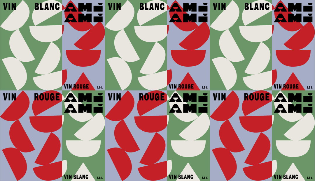
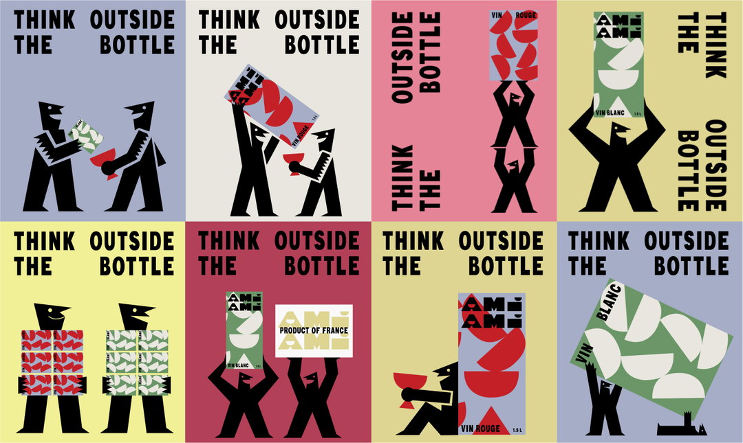
There are plenty of brands delivering fun, illustrated box and can-based wine – Bowl Grabber comes to mind as one serious contender immediately. Though, Wedge has managed to fuse playful, approachable graphics with a refined timelessness. Much of this comes from one of the studio’s main sources of inspiration on the project: Fortunato Depero, the Italian painter, artist and graphic designer known for creating the iconic cone bottle for Campari Soda, and pushing futurism into branding and beyond. Wedge returns to Depero’s signature paper cut style via Ami Ami, particularly in the illustrated characters that appear throughout.
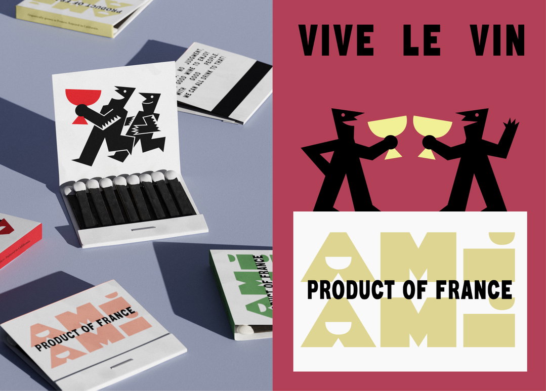
Wedge: Ami Ami (Copyright © Wedge, 2023)
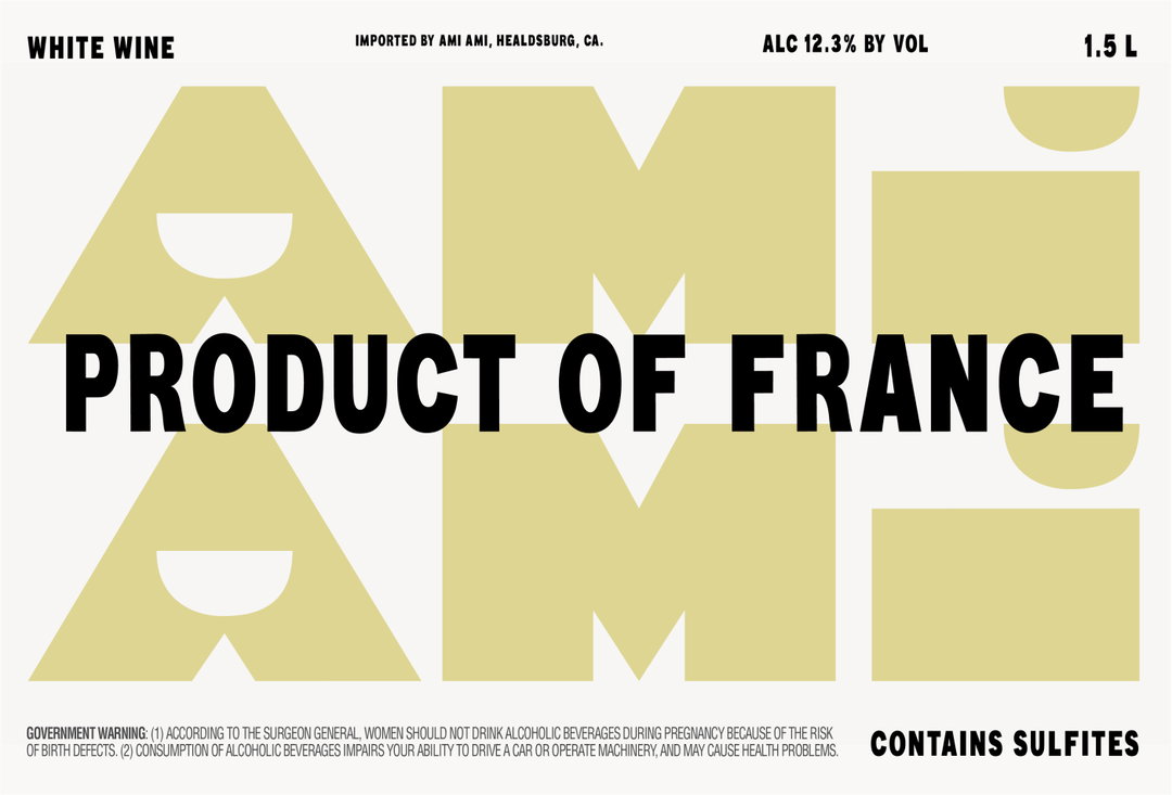
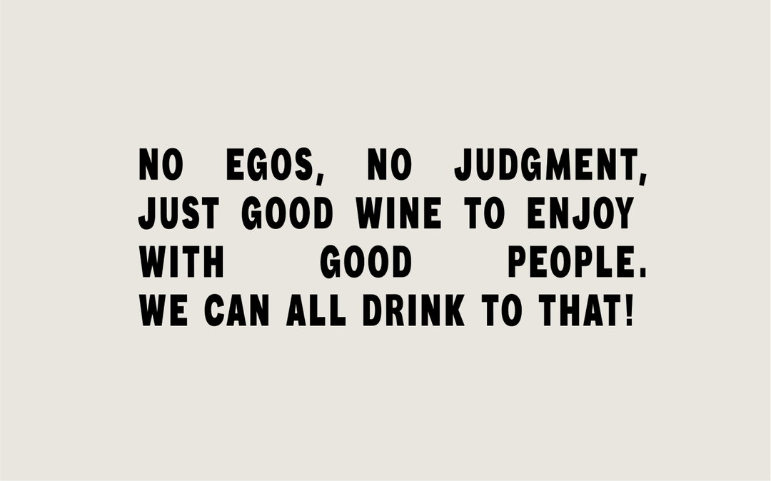
Wedge also introduces a typeface, designed in-house, that works wonders to flip the assumption that boxed wine isn’t authentic, without fighting to appear too fussy. Based on Vin de France imprints you might find on vintage wooden wine crates, Ami Ami Vin Bold harks to a more functional heritage.
Ami Ami’s packaging is half the size of typical boxed wine, “to create a charming impact on the shelf, portability from dinner party to picnic, and irresistible cuteness”, the studio explains in a press release. Other fun details include a cup pattern on packaging to “gently indicate” the amount of glasses contained in each box (10 in total). The cup motif extends to the logomark, which has been designed especially to fit the panel of the smaller box.
GalleryWedge: Ami Ami (Copyright © Wedge, 2023)
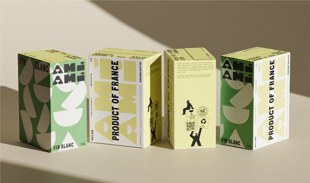

Hero Header
Wedge: Ami Ami (Copyright © Wedge, 2023)
Share Article
Further Info
About the Author
—
Liz (she/they) is the senior editor at Insights, a research-driven department within It’s Nice That. They previously ran the news section of the website. Get in contact with them for potential Insights collaborations or to discuss Insights’ public-facing reports.