Launch Recite Me assistive technology

Wolff Olins rebrands Vonage, bringing “quirk” to boring B2B branding
—
Date
18 November 2019
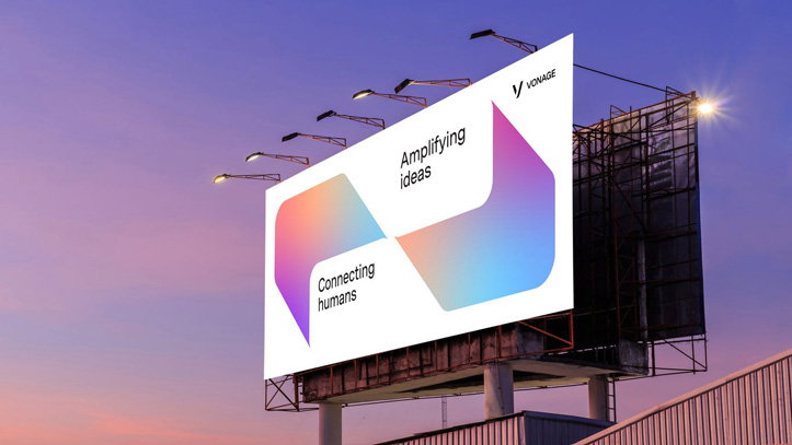
A large billboard against a purple and orange sunset sky. The white advertisement for Vonage features two colourful, abstract shapes and the text “Amplifying ideas” and “Connecting humans”.
Above

Wolff Olins: Vonage rebrand

Design agency Wolff Olins has rebranded telecommunications company Vonage, a company that thrived in the early 2000s and became known for its offbeat tone of voice. After the decline of the home phone market, it became a B2B company, yet when Wolff Olins was brought in to rebrand, it wanted to be careful to avoid the tropes of branding in this sphere. As a result, Vonage’s new visual identity centres around a bold, gradient colour palette and charming illustrations and icons, standing out in a corporate environment.

The visual language was designed to “flex across the tech space and into the hearts and mind of developers,” says a statement from the agency. “Rich gradients challenge the more static colourspace of the industry, and the illustration style and verbal identity brings to life the quirk and irreverence that made Vonage memorable in the past. All of it works together to create an experience that’s as delightful as it is helpful.”

Jan Eumann, creative director at Wolff Olins, says whether you’re designing for consumer-facing or corporate-facing brands, your audience – at the end of the day – are people, so it shouldn’t make a difference. “These audiences bring their personal selves to work, with visual patterns and product experiences they’ve learned from brands and apps used daily in their private lives,” he says. So, he continues, “there’s no point in creating ‘corporate’ or sterile looking brands for environments in which businesses operate.”

This ethos led to a conversational and friendly tone of voice for the brand, seen in its photography, illustration, copywriting and even colour choice. The new brand also brings together eight separate businesses under one identity.
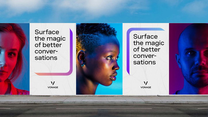
A series of billboards along a roadside feature close-up portraits of three people lit in blue and red tones. Interspersed between the portraits, white panels read “Surface the magic of better conversations” above the Vonage logo.
Above

Wolff Olins: Vonage rebrand

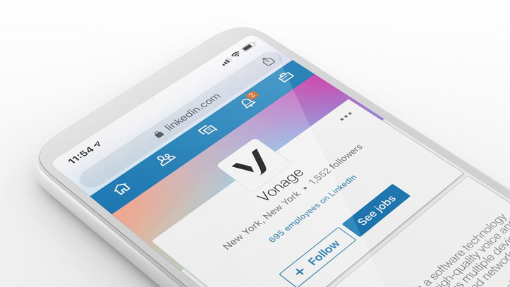
A 3D render of a smartphone displaying a LinkedIn company page for “Vonage”. The screen shows the company logo, its location in New York, and a blue “See jobs” button.
Above

Wolff Olins: Vonage rebrand

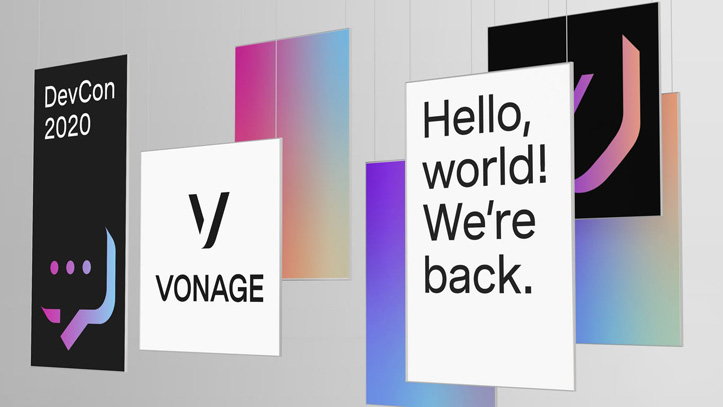
A series of rectangular banners hang against a grey background. One reads “DevCon 2020”, another shows the Vonage logo, and a third reads “Hello, world! We’re back.”
Above

Wolff Olins: Vonage rebrand

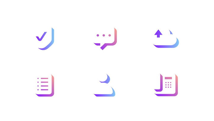
A set of six minimalist 3D icons in purple and blue gradients on a white background. The icons represent a checkmark, a speech bubble, a cloud upload, a list, a curved shape, and a document.
Above

Wolff Olins: Vonage rebrand

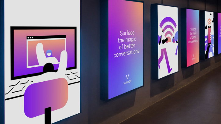
A row of vertical digital screens displays colourful graphics and text in a dark corridor. One screen reads “Surface the magic of better conversations” above the Vonage logo.
Above

Wolff Olins: Vonage rebrand

An isometric 3D render of a stylised landscape on floating purple and pink platforms. The scene features a large white letter “A”, a cluster of rounded trees, and a group of minimalist city buildings.
Above

Wolff Olins: Vonage rebrand

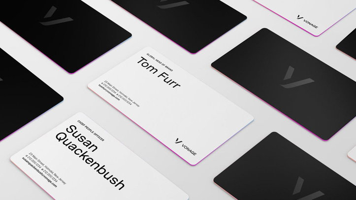
A collection of business cards for Vonage, some in white and some in black. The white cards feature the names “Tom Furr” and “Susan Quackenbush” in bold black type.
Above

Wolff Olins: Vonage rebrand

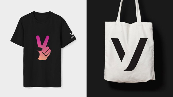
A black T-shirt features a pink and orange gradient illustration of a hand making a peace sign. Beside it, a white tote bag displays a large, black “V” logo.
Above

Wolff Olins: Vonage rebrand

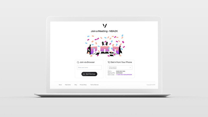
A laptop displays a meeting join page with the headline “Join a Meeting - NBA2K”. An illustration shows several computer screens surrounded by colourful confetti.
Above

Wolff Olins: Vonage rebrand

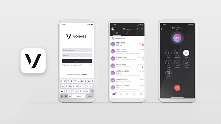
A 3D render of three smartphones displaying the Vonage app interface. The screens show a login page, a messages list and an active call screen.
Above

Wolff Olins: Vonage rebrand

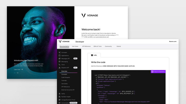
A series of screens for the Vonage developer platform. One shows a close-up of a person’s face lit in blue and purple, with the headline “Introducing the Dispatch API”. Another screen displays a code snippet for the API against a dark background.
Above

Wolff Olins: Vonage rebrand

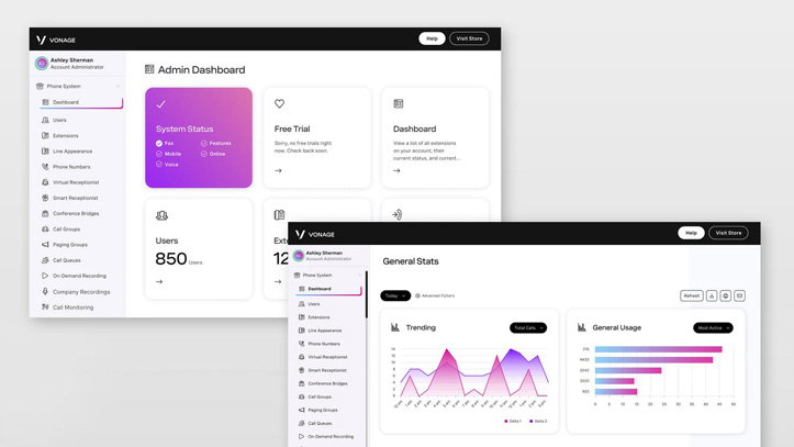
Two screens showing the user interface for a Vonage admin dashboard. The layout features a dark sidebar and a clean white workspace with data widgets, including a “System Status” card in purple and pink.
Above

Wolff Olins: Vonage rebrand

Share Article

Further Info

About the Author

Jenny Brewer

—

Jenny oversees editorial output across It’s Nice That. Get in touch with writing pitches for features or opinion pieces, big creative story tips, or questions about all things editorial. [email protected]

To submit your work to be featured on the site, please see our Submissions Guide.

It's Nice That Newsletters

Fancy a bit of It's Nice That in your inbox? Sign up to our newsletters and we'll keep you in the loop with everything good going on in the creative world.