




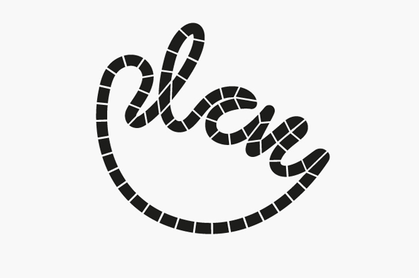
Graphic Design: Bedow create an identity that can be used as a board game
This is now the fifth time we’ve featured Swedish studio Bedow’s work on the site. First it was for thermosensitive beer labels that changed design according to their temperature, then for some incredibly tasteful cosmetics packaging. Next there was the book about hand-carved spoons and then finally this record label identity.
All of these projects show an attention to detail that’s become de rigeur for Bedow. While some studios like to be shouty about their work these guys are content to keep creating simple, thoughtful, practical design that’s easy to engage with and comfortable to have around.
They’re happy to work for a good cause too. This recent project is for an Indian children’s charity that provides quality toys and games to under-privileged children. How do they communicate the brand’s ethos throughout their identity? With a logo that can be used as both board game and colouring-in book of course, thereby producing a product that can be appreciated by children and adults alike. Who says design for kids can’t be exciting too?
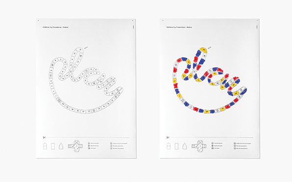
Bedow: Play
Bedow: Play
Bedow: Play
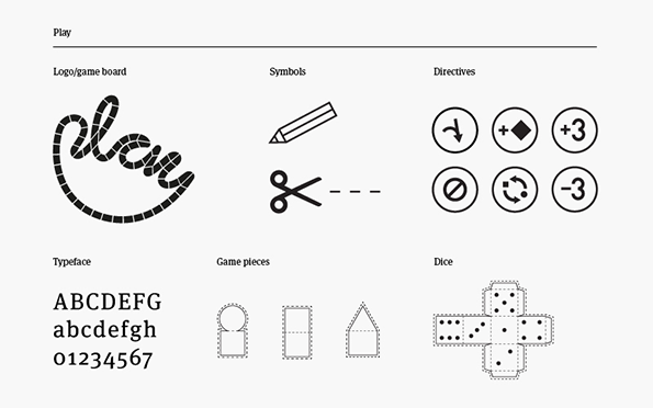
Bedow: Play
Share Article
Further Info
About the Author
—
James started out as an intern in 2011 and came back in summer of 2012 to work online and latterly as Print Editor, before leaving in May 2015.

