Comma Type’s CMM Coda epitomises the influence of women in code
From designer Anna Cairns, the workhorse monospace typeface is rooted in feminist theory.
Comma Type is a new foundry founded by the Berlin-based type designer Anna Cairns. The designer sees it‘s launch as an opportunity to independently publish typefaces and explore her personal practice – challenging industry expectations and technologies through distinctly curious, ultra-considered type.
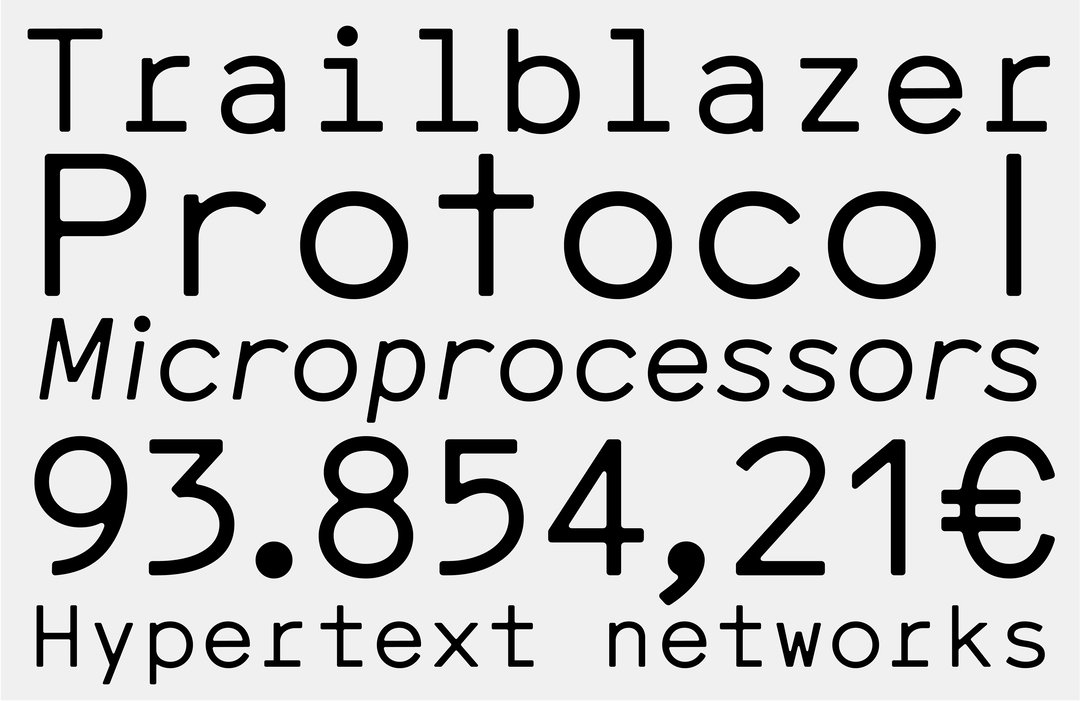
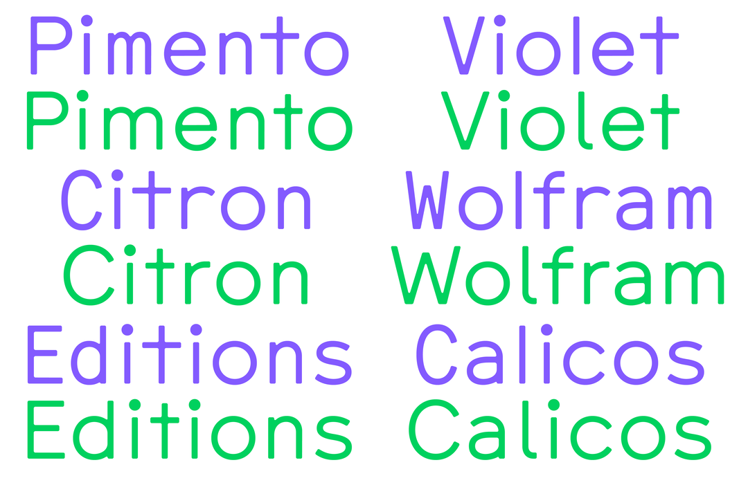
Typography wasn’t always Anna’s focus; she initially specialised in the incorporation of web and graphic design. “Over time, type design – almost stealthily – became part of my practice as well, and is slowly causing my professional focus to shift,” Ann says. Making typefaces is all about building systems,” she adds (having worked with code from a very young age), “this probably also explains my penchant for monospaced type.” Living up to expectation, Comma Type has released CMM Coda, a mighty and mellow monospace typeface that – albeit friendly and accessible with soft, rounded edges – has a stringent and rigorous creative context.
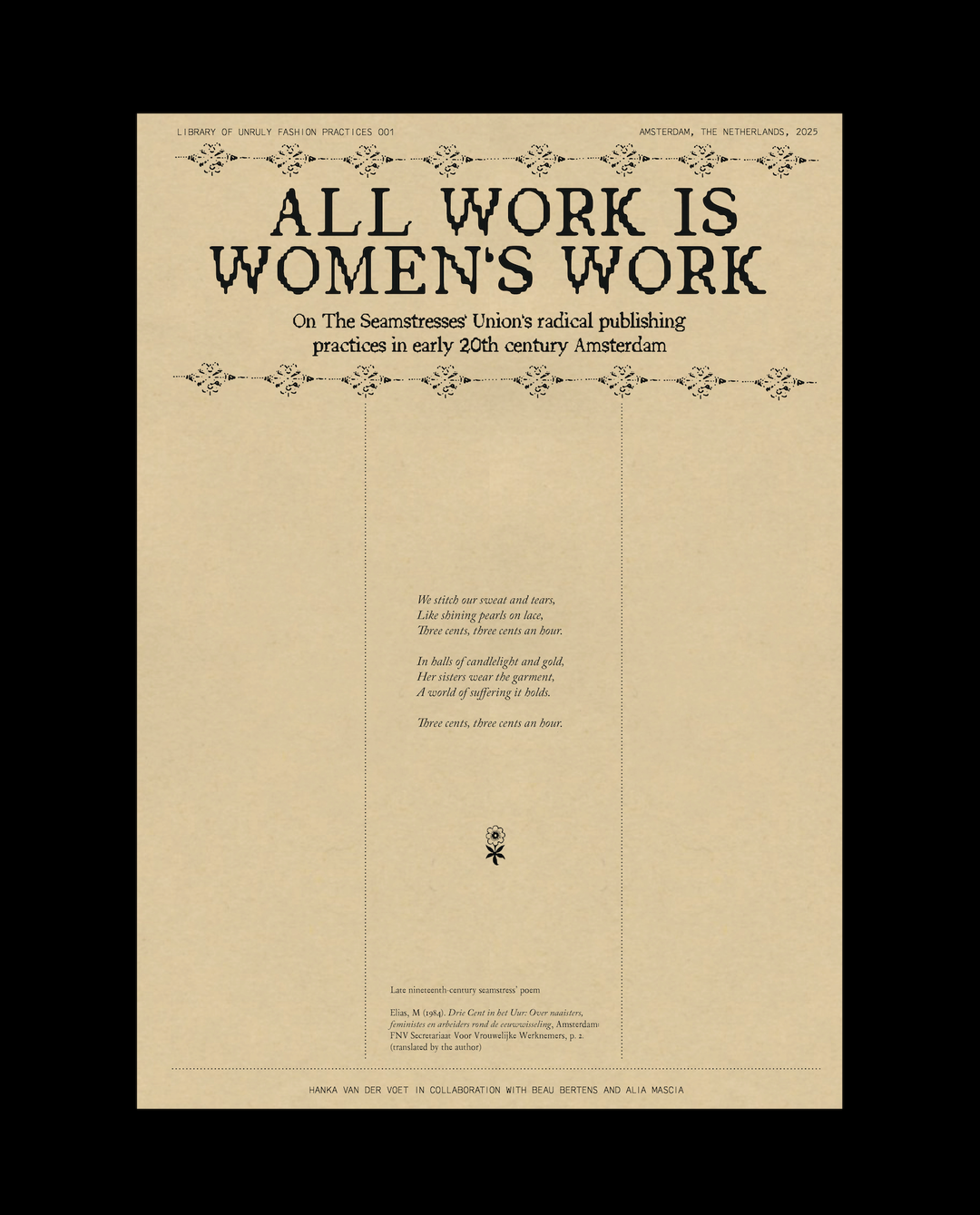
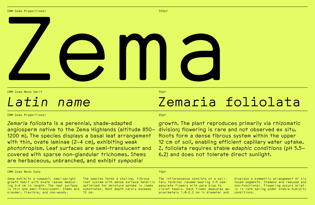
The type family, hardworking in its structure – with Mono Sans, Mono Serif and Proportional styles – grew from a collaboration with artist Katrin Mayer, who initiated the c0da project in which the typeface was designed. Across the research and publishing platform, c0da champions artists and writers that meditate on the history, influence and artistry of women in code, tying the project to rigorous feminist theory. After all, the history of code is intrinsically tied to women, with women being the first software engineers and the industry offering women careers in the 19th century. “Interestingly, both ‘typewriter’ and ‘computer’ were once terms to describe the female workforce operating the machines,” Anna writes on the subject, “CMM Coda draws a conceptual and typographic connection between the notions of typing, coding and writing.”
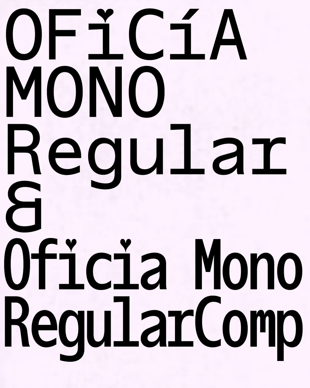
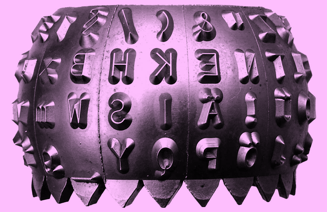
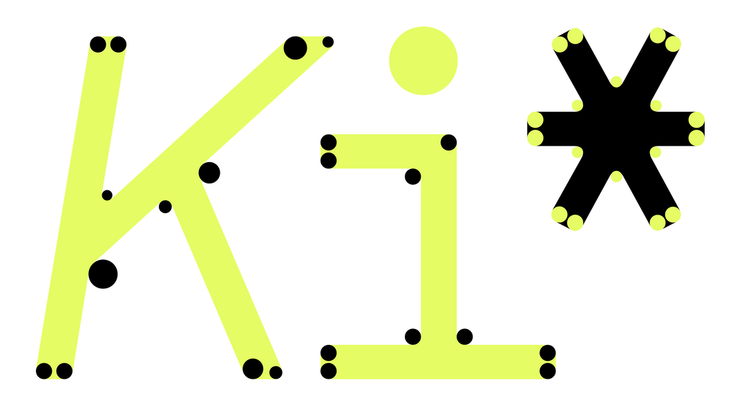
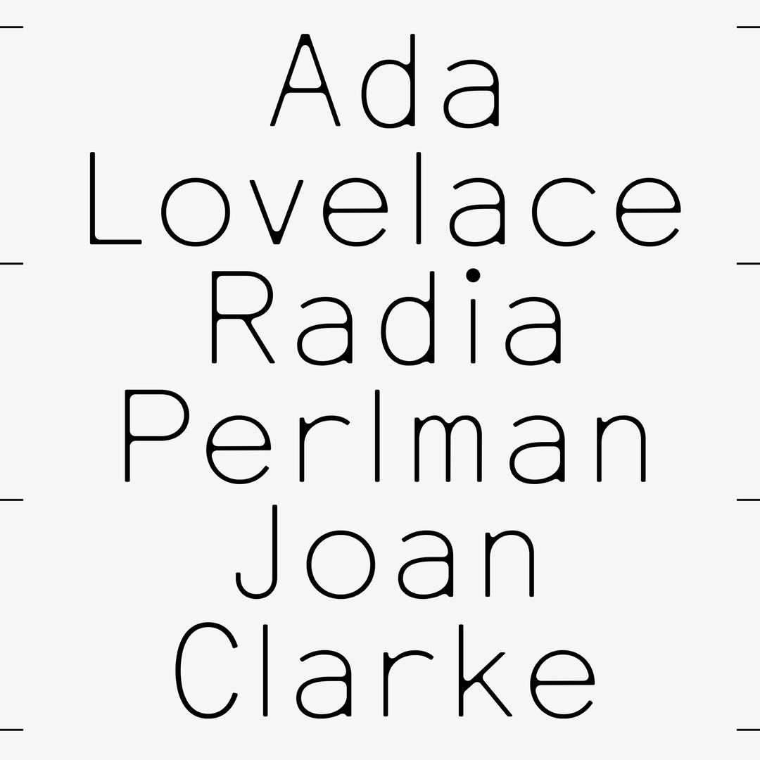
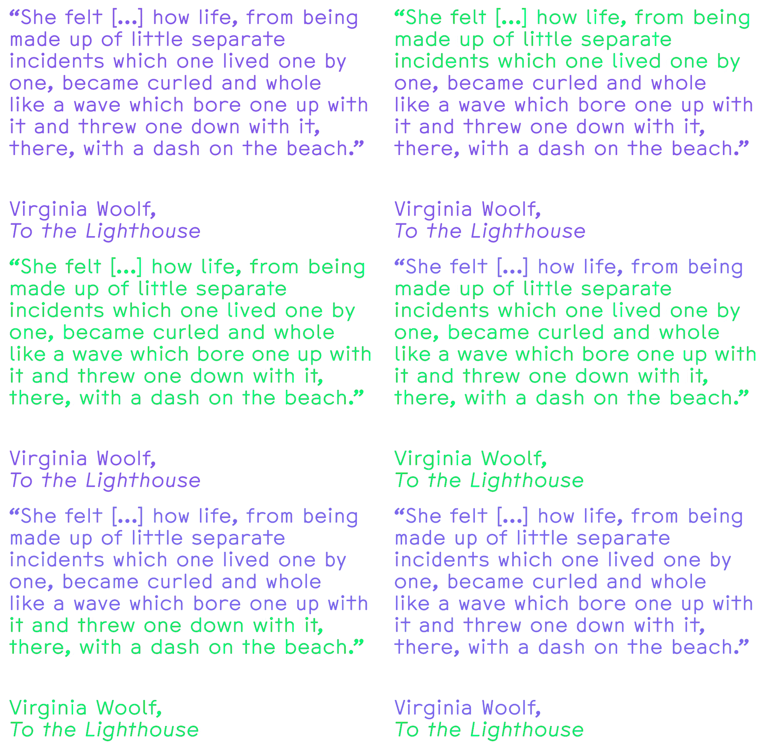
Across CMM Coda’s subtly imperfect, analogue-inspired letterforms – based on the IBM Selectric typewriter’s typeface, Dual Basic – Anna practically and conceptually brings together the feminist legacy of software and typewriters with the aesthetic sensibilities of the genre associated with the industry. Additionally, CMM Coda enables Anna to explore her intrigue in the blurry terminology used in text production, such as typing, coding and writing, “especially now that most text is created digitally,” Anna says, with typefaces being software in their own right. “We also associate a certain look with each of these modalities,” she continues, “so my idea was to create a typeface that can jump all of these genres simply through a play with white space,” an approach that resulted in CMM Coda’s multiple styles.
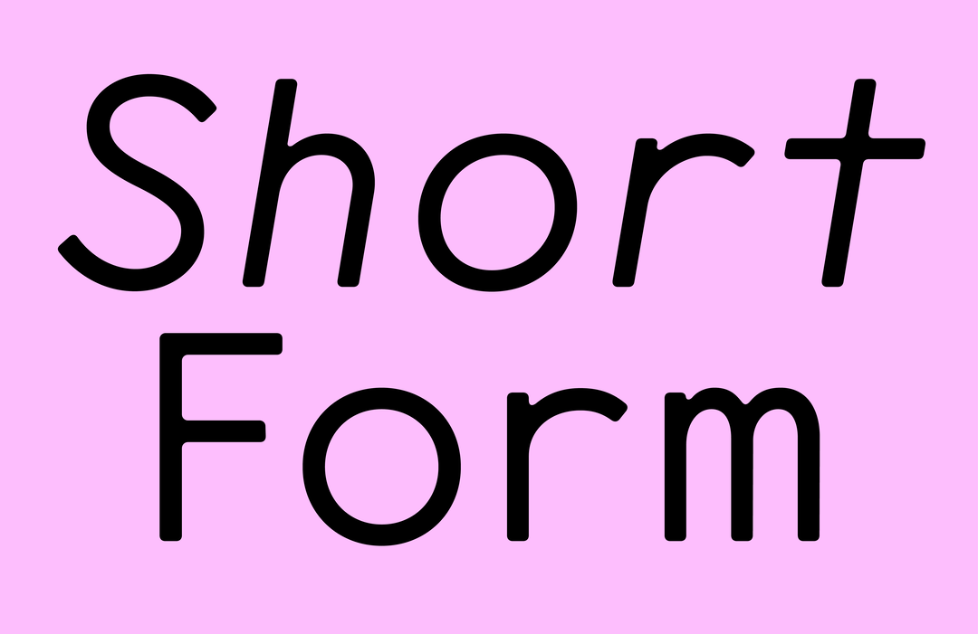
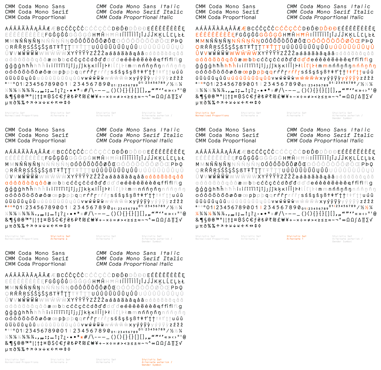
“Mono Sans is most closely related to the historical typewriter source Dual Basic,” Anna explains, designing the letterforms to deliberately not fill the entire space available. “This leads to a slightly clumsy but charming rhythm,” she continues, whilst, in contrast, its Proportional style removes this white space, streamlining its visual rhythm and ultimately optimising it for body copy. That said, it still retains some of its letterform distortions, such as M/m or W/w, making for some distinctive, atypical letters. “There are also lots of letter alternates where these distortions are normalised,” alongside more conventional forms. Anna ends, “this way, the typeface can also be styled as a regular text typeface with super smooth legibility,” as well as distinctly the unconventional monospace – odd, precise and profound in equal measure.
GalleryComma Type: CMM Coda (Copyright © Comma Type, 2025)
Hero Header
Comma Type: CMM Coda (Copyright © Comma Type, 2025)
Share Article
About the Author
—
Hailing from the West Midlands, and having originally joined It’s Nice That as an editorial assistant in March 2020, Harry is a freelance writer and designer – running his own independent practice, as well as being one-half of the Studio Ground Floor.