Conran Design Group rebrands with help of Le Monde type designer Jean François Porchez
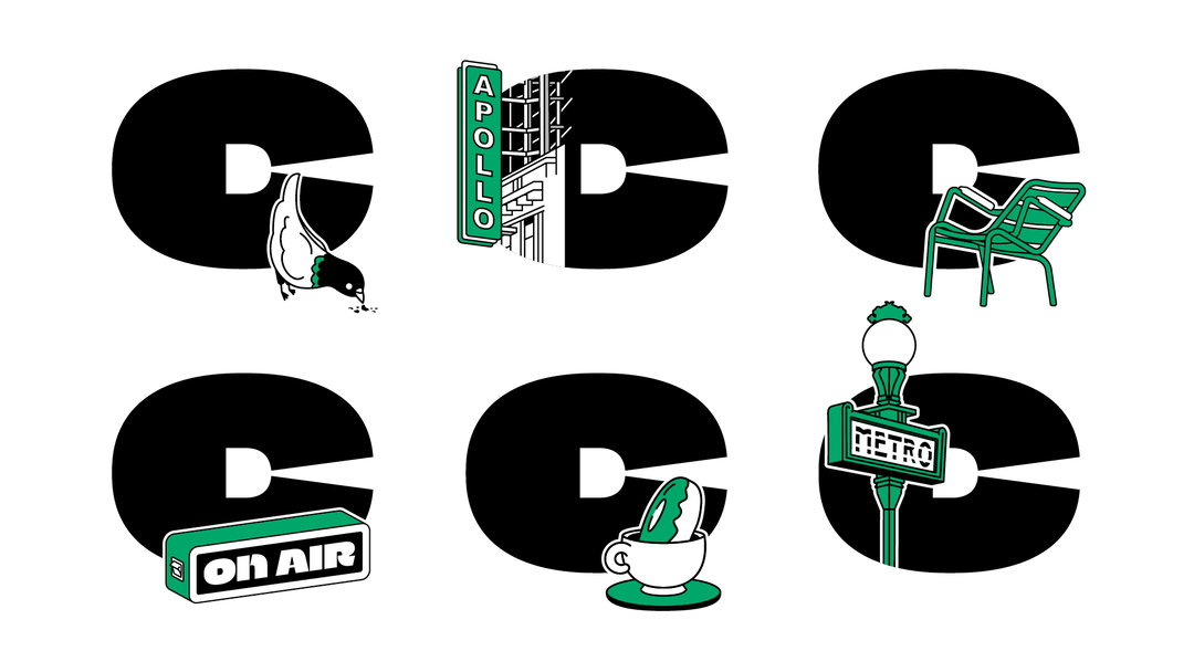
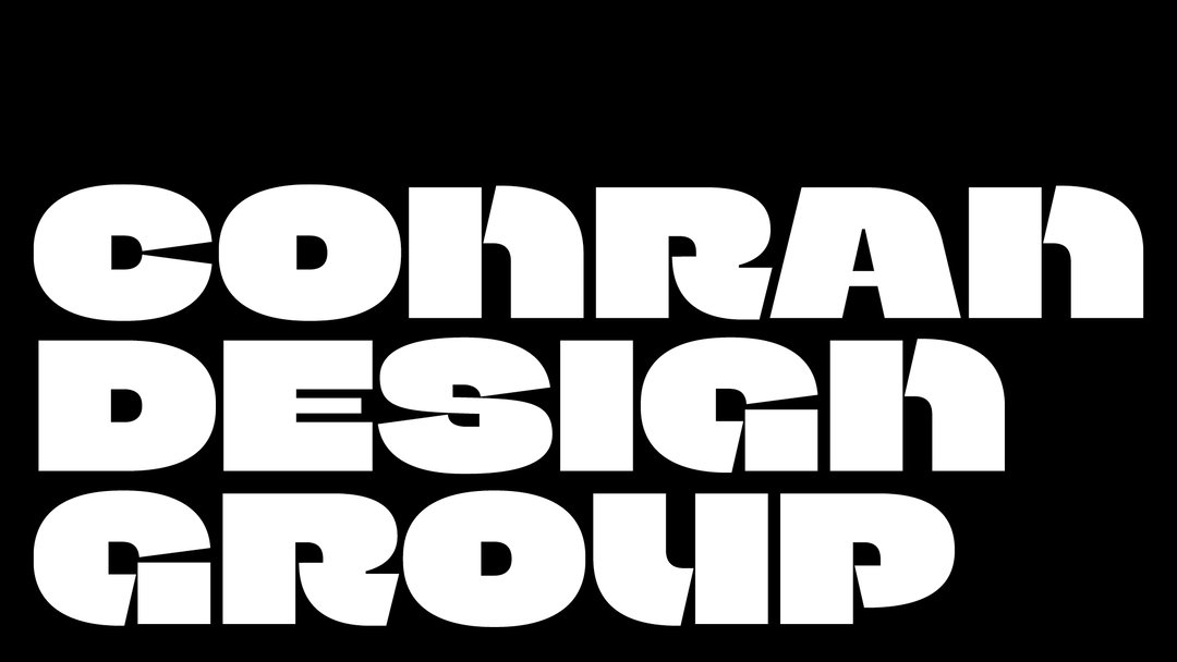
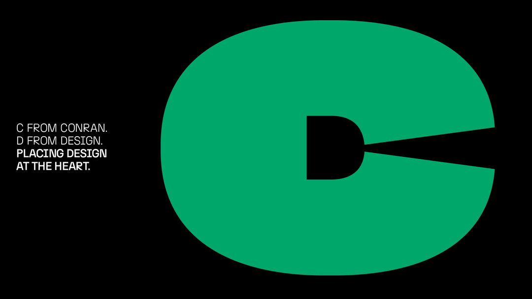
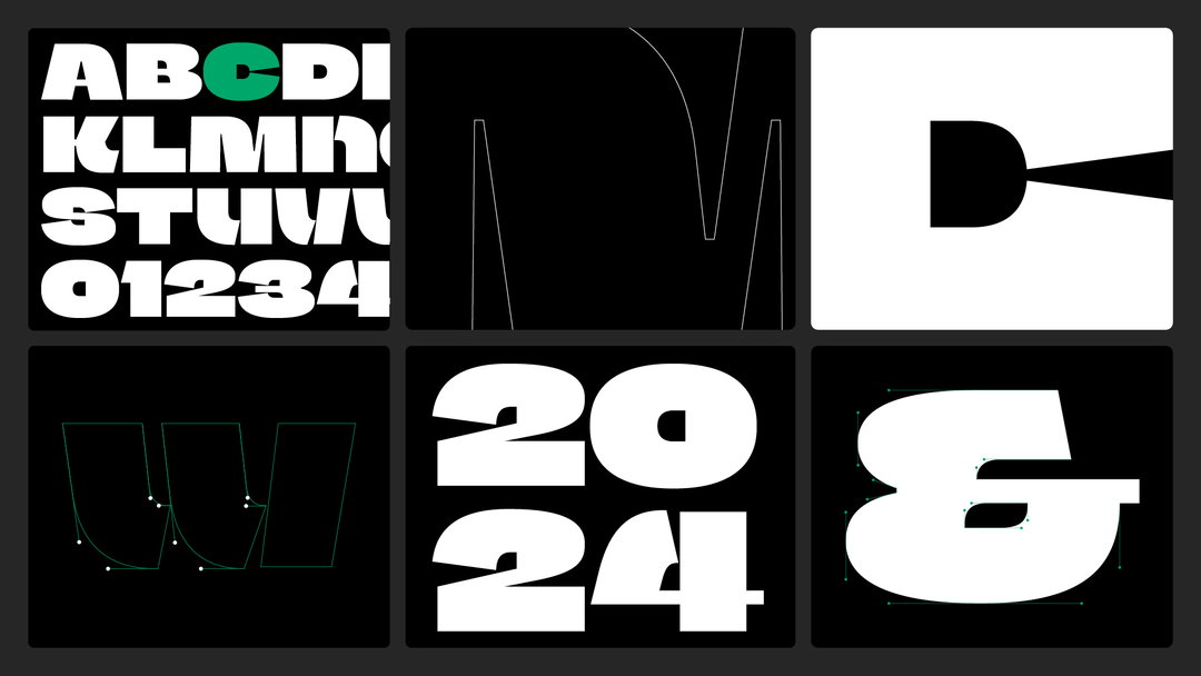
A chunky new marque and typeface has been introduced which swaps all counterforms for Ds (standing for design).
Founded over 60 years ago by Sir Terence Conran, Conran Design Group has undergone a design revamp as it becomes Havas’ brand and design network, with W Conran Design as founding partners. The new identity looks a lot more personable, or what many agencies would call more ‘human’. The focal point is a logo by French type designer Jean François Porchez, featuring a very chunky ‘C’ – so chunky that the aperture is nail-bitingly close to closing completely. A ‘D’ is hidden in the centre of the form, which stands for design.
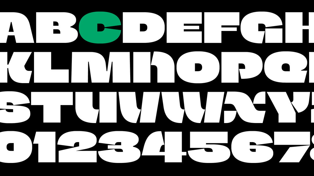
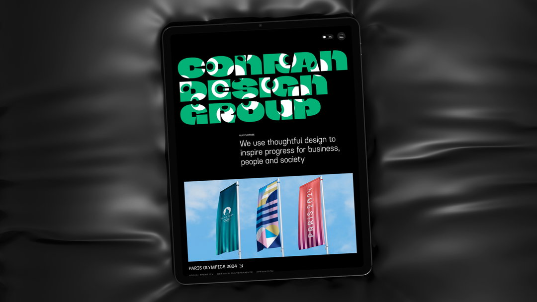
A wider brand typeface has been built out from this single letterform. W Conran Design’s ECD Paul Groves says: “With such a strong typographic style, we then thought it would be interesting to go beyond the wordmark and create an alphabet that could be used for key words like ‘inspire’, ‘design’, ‘progress’.” Jean François also contributed this corresponding brand typeface.
Jean François is known for a few high-profile custom fonts. He was type director at Le Monde in the early 90s, coming up with a bespoke typeface family for the daily French newspaper; Emmanuel Macron has also used his typefaces for communication since 2017. More recently, Jean François and W Conran Design worked together on the custom font for the French Olympics and Paralympic teams for the upcoming Games.
“We’ve always been passionate about creating original customised font designs for our clients, so it was natural to take this direction for our own brand,” says Paul. “The brand needed to feel big, bold and playful. Strong-minded but joyful and optimistic at the same time.”
Conran Design Group / Jean François Porchez: Conran Design Group rebrand (Copyright © Conran Design Group, 2024)
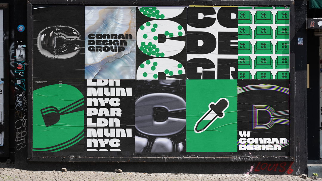
The illustrations and 3D renderings of the logomark both play into that elevated sense of fun that brands and agencies alike are trying to bottle right now. “Illustration felt like a natural way to augment our iconic new symbol – through 3D animated ‘idents’ that reflect our varied creative approach, or as single-colour, playful illustrations that bring personality to our studio environments,” says Conran Design Group ECD Lee Hoddy.
Some of the renderings, like the wandering eyeball, feel similar to existing design names, like AIGA Eye on Design. But generally the ‘D’ counterforms feel like a subtle way to bring variety to a rounded typeface.
GalleryConran Design Group / Jean François Porchez: Conran Design Group rebrand (Copyright © Conran Design Group, 2024)
Hero Header
Conran Design Group / Jean François Porchez: Conran Design Group rebrand (Copyright © Conran Design Group, 2024)
Share Article
Further Info
About the Author
—
Liz (she/they) is the senior editor at Insights, a research-driven department within It’s Nice That. They previously ran the news section of the website. Get in contact with them for potential Insights collaborations or to discuss Insights’ public-facing reports.