Launch Recite Me assistive technology
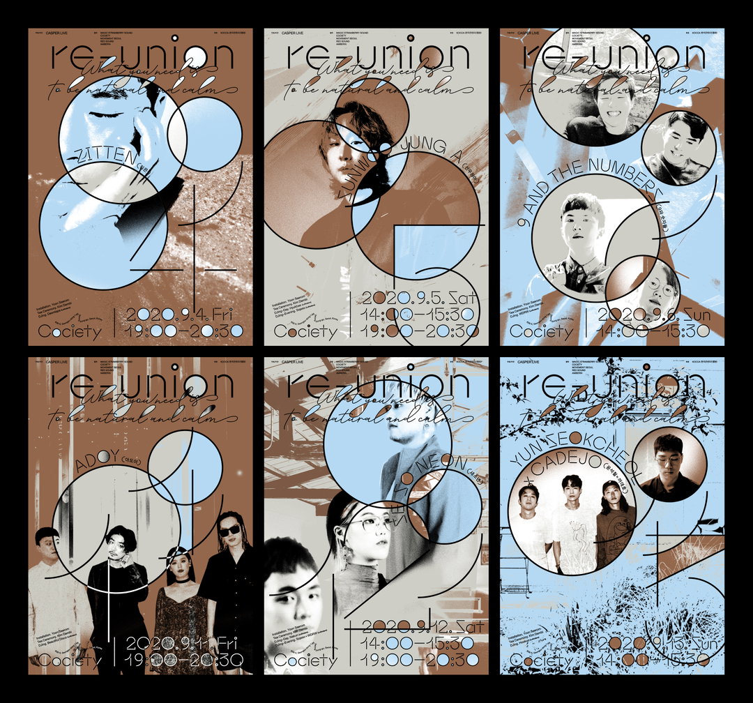
A grid of six event posters for “re-union”, each featuring a different musical act. The designs use a consistent layout of overlapping circles, thin lines, and a muted colour palette of blue, beige and brown.

From large-scale installations to pocketable publications: Studio DDBBMM tackles briefs of every size

With great taste in typography and a knack for all the fun and tactile elements of graphic design, this studio is leaning into analogue approaches.

—
Date
9 January 2025

DDBBMM, the shared design practice of Lee Yunho and Kim Kangin, has executed a whole range of creative projects for the likes of Google and Wieden+Kennedy Tokyo as well as large cultural institutions such as The National Theatre of Korea. From the studio’s beginnings in 2013, it’s tackled just about everything; from large-scale installations to pocketable publications and stationery — be sure to take a look at their series of calendar rulers (a wonderful invention that we didn’t know we needed).

Always working with precision and a curiosity toward materials, something that coloured the pair’s collaborative work together over the years is their keen interest in, and love for typography; as evidenced in their recent postgraduate studies, where Kangin’s final project focused on “rubber stamps and self printing” and Yunho spent his time playing with “poetry and typography”. This typographic interest always finds its way into print for the pair, and is often something they feel is “a particular strength”.

When it comes to where the duo find their creative inspiration, like many of us coming into the new year, the studio have made a resolution to “let their interests lead into studio work” – which for them, means committing a bit more time to tinkering away at things that don’t sit on a screen. So, the pair have recently set up a small workshop space in the corner of their Seoul-based studio dedicated to making and experimenting, with future hopes to hold events and exhibitions in the space based off their more free-flowing research.
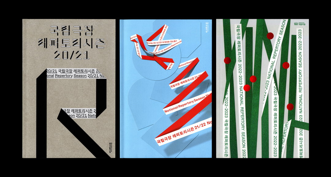
Three graphic design layouts for the National Repertory Season. The first is a grey cover with bold black typography and a large, cropped letter “R”. The second is a light blue composition with red diagonal strips of text. The third features green vertical bands and red circles over a white background.
Above

DDBBMM: National Repertory Season (Copyright © DDBBMM 2020 - 2022)
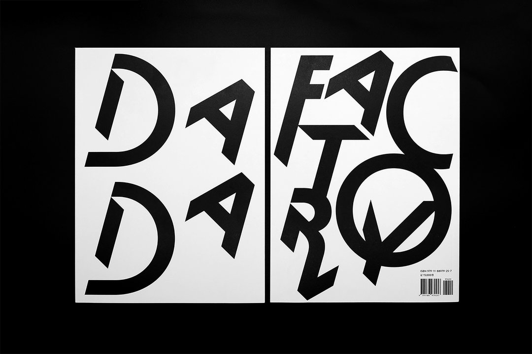
Two white book covers with bold, black typographic designs against a black background. The letters are fragmented and rearranged to spell “Dada” and “Factory”.
Above

DDBBMM: DADA FACTORY (Copyright © DDBBMM, 2019)
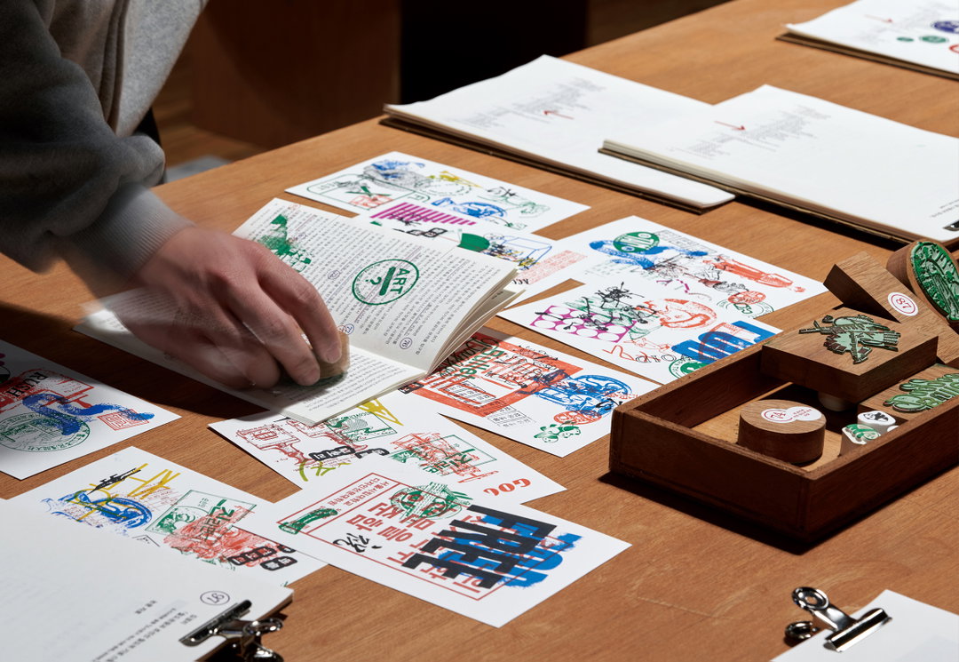
A person uses a small stamp on the pages of an open book. The wooden table is covered in stamped prints and a wooden box containing various stamp blocks.
Above

DDBBMM: Kangin’s Graduate Study (Copyright © DDBBMM, 2023)
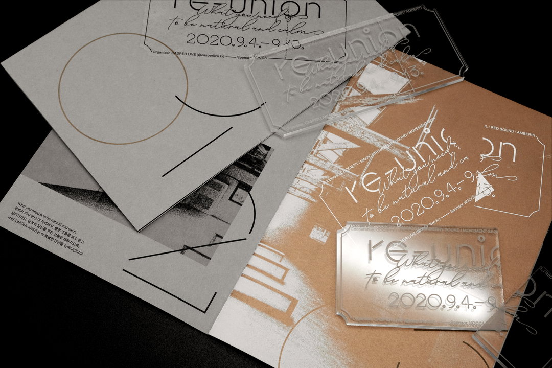
A collection of stationery and acrylic blocks featuring the branding for “Re:union”. The minimalist design includes the date “2020.9.4.–9.5.” and the phrase “What you need to be natural and calm”.
Above

DDBBMM: Re-Union (Copyright © DDBBMM, 2020)
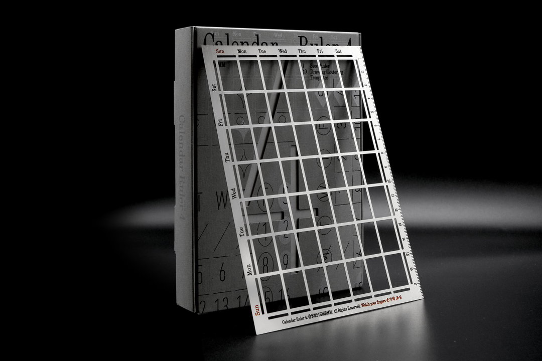
A white cardboard box stands beside a transparent plastic ruler. The ruler is printed with a calendar grid and the words “Calendar Ruler 4”.
Above

DDBBMM: Calendar Ruler 4 (Copyright © DDBBMM, 2022)
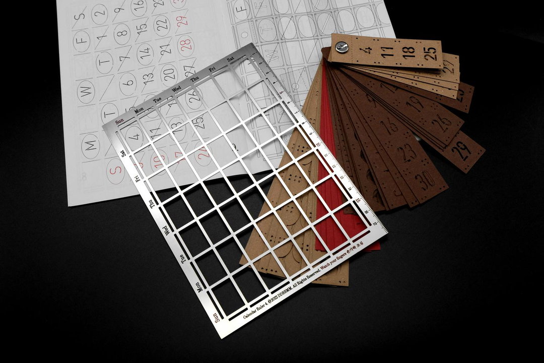
A metal grid ruler lies across a printed calendar page and a fan of brown leather date strips. The ruler features a grid of squares and labels for the days of the week.
Above

DDBBMM: Calendar Ruler 4 (Copyright © DDBBMM, 2022)
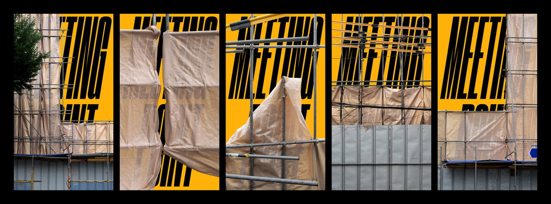
A series of five vertical photographs showing close-ups of scaffolding and beige plastic sheeting against a bright yellow background. Bold black typography is layered behind the construction materials, reading “MEETING POINT”.
Above

DDBBMM: Meeting point (Copyright © DDBBMM, 2022)
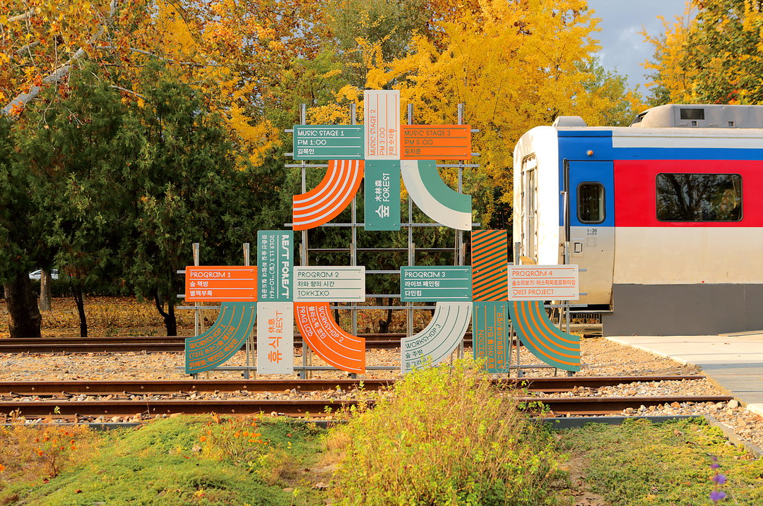
A colourful installation of geometric signs and panels stands beside a railway track. The signs feature Korean text and abstract shapes in orange, green and blue, set against a backdrop of autumn trees and a white and red train.
Above

DDBBMM: Rest Forest (Copyright © DDBBMM, 2019)
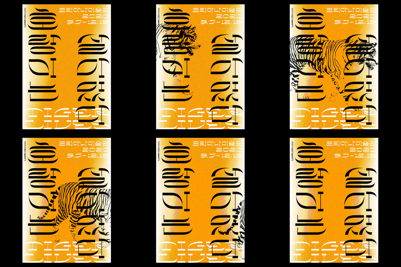
An animation of a graphic poster in orange, white and black, featuring bold Korean typography and a tiger that moves behind the text. The top right reads “2020 9.7–12.19” and the left edge includes the text “space C”.
Above

DDBBMM: Tiger Lives (Copyright © DDBBMM, 2020)
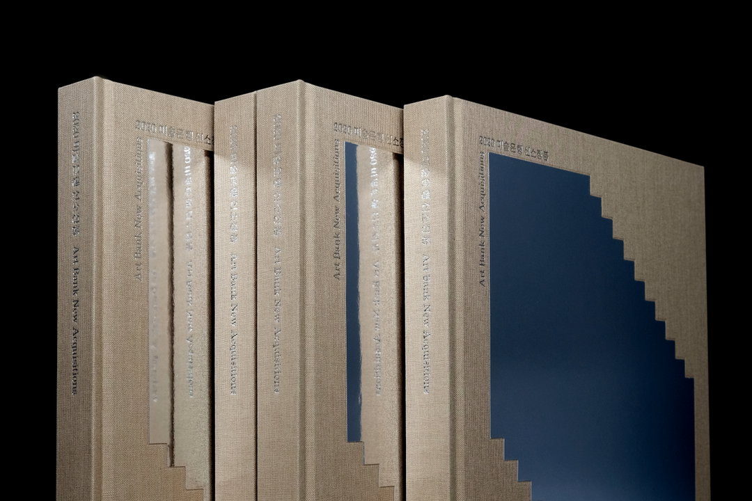
Three beige cloth-bound books stand side by side against a black background. The spines and covers feature the text “Art Bank New Acquisitions” and Korean characters.
Above

DDBBMM: Art Bank New Acquisitions (Copyright © DDBBMM, 2021)
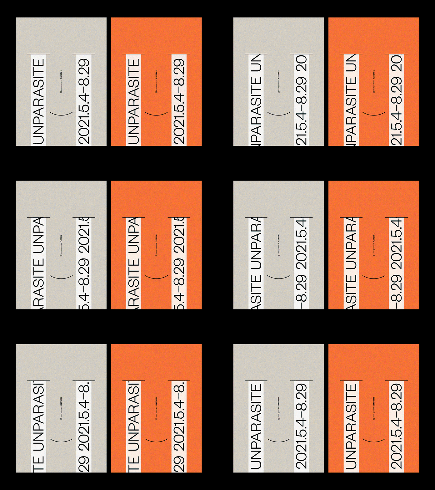
An animation of two side-by-side posters, one in grey and one in orange. Vertical white strips of text containing “UNPARASITE” and the date “2021.5.4–8.29” slide upwards.
Above

DDBBMM: Unparasite (Copyright © DDBBMM, 2021)
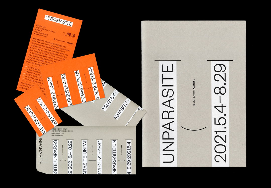
A grey notebook sits beside a collection of orange and white tickets and pamphlets. The notebook cover features the word “UNPARASITE” and the date “2021.5.4-8.29” in bold, vertical typography.
Above

DDBBMM: Unparasite (Copyright © DDBBMM, 2021)
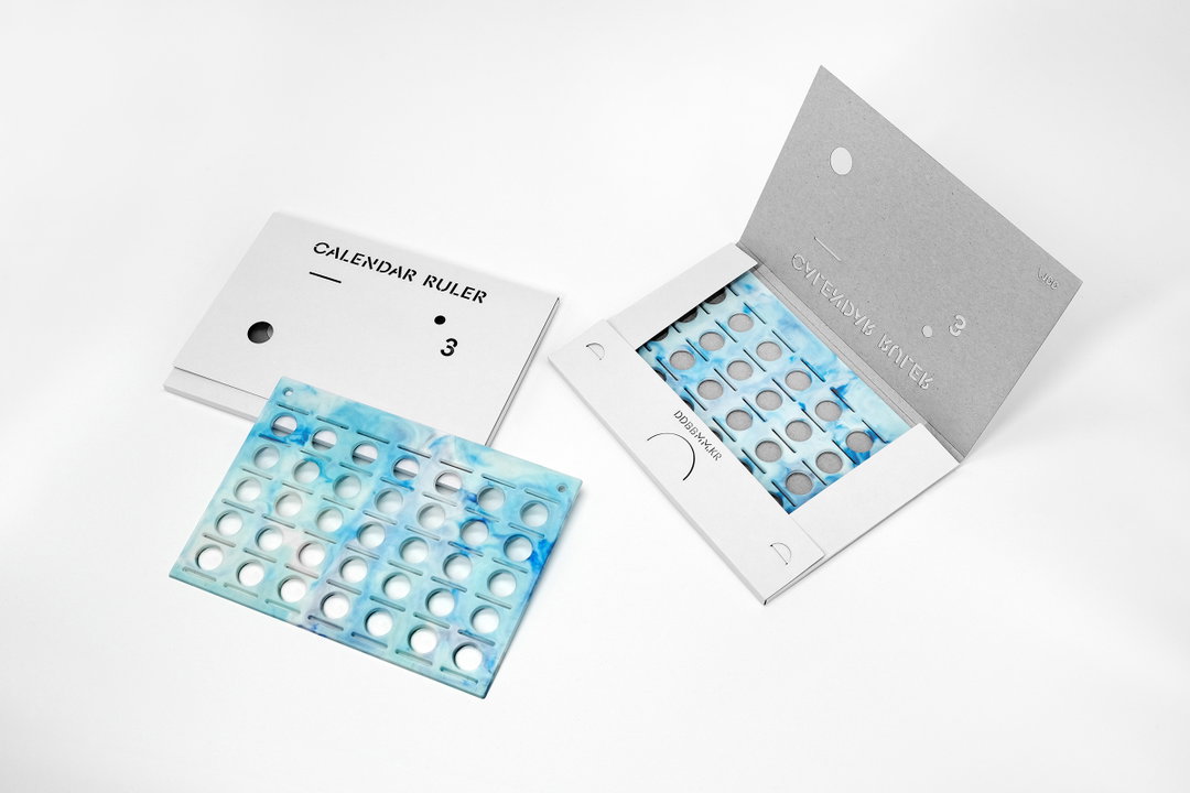
A blue and white marbled acrylic calendar ruler sits beside its grey cardboard packaging. The cover of the packaging reads “CALENDAR RULER” and features the number “3”.
Above

DDBBMM: Calendar Ruler 3 (Copyright © DDBBMM, 2021)

Hero Header

DDBBMM: Re-Union (Copyright © DDBBMM, 2020)

Share Article

About the Author

Ellis Tree

—

Ellis Tree (she/her) is a staff writer at It’s Nice That. She joined as a junior writer in April 2024 after graduating from Kingston School of Art with a degree in Graphic Design. Across her research, writing and visual work she has a particular interest in printmaking, self-publishing and expanded approaches to photography. ert@itsnicethat.com

To submit your work to be featured on the site, see our Submissions Guide.

It's Nice That Newsletters

Fancy a bit of It's Nice That in your inbox? Sign up to our newsletters and we'll keep you in the loop with everything good going on in the creative world.