Design studio Requena uses colour as a vehicle for concept
It’s easy to use colour; it’s harder to use it well. Spanish design studio Requena has got it down to a fine art.
Barcelona-based design studio Requena was founded by Spanish designer Andres Requena in 2014 after he had spent many years working for other agencies and studios. Andres believed that “the time had come to do more of what I wanted to do and, more specifically, less of what I didn’t want to do.” At this point in his career, he had come to the realisation that the best decisions were often the decisions not to do something, to say “no” to work that didn’t fit the bill. He goes on: “After some time, saying ‘no’ led to more ‘yes’.” His desire to be selective gave him the space to take on better projects and more of them. Evidently, it also gave him a keen eye for promising collaborations, ideal clients, and exciting opportunities. These days, Requena’s portfolio is bursting with work that feels uniquely its own, with most of it characterised by vibrant colour palettes, playful letter forms, and endearing character designs.
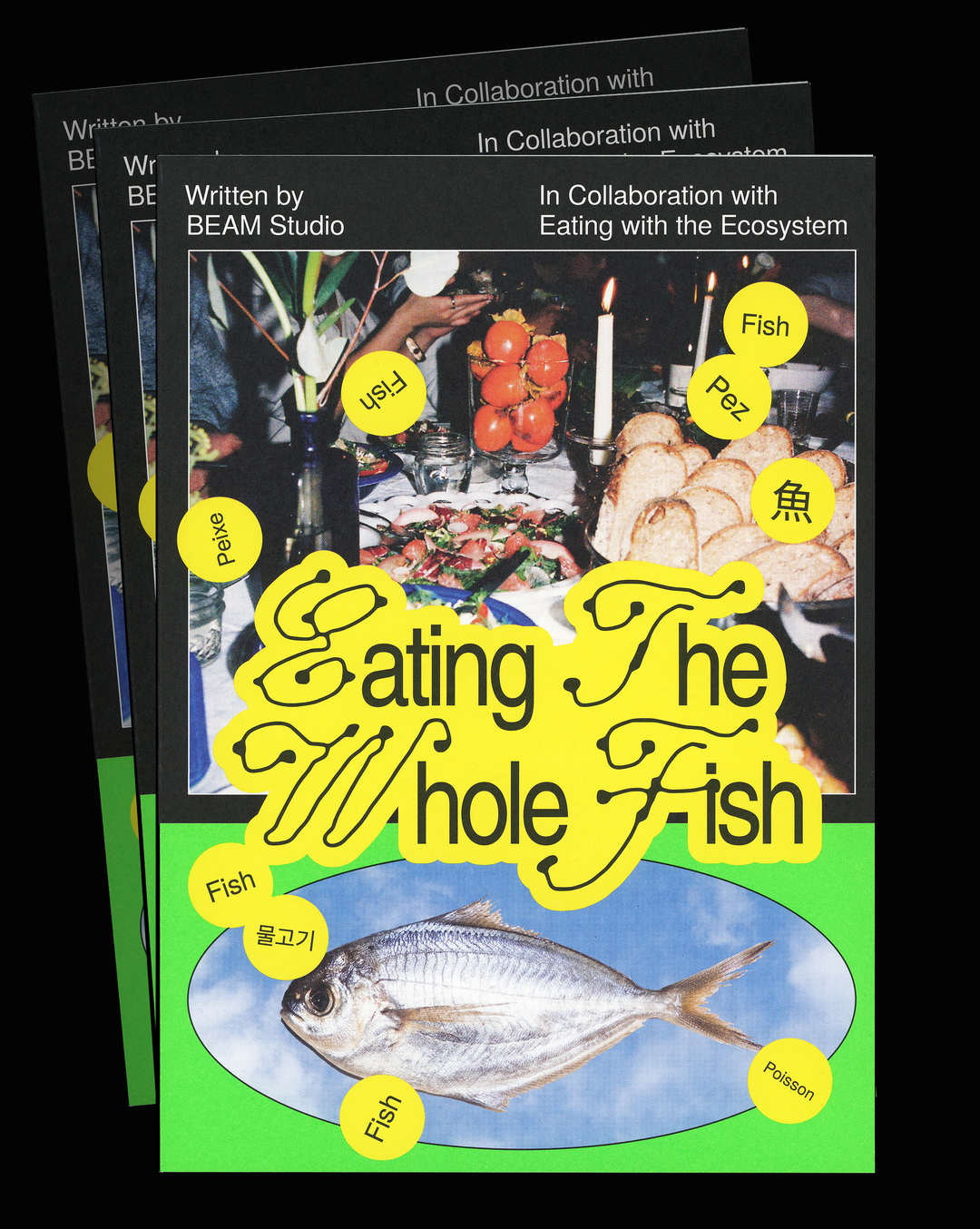
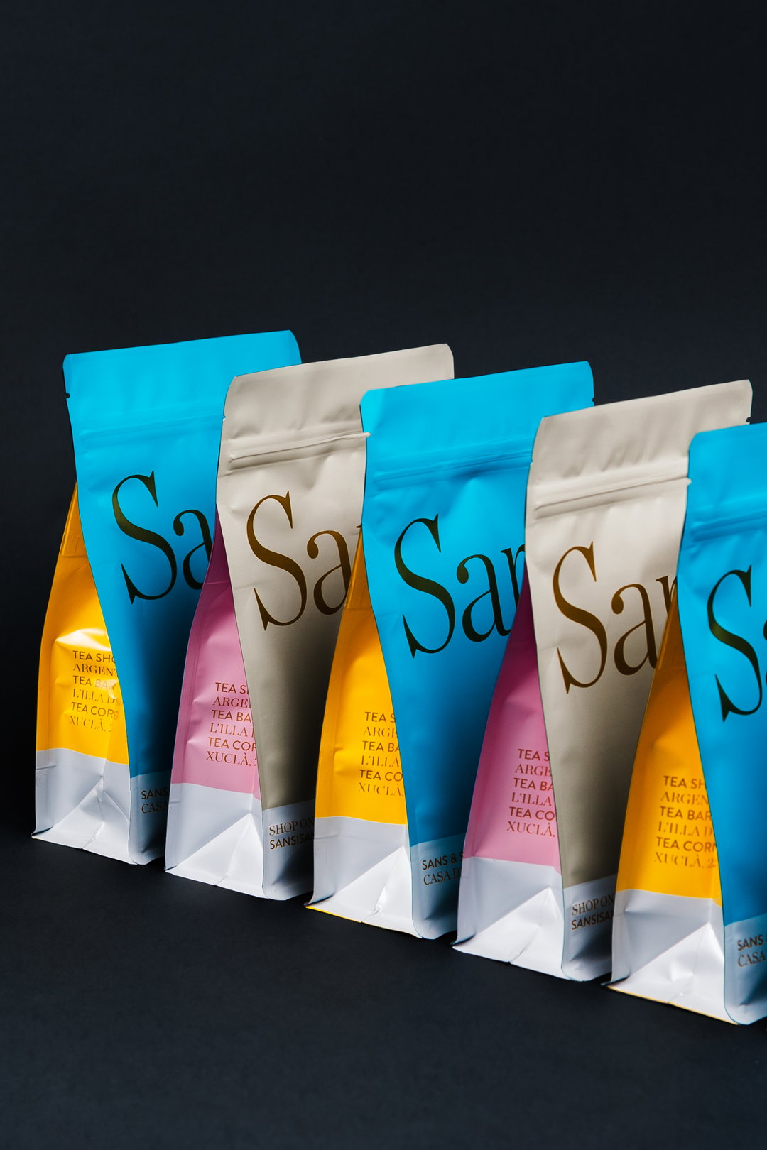
The illustrations found throughout Requena’s various projects show a fondness for refined styles. Rudimentary, colour-blocked shapes, uncluttered compositions, and simple yet effective characters are recurring motifs within the studio’s output. The colour palettes themselves, striking but not overdone, are created with boldness in mind. “Colour serves as a wake-up call, as a hook, as a lure,” Andres tells us. “Once we've captured your attention we are then in a position to explain the idea, the concept. Sometimes we use colour as part of the language of the story.” In this sense, colour is used as a vehicle to both embody the concept and to create space in which viewers can engage with it. For example, Requena’s design for a box of tea by Spanish tea company Sans & Sans uses colour-blocking as a straightforward yet effective way of reflecting the diversity of the different types of tea found within. Elsewhere, in its design for Barcelona City Council’s St George’s Day posters, it uses expressive, lively characters embellished with pops of colour to represent a universal and free love.
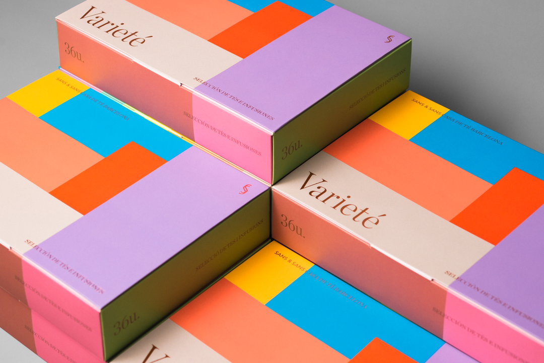
Requena: Sans & Sans (Copyright © Requena, 2021)
Other Barcelona-based collaborators include Funky Bakers, a bakery that Andres says is part of Requena’s “golden mile” of clients – in the city’s Born district, the studio has four different clients less than 100m apart, each won through “the recommendation of the previous”. Requena’s recent work for Funky Bakers champions the hip bakery as a hub of homemade, local goodness. Playful splotches of blue, yellow, orange, and peach play on the idea of “formal imperfection” as “a declaration of intent, a rebellious symbol, and an ethical manifesto against the bread lobby, with its mass-produced products and industrial processing.” An animated version of the bakery’s logo shows its four splashes of colour increasing and decreasing in size to take on different forms, referencing the many perfectly imperfect batches of bread made in its ovens – and acting as a tongue-in-cheek criticism of the cookie-cutter loaves pumped out by the big bread companies. The bakery’s artisanal approach to bread making is also reflected in the typography. The choice of Platform Light serves as a nod to its transparent methods of production and the simplicity of its process and materials.
Requena’s other upcoming collaborations include two branding and packaging projects for a natural health product and for a specialty coffee shop in Madrid, both of which the studio has been working on for the past year. Reflecting on its future, Andres insists that his selectivity does not limit Requena’s ability to find new and exciting work. “Any project that allows us to enjoy the process and the client are welcome,” he says. Though his ethos may be informed in part by careful consideration of the work that he takes on, at its core is a genuine passion for design and a humble appreciation for the opportunities he is presented with: “We still consider every new assignment a small victory and that makes me very happy.”
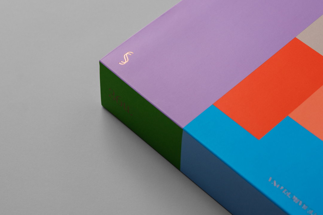
Requena: Sans & Sans (Copyright © Requena, 2021)
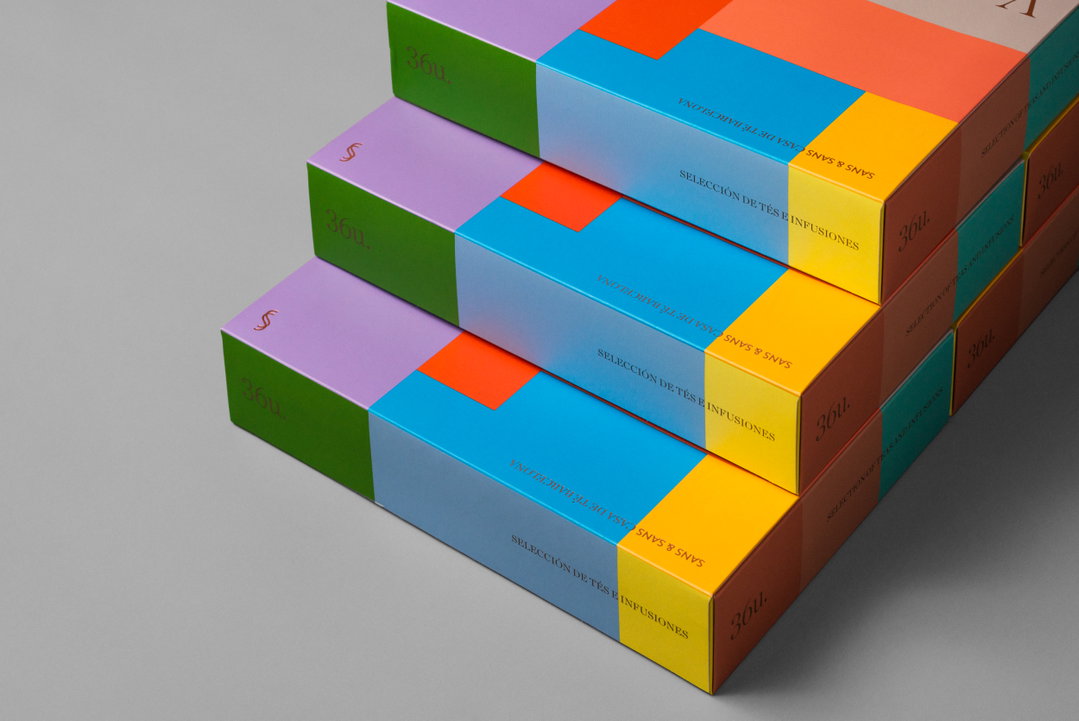
Requena: Sans & Sans (Copyright © Requena, 2021)
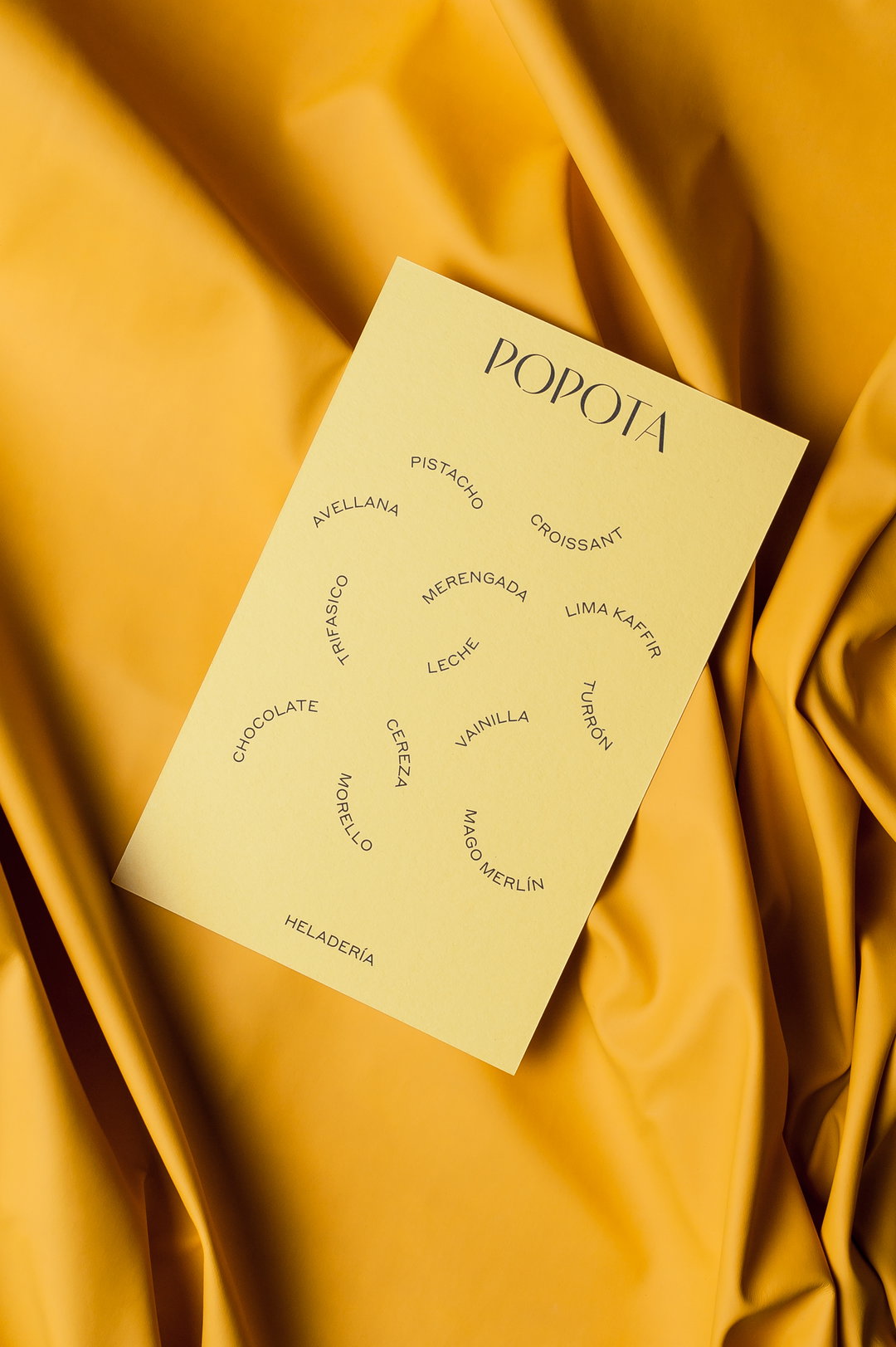
Requena: Popota Helados (Copyright © Requena, 2021)
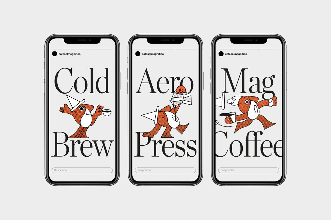
Requena: Mag Identity (Copyright © Requena, 2021)
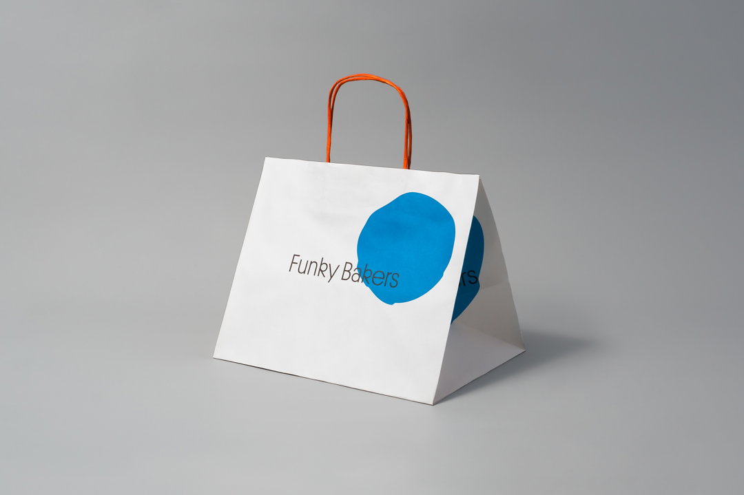
Requena: Funky Bakers (Copyright © Requena, 2021)
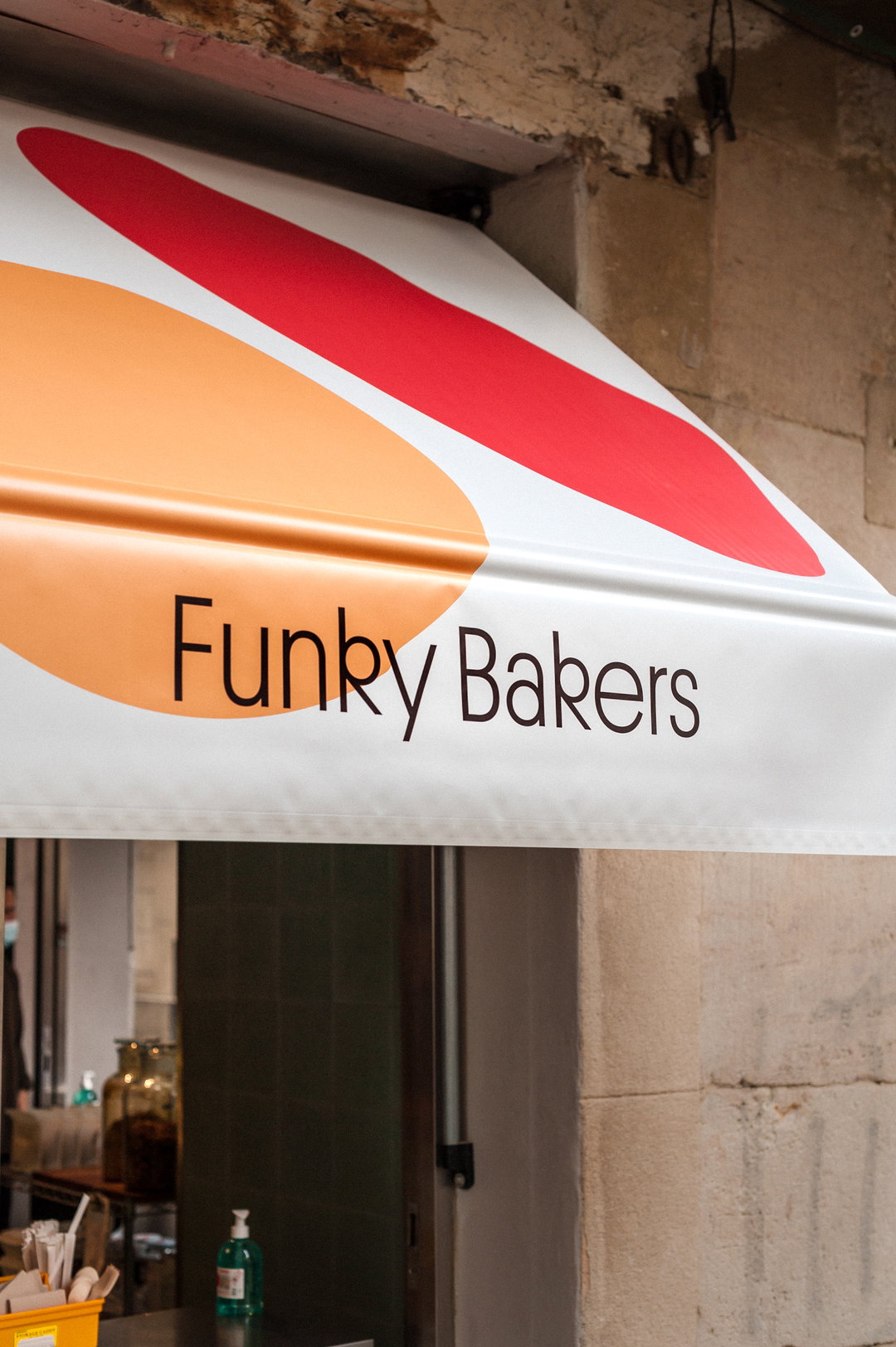
Requena: Funky Bakers (Copyright © Requena, 2021)
Requena: Funky Bakers (Copyright © Requena, 2021)
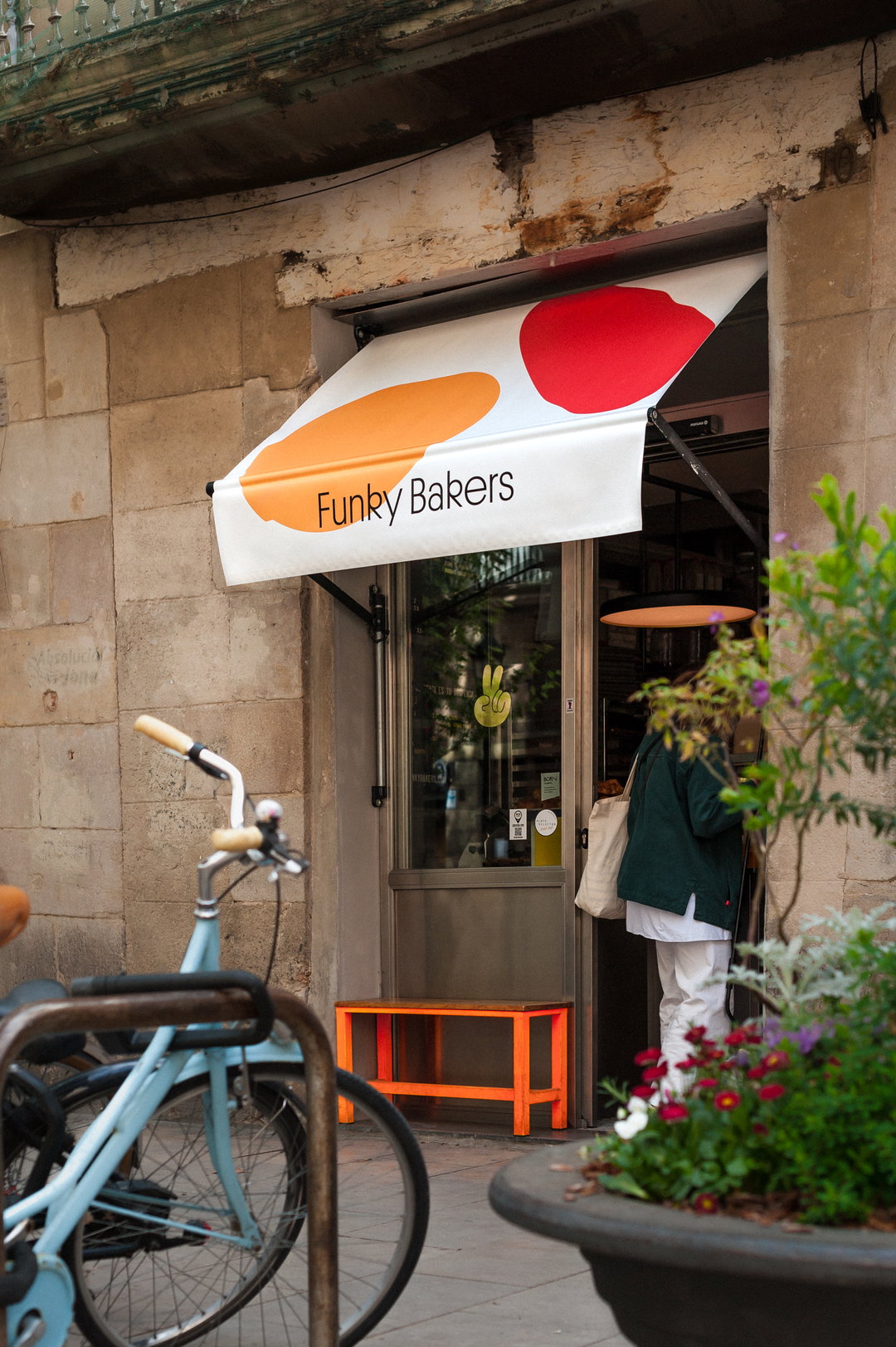
Requena: Funky Bakers (Copyright © Requena, 2021)
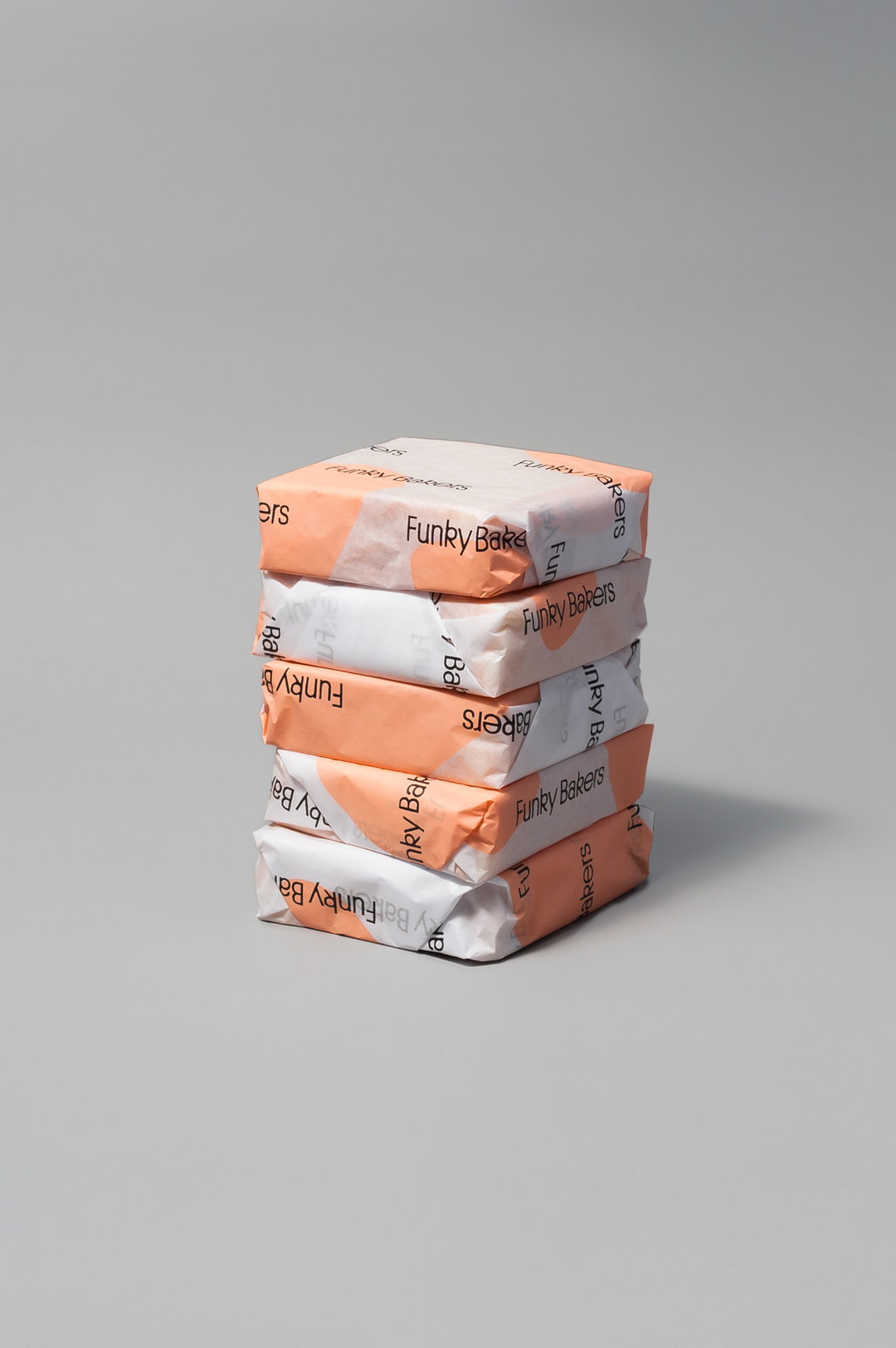
Requena: Funky Bakers (Copyright © Requena, 2021)
Become an Extra Nice Supporter
Unlock an inspiring new way to explore It’s Nice That, get your hands on exclusive perks, and help bring meaningful creative projects to life.
Hero Header
Requena: Sans & Sans (Copyright © Requena, 2021)
Share Article
Further Info
About the Author
—
Daniel joined It’s Nice That as an editorial assistant in February 2019 and continues to work with us on a freelance basis. He graduated from Kingston University with a degree in Journalism in 2015. He is also co-founder and editor of SWIM, an annual art and photography publication.