“The power of language really catches me”: Eager Zhang on what draws her to experimental typography
Growing up speaking three languages has instilled a “metalinguistic awareness” in Eager which now infiltrates nearly all her projects.
Share
Eager Zhang’s love of graphic design stems from its ubiquity. “It’s a pure language that we use to communicate,” she says, “wiggling between intuition and logic and distinct from fine art.” It’s a medium that often begins its life in a grid but is far from confined to it, straddling a multiplicity of outputs, meaning Eager has previously worked with coding, product design, architecture, photography and more. Based in Kansas City where she works at an art college as a faculty member, Eager also runs her own studio practice, creating works that explore language and boundaries, whether that’s “the boundary between the functional and poetic, between legible and enigmatic, or between visual and phonetic.”
This interest in the relationship between design and language began at an early age. Eager – whose first name in Chinese is Yige, which is pronounced the same as “eager” in English – grew up in her hometown of Weihai, a small town in northern China. “I grew up as a Chinese speaker but held a personal interest in foreign languages: besides English, my third language is Japanese,” she explains. Speaking multiple languages fostered a “metalinguistic awareness” and she became fascinated with “observing how people use language as an individual or as a group, how we ‘read’ language or ‘perceive’ it, what happens in our brain when we read a poem, etc.” She was drawn to graphic design, particularly typography, for the fact it represents “an intersection where the visual part and semantic part of language studies meet each other.”
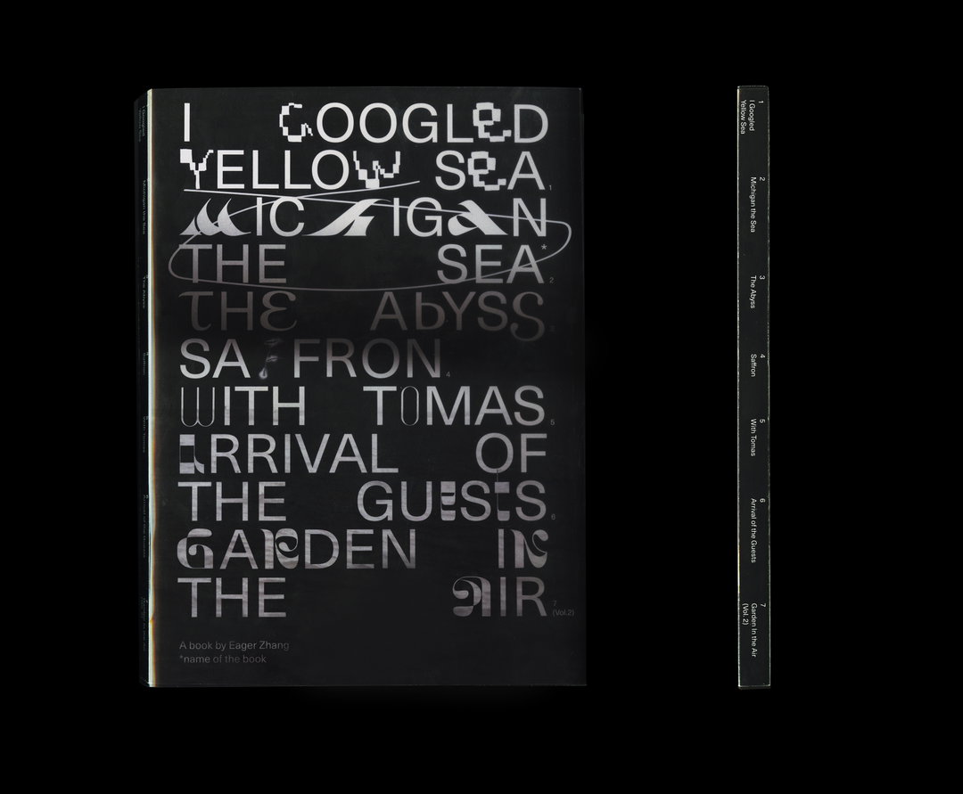
Eager’s graduate project from School of the Art Institute of Chicago, which she attended following her studies at Tongji University in Shanghai, consists of two books that exemplify her preoccupation with the vernacular. Having “messed about” with so many different mediums during her time there, she decided to return to a core of graphic design – printmaking, resulting in Michigan the Sea and Garden in the Air. The first explores the boundary between how we perceive poetry and how we read it in two dimensions: visual and verbal. Having picked up writing poetry during the pandemic, she designed a typeface to embody the narrative of each of the six poems that made it into the publication. In one piece titled With Tomas, for example, Eager tells of a historical crush with poet Tomas Tranströmer. “I mixed his poem lines with mine, so I created a ‘half regular, half italic’ font to print that poem out, to show a dialogue between internal and external literature,” she explains. For another poem that deals with the nostalgia she feels when standing at Lake Michigan, Eager created a Latin typeface from “Chinese calligraphy writing habits”.

Eager Zhang: Michigan the Sea (Copyright © Eager Zhang, 2021)
Garden in the Air, on the other hand, is a Risograph-printed book with a red velvet cover to mimic a family photo album. Based on another poem Eager wrote, it simulates how she and her mother interact over text – by sharing images of flowers with one another. “I’m playing around with the texture between analogue and digital mediums under the narrative of this book, too,” she adds. Eager also made use of Riso in her project Family Portraits which once again deals with language. “The power of language really catches me when I think of the naming of things: when we call ‘māmā’ (mom) or ‘lǎolao’ (grandma, on mother’s side, in a northern Chinese accent), we recall the emotions or memories from the signified,” she explains. She, therefore, created a series of large-scale typographic posters visualising “certain scenes, tactile memories, maybe smells, diseases, violence, etc” as well as the phonetic attribute of a family member’s name.
Observing her portfolio as a whole, Eager notices how the aesthetics of nature often infiltrate her work, whether that’s “nature-nature or digital nature as a new norm.” She elaborates: “I love collecting textures from anything: some of the textures are from plants, the human body, tactile visualisation; some textures are from the built environment and artificial nature, pixels, coding art, those manmade mechanisms that not only shows aesthetic value but also constitute the context itself.” She then blends these within her projects, creating “new species” like “pixelated plants, ‘cyber music note’ rain drips, a typeface that has crystal shapes and body curves in it,” and more. In turn, she builds metaphorical narratives that are “open to spectators’ interpretation”.
Eager is currently looking forward to more teaching at Kansas City Art Institute as a full-time assistant professor in the graphic design department, saying, “it seems that I never want to leave school, not only because I can stay with many creative, forever-young people, but also I can continue my studio practice in a supportive environment.” Unsurprisingly, she is also planning on continuing to investigate verbal expression but adds that she’s also studying botany and mycology, “trying to extend my practice between poems and plants into another level: the naming of creatures is another language issue.” Finally, she’s excited to return to coding after a hiatus, concluding: “Print and interaction will be an important theme in at least next year’s practice. I’d love to try silkscreen printing and make prints in larger formats, continue playing with sensors and see if they work on printed canvas, create interactive print work, those are all exciting fields for me to dip my toe into.”
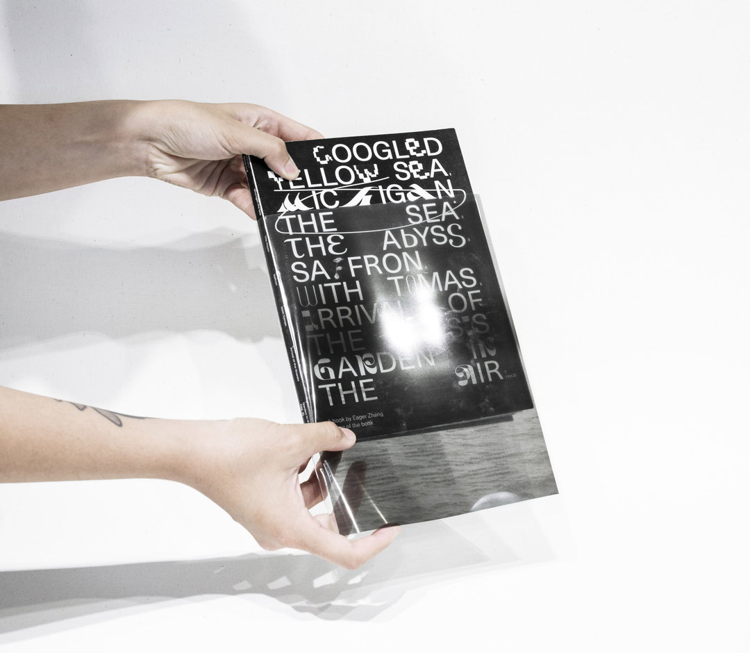
Eager Zhang: Michigan the Sea (Copyright © Eager Zhang, 2021)
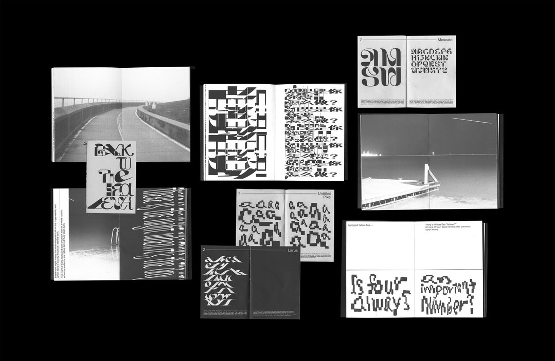
Eager Zhang: Michigan the Sea (Copyright © Eager Zhang, 2021)
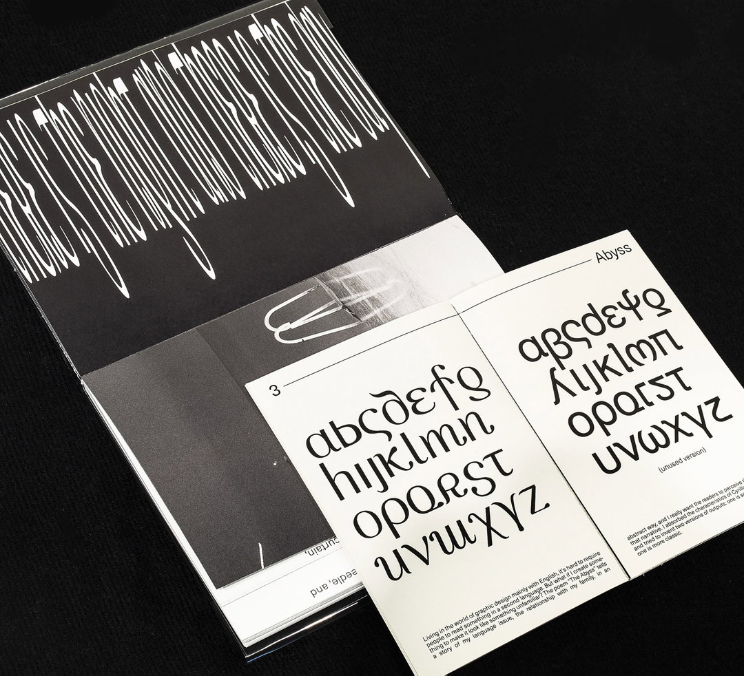
Eager Zhang: Michigan the Sea (Copyright © Eager Zhang, 2021)
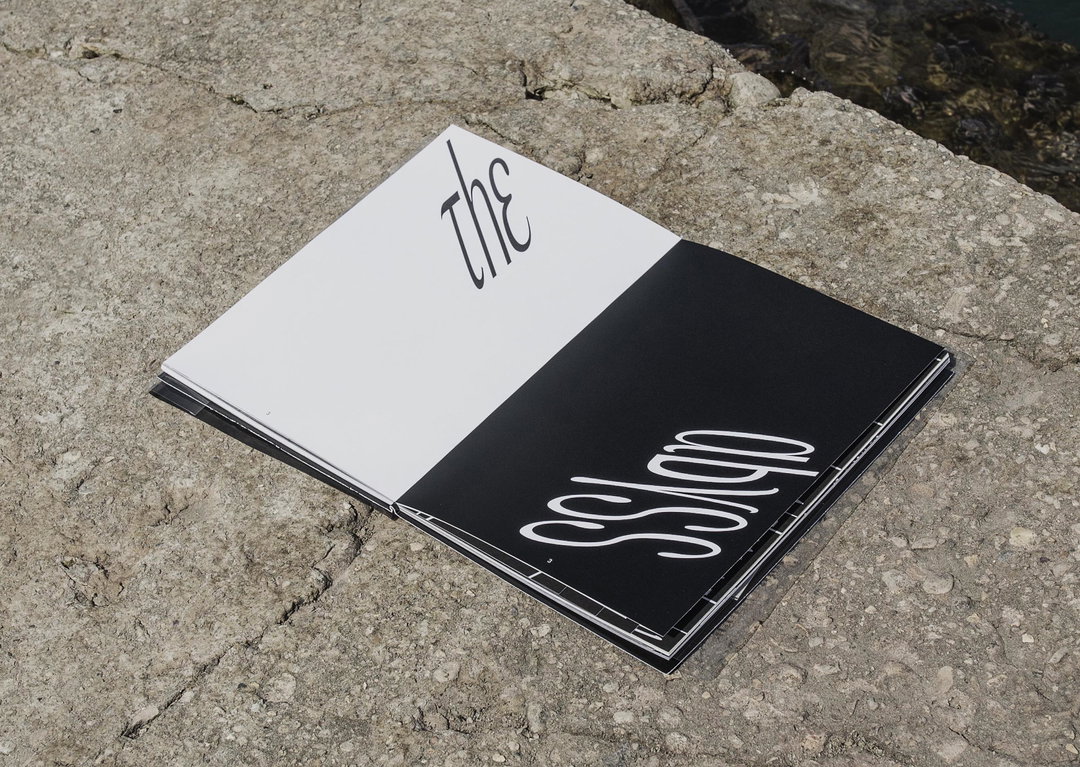
Eager Zhang: Michigan the Sea (Copyright © Eager Zhang, 2021)
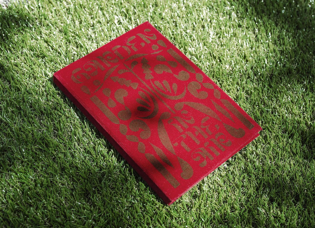
Eager Zhang: Michigan the Sea Vol.2: Garden In the Air (Copyright © Eager Zhang, 2021)
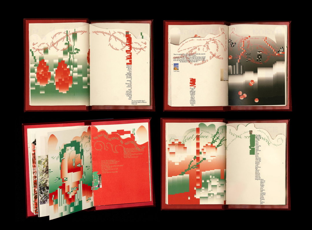
Eager Zhang: Michigan the Sea Vol.2: Garden In the Air (Copyright © Eager Zhang, 2021)
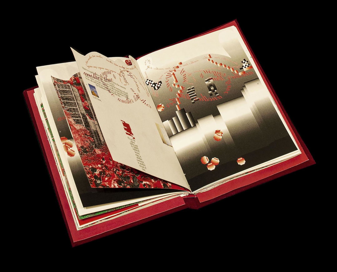
Eager Zhang: Michigan the Sea Vol.2: Garden In the Air (Copyright © Eager Zhang, 2021)
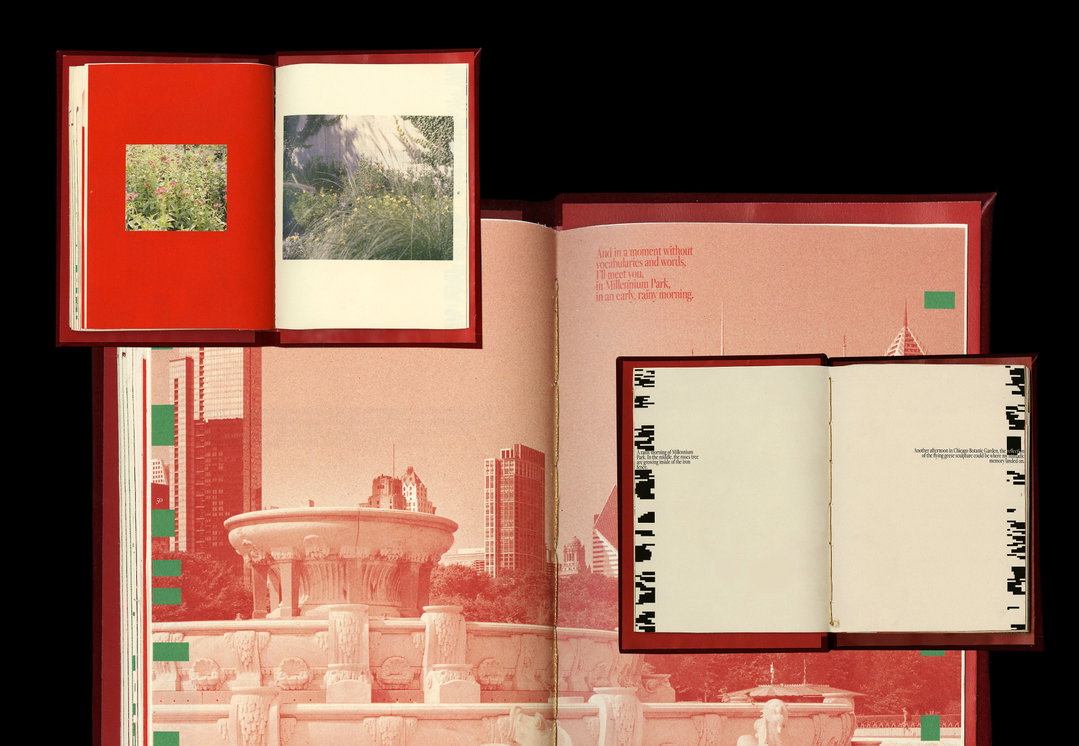
Eager Zhang: Michigan the Sea Vol.2: Garden In the Air (Copyright © Eager Zhang, 2021)
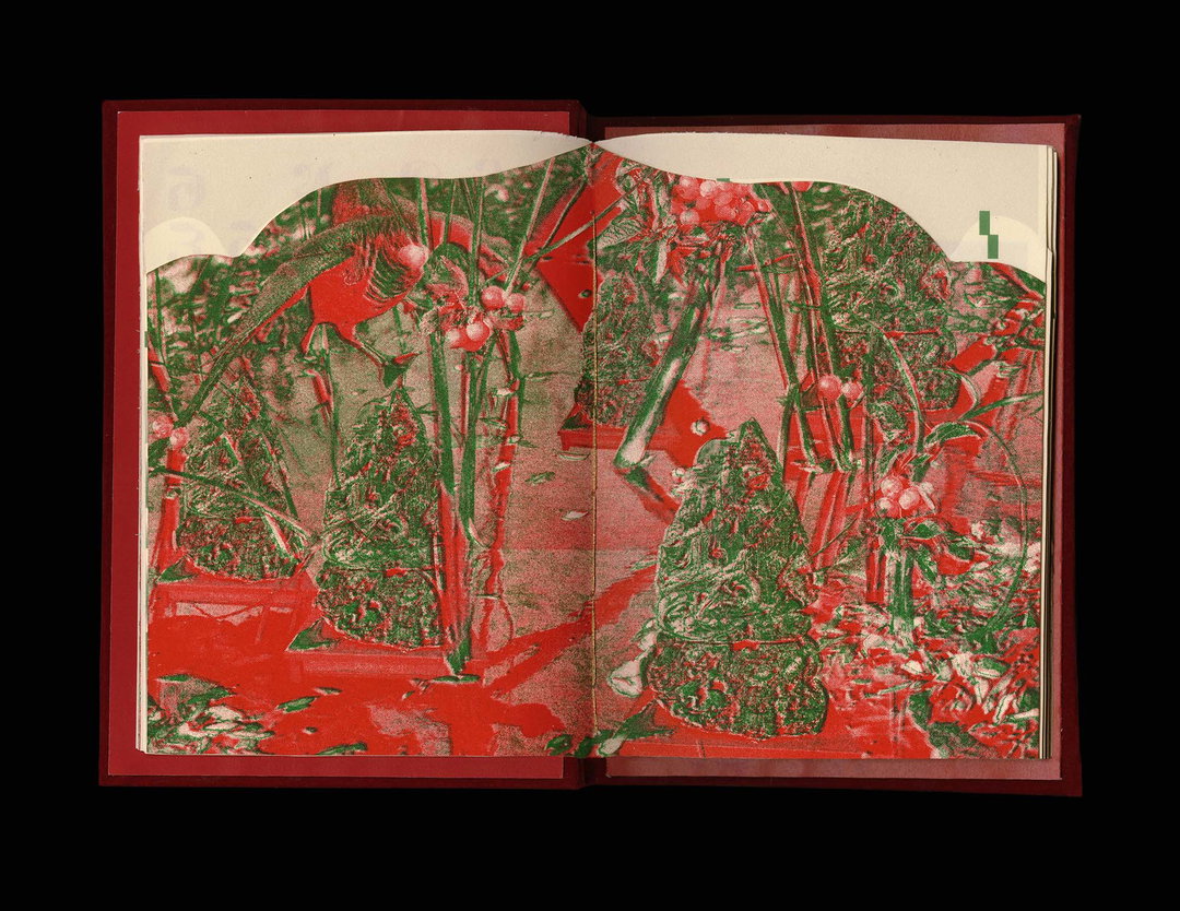
Eager Zhang: Michigan the Sea Vol.2: Garden In the Air (Copyright © Eager Zhang, 2021)
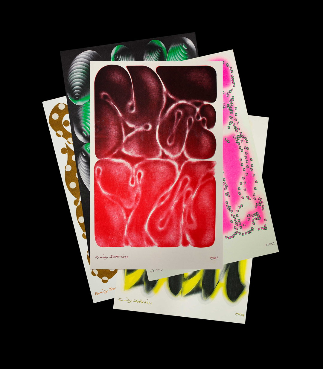
Eager Zhang: Family Portraits (Copyright © Eager Zhang, 2021)
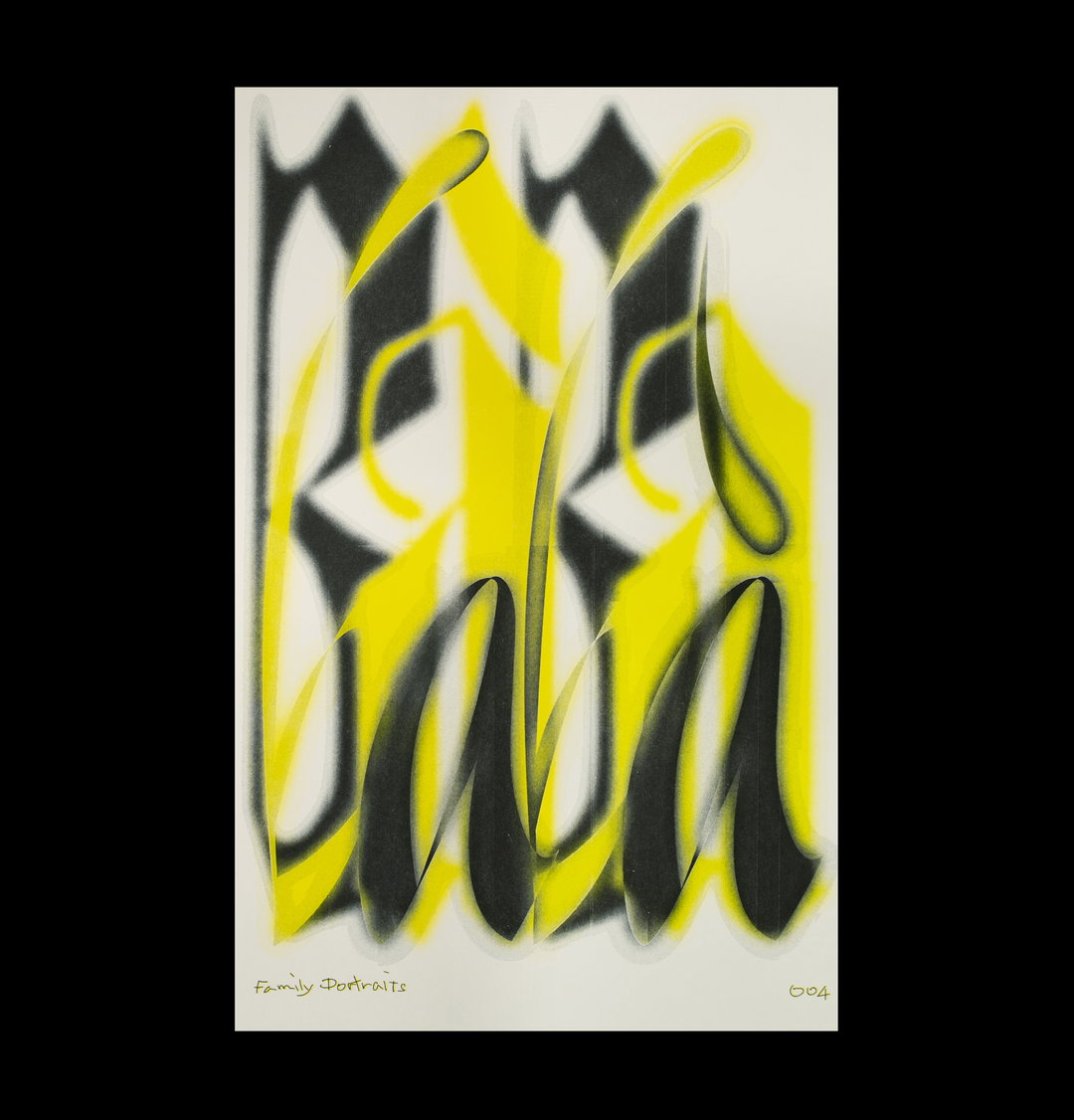
Eager Zhang: Family Portraits, #004 (Copyright © Eager Zhang, 2021)
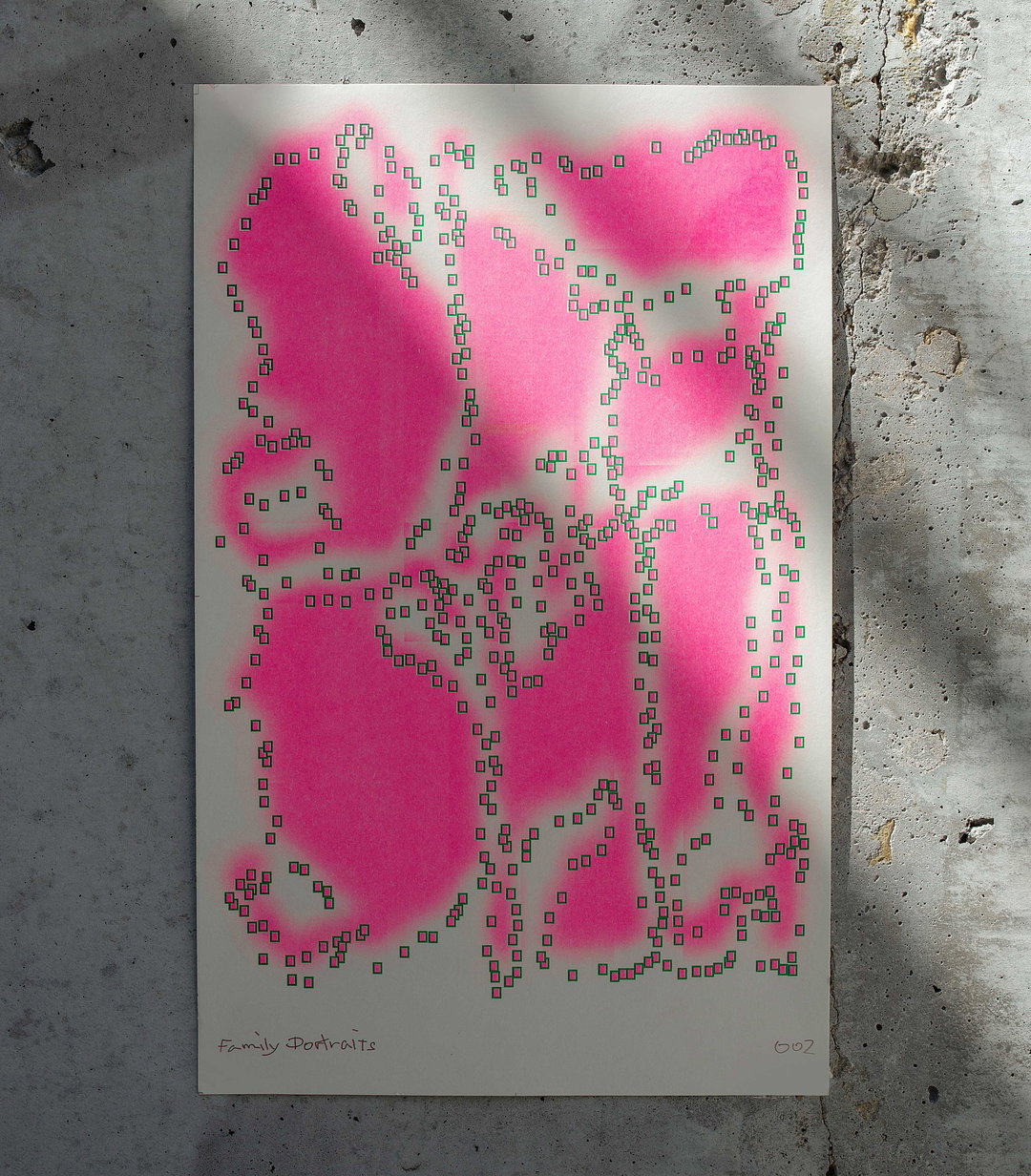
Eager Zhang: Family Portraits, #002 (Copyright © Eager Zhang, 2021)
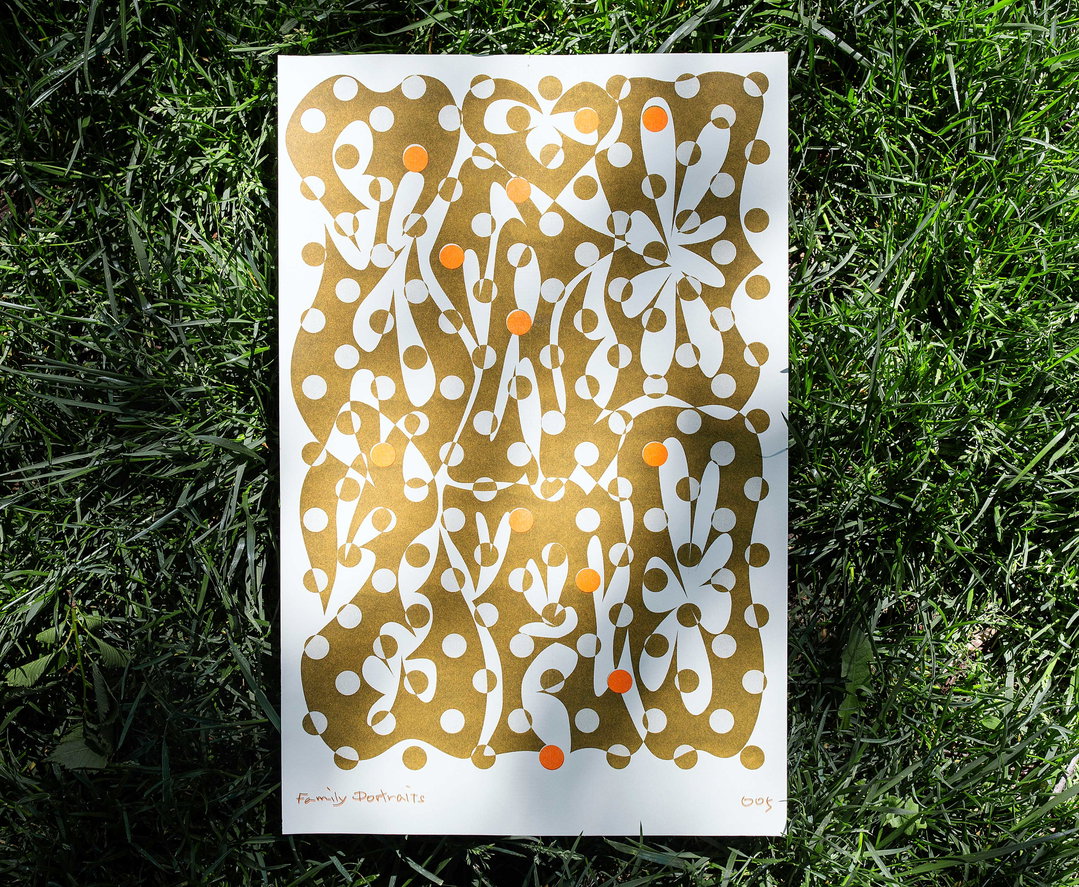
Eager Zhang: Family Portraits, #005 (Copyright © Eager Zhang, 2021)
Become an Extra Nice Supporter
Unlock an inspiring new way to explore It’s Nice That, get your hands on exclusive perks, and help bring meaningful creative projects to life.
Hero Header
Eager Zhang: Michigan the Sea (Copyright © Eager Zhang, 2021)
Share Article
About the Author
—
Ruby is Senior Creative at It's Nice That, overseeing our visual output across platforms and projects. Before that, she was associate editor on the editorial team, after joining in September 2017 following graduation from Central Saint Martins.