Launch Recite Me assistive technology
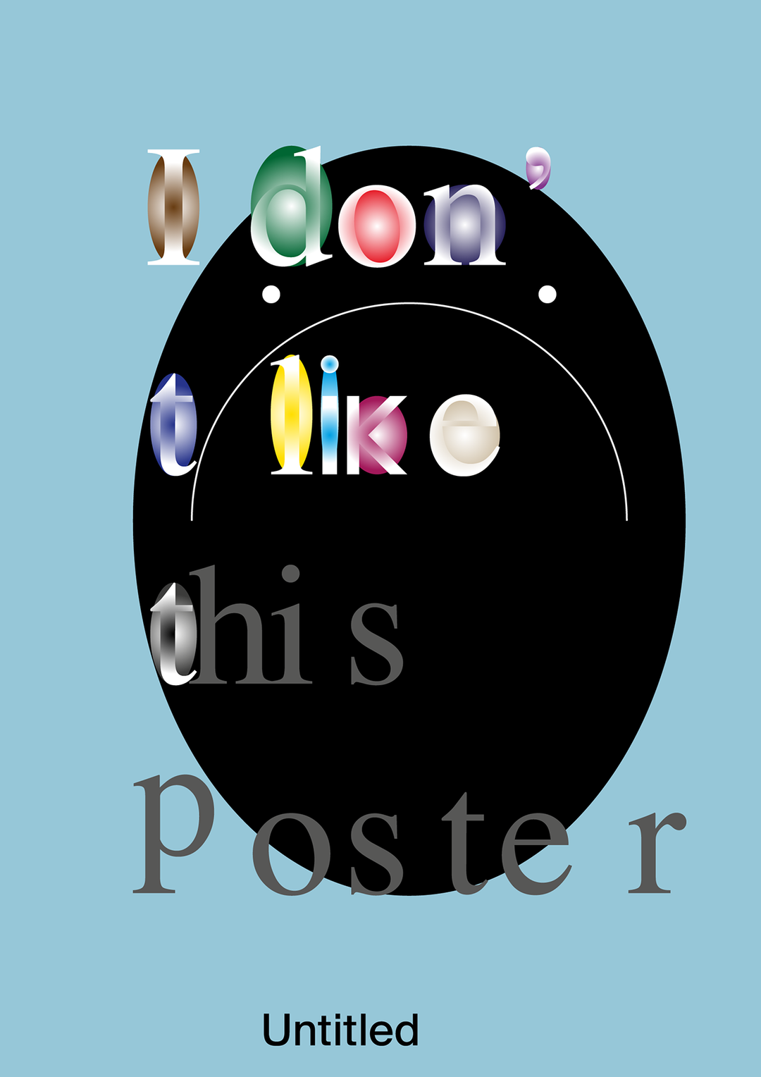
A graphic poster featuring a large black circle on a light blue background. Stylised, 3D lettering across the image reads “I don’t like this Poster”.

Geometric mischief: Elya Akateva’s posters prove how much you can do with the default

Challenging system settings, these forward-thinking graphics show a refusal of control.

—
Date
19 June 2025

There’s a playfulness to Elya Akateva’s posters, and the way they bend the the flatness of digital type design; they burst expectations of what graphic design should look like. “Posters are my primary and beloved medium,” says Elya. “I treat them as containers for thought rather than announcements.” Challenging the authority of language through what some may call ‘low-brow’ digital typography, Elya’s posters become terrains of fascinating shapes that are defined by their digitality. Perfect angles, hard lines, computerised gradient and bevel effects are all used to inspire curiosity and humour. Letters and meanings are sometimes dissolved into an amusing, textureless languor – other times they mutate into a formidable physicality.

“I like structures that break and accidentally reassemble into something new and systems that glitch into poetry,” says Elya. In one poster, Elya incorporates a hilariously frank ‘Untitled’ text box, toying with the idea of the digital default, systematic fonts, automatic leading – Elya forces the viewer to recognise that she is always working from the starting point, smashing it and glueing it back together to create new bodies of forward-thinking graphic design. “In my work, letters are not neutral carriers of meaning but active participants,” says Elya. “I see language as a system that can be broken apart and reassembled – liberated from its original function.” From patchwork orgies of shapes, created from manipulated line and selection tools, to experimentations in minimalism and geometric mischief – Elya’s posters contain the thoughts of a well needed prankster.

Gallery(Copyright © Elya Akateva, 2025)
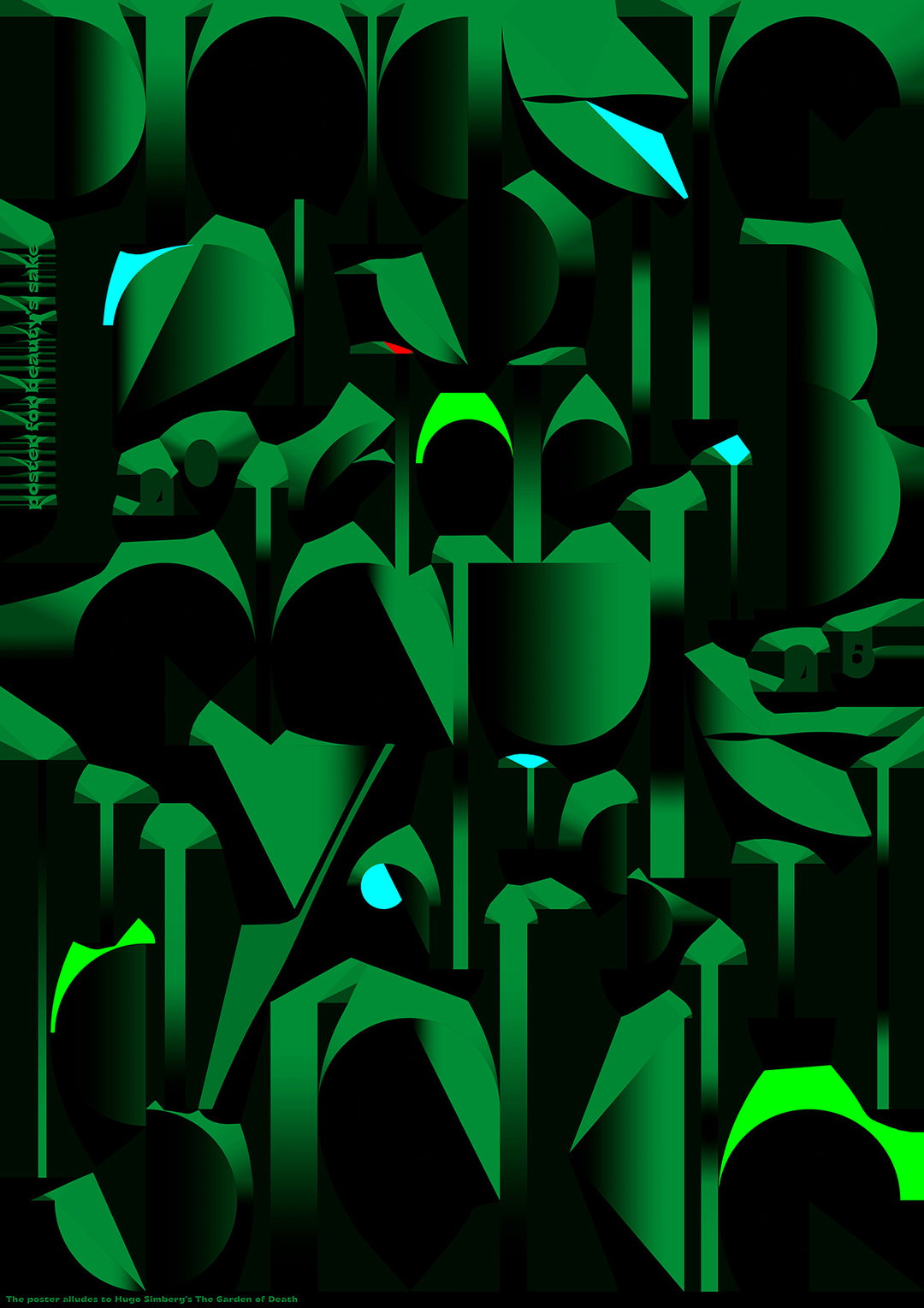
An abstract illustration of interlocking geometric shapes in various shades of green and black. Vertical text on the left reads “forced for beauty’s sake”, while a small caption at the bottom states the poster alludes to Hugo Simberg’s The Garden of Death.
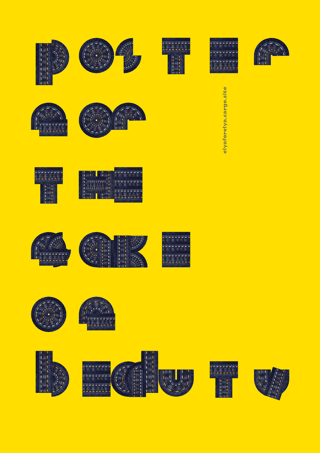
A typographic poster on a bright yellow background. The letters are constructed from dark blue denim fabric with visible orange stitching, reading “poster for the sake of beauty”.
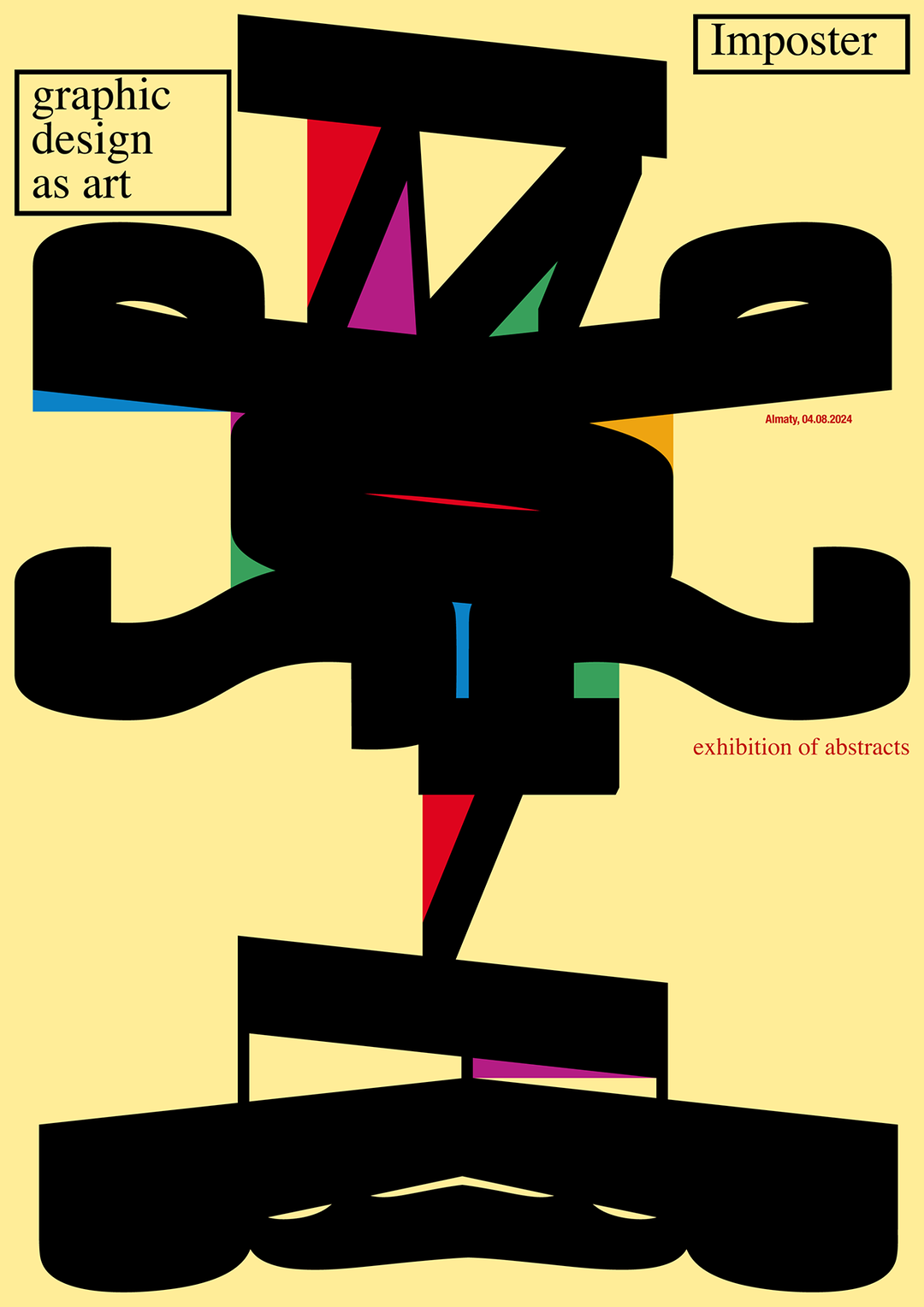
A graphic poster on a pale yellow background featuring bold, black abstract shapes. Text in the corners reads “graphic design as art” and “Imposter”, with “exhibition of abstracts” and a date in smaller red type.
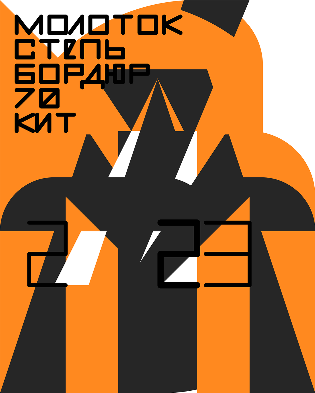
A bold graphic poster in orange, black and white. Cyrillic text in the top left reads “МОЛОТОК”, “СТЕПЬ”, “БОРДЮР”, “70” and “КИТ”, with the numbers “23” appearing in a large, stylised font across the centre.
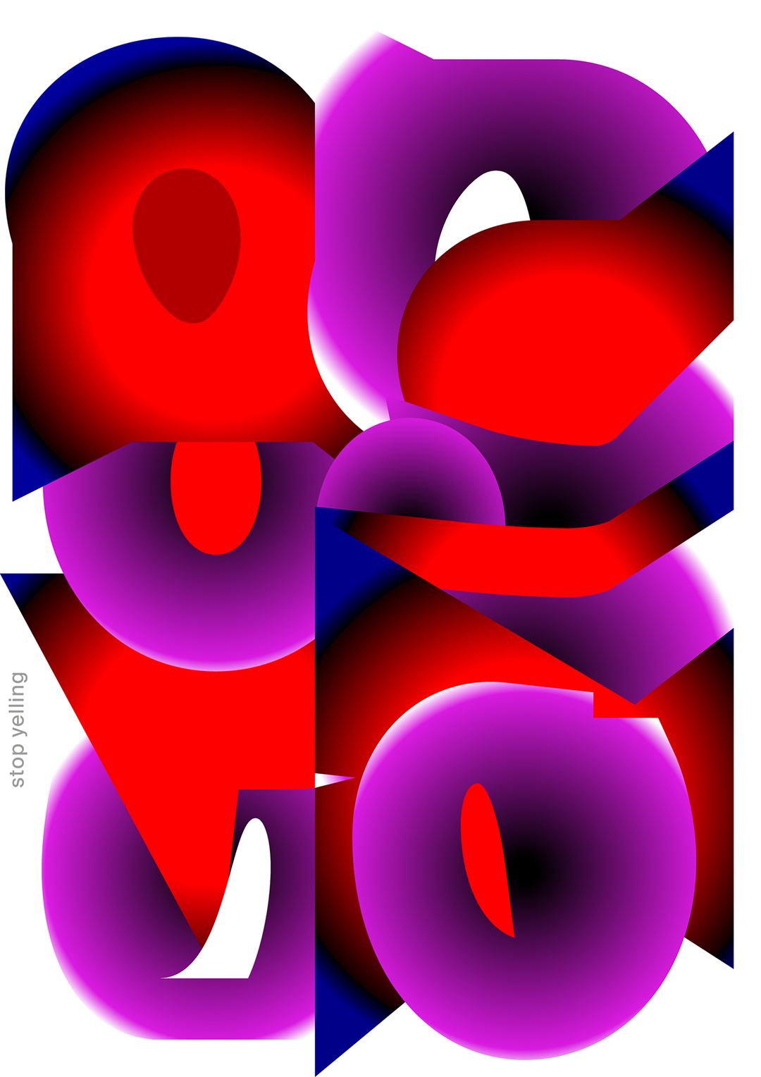
A 3D render of distorted, bulbous shapes in vibrant red, purple and blue. The forms overlap and intertwine across a white background, with the words “stop yelling” written vertically in small, lowercase letters on the left.
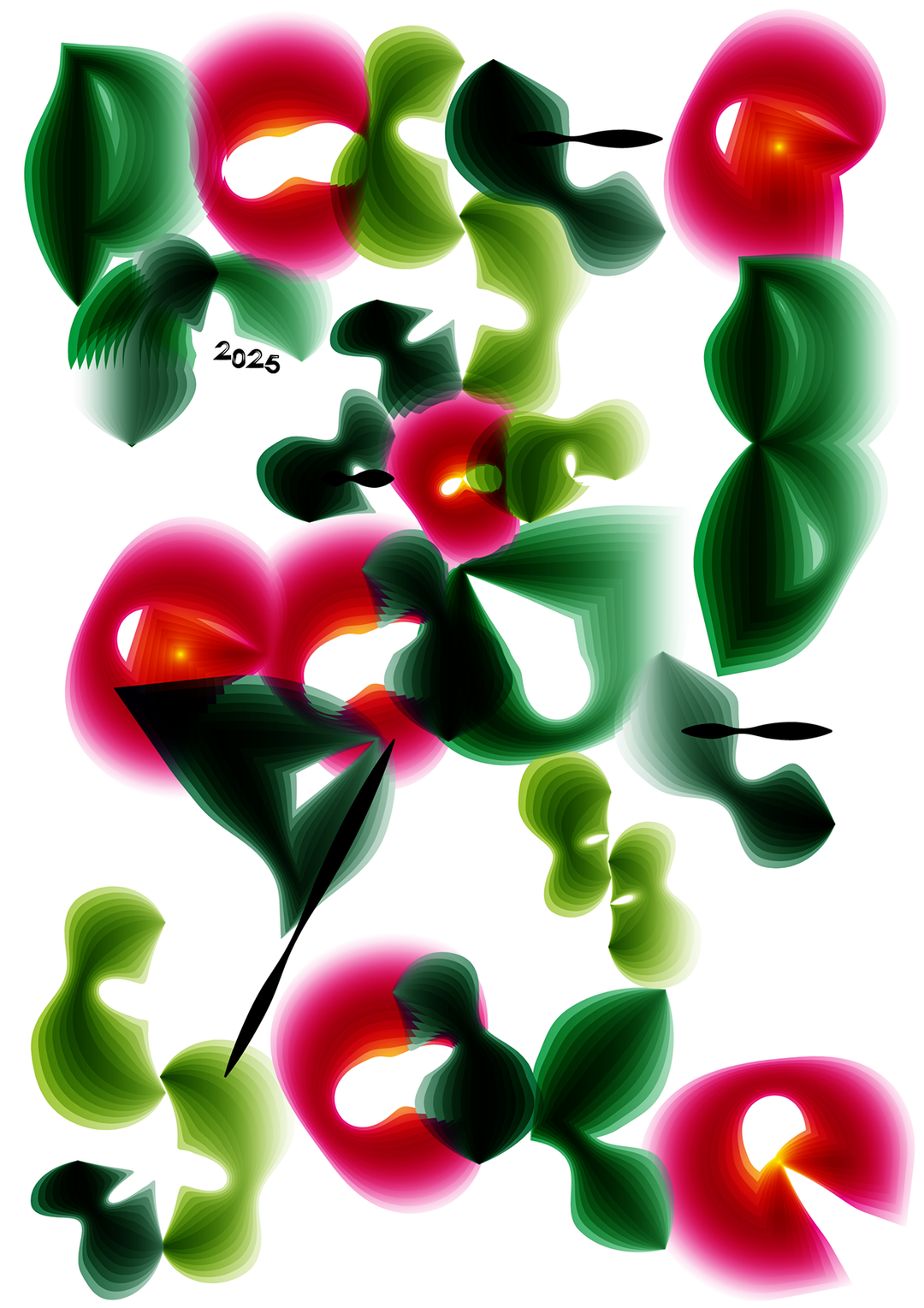
An abstract digital composition of fluid, organic shapes in vibrant pink and deep green. The forms overlap and swirl across a white background, with the number “2025” handwritten in black.
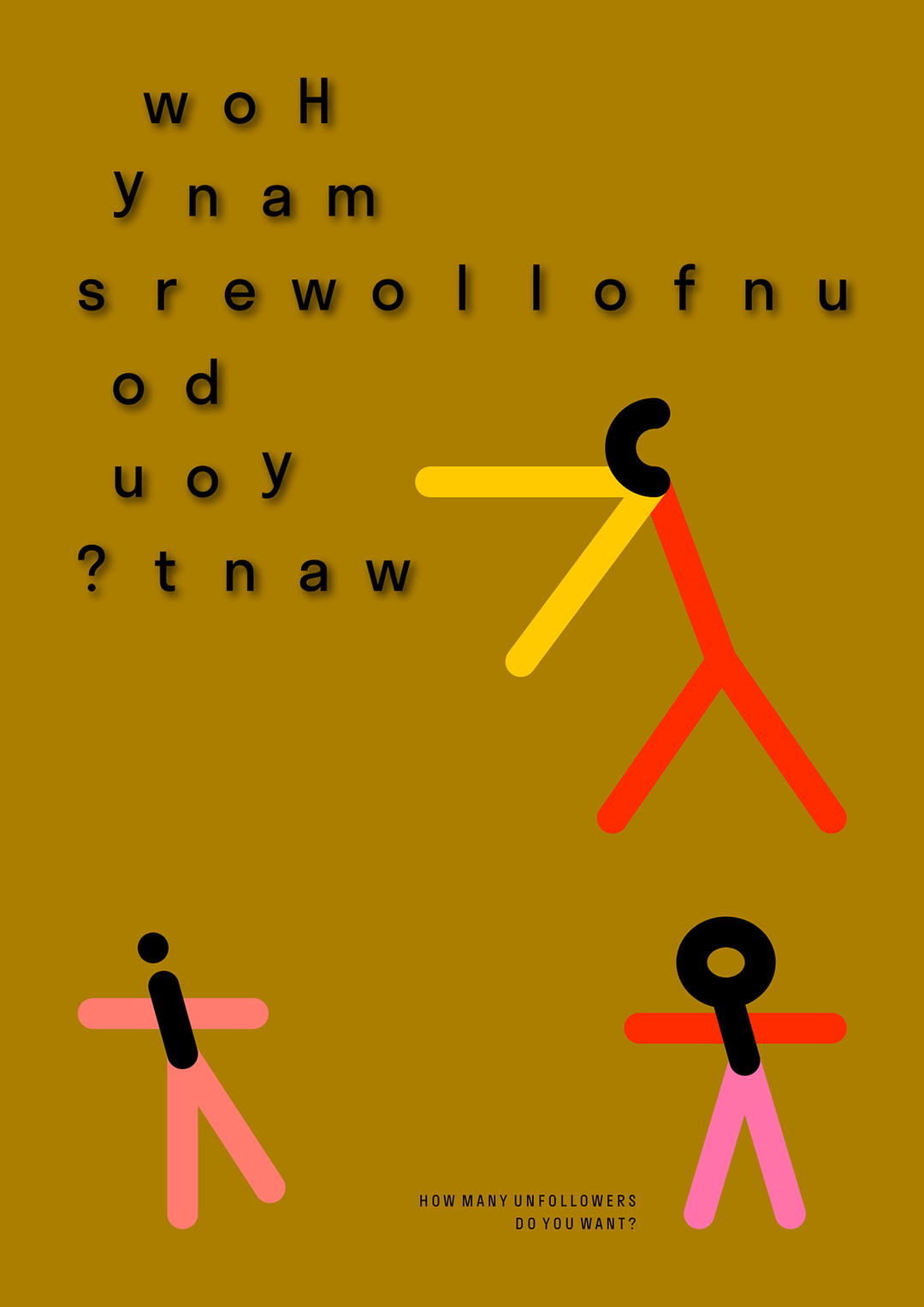
A graphic poster on a mustard yellow background featuring abstract figures made of colourful lines and circles. Mirrored text at the top reads “How many unfollowers do you want?”. The same phrase is repeated in standard orientation at the bottom.
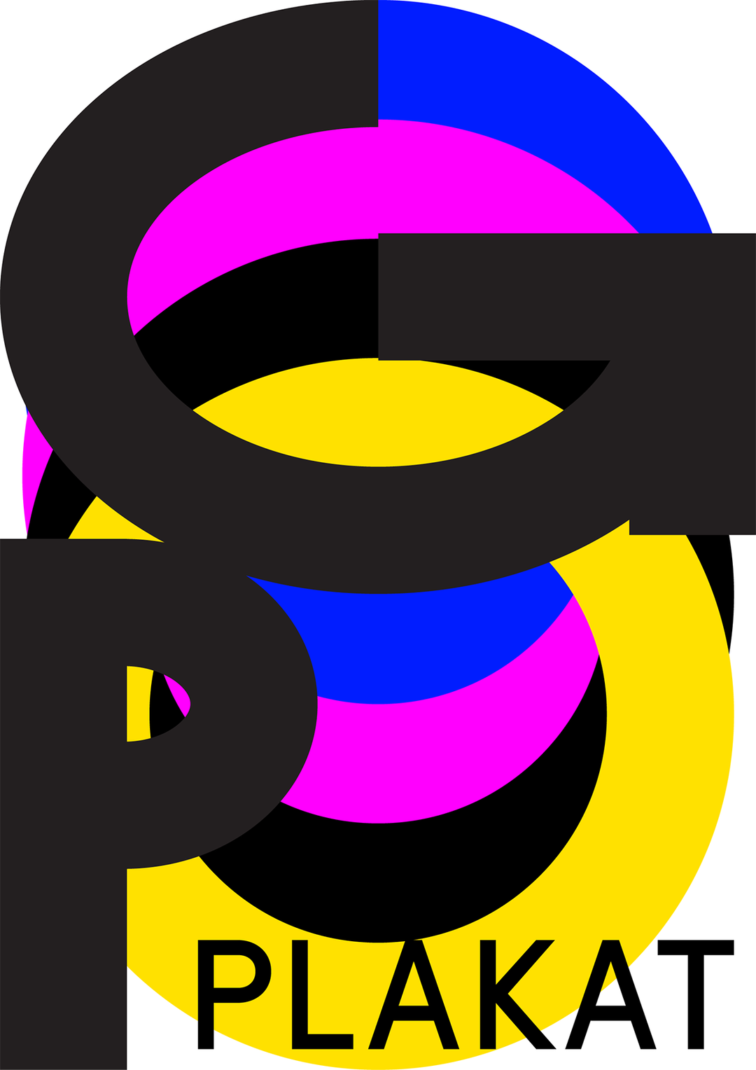
A graphic design featuring a large, black “GP” monogram layered over overlapping circles of cyan, magenta, and yellow. The word “PLAKAT” is written in black capital letters across the bottom yellow circle.
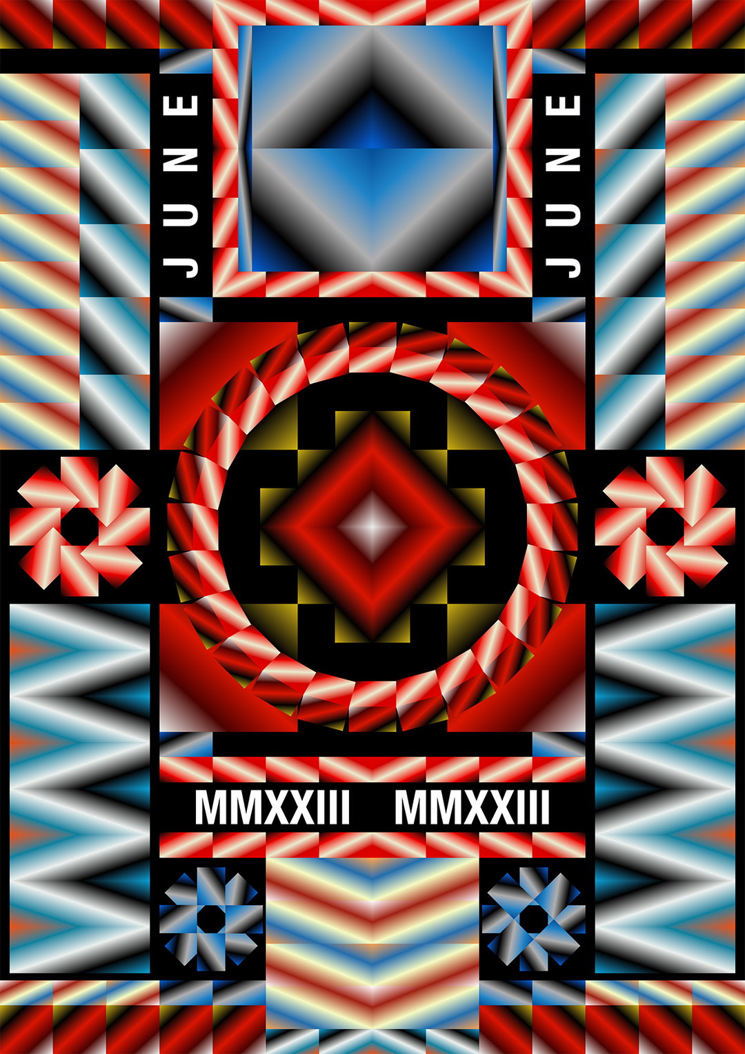
A symmetrical digital illustration featuring bold geometric shapes and gradients in red, blue, and white. The word “JUNE” appears twice in white vertical text, and the Roman numerals “MMXXIII” are repeated at the bottom.

Hero Header

(Copyright © Elya Akateva, 2025)
Share Article

About the Author

Paul Moore

—

Paul M (He/Him) is a Junior Writer at It’s Nice That since May 2025. He has a strong interest in graphic design, digital kitsch, multimedia painting, collage, nostalgia, analogue technology and all matters of strange stuff. pcm@itsnicethat.com

To submit your work to be featured on the site, see our Submissions Guide.

It's Nice That Newsletters

Fancy a bit of It's Nice That in your inbox? Sign up to our newsletters and we'll keep you in the loop with everything good going on in the creative world.