After 11 years of practice, Jad Hussein tells us why he is now more comfortable as a designer than ever before
The Parisian designer talks us through three recent print projects for the cultural sector, where each one is as beautifully designed as the next.
Jad Hussein has a scientific mind. So scientific in fact, he started his education studying medicines and then physiology before turning to graphic design. It’s this methodical and precise nature, however, which makes him such an adept designer today. His practice feels effortless yet highly considered, and after nearly 11 years in the business, he finally feels more comfortable with who he is as a designer. After graduating in 2008, subsequently winning a competition to design the identity for a major institution, MAC Lyon, Jad’s freelance career has gone from strength to strength.
Predominantly working in editorial design for publishers as well as the cultural sector, for the last decade he’s also taught at design schools while honing his increasingly sophisticated practice. Clearly an interdisciplinary creative given his eclectic background, it was actually an interest in photography and magazines which sparked Jad’s attention to give graphic design a go. “When I was bored at university, I fell deep into photographing naively, pretending to be the Cartier-Bresson in my neighbourhood,” he fondly recalls. “Years later, I’m still in love with that medium and really like laying out photography on white sheets of paper.”
Skateboarding and snowboarding magazines were his first introduction to print, and by scouring through the pages of such publications, he realised the creative freedom within the design. It opened a world of editorial hierarchies, layout design, typography, not to mention how to elevate different perspectives onto a page. “It’s where the content is really challenged by the designer and if it doesn’t work on an issue, well, no worries, let’s try again on the next one,” he says of this passion. For Jad, book design can be the opposite. “A book is often considered by authors or publishers to be a more serious adventure so it can be more inhibited and less audacious,” he adds. In his experience, the outcome can be disappointing because of the inherent seriousness of a book’s nature, which in turn can be “less exciting due to all the pressure placed on this or that, from cover to colophon.”
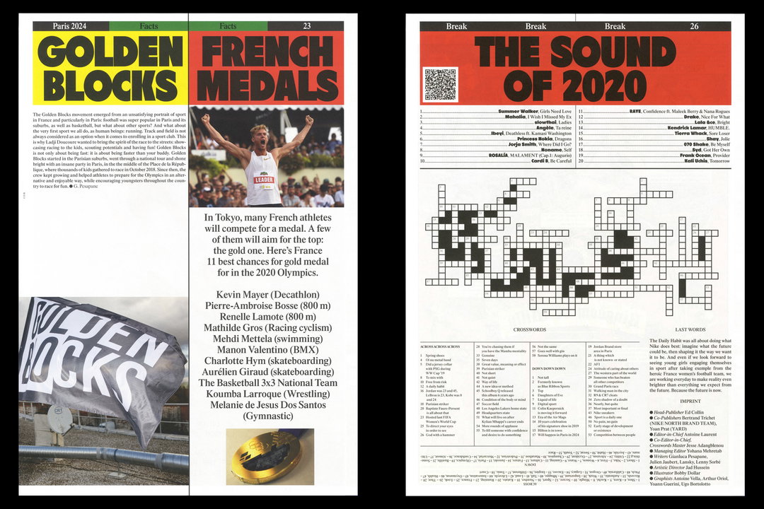
Jad Hussein: Nike The Daily Habit
With this in mind, playfulness is key to Jad’s design practice. As long as his work looks good when printed, “well let’s go!” he exclaims. Now, with years of attuned experience under his belt, he is no longer shackled by the rules of the grid nor the conventional design functions that he prescribed to previously. “I try not to overthink everything and let my feelings rule some aspects of my project,” he adds on the matter, evaluating how he no longer “needs this constructed approach to make [him] feel better at the job.”
It’s an approach he’s adapted across his recent projects. In one, Jad designed The Architecture Exquise, a book to accompany a photography exhibition in the south of France. Published by Building books, the idea for the project was simple; three photographers exchanged their images over email for a few months, responding with a piece of their work one image after another “like ping-pong.” Culminating in 70 images, the beautifully designed publication features all the emails in the smallest point size possible running along the bottom of the page, as well as a few subtle jokes sprinkled amongst the spreads in the mix up of names and pictures. “As in the book,” adds Jad, “we intentionally didn’t mention who had done which pictures” in order to create an overall coherence to the book as opposed to three separate volumes. There is however, a hidden index in the book to uncover whose images are whose.
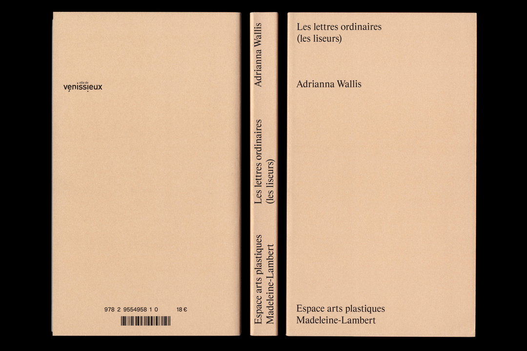
Elsewhere, he designed a book for artist Adrianna Wallis, titled Lettres Ordinaires. The artist managed to access all the lost letters kept by a French post office and created a series of works from this raw material. “It’s sometime fun, sometimes off, but most of the time touching,” Jad says of the extensive body of work. And with this delicate feeling in mind, he designed something introverted in favour of the reading experience. He also designed a Nike newspaper along with Yard Agency for a big marketing meeting that took place in Paris. “The idea was to mix up real and hypothetical content in a spirited newspaper, providing a feeling for future Nike activities in Paris,” Jad finally goes on to say. And without hesitation, he chose the typefaces Refusit and a stretched Times to convey the classic editorial look while promoting the “easy and fun” feeling of the project.
As for the future, there are some pretty cool projects in the pipeline that he’s hoping won’t be too drastically by the current pandemic. But most importantly for Jad, right now, his main goal is to be a good dad and to give his young son all that he needs. Finally, he ends our interview with a warm, “Stay safe and take care guys."
GalleryJad Hussein
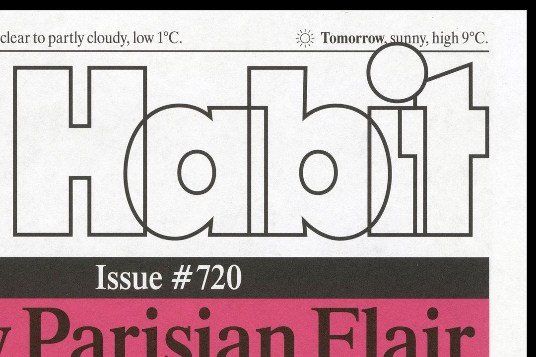
Nike The Daily Habit
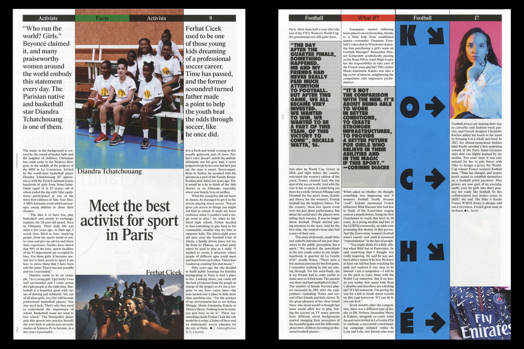
Nike The Daily Habit
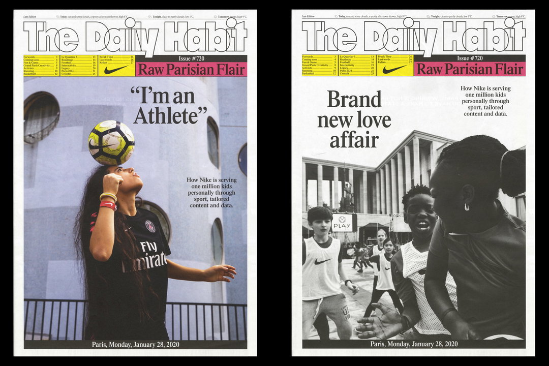
Nike The Daily Habit
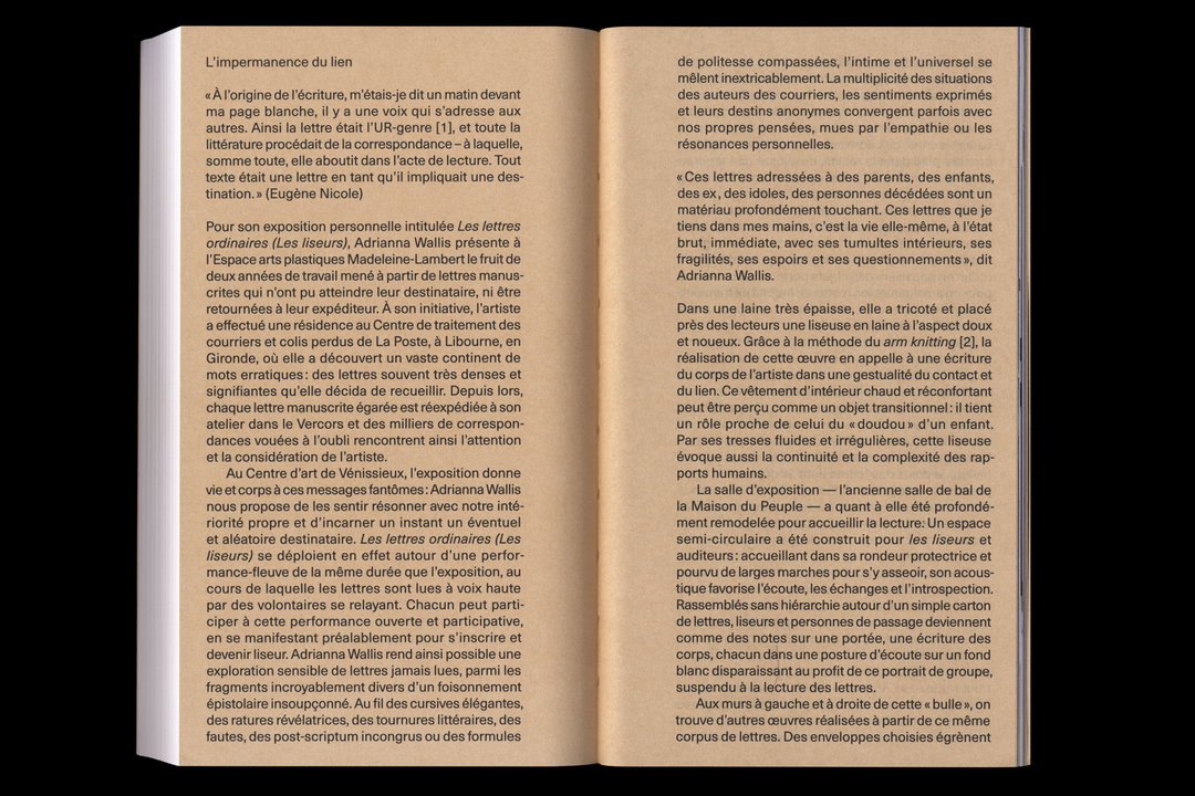
Lettres Ordinaires
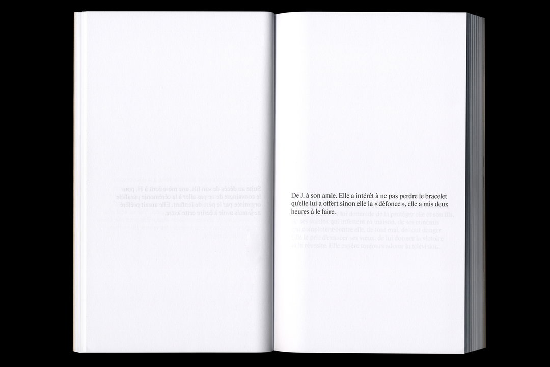
Lettres Ordinaires
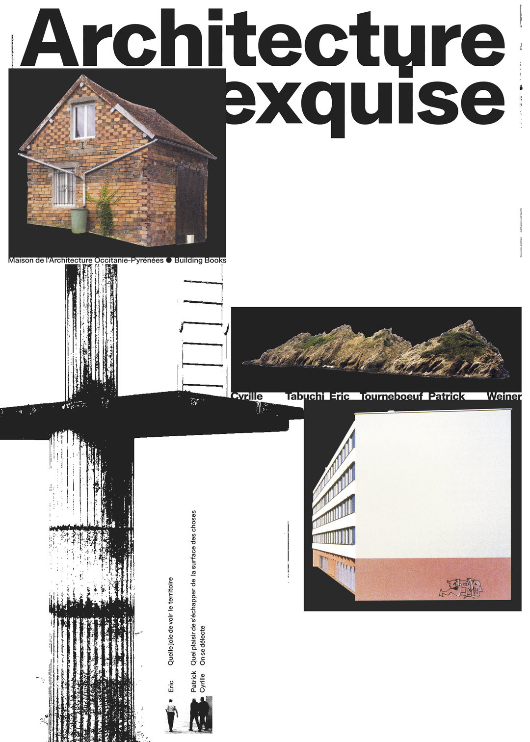
Architecture Exquise
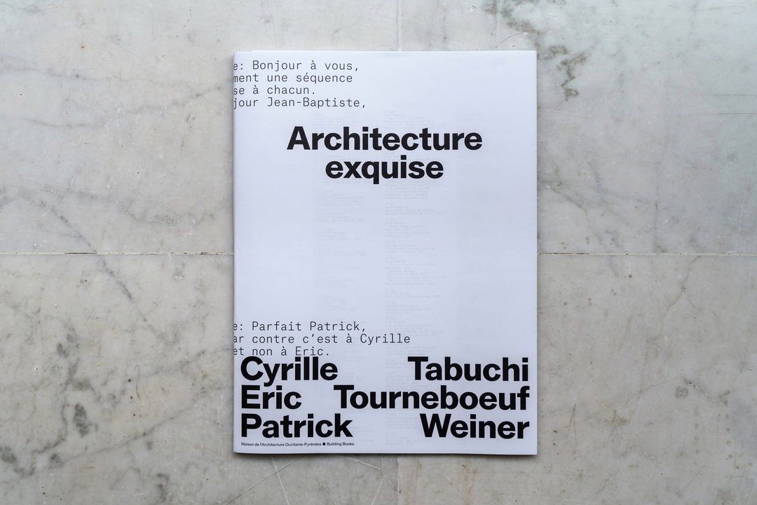
Architecture Exquise
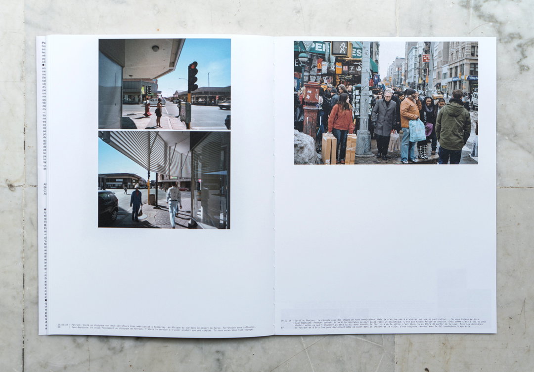
Architecture Exquise
Share Article
Further Info
About the Author
—
Jynann joined It’s Nice That as an editorial assistant in August 2018 after graduating from The Glasgow School of Art’s Communication Design degree. In March 2019 she became a staff writer and in June 2021, she was made associate editor. She went freelance in 2022.