




For Kellen Renstrom type design is a way to mutate the mundane into “some new magic or mystery”
Constantly remixing his range of visual influences, you’ll often find the New York-based designer “in archives or on the street finding things to chop and screw”.
As a self-identified “type-led generalist”, graphic designer Kellen Renstrom’s portfolio of work spans a wide range of media and covers all corners of the discipline. Previously designing for High Tide and Wax Studios, the designer now splits his time between his personal practice and his work at Actual Source – the American publisher, bookstore, and the collaborative practice of Davis Ngarupe and JP Haynie. When working across a broad range of editorial and web design, identities and fonts, Kellen’s approach always “orbits around a focus on physicality and typography”, no matter what form the work takes.
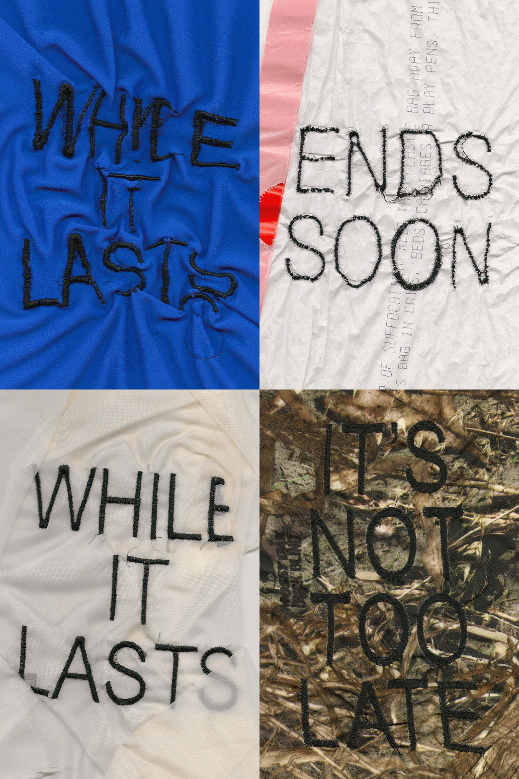
Naturally, analogue processes take a front seat in the designers practice: “I’m usually ripping up paper or drawing with different substances or printing and scanning over and over again”, he says. This engagement with hands-on processing is one of the main ways that Kellen arrives at the right ideas for his tactile, multilayered works, especially with custom type. “I’m also sort of a remixer, so I’m often in archives or on the street finding things to chop and screw,” he says. Seeing everyday things like: “water towers, sale signage copy, natural phenomena” as visual puzzle pieces for his practice, Kellen likes to “modulate” the mundane through “different channels or media or expressions until they pop out mutated with some new magic or mystery”.
With most of his influences sitting outside of the design world, the typographic forms in Kellen’s multimedia design work take from the commonplace subject matter of Ed Ruscha’s paintings, and the abstract patterns of Hilma af Klint. The designer also finds creative inspiration in “the high-low transcendence of pop music and internet culture (as a gay MySpace/Tumblr kid)... and my friends!”, he says. “There’s nothing more influential to me than seeing the people I love and respect doing the things they love”.
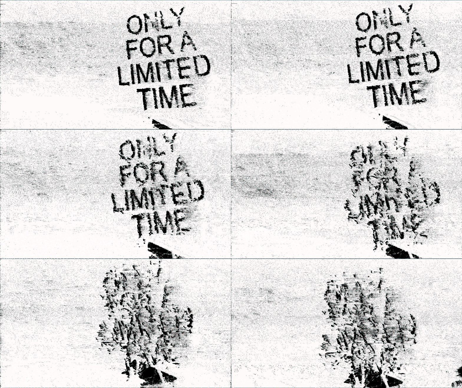
Kellen Renstrom: ONLY FOR A LIMITED TIME (Copyright © Kellen Renstrom, 2018)
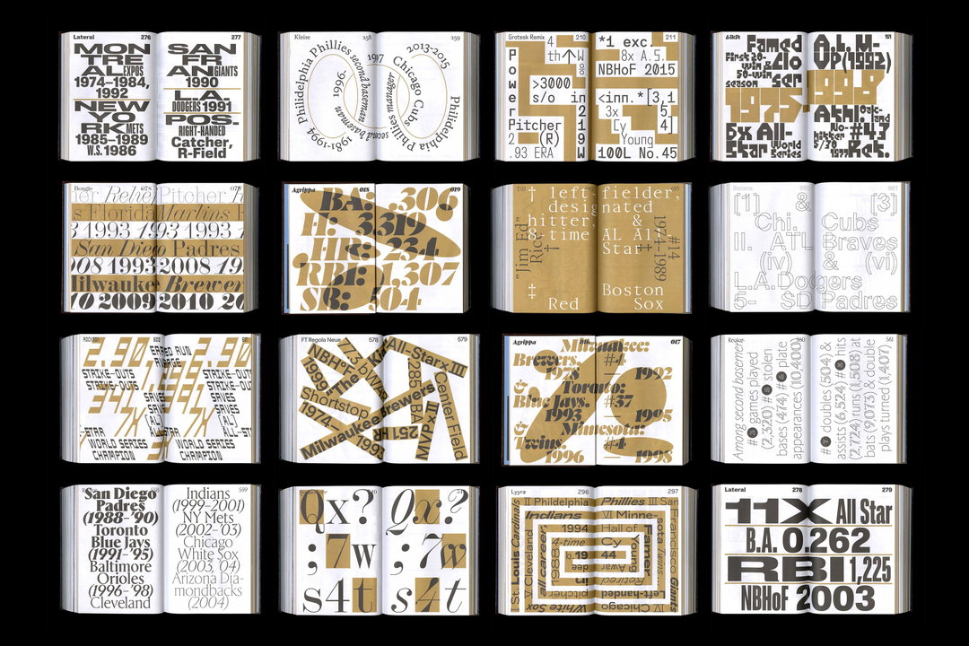
Actual Source: Shoplifters 10 (Copyright © Actual Source, 2021)
Kellen Renstrom: ONLY FOR A LIMITED TIME (Copyright © Kellen Renstrom, 2018)
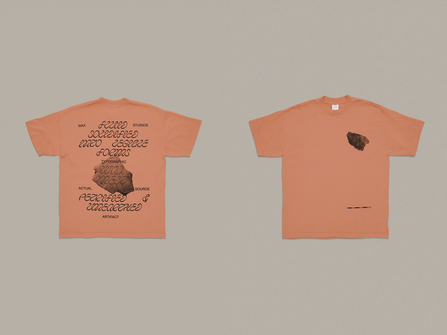
Wax Studios (Zak Klauck, A--Z Studio / David Yun, New Information Studio): Wax Melt (Copyright © Wax Studios, 2020)
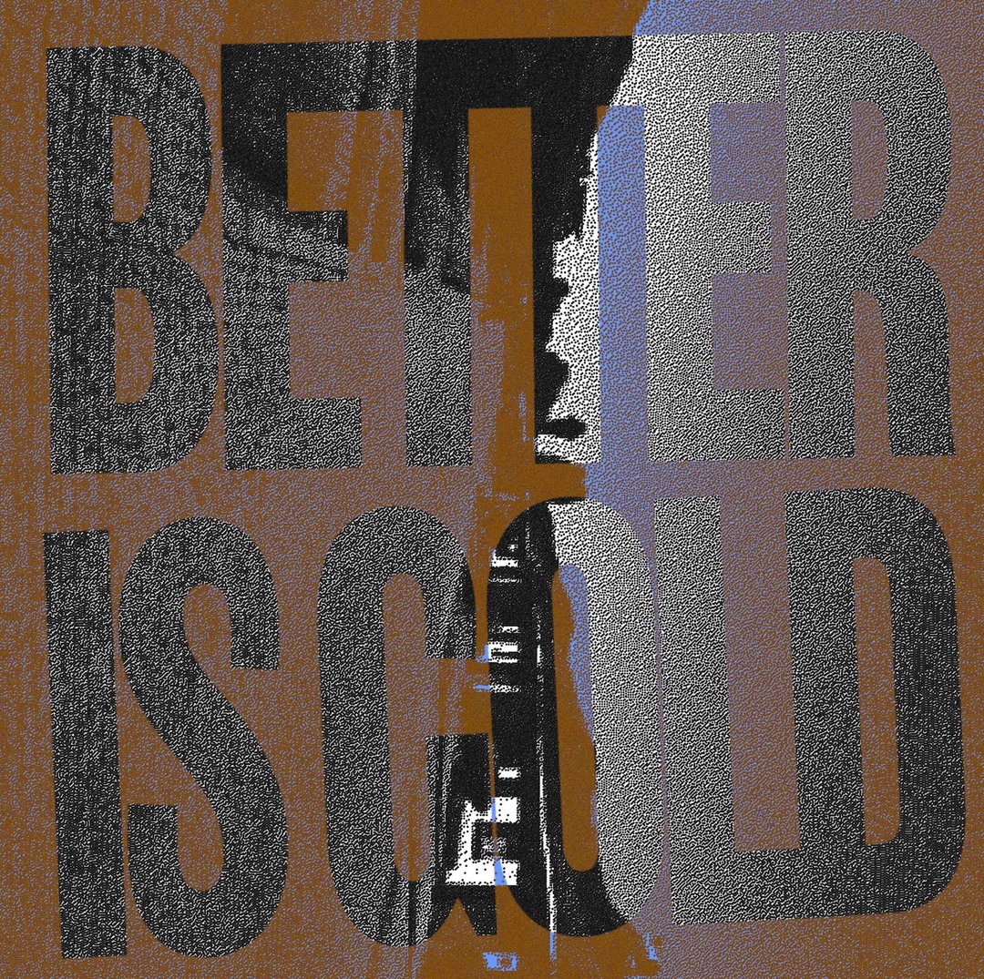
Wax Studios (Zak Klauck, A--Z Studio / David Yun, New Information Studio): Better Is Gold — Enid Ze (Copyright © Wax Studios, 2019)
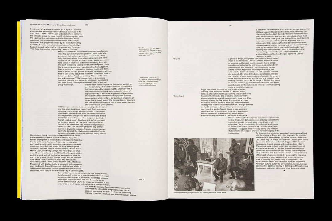
Wax Studios (Zak Klauck, A--Z Studio / David Yun, New Information Studio): Electronic Landscapes — Isaac Diggs & Edward Hillel / Kris Graves Projects (Copyright © Wax Studios, 2021)
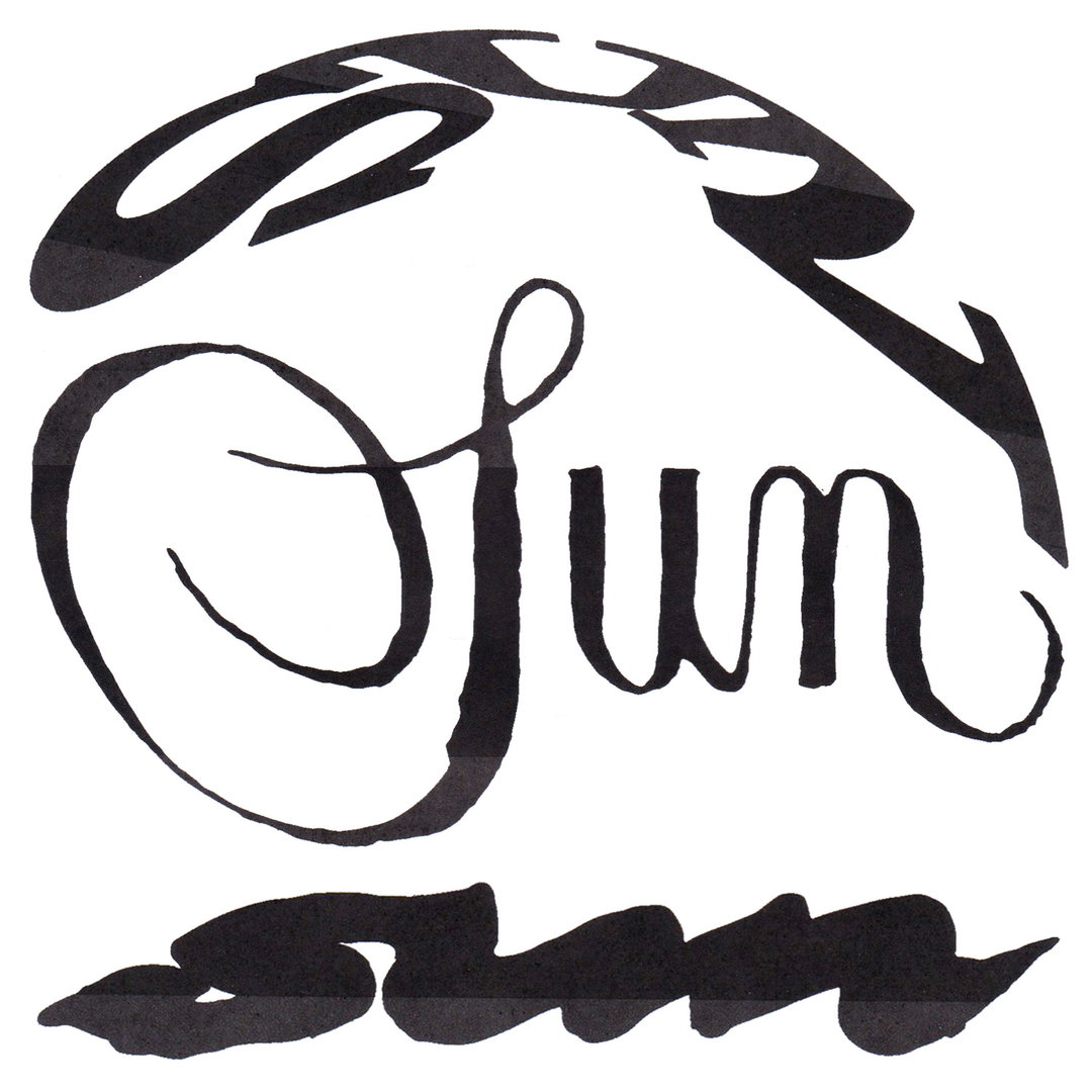
Kellen Renstrom: ‘SUN’ title explorations (Copyright © Kellen Renstrom, 2024)
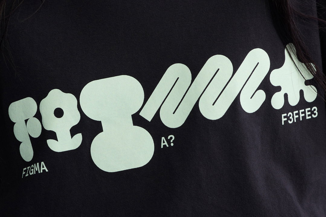
Actual Source: Figma SZN 3 (Copyright © Actual Source, 2024)
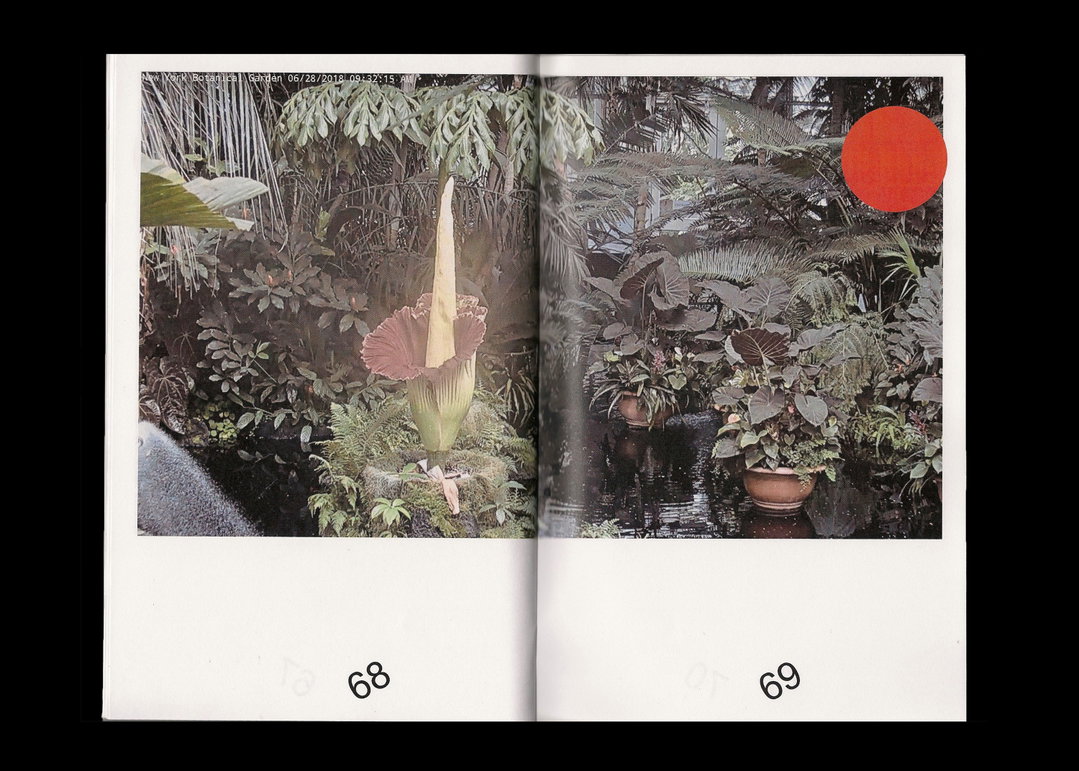
Kellen Renstrom: Live! bloom (Copyright © Kellen Renstrom, 2018)
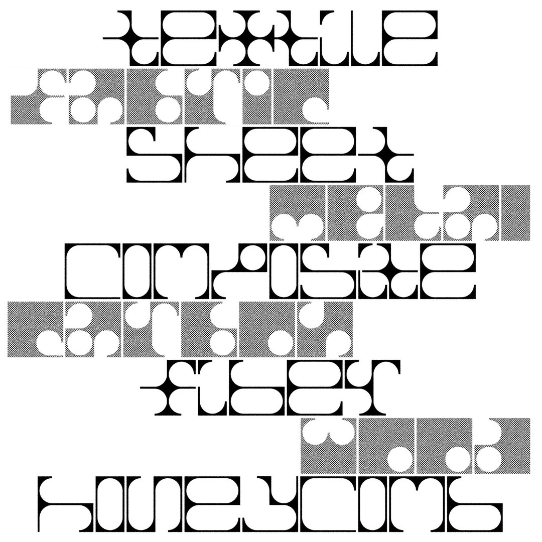
Kellen Renstrom: Grommet (Copyright © Kellen Renstrom, 2021)

Actual Source: Dizzy — Olly Alexander (Copyright © Actual Source, 2024)
Hero Header
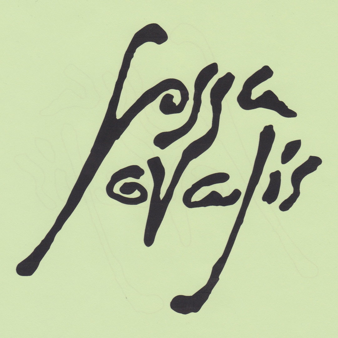
Kellen Renstrom: fossa ovalis, Leila Greiche LLC (Copyright © Kellen Renstrom, 2022)
Share Article
Further Info
About the Author
—
Ellis Tree (she/her) is a staff writer at It’s Nice That. She joined as a junior writer in April 2024 after graduating from Kingston School of Art with a degree in Graphic Design. Across her research, writing and visual work she has a particular interest in printmaking, self-publishing and expanded approaches to photography. ert@itsnicethat.com
To submit your work to be featured on the site, see our Submissions Guide.





