How Love And Money designed the identity and tiny typeface for Tame Impala’s synthesiser brand, Orchid
The Orchid synth is made for beginners and pros alike, including Kevin Parker from Tame Impala – the identity is floral like its namesake, and celestial like its unique sound bank.
- Date
- 6 October 2026
- Words
- Paul Moore
Share
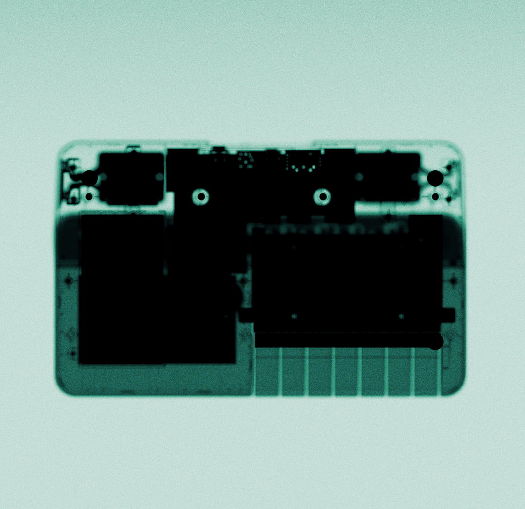
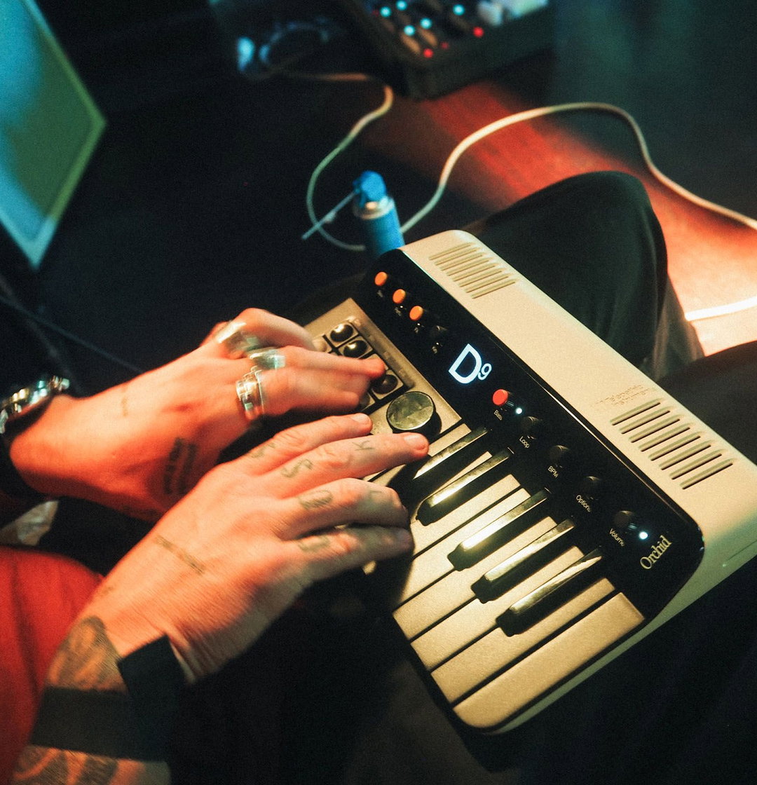
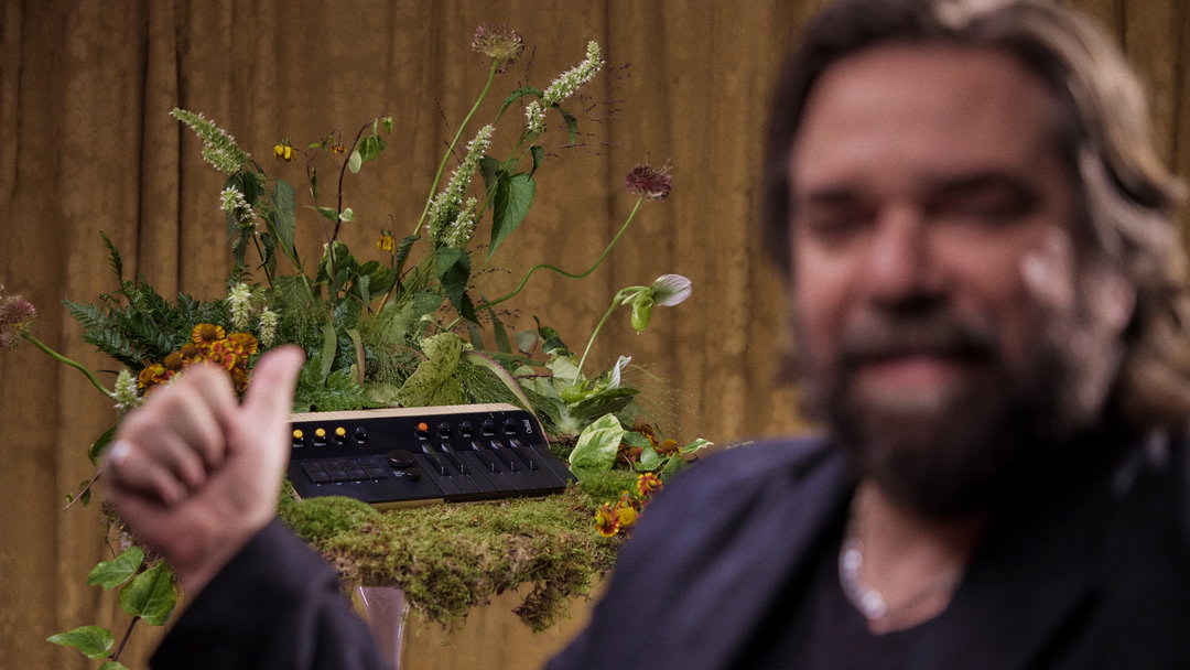
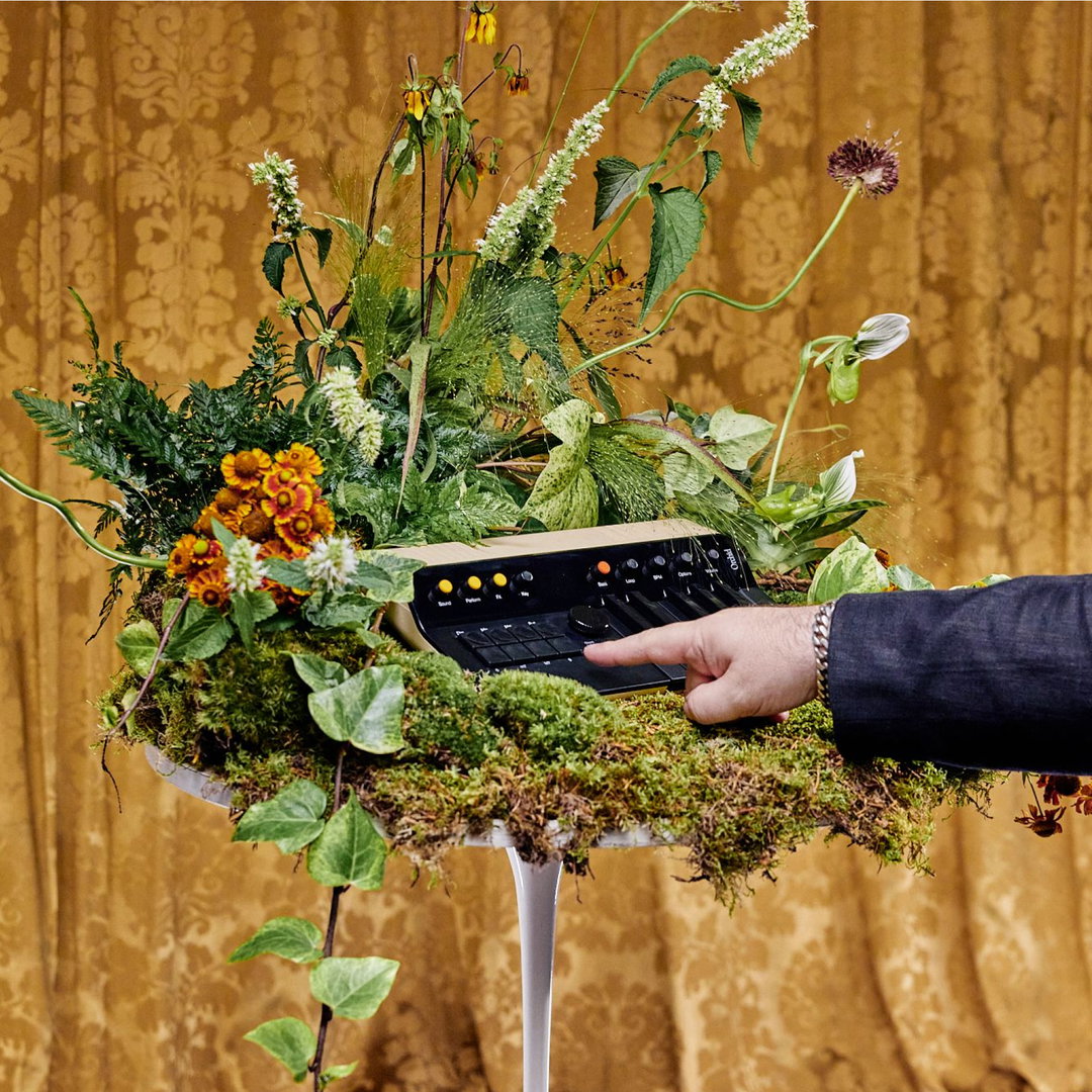
Telepathic Instruments don’t just make musical hardware and synthesisers, they make idea machines. Co-founded by Tame Impala’s Kevin Parker, the company’s biggest product to date is the Orchid, an easy to play mini synth which allows for playing entire chords with the click of a button. It’s beautifully designed – retro-futuristic, looking somewhere between a toy and something from our chunky analogue childhoods, even some of the Orchids are transparent, reminiscent of the iconic clear GameBoys. It’s a small piece of kit that’s capable of celestial sounds, so when this Pandora’s Box of musical potential needed a branding that felt like an extension of its beautiful simplicity, Telepathic Instruments went with design consultancy Love And Money.
Charl Laubscher, founder of Love and Money and CEO of Telepathic Instruments, had dropped out of a jazz degree when he was younger, but music had always been his first love. When writing primarily on keyboards, he always wanted a way to play in a more intuitive fashion. “I think that more than anything we’re an instrument company that’s by artists, for artists. From Kevin all the way down to customer service almost every single person in the company is or was a musician, or worked in the music industry in some capacity,” says Charl. “So when we design, we’re not just designing for what we think our customers may like. We’re designing for ourselves, too.”
GalleryLove And Money: Orchid (Copyright © Love And Money, 2026)

Love and Money want to be the “Max Martin of brand and advertising” – to create great pop art that “has a job to do” but is also fun, interesting and gets its audience bumping their heads. The motion assets surrounding the Orchid are serene, whimsical and filled with offbeat visual effects, transporting the viewer into a world of lush synthy waves – it’s what Charl says great pop art does, it blends the “familiar and the fresh”.
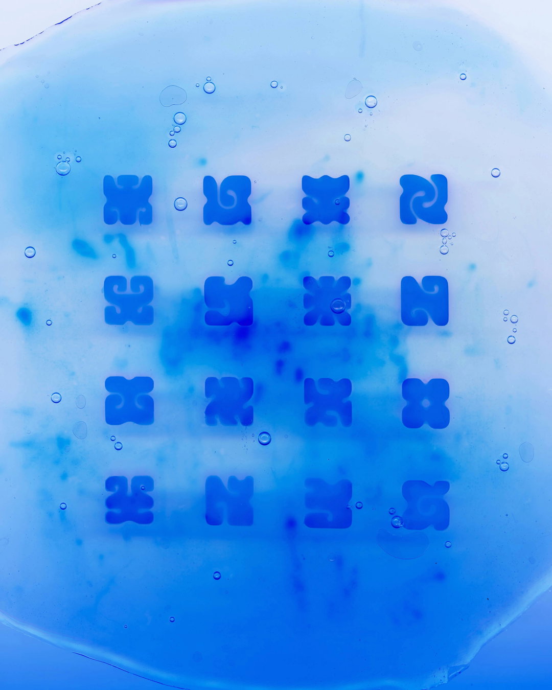
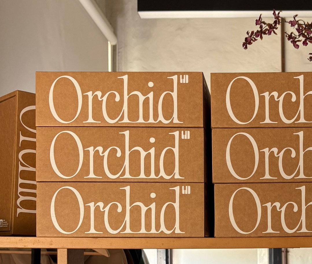
Orchid’s logo type in motion subverts Evan Gendell’s Superbloom typeface (which was forecast to be a new major trend in 2026) by going the opposite direction, instead of blooming like a flower, the Orchid actually decays like a fluttering synth sound. “When we came across PP Editorial Neue from Pangram Pangram, we fell in love with its unusual, organic-feeling letterforms. From there we customised the characters, playing with hand-drawn ligatures and bleeding the letters into each other even more,” says Danny Pemberton, design lead at Telepathic Instruments. “The result is a mark that could be blooming or decaying, growing or fading, like a note swelling and dying away. Perfect for an instrument called Orchid.”
The logotype almost feels like thick caramel or honey, viscous in its cursive design, mirroring the fluidity and flow of a great melody. Ease is the main character of the Orchid, everything comes from the nature of the synth, which is to create complex and gorgeous compositions with the click of a button – that attitude is expressed across visuals of lakesides, nature, fields of flowers, inviting audiences into its user accessibility. There’s even a half-parody, half-tutorial of the Orchid starring the one and only Matt Berry!
Love And Money: Orchid (Copyright © Love And Money, 2026)
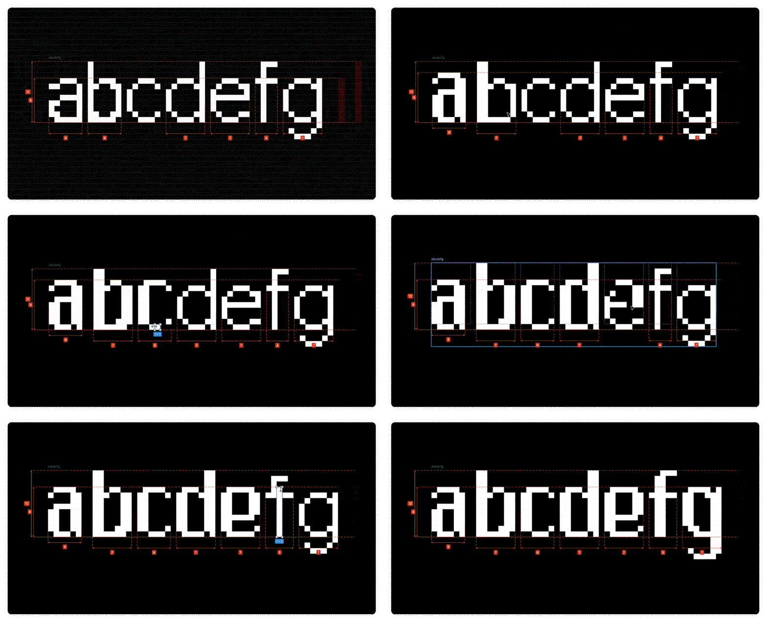
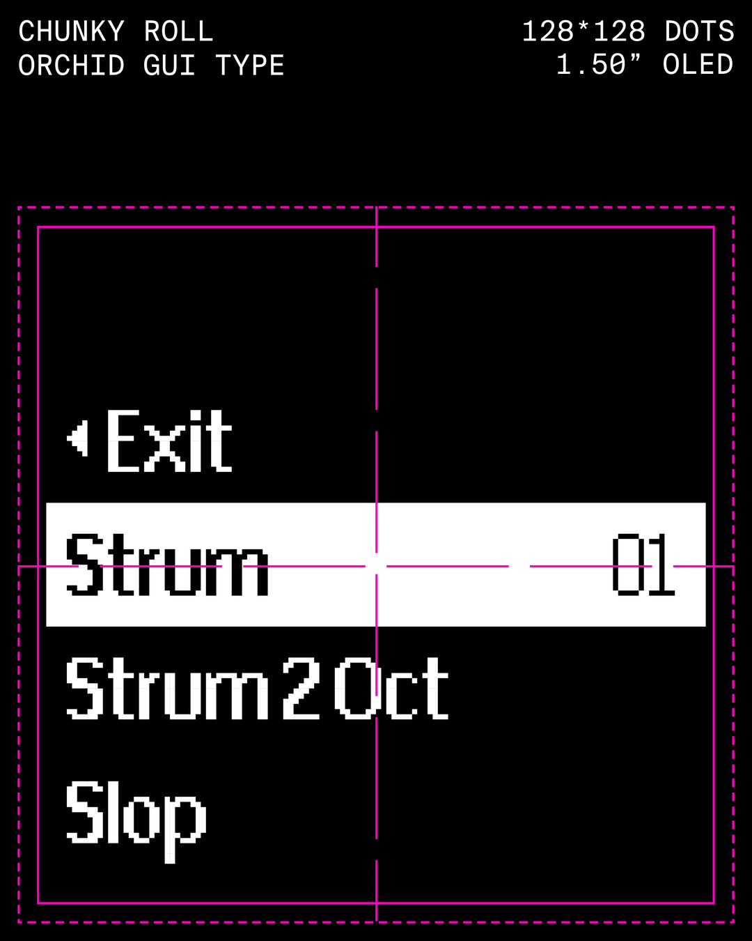
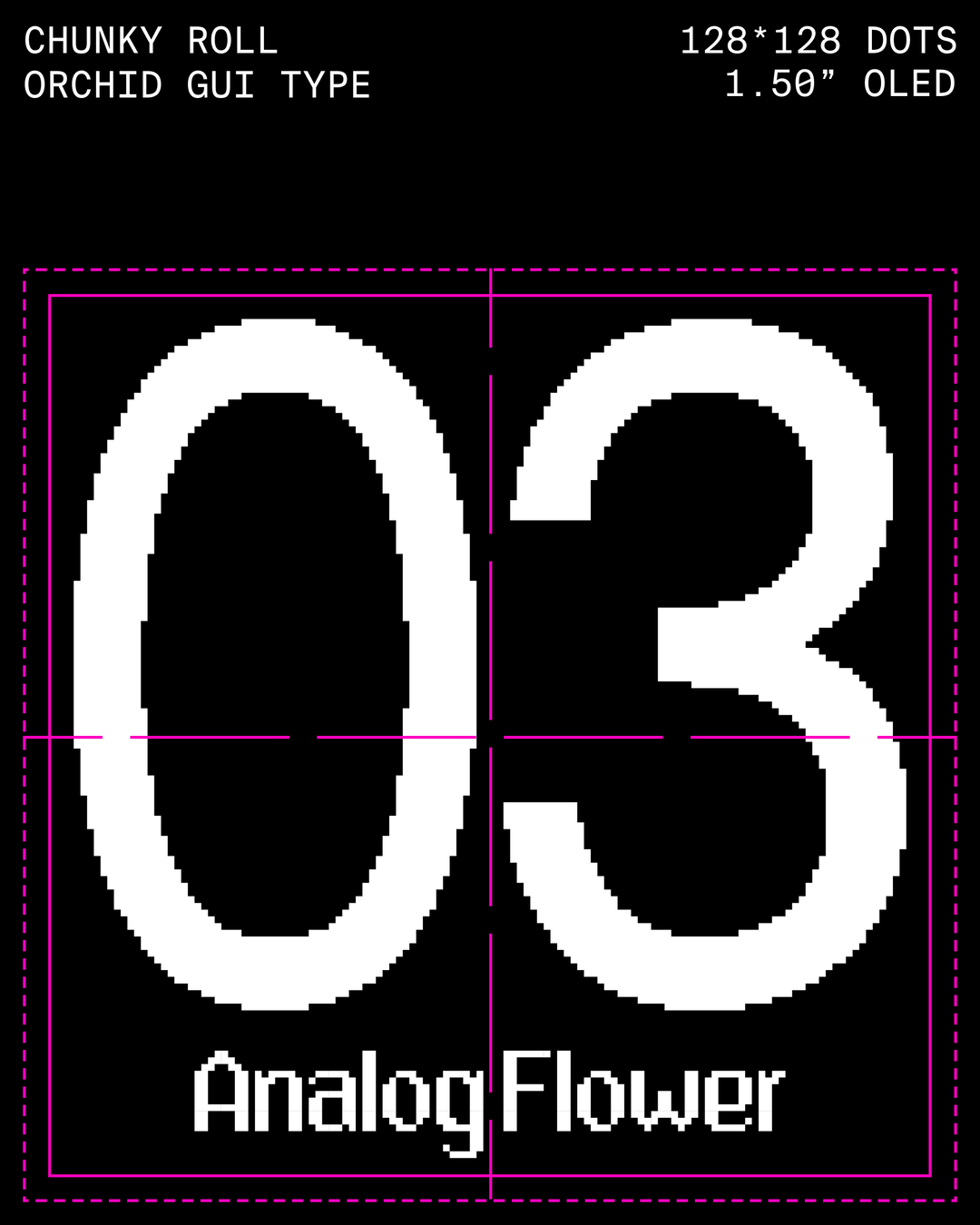
The Orchid itself comes with a 128x128 pixel screen, and within it holds all of the cute user interfaces that Love and Money created, including the Orchid’s own typeface Chunky Roll, which shows what note you’re playing and small animations which illustrate what exactly you’re doing on the synth nice and easily. Within the tight constraints, Charl and Danny had to create something that was fourteen to eighteen pixels from the top of the tallest character to the bottom after taking into account the necessary spacing for readability. The typeface is very vintage, made out of pixels that are two pixels vertically, one pixel horizontally, which kept the enclosed spaces between the letters open enough for legibility, whilst creating a nice interplay between the two letter weights. It’s a lot to cram into such a small screen!
One of the early references for the Orchid’s design came from Kevin Parker, who programmed an analogue oscilloscope from the 70s to draw a flower with the audio signal, thus the sound for the pattern itself – it inspired them to try create something that could tell a story about music, science and nature all at the same time. Alongside that, Ignacio Germade (another one of the founders) was leading the physical product design while we worked on the brand and visual identity. Having those running in parallel meant a lot of conversations about moments in recent culture when people felt differently about technology, when the future was something to be genuinely excited about. “How did those periods look, feel and sound?” says Danny. “Put all of that together and the process felt less like designing an ‘identity’ and more like an exercise in cross-disciplinary world building.”
GalleryLove And Money: Orchid (Copyright © Love And Money, 2026)
Hero Header
Love And Money: Orchid (Copyright © Love And Money, 2026)
Share Article
Further Info
About the Author
—
Paul M (He/Him) is a Junior Writer at It’s Nice That since May 2025. He has a strong interest in graphic design, digital kitsch, multimedia painting, collage, nostalgia, analogue technology and all matters of strange stuff. pcm@itsnicethat.com
To submit your work to be featured on the site, see our Submissions Guide.