




A new typeface from Man vs Type looks back to the culture of colonial Bombay
The New Delhi-based graphic designer discusses the inspiration behind his new typeface and how it tackles a problem affecting many Indian designers.
“It’s impossible to ignore colonial history in India,” says Manav Dhiman (AKA Man vs Type). “More so in Bombay than anywhere else.” Manav grew up just outside Mumbai and has always been fascinated by its colonial period, when the city was known as Bombay. He is interested in the ways the city changed under British rule, through its architecture and infrastructure but also through the vibrant mixing of local cultures. He explains: “The food is a mix of Portuguese (colonisers before the British), Parsee (famously the community that ran many of the successful businesses in the British era and some of the yummiest bakeries that still exist today), Maharashtrians, and so many more.”
These communities and food cultures still exist and “that’s what makes Bombay, Bombay,” Manav says. When he began designing his typeface, the variable shoulders in the letters a, b, d, h, m, n, p, q, r and u, reminded him of “an old Parsee uncle’s spectacles”. This is when he knew that the typeface should be called “Bombay”. He adds: “It’s hard to explain, but in my heart I definitely know I couldn’t have named it anything else.”
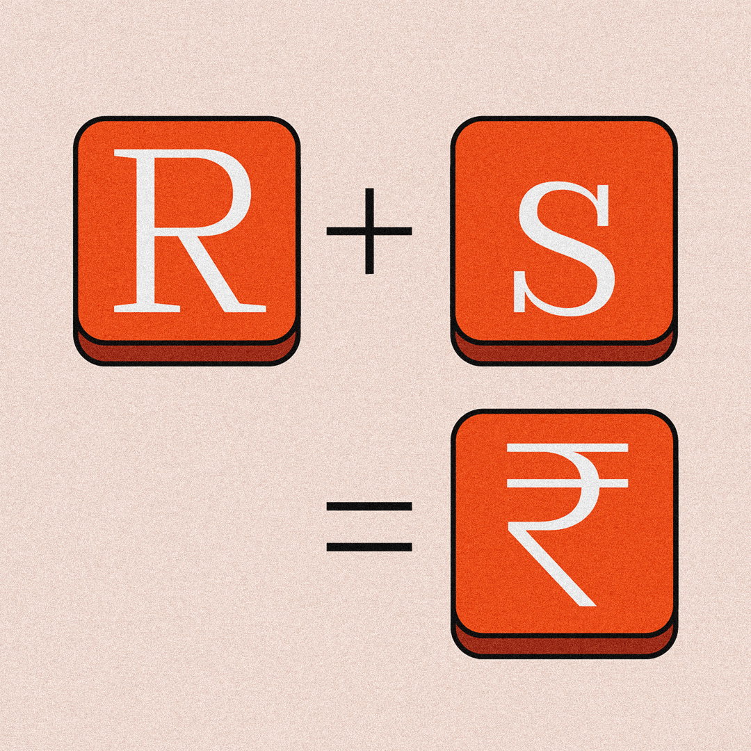
Manav wanted the typeface to be used by Indian designers and projects designed for an Indian context. So he set about dealing with a type-themed problem affecting the whole of India. The rupee symbol is a recent addition to Unicode, so “almost all of the legacy typefaces don’t have it,” he says. Even if a typeface has a rupee symbol, people often get lost between changing keyboard settings and complex key combinations when trying to access it.
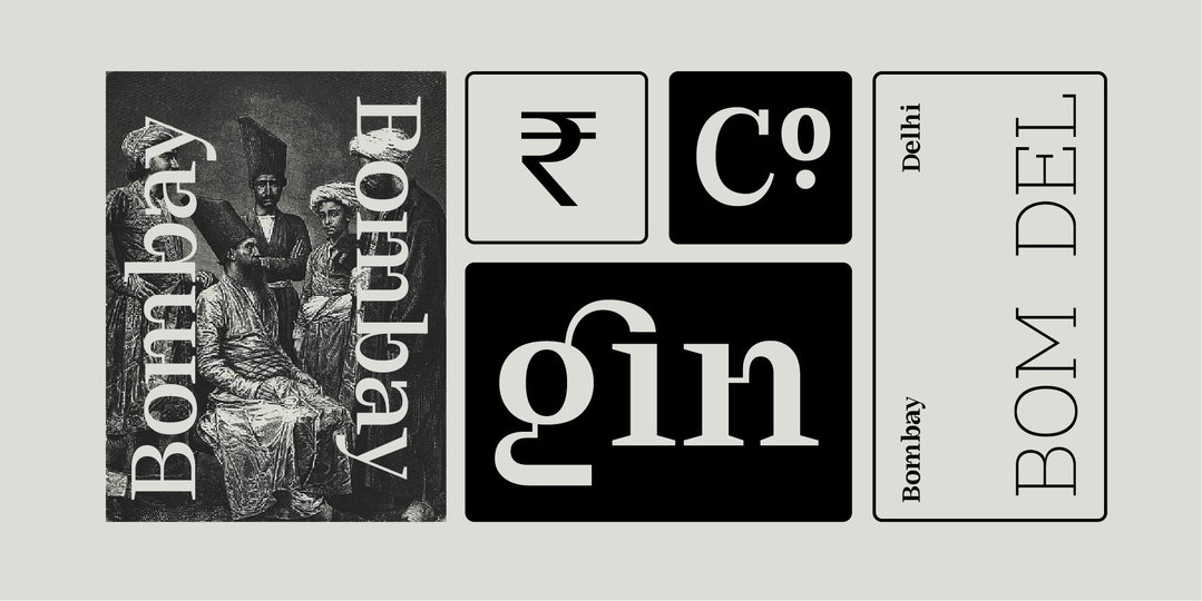
Manav Dhiman: Bombay (Copyright © Manav Dhiman, 2021)
“Not everyone is savvy enough to use a PNG or maybe a PNG image doesn’t work in an Excel sheet they are making. The other alternative currently available are rupee symbol typefaces that have different styles of the symbol (sans-serif, serifs, etc.). That isn’t the best solution either, because of course not all serif typefaces look the same, so there’s always some visual mismatch.”
So Manav came up with a solution. By adding an R-s ligature, he produced a “unique enough combination of letters and case that when you type this it turns into ₹.” Soon Manav is going to release his new sans-serif typeface but he’s also excited to continue experimenting with Devanagari typefaces. He assures us that the R-s ligature will feature in all his future projects.
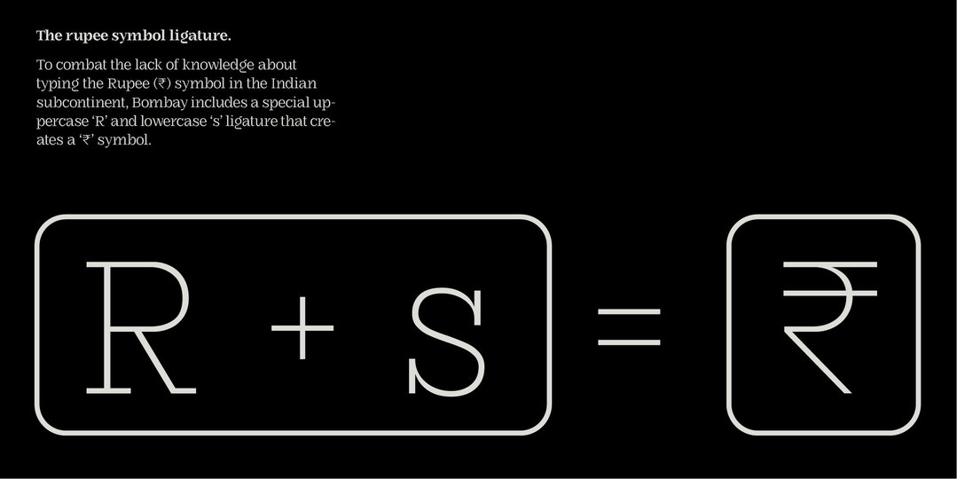
Manav Dhiman: The Rupee Symbol Problem (Copyright © Manav Dhiman, 2021)
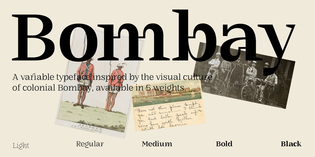
Manav Dhiman: Bombay (Copyright © Manav Dhiman, 2021)
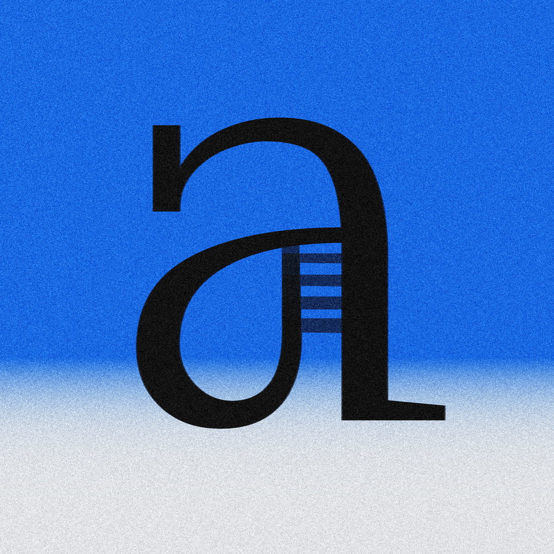
Manav Dhiman: Bombay (Copyright © Manav Dhiman, 2021)
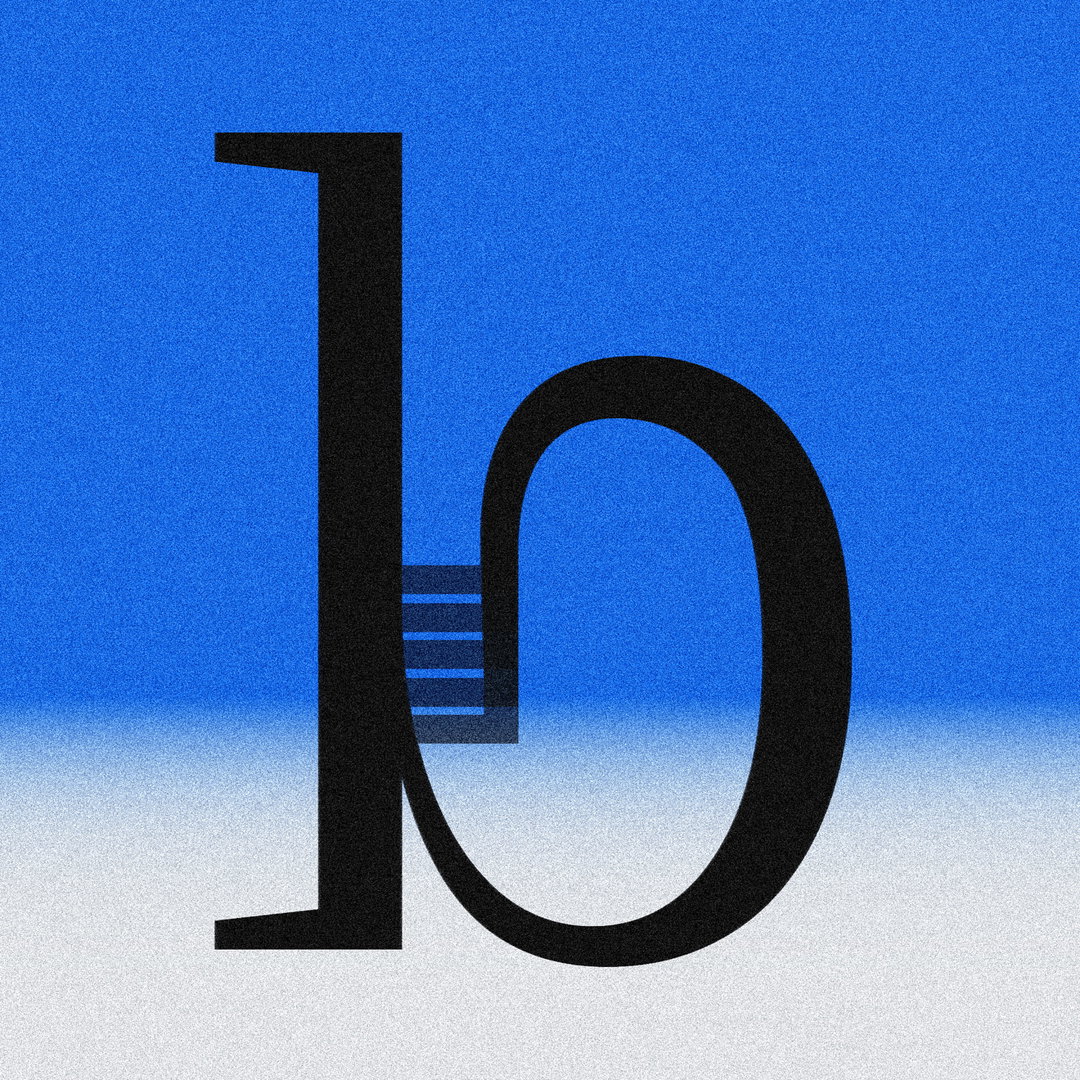
Manav Dhiman: Bombay (Copyright © Manav Dhiman, 2021)
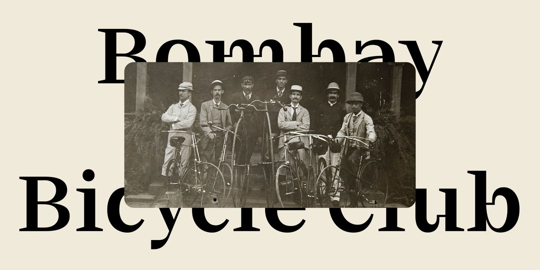
Manav Dhiman: Bombay (Copyright © Manav Dhiman, 2021)

Manav Dhiman: r-y ligature (Copyright © Manav Dhiman, 2021)

Manav Dhiman: f-i ligature (Copyright © Manav Dhiman, 2021)
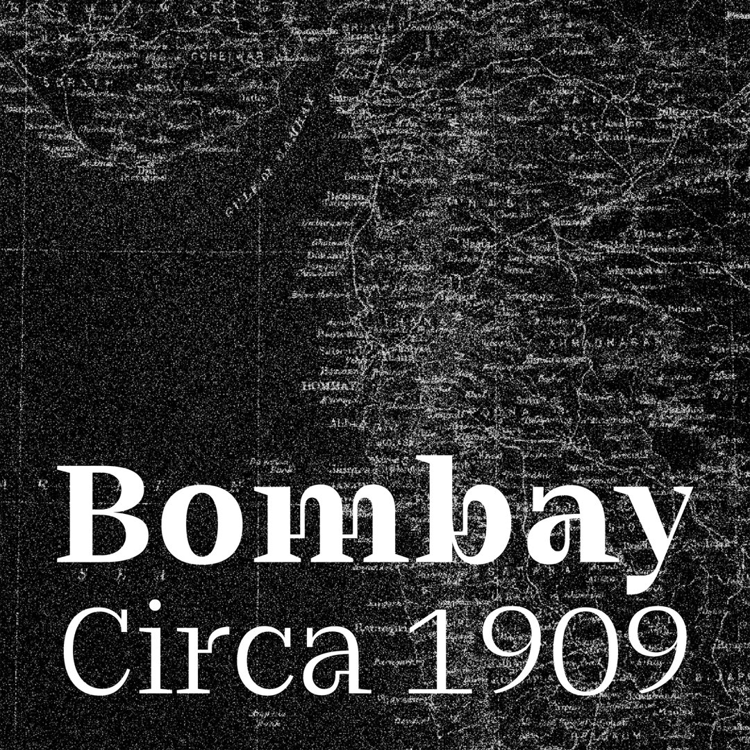
Manav Dhiman: Bombay (Copyright © Manav Dhiman, 2021)
Hero Header
Manav Dhiman: R-s ligature (Copyright © Manav Dhiman, 2021)
Share Article
Further Info
About the Author
—
Elfie joined It’s Nice That as an editorial assistant in November 2021 after finishing an art history degree at Sussex University. She is particularly interested in creative projects which shed light on histories that have been traditionally overlooked or misrepresented.




