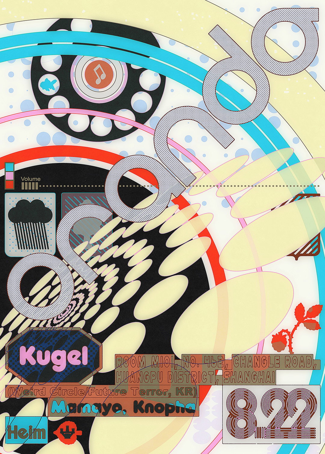
Menslies makes experimental posters for China’s club scene that shed grids and look purposely worn in
Over the past ten years, the studio has kept the pulse of China’s clubbing scene alive from the inside, with innovative visuals that always point back to print.
2026 marks an entire decade of designers, DJs and producers Haojun Pan and Yenk’s joint practice, Menslies. What began as a friendship between two creatives, brought together by a shared love of club music, illustration and design, has since produced an incredible archive of show-stopping gig and event posters that push to capture, what Haojun calls, “the true feeling of the sound and the event” inside every eclectic composition.
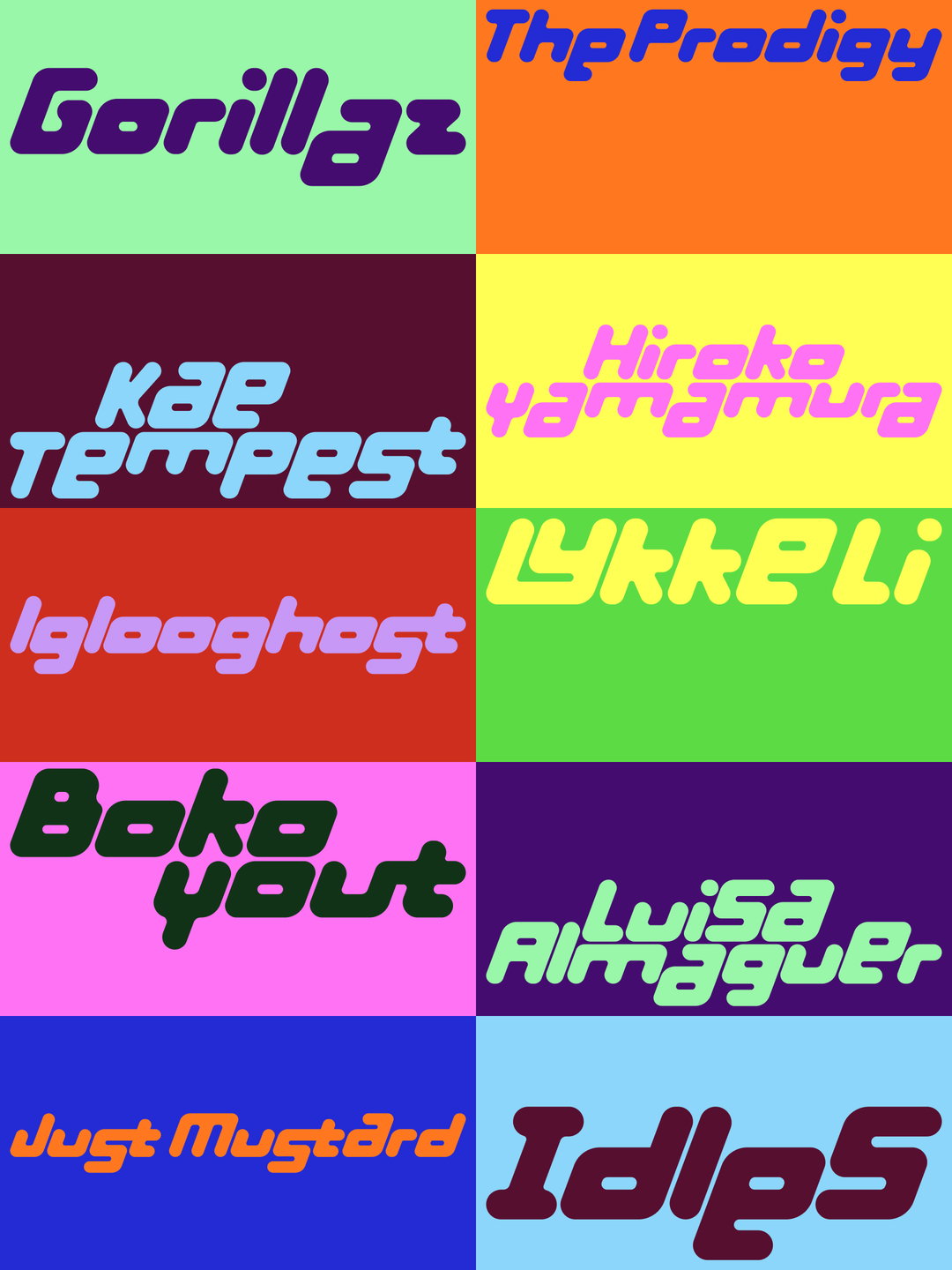
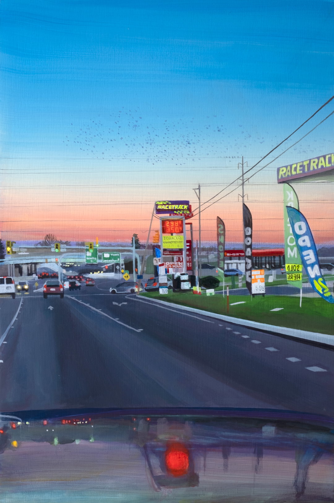
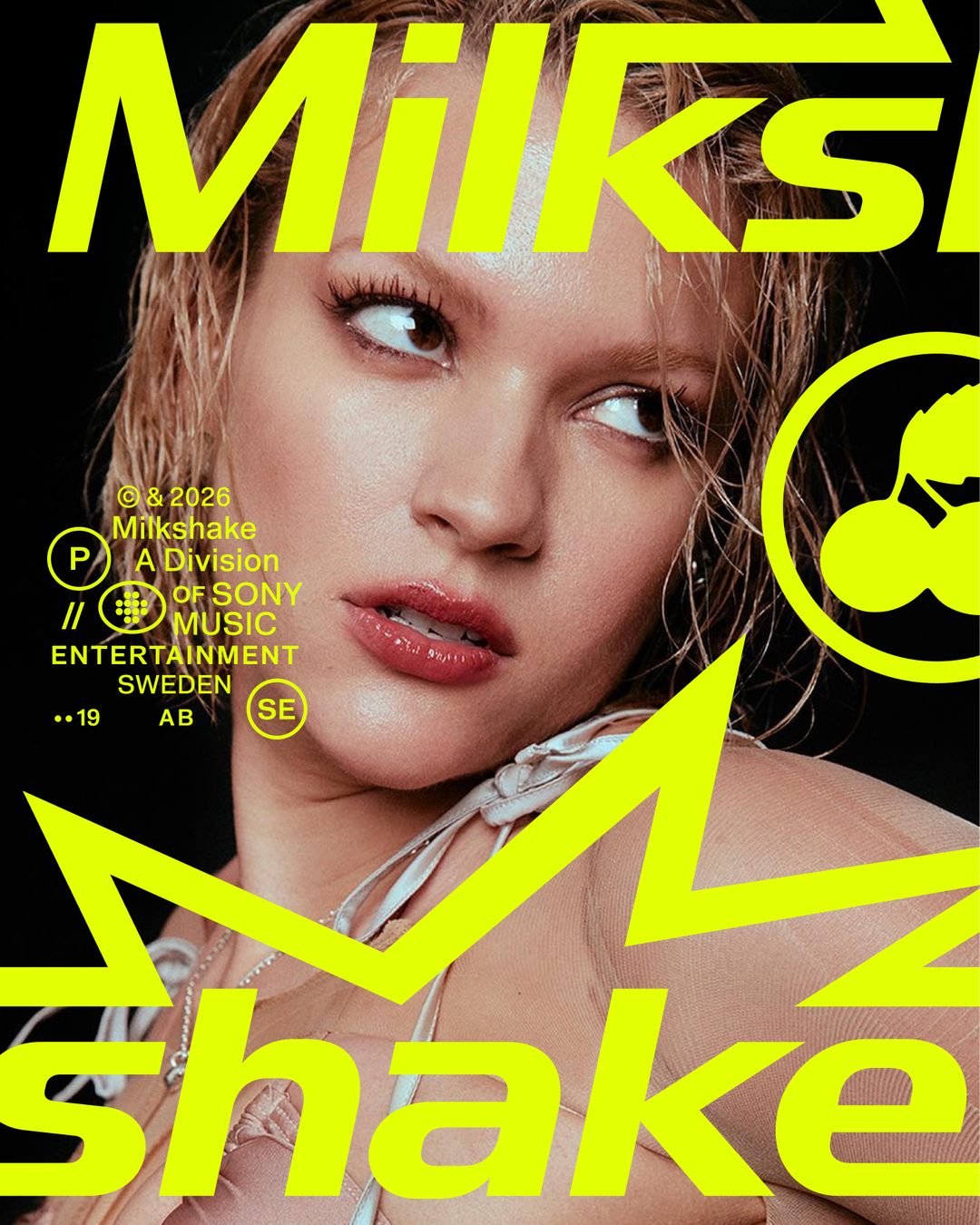
In an exhibition currently on show at WarmUp in Kyoto (on until 27 September), Menslies looks back at a selection of posters over the last ten years, charting the evolution of the label and creative studio to date. The show highlights how event flyers and promotional visuals all snowballed into a wider graphic design practice that now holds up a number of artists, promoters and labels on the Beijing music scene: from working as in-house designers at club venue Zhao Dai for a number of years, to freelance gigs for a whole host of events. Charting a contemporary history of China’s club culture through its work, the studio’s design decisions have notably strayed from the more classic tropes when pulling together visual world – something that Yenk puts down to drawing their inspiration from “various fields outside graphic design, offering fresh symbolism and storytelling to artists and venues”.
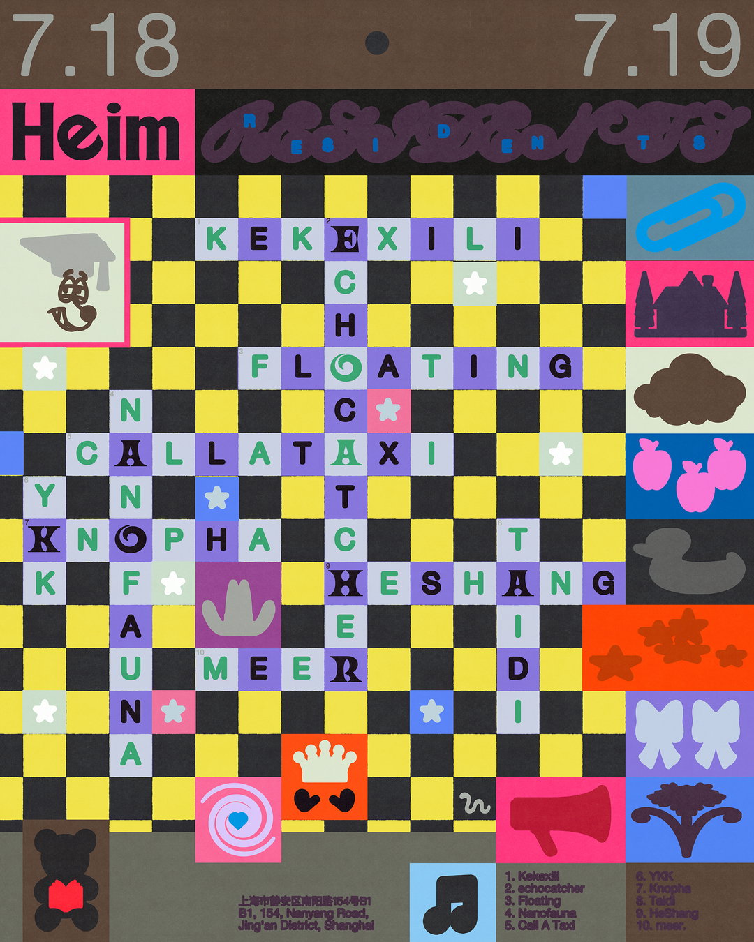
Menslies: Heim Residents (Copyright © Menslies)
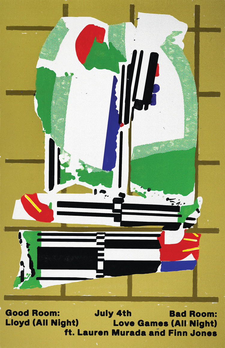
A spirit of invention has run through all of the studio’s work to date, and even though the pair’s design process is entirely digital, it takes experimental instincts from more analogue means. A Menslies poster isn’t concerned with rules or grid systems – instead it holds on to the freedom and spirit of something more improvised and part of this is making sure that posters look more worn in. Finding a way to remove their glossy digital sheen is a key part to the creative process for Haojin: “Making it look analogue is always the last step. That part feels like Hualong Dianjing (画龙点睛), which literally translates to ‘painting a dragon and dotting its eyes’, meaning the final touch that brings the whole thing to life. I try my best to add a more human, raw vibe, sometimes through unplanned, chaotic decisions that just feel right within the image; I found this approach satisfies me the most,” they say.
This lens on poster design largely derives from the fact that many cities in China “don’t really encourage pasting posters in public spaces”, Yenk says. “The word poster itself becomes a bit tricky without its usual context, so the screen is the actual format that we are using to promote an event.” So the design duo’s layered compositions always aim to have within them a distinct nod to the poster’s printed origin. “We look at that same poster on different screens (phone, laptop and iPad), and designing for each feels like reviewing a mastered track on different stereos,” Haojun. It helps me reset my sense, and sometimes guides me towards a better revision. By sharpening your intuition like this, over and over again, one eventually finds their own personal balance point.”
“Our passion really is to engage with the scene beyond just the graphic design though,” Yenk ends. “To us, experiencing music as a DJ has really broadened our understanding of music – the evolution of our visuals has probably benefited a lot from that.”
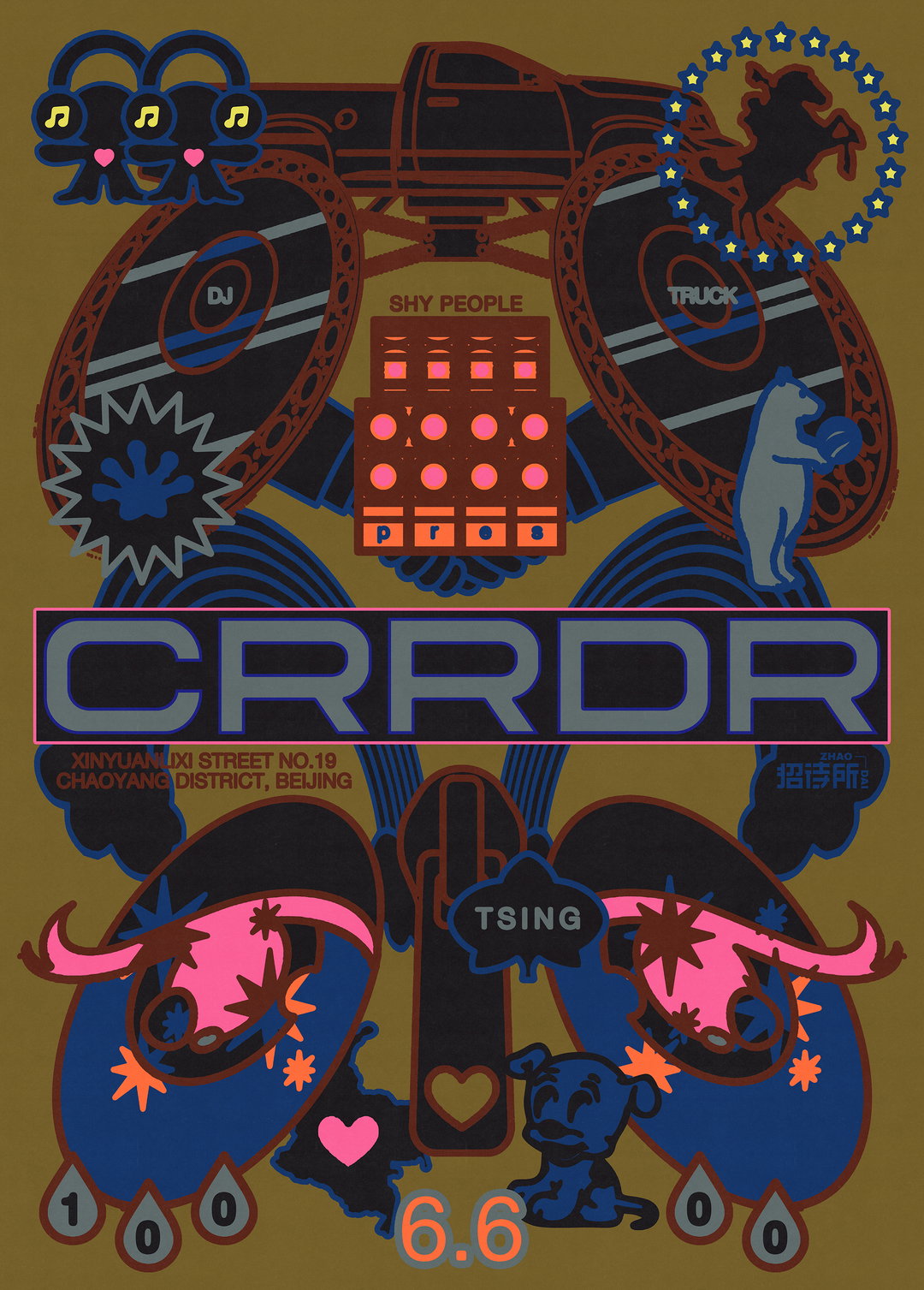
Menslies: CRRDR (Copyright © Menslies)
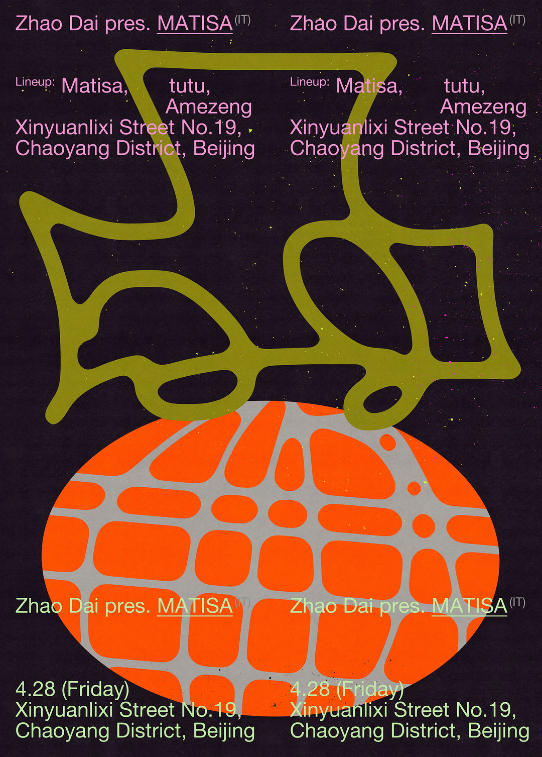
Menslies: Zhao Dai Matisa (Copyright © Menslies)
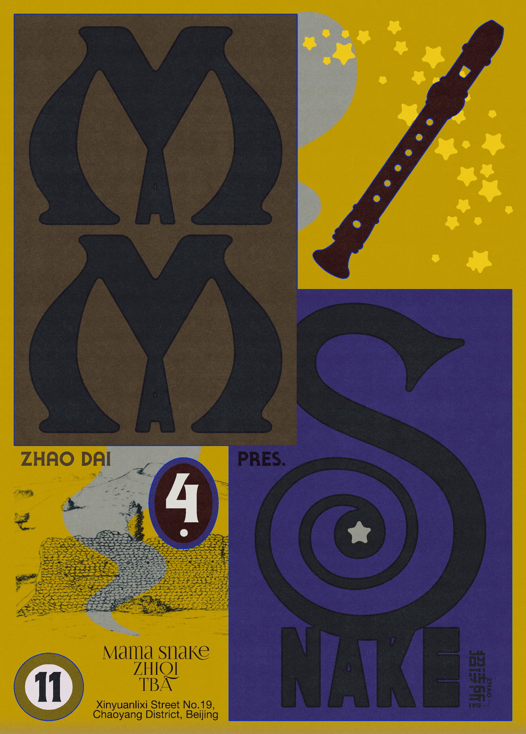
Menslies: Zhao Dai Mamma Snake (Copyright © Menslies)
Menslies: Zhao Dai, Hiroka Yamamura (Copyright © Menslies)
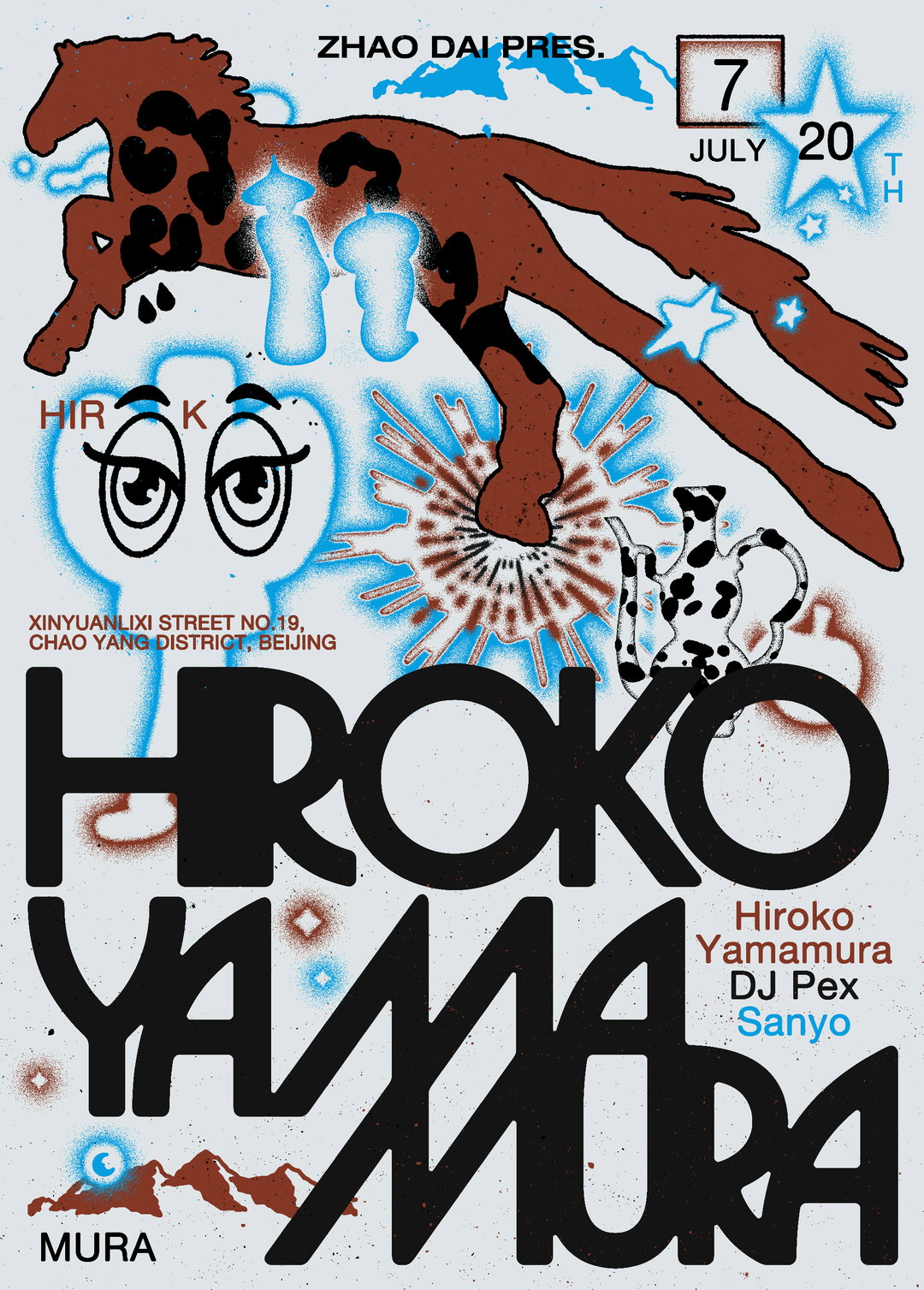
Menslies: Zhao Dai, Hiroka Yamamura (Copyright © Menslies)
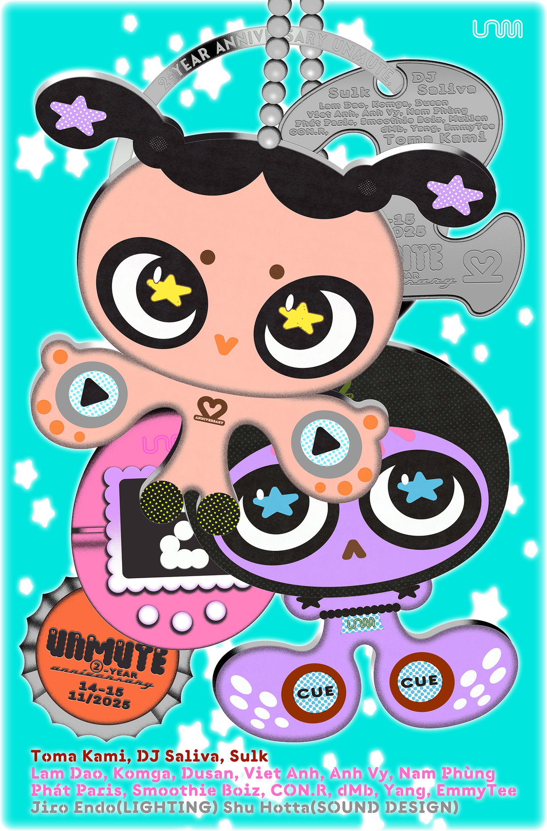
Menslies: Two year anniversary poster for Unmute Hanoi (Copyright © Menslies)
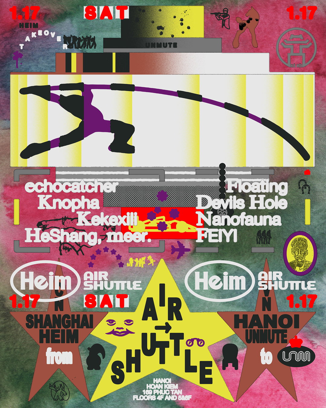
Menslies: Heim Takeover (Copyright © Menslies)
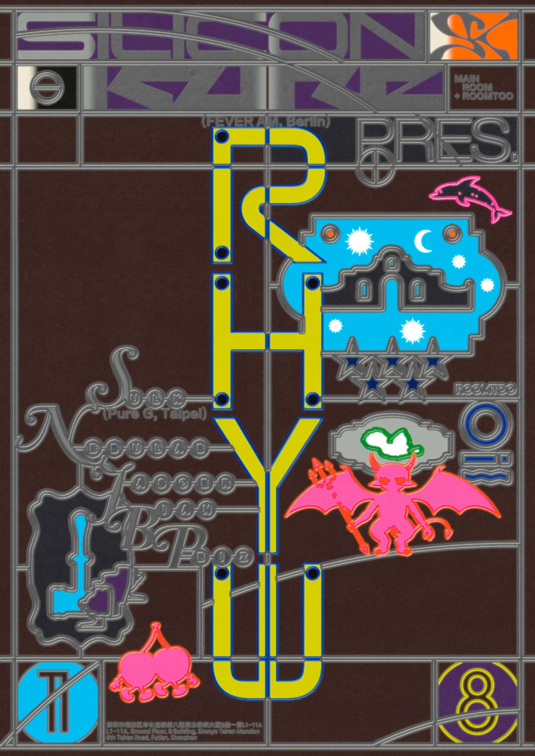
Menslies: Oil (Copyright © Menslies)
Menslies: Oil (Copyright © Menslies)
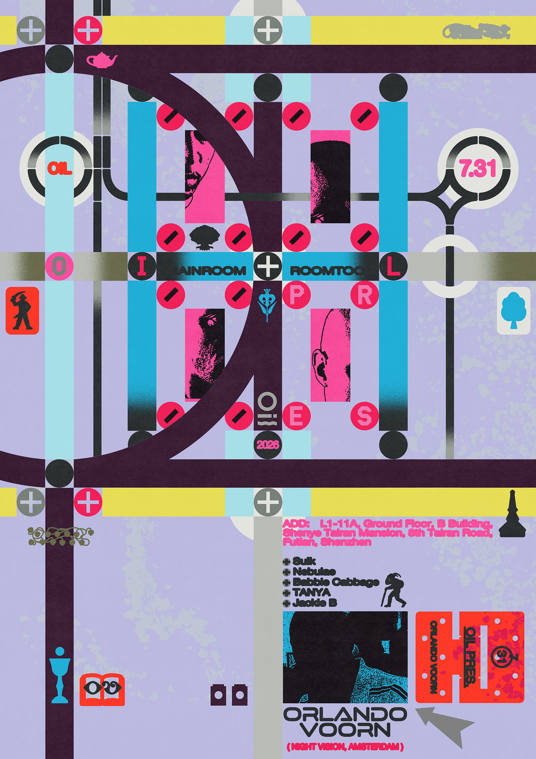
Menslies: Oil (Copyright © Menslies)
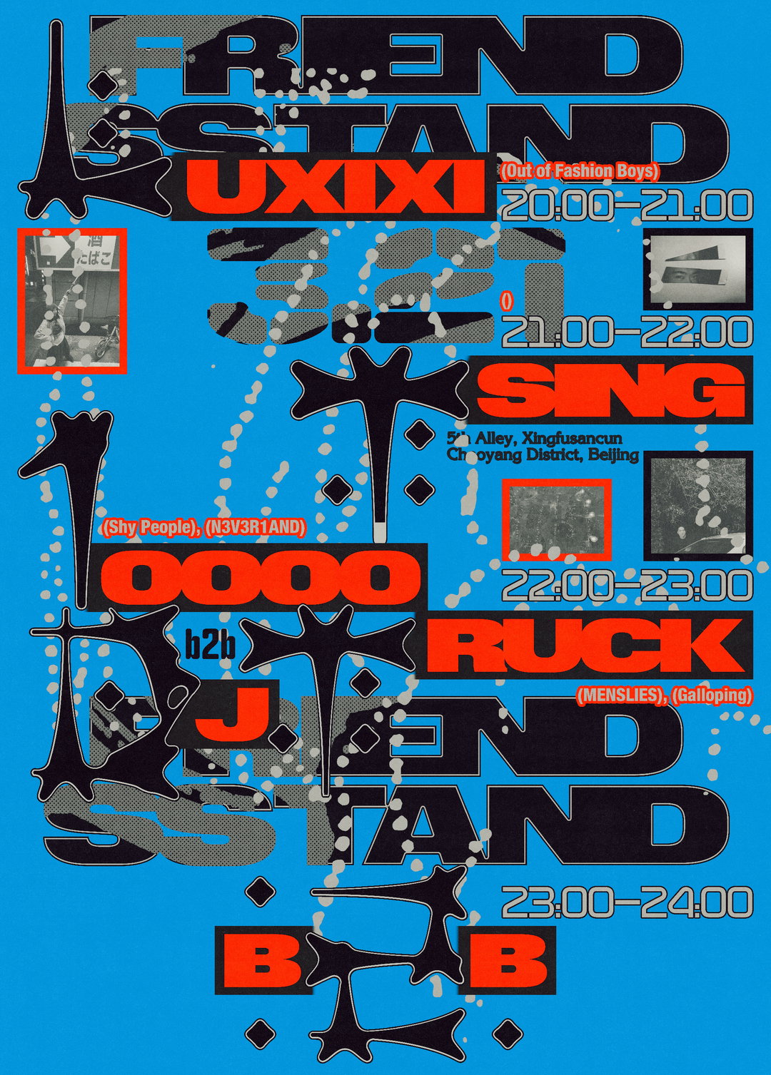
Menslies: Friend Stand (Copyright © Menslies)
Hero Header
Menslies: Oranda (Copyright © Menslies)
Share Article
About the Author
—
Ellis Tree (she/her) is a staff writer at It’s Nice That. She joined as a junior writer in April 2024 after graduating from Kingston School of Art with a degree in Graphic Design. Across her research, writing and visual work she has a particular interest in printmaking, self-publishing and expanded approaches to photography. ert@itsnicethat.com
To submit your work to be featured on the site, see our Submissions Guide.