Mickaël Emile on his typeface Clinker, inspired by 3D-printed concrete
The Paris-based designer admits he won’t be creating the next Helvetica, but his latest endeavour is a good place to start.
In his younger years, Mickaël Emile was asked what kind of job he wanted to pursue in the future. In response, he thought to himself: “OK, what do I really not want to do?” A considered way of looking at things no less, he proceeded to deliberate and exclude a couple of professions from his list. Then, he landed on the role of a graphic designer and said, “let’s go!”
Ever since this pivotal moment, Mickaël worked hard to get his foot in the door as a designer. As such, he went on to study design and applied arts in a specialised high school, instead of taking the more traditional route of academia. It was there that he learnt the ropes of art and design, which thus inspired him to take on a degree in the field with a focus on digital media (he’s a big fan of technology after all). An MA later – in Graphic Design and Multimedia Narration from Jacques Prévert School in Boulogne-Billancourt – and Mickaël had fully developed all the necessary tools to flourish. So it comes as no surprise to hear that straight after graduation in January 2020, he joined Feldman Studio, specialising in branding and art direction, based in Paris. On working there for a few months, he says: “It was a really nice experience where I learned a lot. Then the global pandemic made me realise that I needed to better control my work environment, and find more time for personal projects and my private life.”
The past year has of course had its difficulties, and there are the minor few who have yet to feel its rippling effect of job loss and disconnection. But some, like Mickaël, saw this as an opportunity for change: he decided to leave his studio job and work on his own endeavours as a freelance graphic designer. “The balance between personal and professional life is quite hard to find,” he tells It’s Nice That, “but mine went with more control of my free time.”
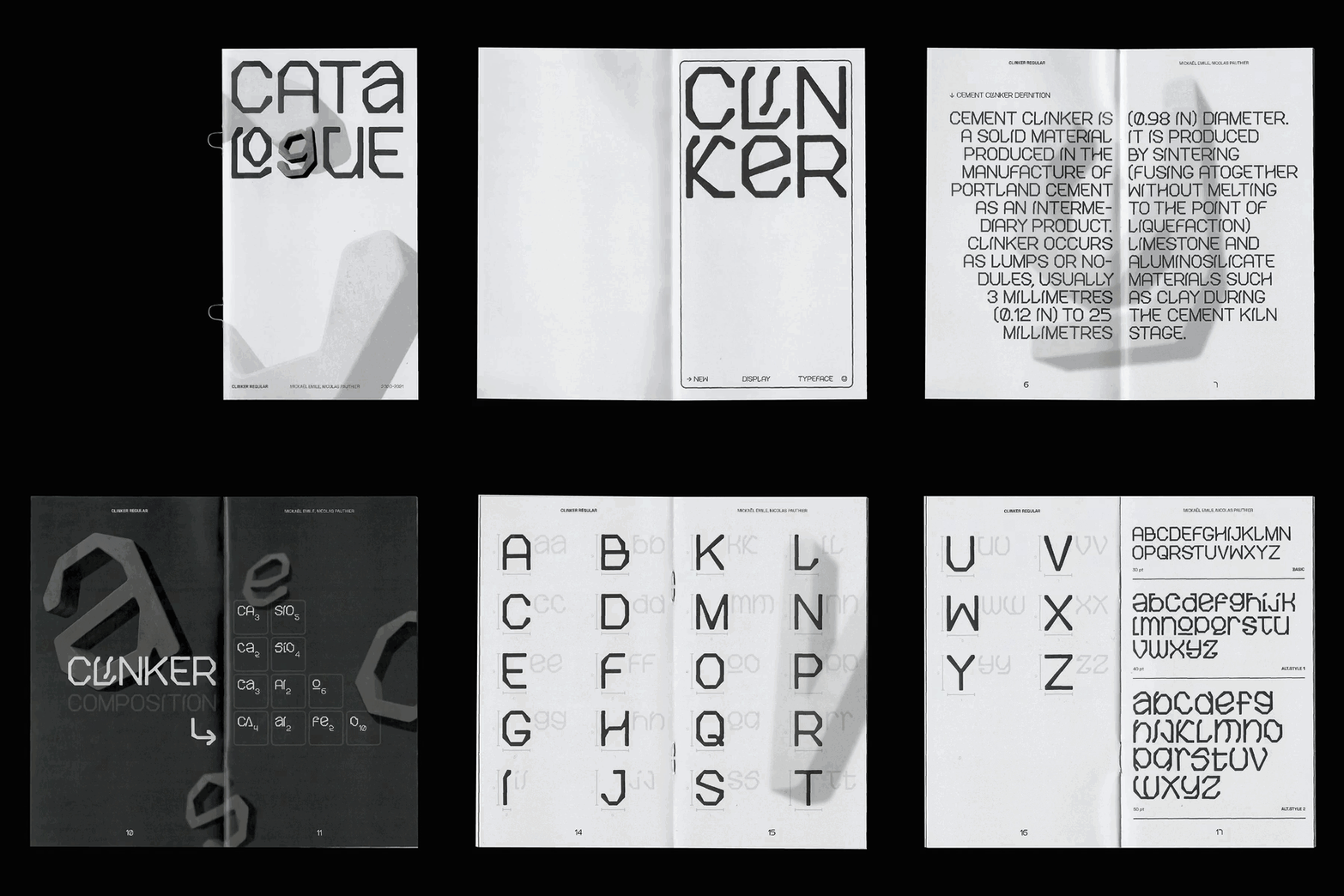
Mickaël Emile: Clinker, designed with Nicolas Pauthier (Copyright © Mickaël Emile and Nicolas Pauthier, 2021)
Now working on his own terms, Mickaël enjoys onboarding projects that have a distinct and obvious graphic solution, but equally, those that seem “particularly relevant” to the project at hand. He likes simplicity and efficiency: “We are not designing for us,” he notes. “We are designing for an audience, for a brand, for an institution, for others that aren’t always designers. I always try to keep that in mind.” So when approaching any given brief, not only does he bring a hefty dose of personality, he also hopes that the task at hand will have multiple constraints – he’s always up for a challenge and sees limitations as a way of helping him figure out the best direction.
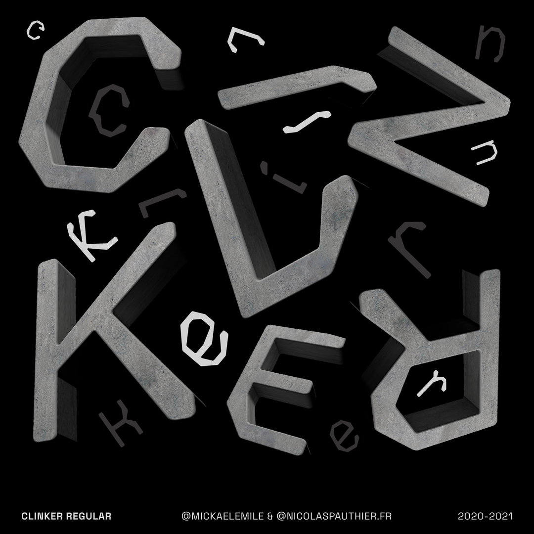
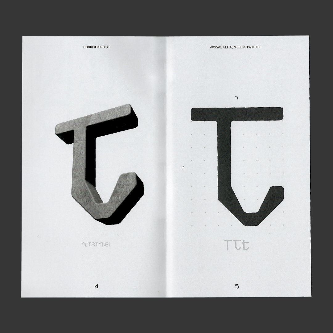
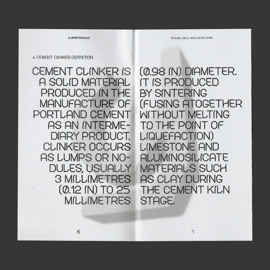
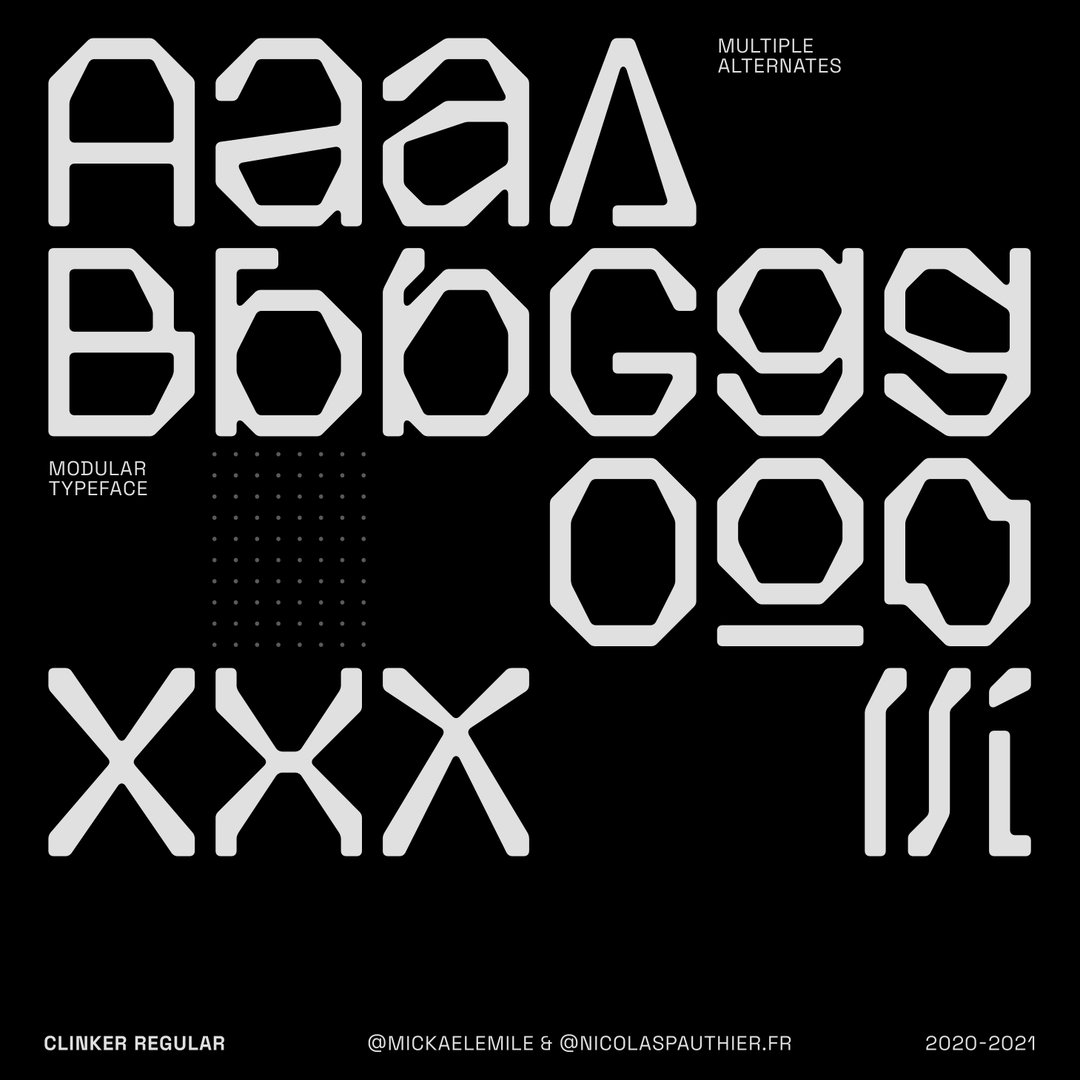
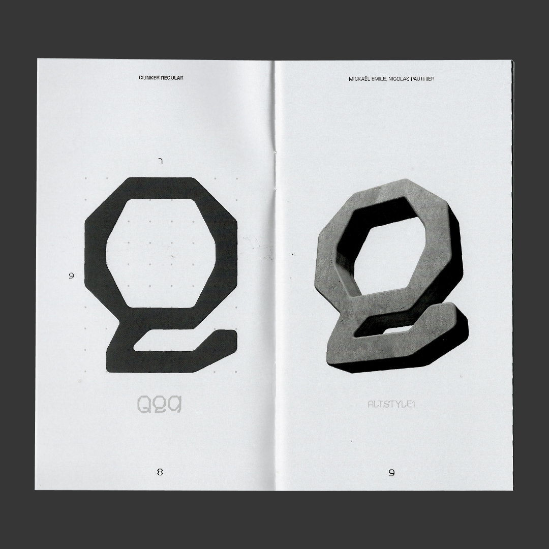
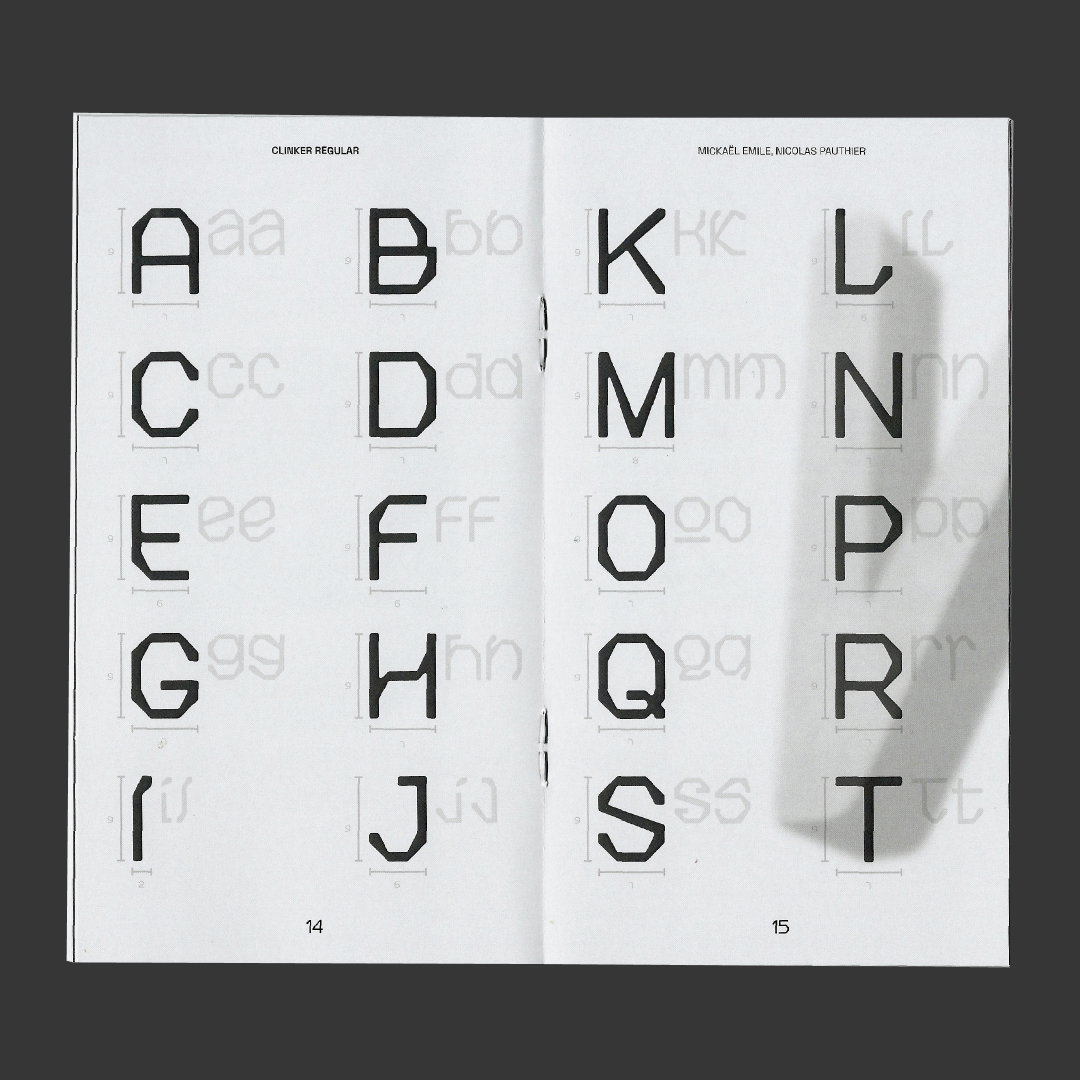
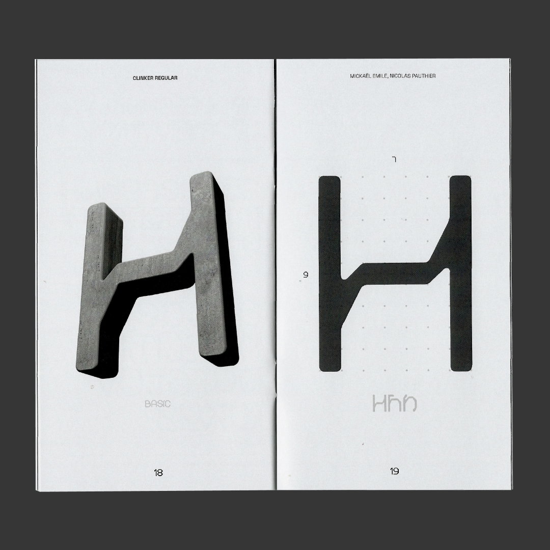
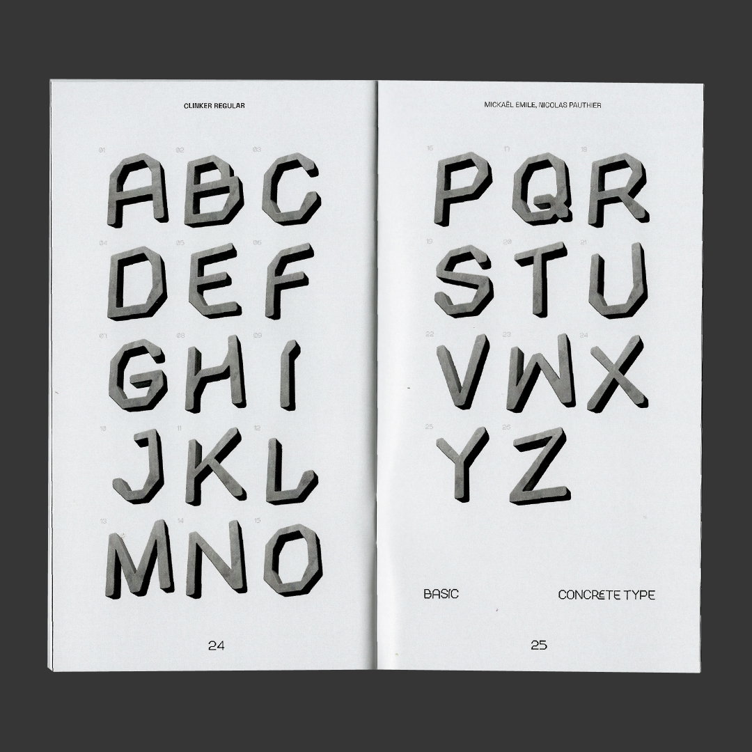
His portfolio, then, is replete with various workings and experimentations. This includes a typeface inspired by skateboarding, another by magic tricks, another by flowers and plants, and another by 3D concrete printing – the latter forming the basis of his most recent typeface Clinker, made in collaboration with Nicolas Pauthier. The pair met during an internship at a company specialising in 3D printing with concrete material, which sparked many inquisitions as to how to transfer this subject matter into a piece of typographic design. The answer rests in the sculptural approach of 3D printing, wherein the pair would develop the precision of a machine to build the final form. And that’s where the concept and modular grid for Clinker were born.
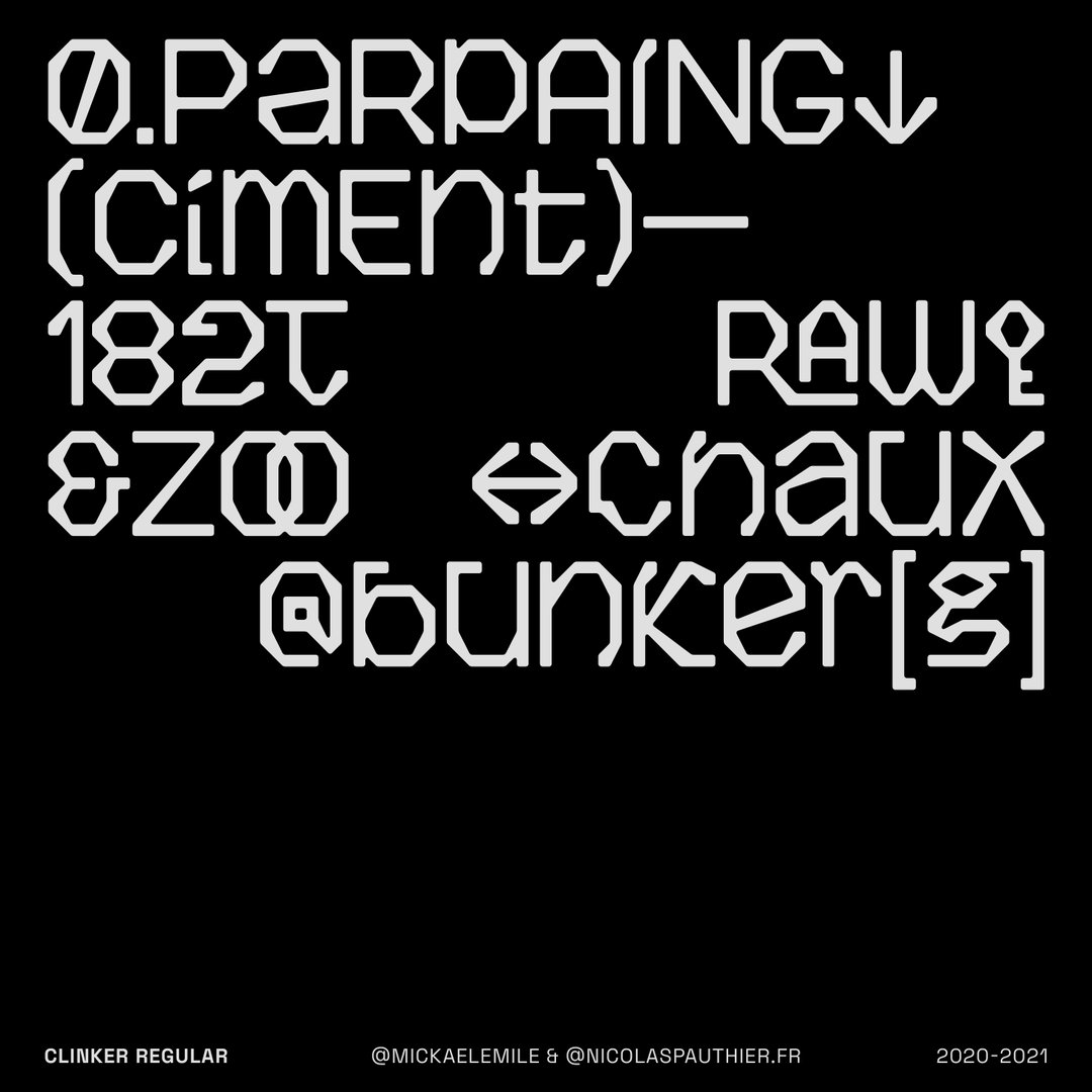
“It was both relevant with our inspiration and process because it helped us to maintain some consistency between our drawings while not seeing each other,” he details of the method that took place over the pandemic. The end result is playful and technical, incorporating different variations and at least two alternative styles for each glyph. “I have a great respect for type designers,” adds Mickaël. “I don’t consider myself as one for the moment. It takes so many years of practice to perfect this art. I love to design typographic projects, but with the will of creating something different. I mean, of course, I will not create the next Helvetica. I am aiming for an approach of type design without complexities, but still by having some consciousness of the basic rules. I hope that my fonts look like no one else’s.”
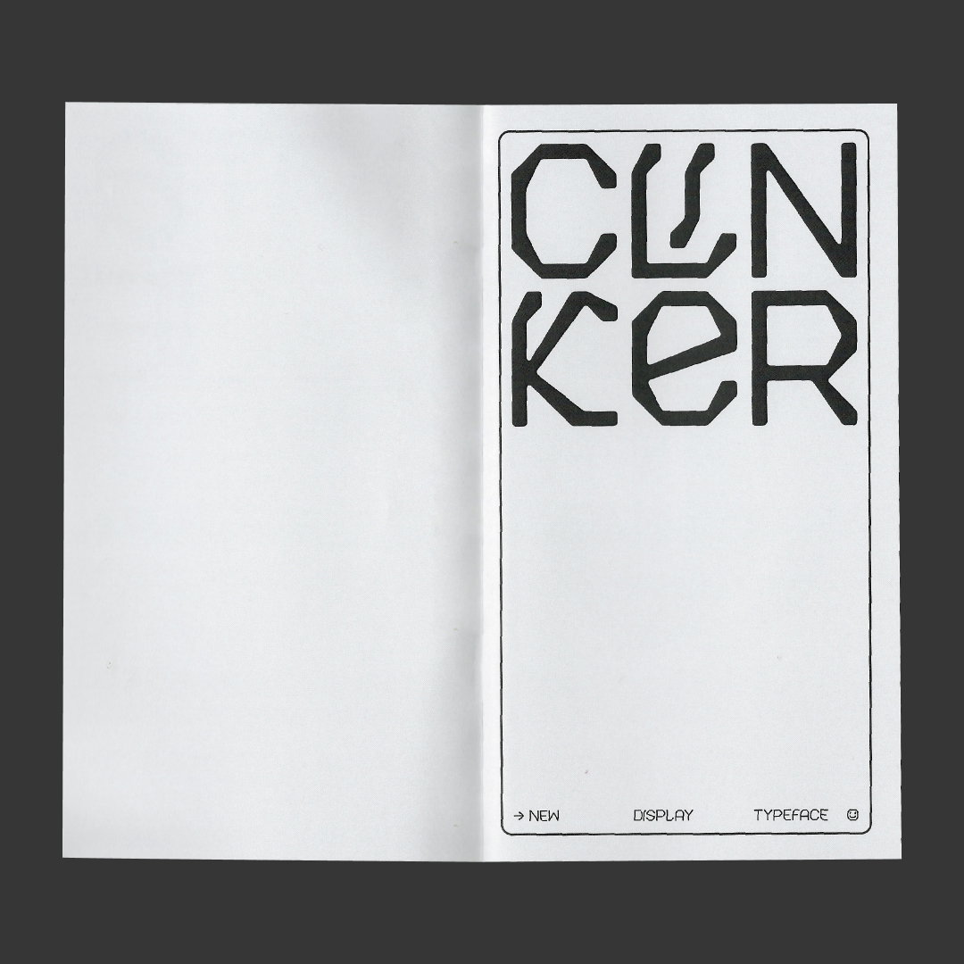
Clinker beholds a certain 3D dimensional edge that means you can easily see it being used in a big branding project as well as something more experimental. It’s highly creative and versatile in that sense, just like many of the typefaces that came before it. And when asked where he hopes he’ll see the typeface in use, Mickaël says: “I would really love seeing it on a branding project for a modern and minimal furniture brand. Or more surprising, why not use the 3D version in a VR experience? It would be awesome.”
GalleryMickaël Emile: Clinker, designed with Nicolas Pauthier (Copyright © Mickaël Emile and Nicolas Pauthier, 2021)
Hero Header
Mickaël Emile: Clinker, designed with Nicolas Pauthier (Copyright © Mickaël Emile and Nicolas Pauthier, 2021)
Share Article
About the Author
—
Ayla is a London-based freelance writer, editor and consultant specialising in art, photography, design and culture. After joining It’s Nice That in 2017 as editorial assistant, she was interim online editor in 2022/2023 and continues to work with us on a freelance basis. She has written for i-D, Dazed, AnOther, WePresent, Port, Elephant and more, and she is also the managing editor of design magazine Anima.