Mònica Losada is breathing fresh air into graphic design fundamentals
Working across analogue and digital, Mònica has taken every chance to ask herself: “what if?”
When Mònica Losada was in her first year at the Bau Design College of Barcelona, she started to work in the school library. As you can imagine, she read – a lot. It was mostly graphic journals and books on design culture, but she fondly remembers stumbling across the OASE Journal, a publication about architecture and design. It was right at that moment, when her nose firmly burrowed in this little piece of the design world, that she thought “this is what I want to do”. The following year, she started an internship at the studio of her editorial design teacher, the highly awarded Barcelonian designer, David Torrens.
She remained in Barcelona for some time, studying, tinkering and shaping her practice through predominantly editorial and concept-based projects. But during that time, she hit a point where she “felt like I had to take a step back from my own work and learn from other approaches to design". No longer in the library, and keen to get a sense of the design possibilities available to her, she set her sights on the Netherlands-based outfit, Studio Dumbar – a fine choice by any measure. Understandably, it was their signature “playful and experimental attitude” that Mònica first picked up on at a workshop and, before she knew it, she was on a plane to Rotterdam, as Studio Dumbar’s new intern.
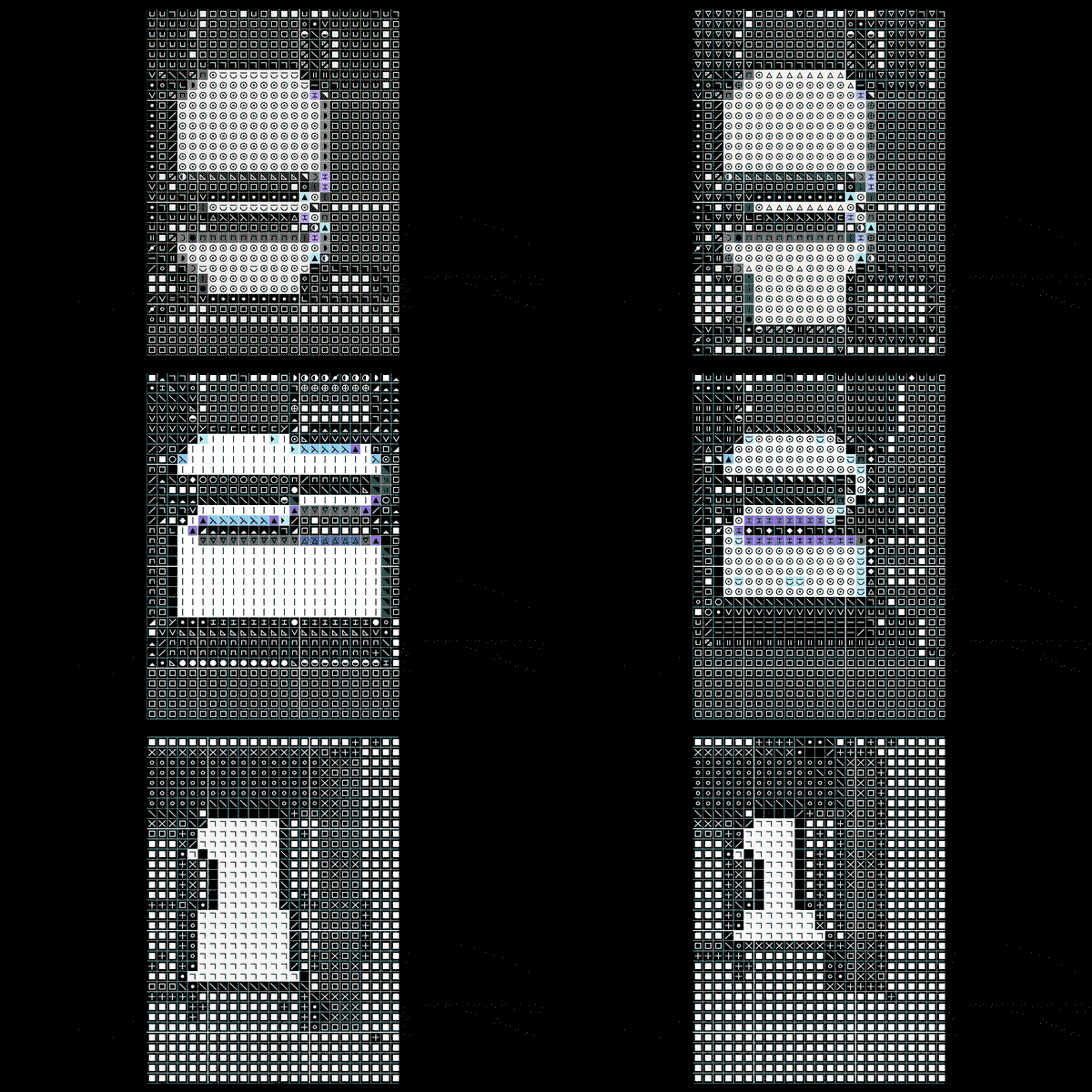
Mònica Losada: 3, 2, 1 (Copyright © Mònica Losada, 2021)
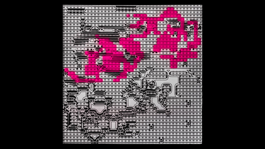
Mònica Losada: No name artwork (Copyright © Mònica Losada, 2022)
A big chunk of Mònica’s practice is rooted in the It’s Nice That-endorsed idea that there’s always more to learn. For example, in the Summer of 2021 Mònica attended a two-day motion workshop tutored by Stan Haanappel and Elvin van Dalen of Studio Dumbar. “I went there with little to no motion design knowledge thinking that it would be great to push myself to learn something new,” she says. And thankfully she did because what resulted was 3, 2, 1 – a stop-motion project made using an image-to-cross-stitch pattern converter to which she uploaded frames of an Excel sheet screen recording. Sounds very complicated, we know, but Mònica retains that the software was very limited. The project even developed into Open Works, a project with her friend and collaborator Josu Larrea, wherein they “continued to explore alternative software to design, but this time to produce printed matter”.
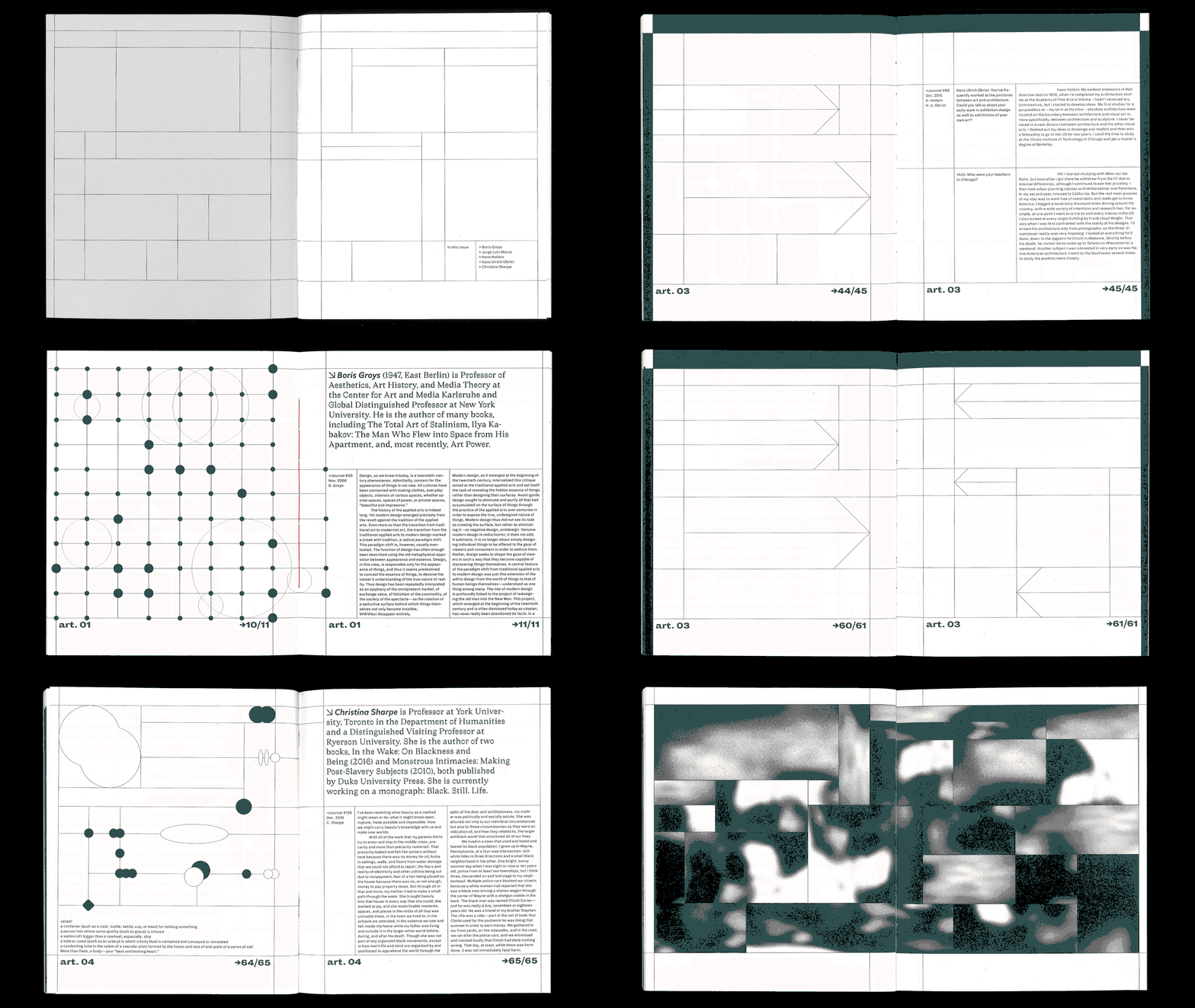
Clearly, it’s not uncommon to find Mònica immersing herself in new methods of working. "It’s not the skill that makes a good practice, but the aim to experiment and to solve new problems in an unexpected way,” she says. Her way of working is intuition-based, not concept-focused – think more jazz than math. That’s not to say that her designs are bereft of logic and reason. She cites “critical thinking” as a sure-fire way to develop one’s own methodology and she shows this off in ¿Qué tienen en común una aspiradora y una ametralladora? where she projected archive images turned into motion clips onto her editorial project about image production – a meta use of both analogue and digital. Like all her work, it’s tight-knit and refined, exhibiting an obvious appreciation and understanding of the fundamentals of grid, structure, form and whitespace. But it’s challenging and boundary-pushing enough to show that the work of design is never done. She ends with: “Usually, I do not necessarily search for solutions but to bring more questions to the table.”
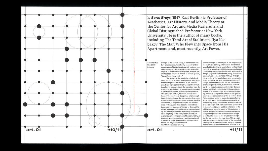
Mònica Losada: Modulor, Issue 01 (Copyright © Mònica Losada, 2022)
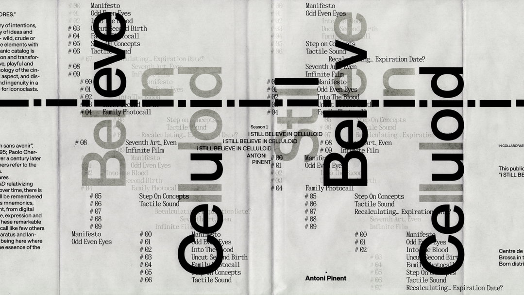
Mònica Losada: I still believe in Celluloid (Copyright © Taller Torrents, 2022 )
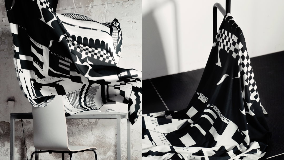
Mònica Losada: Open Works (Copyright © Josu Larrea & Mònica Losada, 2021)
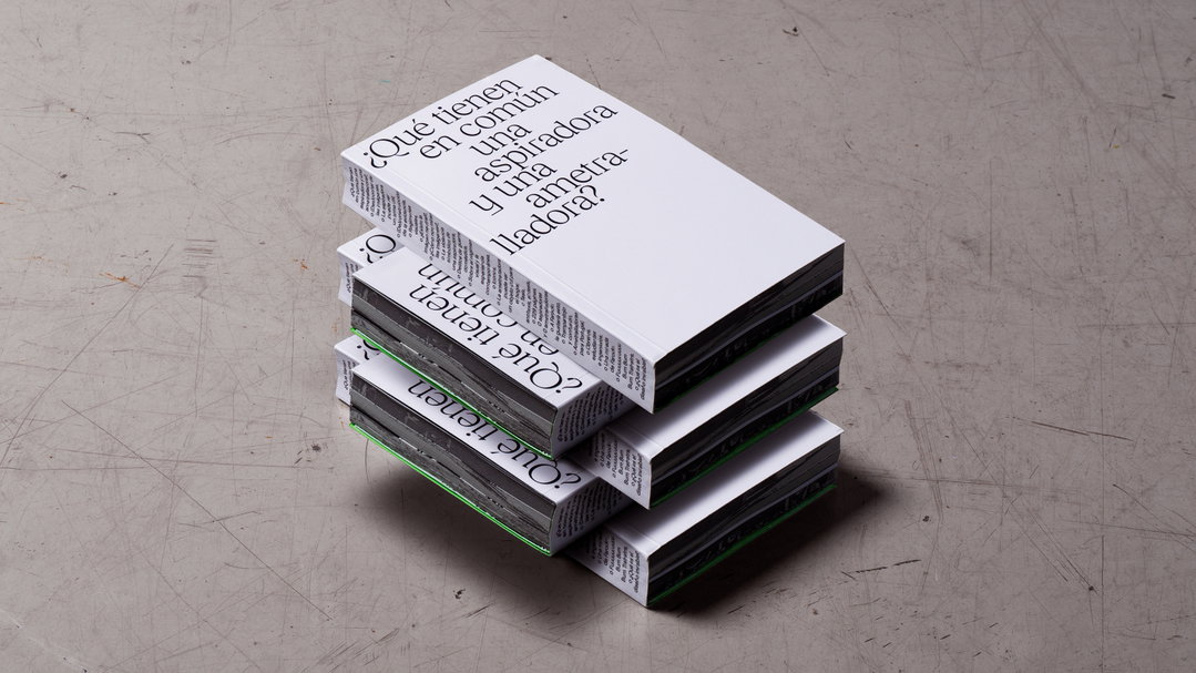
Mònica Losada: Los que se quedan (Copyright © Mònica Losada, 2022)
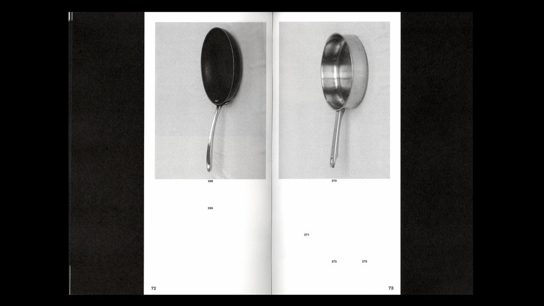
Mònica Losada: Los que se quedan (Copyright © Mònica Losada, 2022)
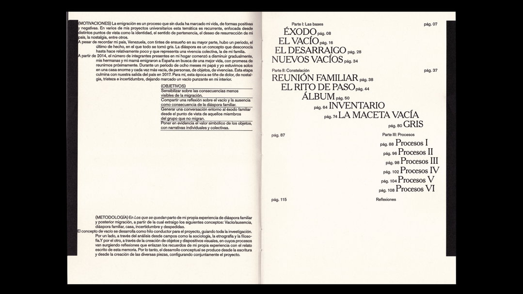
Mònica Losada: Los que se quedan (Copyright © Mònica Losada, 2022)
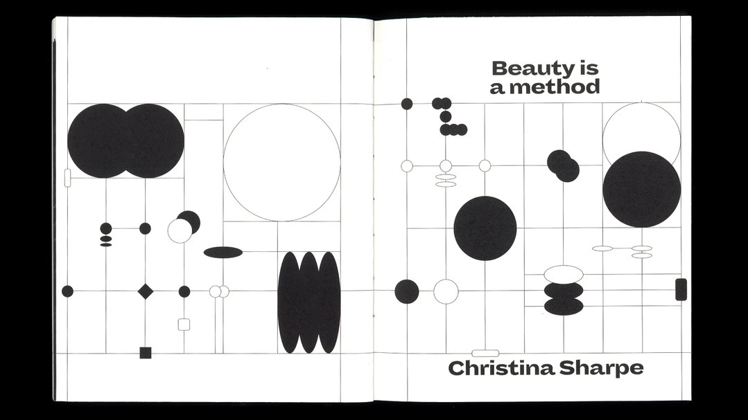
Mònica Losada: Modulor, Issue 01 (Copyright © Mònica Losada, 2022)
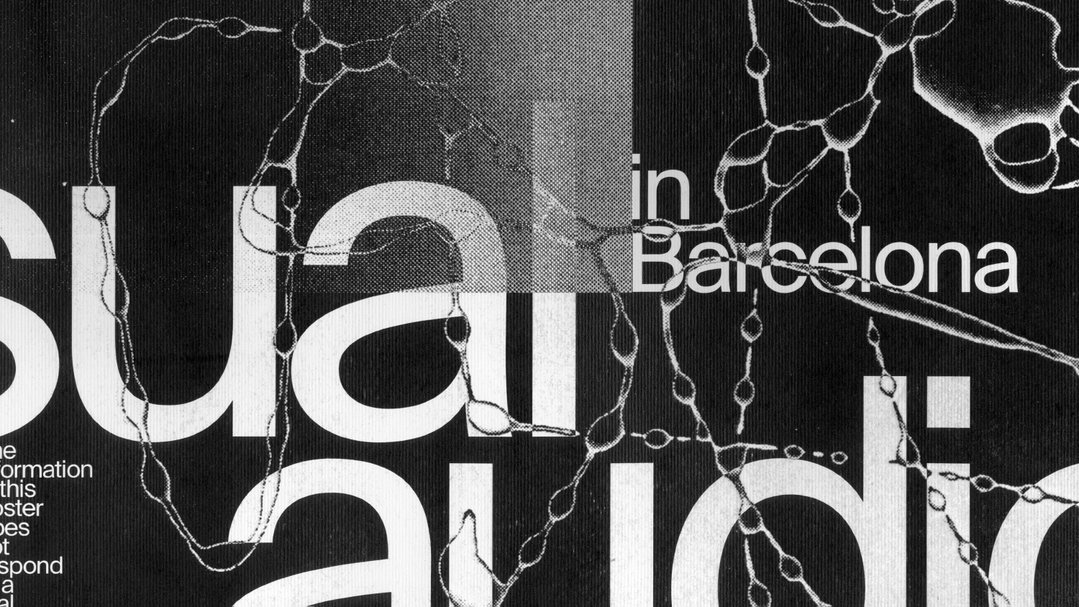
Mònica Losada: No name poster [detail] (Copyright © Mònica Losada, 2022)
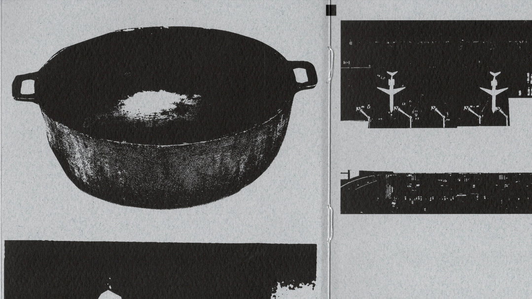
Mònica Losada: Los que se quedan (Copyright © Mònica Losada, 2022)
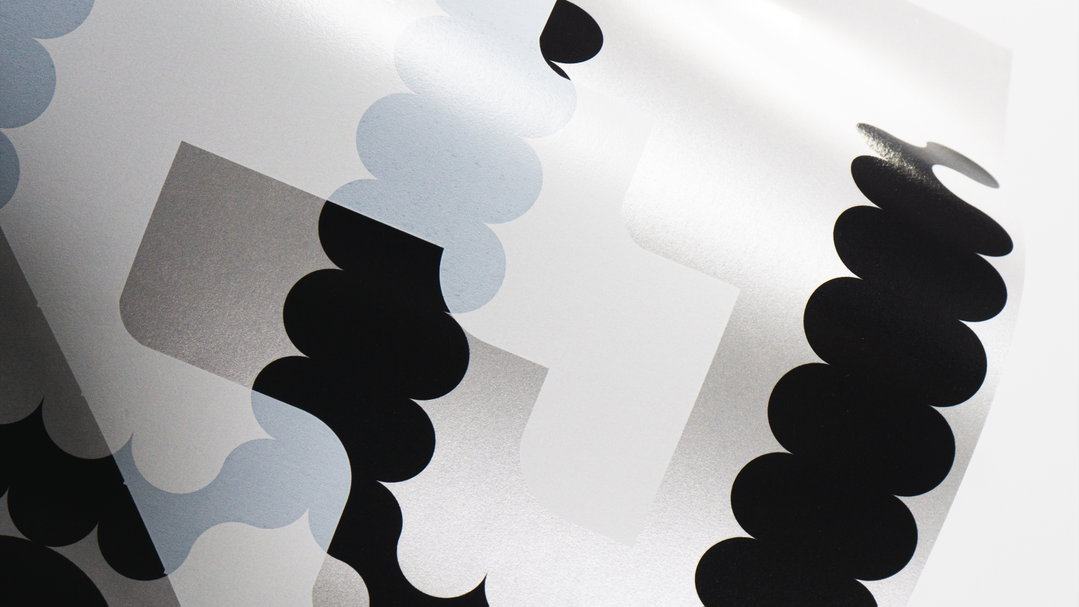
Mònica Losada: Open Works (Copyright © Josu Larrea & Mònica Losada, 2021)
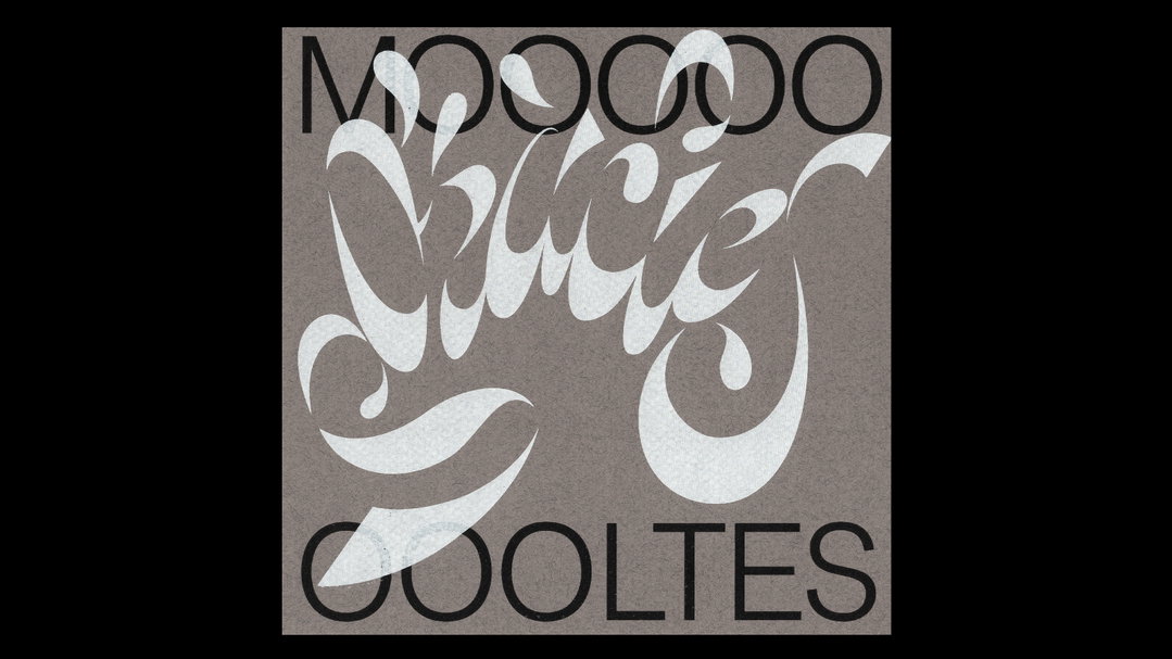
Mònica Losada: Moltes Gràcies (Copyright © Mònica Losada, 2021)
Hero Header
Mònica Losada: Modulor, Issue 01 (Copyright © Mònica Losada, 2022)
Share Article
About the Author
—
Roz (he/him) is a freelance writer for It’s Nice That. He graduated from Magazine Journalism and Publishing at London College of Communication in 2022. He’s particularly interested in publications, archives and multimedia design.