Morcos Key on its work for the Cooper Hewitt, M7, and Kimberly Drew and Jenna Wortham’s Black Futures
In celebration of its five-year anniversary, the studio talks us through its plethora of impactful projects merging Arabic type, editorial design and storytelling for queer and POC communities.
Magic can happen when two creative minds come together. Jon Key and Wael Morcos are testament to that, having met during an arts class at Rhode Island School of Design. Wael, who’s from a small town in North Beirut, was a first year grad student at the time; meanwhile Jon, who’s originally from Seale, Alabama, was a junior undergrad in graphic design. “I was impressed by him immediately,” says Jon, who pinpoints Wael’s “amazing” presentation about Francis Bacon as the catalyst for them collaborating together in school. “From typeface projects and posters to giving feedback on thesis work, our ‘meet cute’ turned into a great partnership.”
A few years of freelancing in New York later – as well as a a handful of full-time jobs and midnight projects on the side – the pair were asked to design an exhibition for the Cooper Hewitt Museum, curated by Ellen Lupton and titled Hear, See, Play: Designing with Sound. It was this very project that inspired the duo to launch their own studio, Morcos Key, on this day (22 February) five years ago, and the studio already boasts a myriad of impressive projects to look back on, and look forward to. Specialising in art and culture, the pair’s past projects include exhibitions for North Western University in Qatar, publications for the MoMa and the Met, plus campaigns for Instagram and Nike.
The founders are suitably matched. Wael is an expert in Arabic type design and bringing it into contemporary conversations. Jon, on the other hand, is not only a painter, he also has a passion for editorial design and storytelling for queer and POC communities. “Our investment in queer and diasporic identities has guided us in developing a process rooted in community building within multicultural contexts,” Wael continues to tell It’s Nice That. “We recognise the responsibility of working at an institutional scale to advocate for the perspectives of underrepresented groups and to prioritise their points of access.”
GalleryMorcos Key: Black Futures (Copyright © Morcos Key, 2021)
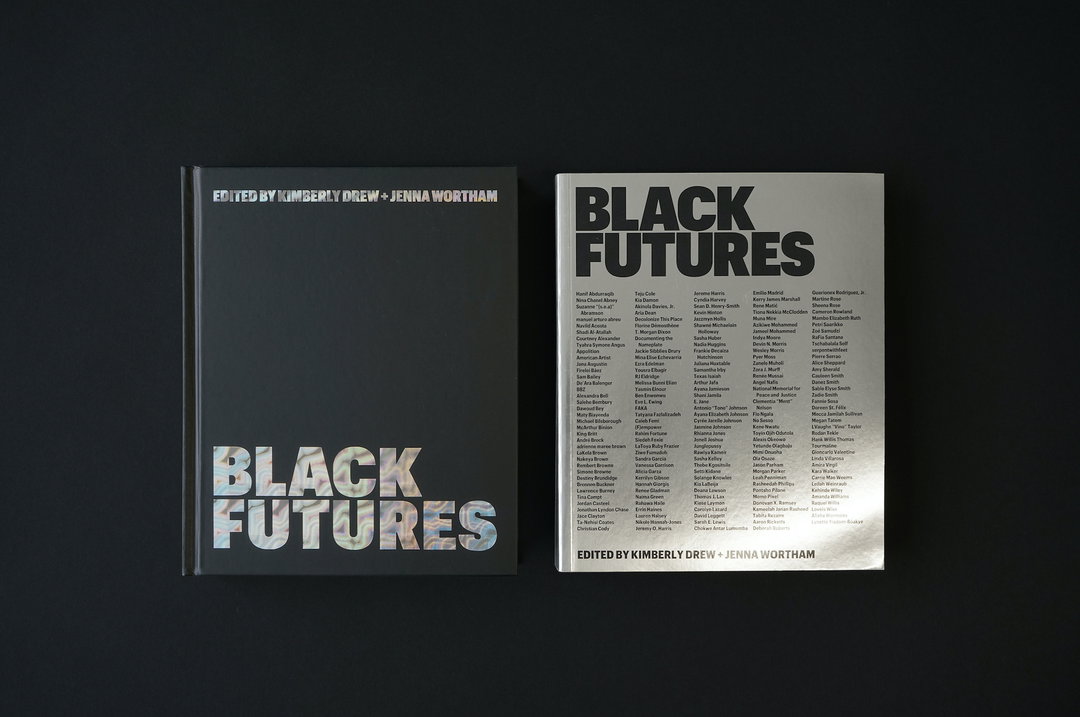
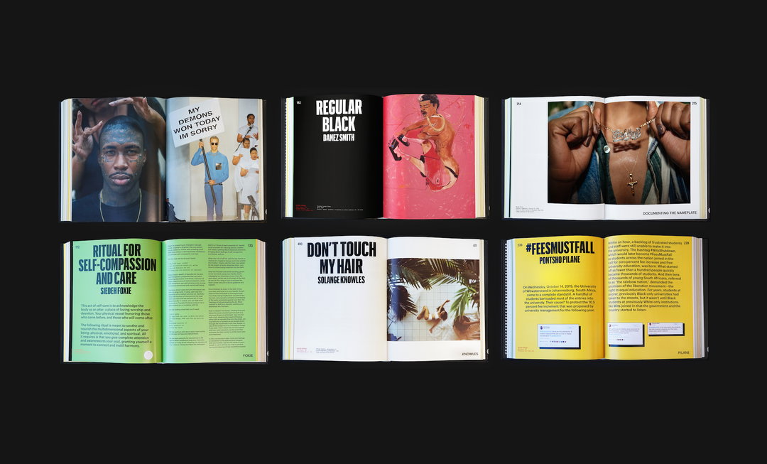
On the topic of recent projects, the founders first point us in the direction of Black Futures, a publication co-authored by Kimberly Drew and Jenna Wortham. Tasked to reimagine the front cover, Wael explains how they devised the concept of mirroring. “Our first idea, and the one to be printed, was to do a reversal of the hardcover version. How could the book become a literal mirror for the person holding the book to see themselves in?” The result is a reflective, monochromatic book cover that depicts all the names of the contributors. In another project, Morcos Key was briefed to design the identity for M7 – what’s known as Qatar’s epicentre for innovation and entrepreneurship in fashion design and tech. The team worked with studio 2x4 on the naming and visual identity, “centred around the building blocks of creativity”, says Jon. Reflecting its mix of incubation programs, co-working and learning spaces, venues for exhibitions and events, the identity needed to showcase its success as a business as well as its commitment to creativity. It’s safe to say they achieved just that.
At just five years young, the success of Morcos Key is only to continue as it plans to release more Arabic typefaces with designers, more collaborations and a new book project with NOMA, New Orleans Museum of Art. Its founders truly believe in the power of design and how it can be as a tool for self expression, as well as building communities and sharing authentic stories. “We want to create work that gets people excited and resonates with their personal stories,” says Wael. “We want to create work that transcends the everyday into meaningful and useful interactions, be it the cover of a book, the logo for an institution or the look of a typeface. We want to inspire a new generation and galvanise a community of designers that share our histories, speak our languages and look like us!”
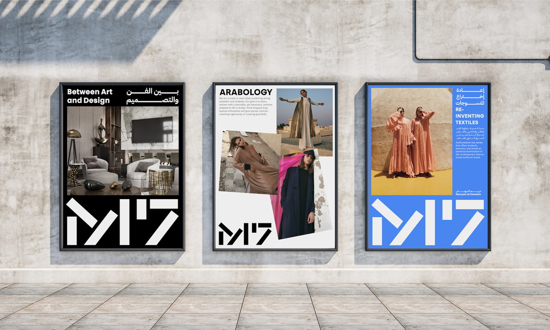
Morcos Key: M7 (Copyright © Morcos Key, 2021)
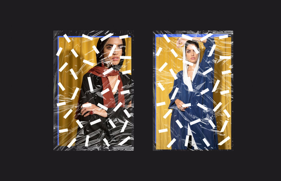
Morcos Key: M7 (Copyright © Morcos Key, 2021)
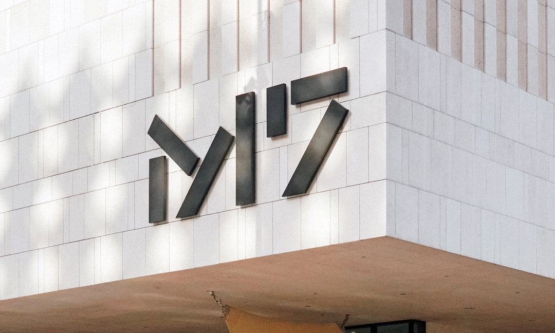
Morcos Key: M7 (Copyright © Morcos Key, 2021)
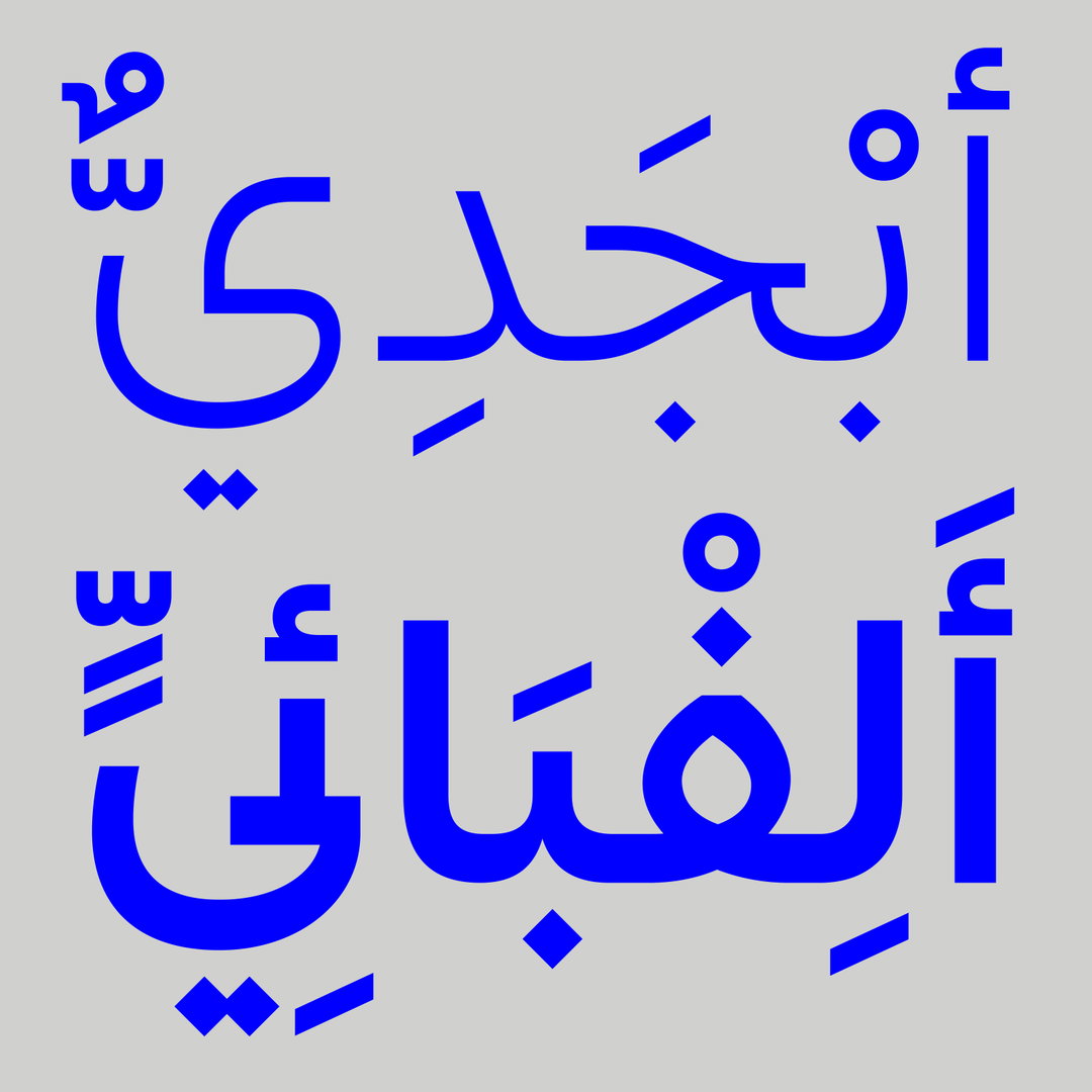
Morcos Key: Favorit Arabic (Copyright © Morcos Key, 2021)
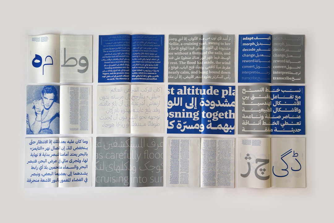
Morcos Key: Brando Arabic (Copyright © Morcos Key, 2021)
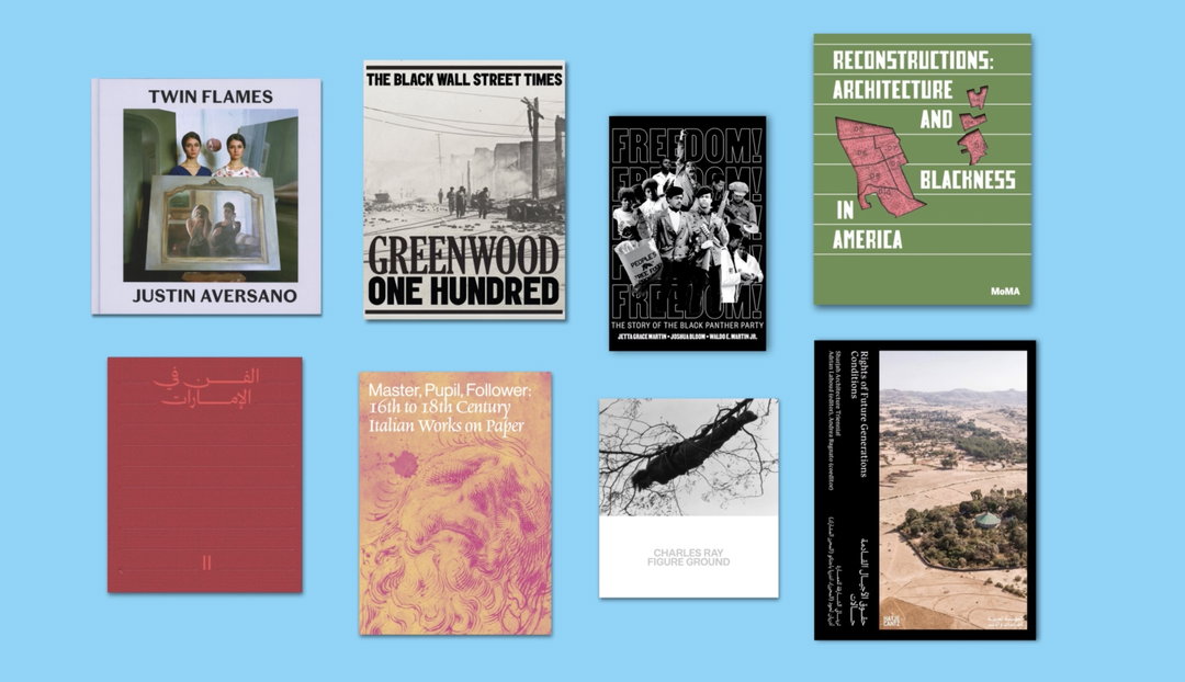
Morcos Key: Editorial Design (Copyright © Morcos Key, 2021)
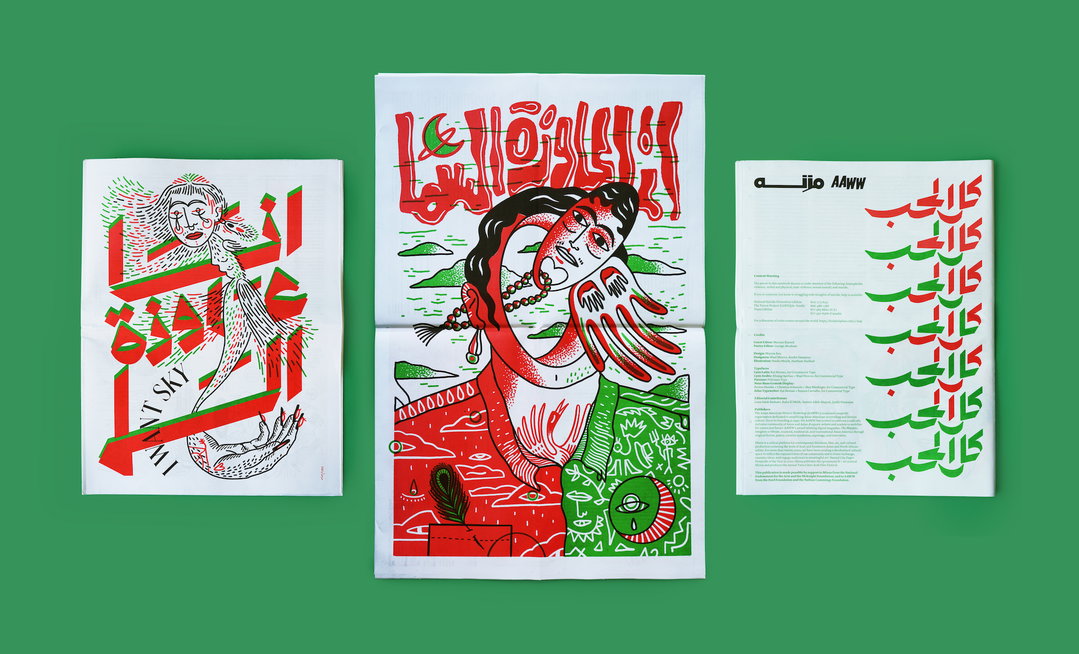
Morcos Key: I Want Sky (Copyright © Morcos Key, 2021)
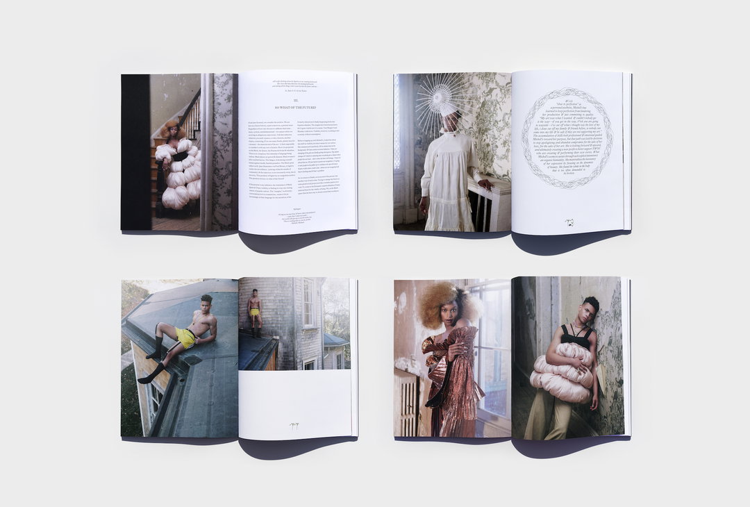
Morcos Key: The Tenth Magazine (Copyright © Morcos Key, 2021)
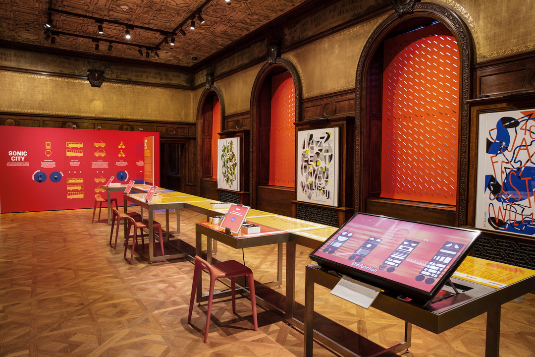
Morcos Key: Hear See Play Designing with Sound (Copyright © Morcos Key, 2021)
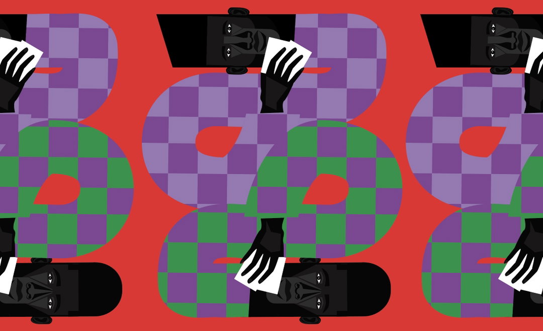
Morcos Key: Jon Key Illusration for New York Times Magazine (Copyright © Morcos Key, 2021)
Hero Header
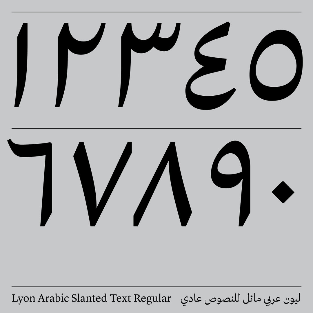
Morcos Key: Lyon Arabic (Copyright © Morcos Key, 2021)
Share Article
Further Info
About the Author
—
Ayla is a London-based freelance writer, editor and consultant specialising in art, photography, design and culture. After joining It’s Nice That in 2017 as editorial assistant, she was interim online editor in 2022/2023 and continues to work with us on a freelance basis. She has written for i-D, Dazed, AnOther, WePresent, Port, Elephant and more, and she is also the managing editor of design magazine Anima.