Mother Design bats Major League Baseball into the future with five bespoke typefaces
Baseball is one of the oldest sports in America, which is why Mother Design have stepped in to revitalise its branding and show what fans stick around for.
Share
Major League Baseball (MLB) is the ultimate American sports league, the nation’s longest-running professional league no less. But recently, the league realised it needed to modernise its overarching brand and refresh its design system, both to elevate the sport and engage a new generation of fans. Mother Design were tasked with bringing a greater focus and energy to the vast baseball ecosystem – and the result is a home run that propels the brand into its next era.
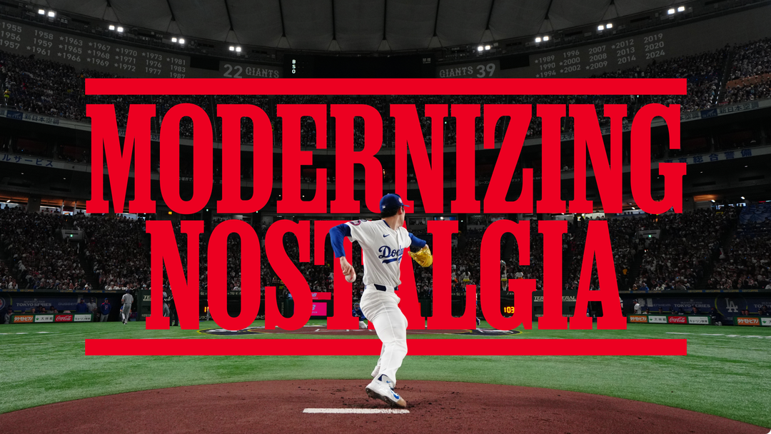
Baseball is largely a sport of nostalgia – look at the feel-good movies surrounding the baseball mythos such as Field Of Dreams. However, while MLB carries a century’s worth of heritage and is known worldwide for its distinct Americaness, its design system wasn’t fully leveraging that depth of history. So Mother Design began by looking at it’s foundations – typography.
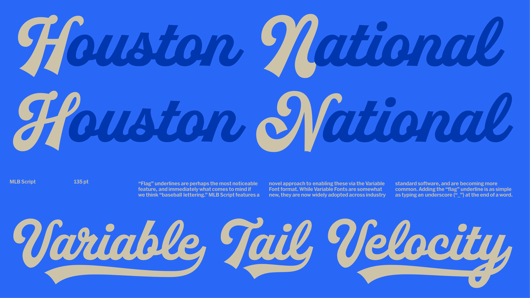
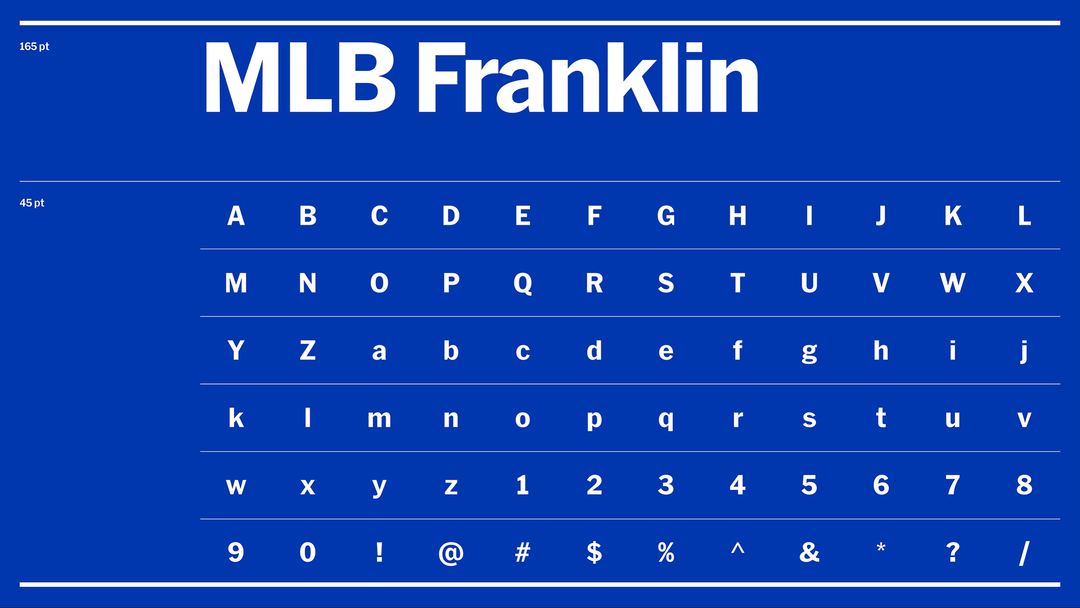
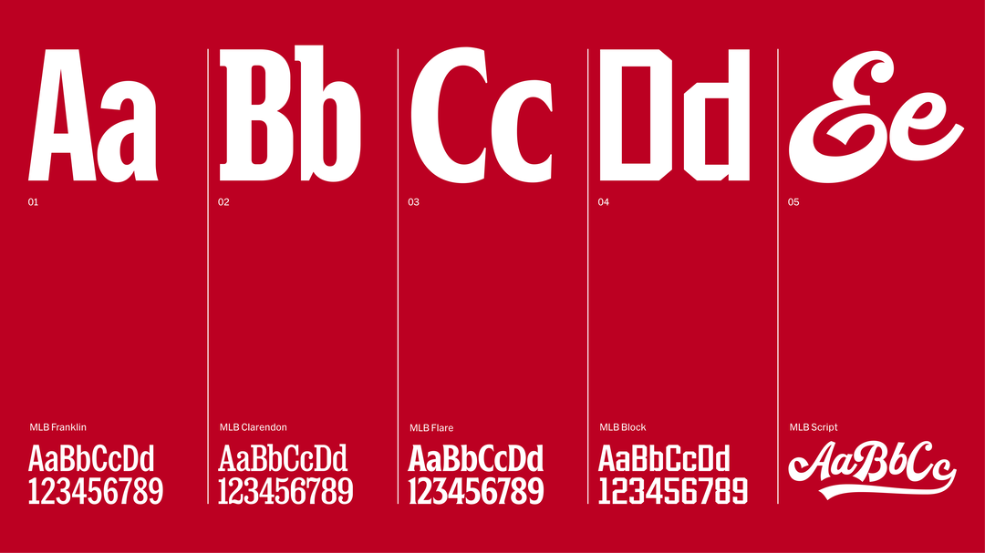
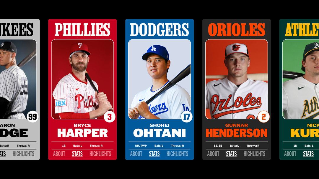
The new MLB brand features a custom suite of five typefaces that reference historical typefaces found throughout baseball’s history – Nick Sherman designed MLB Franklin, a reimagining of Franklin Gothic that recalls American design in the 19th century. David Jonathan Ross and Bethany Heck designed MLB Clarendon, derived from the 1845-released Clarendon, condensing slab-serif styles that share a long lineage in baseball. One more; “Skye Dillon developed MLB Block, an octagonal font found everywhere from historic sites such as Ebbets Field to the numerals and names found on baseball uniforms. This type style has established itself as synonymous with sports typography,” states Mother Design’s press release.
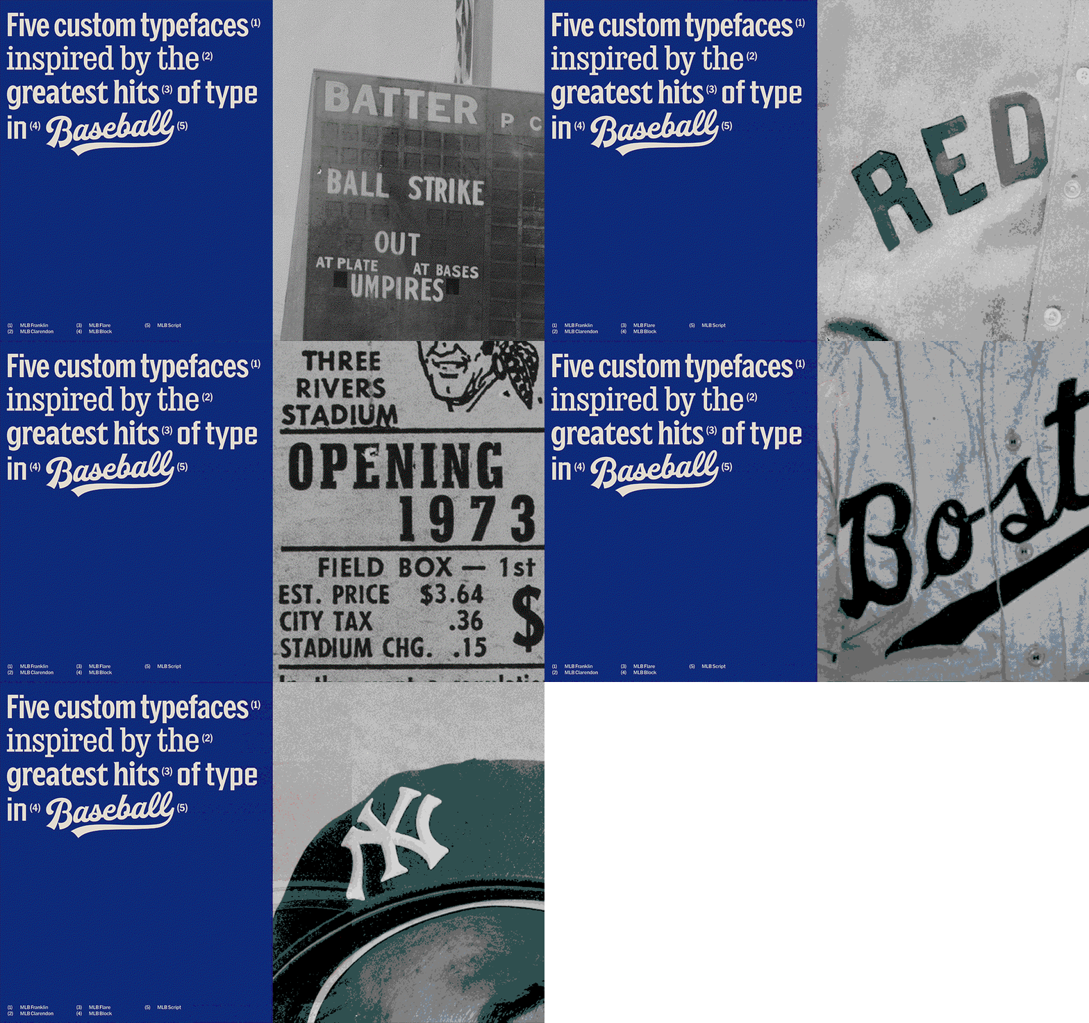
Mother Design: Major League Baseball (Copyright © Mother Design, 2026)
MLB’s graphic elements are equally as important, which utilise all-American colour schemes that are widely recognisable across iconic baseball teams and familiar environments in baseball arenas. “To further energise the palette, we referenced the clubs’ colours and distilled them into a set of vibrant hues to ensure broad representation of all the league’s teams,” the press release continues.
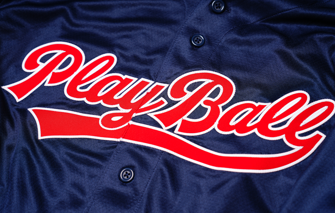
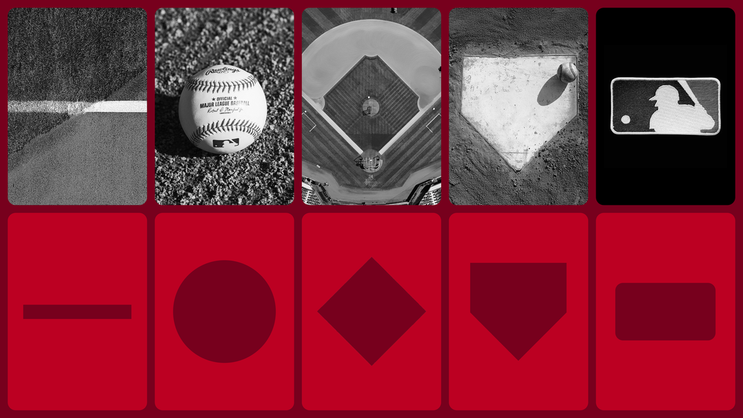
Mother Design looked to the game and its ephemera to develop graphic tools that were flexible across platforms, for example: historical and in-stadium imagery, from baseball cards to uniforms, pentagonal home plates, base and scoreboard lines, a baseball’s beautifully simple circular form and the field of play from a bird’s eye view. That classic silhouette within the MLB logo stays the same though, of course.
You see, MLB isn’t just a game, it’s a visual economy. There’s no fear of crossing over into any other sport’s core aesthetic, baseball lives in a world of its own. Mother Design makes sure that every element of the game, down to social media assets or even the tickets, looks beautiful in a wholly impressive brand re-ignition.
GalleryMother Design: Major League Baseball (Copyright © Mother Design, 2026)
Hero Header
Mother Design: Major League Baseball (Copyright © Mother Design, 2026)
Share Article
Further Info
About the Author
—
Paul M (He/Him) is a Junior Writer at It’s Nice That since May 2025. He has a strong interest in graphic design, digital kitsch, multimedia painting, collage, nostalgia, analogue technology and all matters of strange stuff. [email protected]
To submit your work to be featured on the site, see our Submissions Guide.