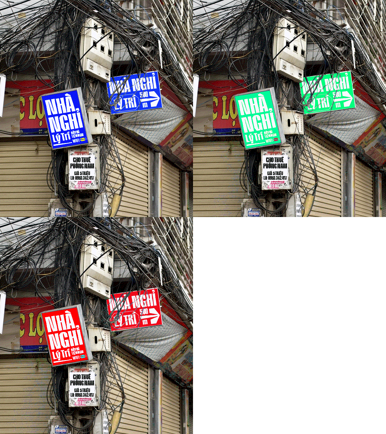
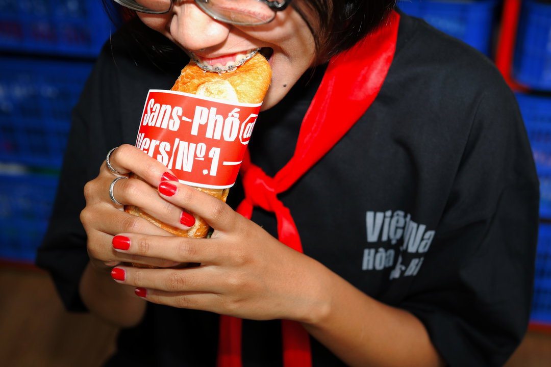
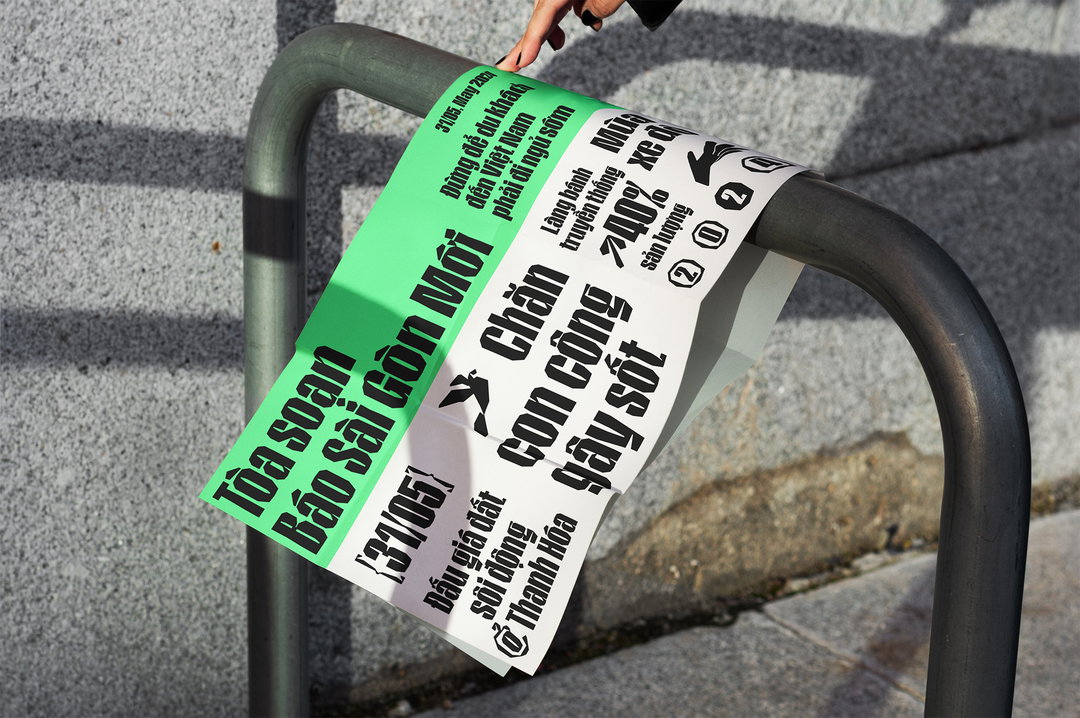
Sans-Phố Display is inspired by hand-crafted Vietnamese street signage
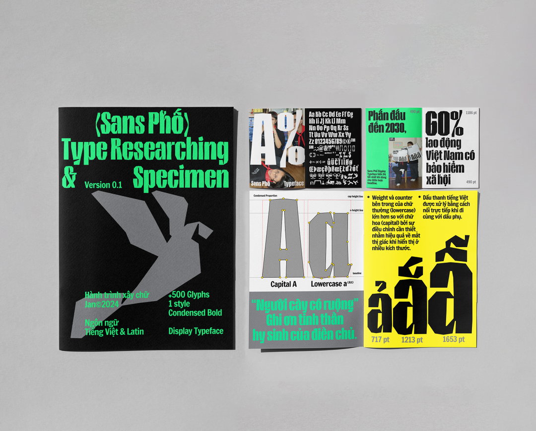
Designed by Nguyện Trương, this display typeface is based on the careful cut outs that define the cityscapes and culinary culture of Vietnam.
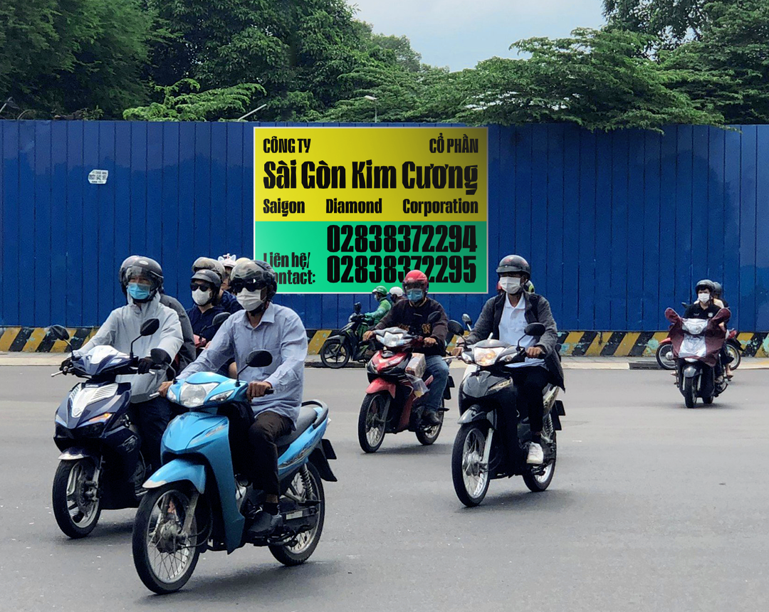
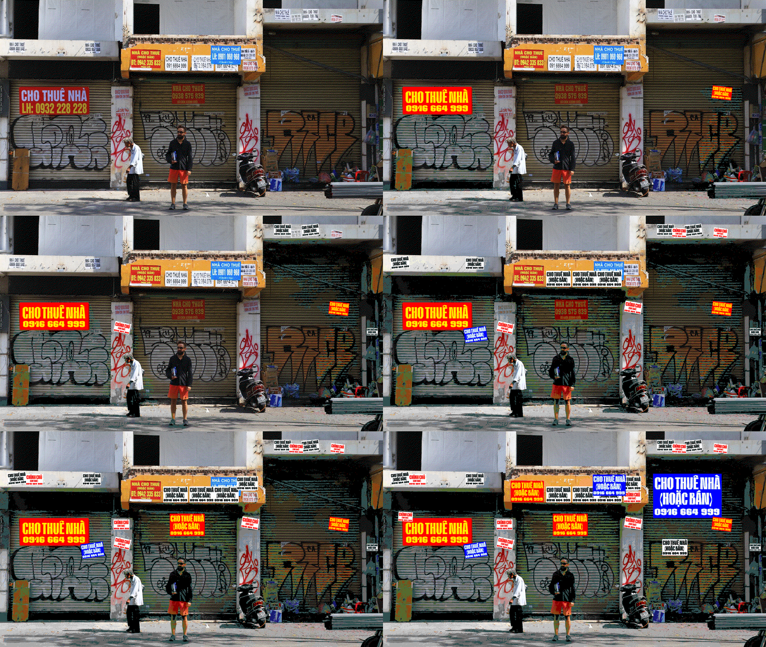
Crossing the street in Vietnam’s central cities should be considered “a sport”, says designer Nguyện Trương. Amongst all the chaos and a bid for survival, you might not have a chance to spot the country’s plethora of distinct street signage, crafted from handwritten to handmade cutouts and printed materials. But as a child, Nguyện was captivated by these old Vietnamese signs as he strolled home through the streets of Ho Chi Minh City, and this traditional practice of letter cutting was even something that he was taught at school.
“Only later did I realise the value of this technique and the beauty of these cut-out letters. Handmade cut-out signs, with the unique creativity of each local, along with images of daily life, people, and culinary culture it creates a vivid picture of the city… I call it the local beauty or the beauty of Vietnamese street culture”, he says.
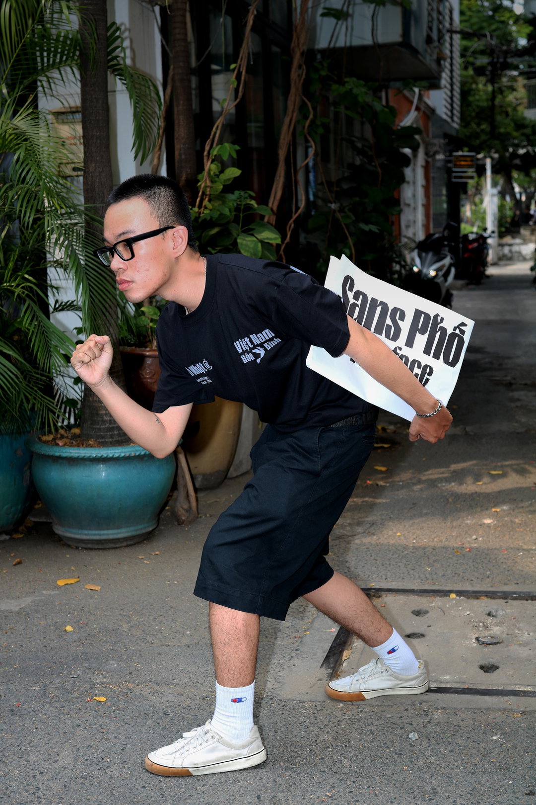
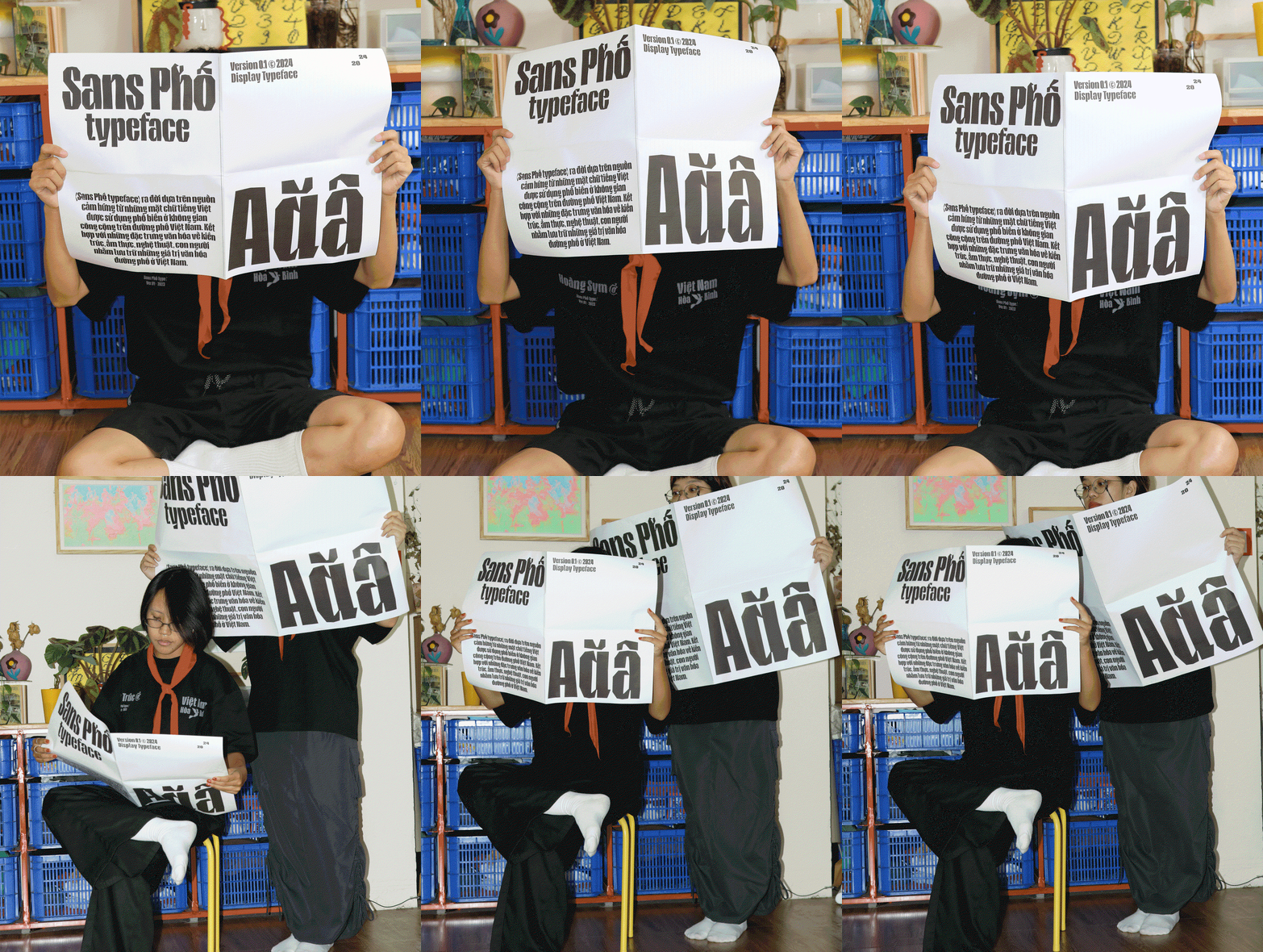
The letterforms within these colourful street signs were the designers source material for his typeface Sans-Phố. “It’s not just about cut-out signs”, he says, “but also about how typography blends into the lives of locals witnessing everyday events, from people and shops to traffic and the bustling, sometimes noisy sounds. Through Sans-Phố, I also want to introduce international friends to the vibrant images of Vietnamese street life.”
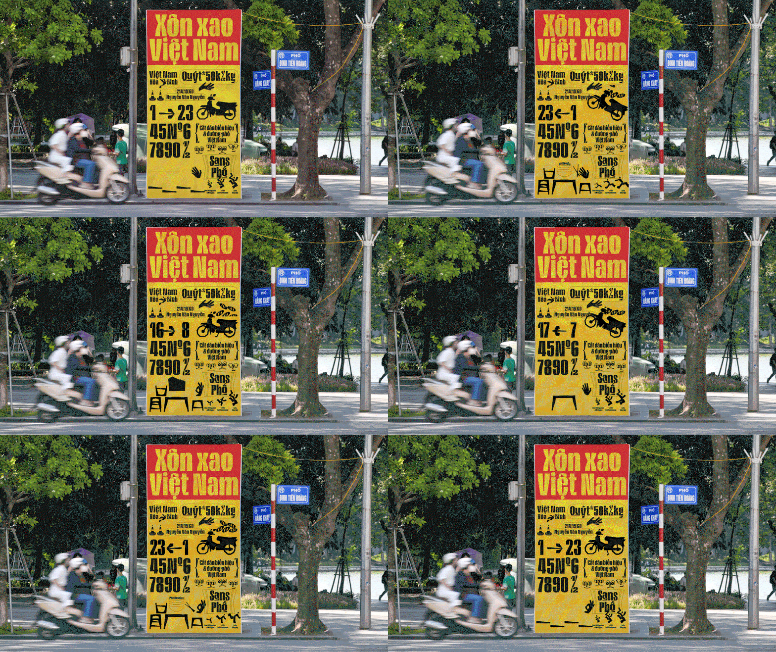
Nguyện Trương: Sans-Phố (Copyright © Nguyện Trương, 2024)
As you can imagine, the designer’s creative process for this project started with a stroll around the streets. “Walking around Saigon I took photos of various cut-out signages for design treatment analysis,” says Nguyện. And then, “after conducting a survey on the need for fonts and their role in street life, I made a brief”, he continues. Delving into further research in the type field, he set a goal for the font to be used in public space, sticking close to its roots. So, looking into designs related to traffic and streets was crucial, specifically, case studies of “typefaces used in US highway signage”. The designer searched for ways to balance his visual concept with functionality and legibility; a typeface that served local communities and brought life to public space.
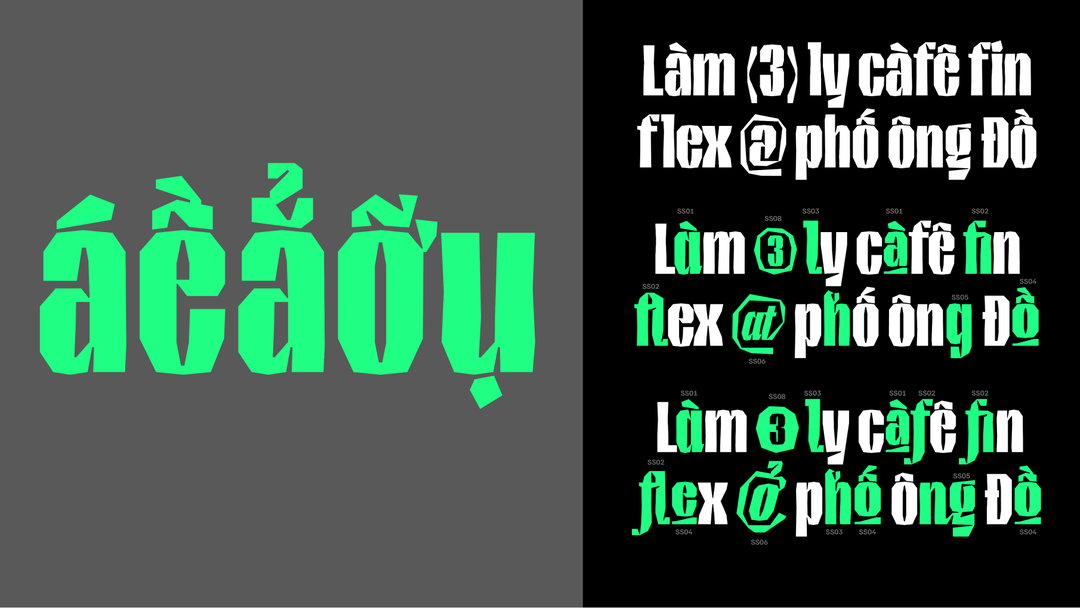
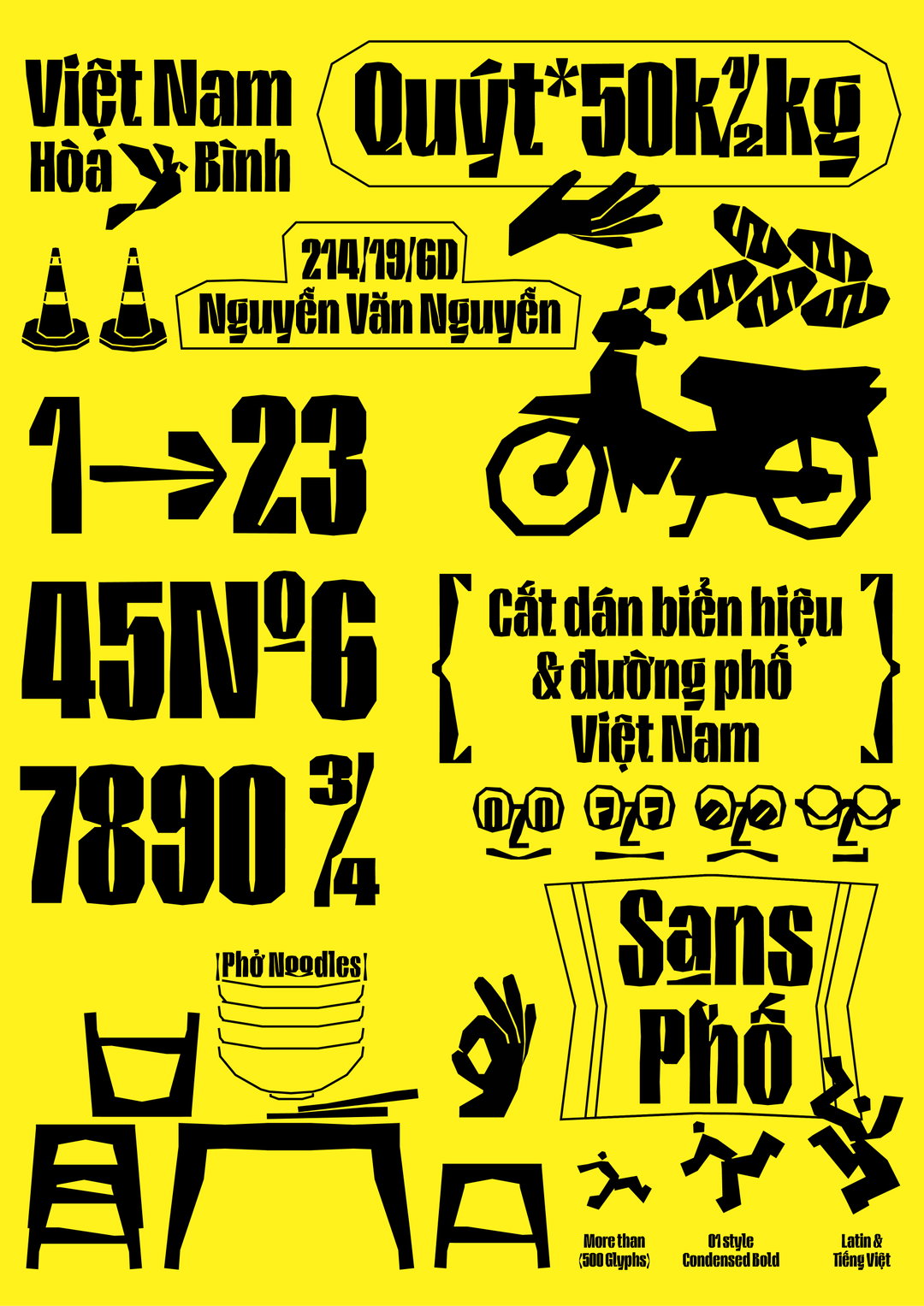
An opportunity for him to revisit some nostalgic cutting skills from school, these basic techniques “formed the foundations for the principle of Sans-Phố’s treatment”, with a rough cutting line, considered as “DNA for structuring the stroke”. Cleverly designed to reuse modules, the full letter set is created by assembling special characters together, and then reassembling their forms in a careful collage. The final part of the process for Nguyện was to bring his paper shapes into the digital world and determine the typefaces’ metric lines, making some visual adjustments to determine the thickness of his playful uppercase and lowercase letters.
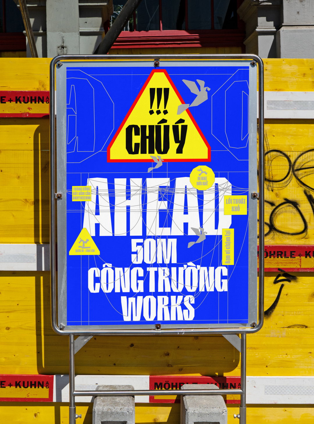
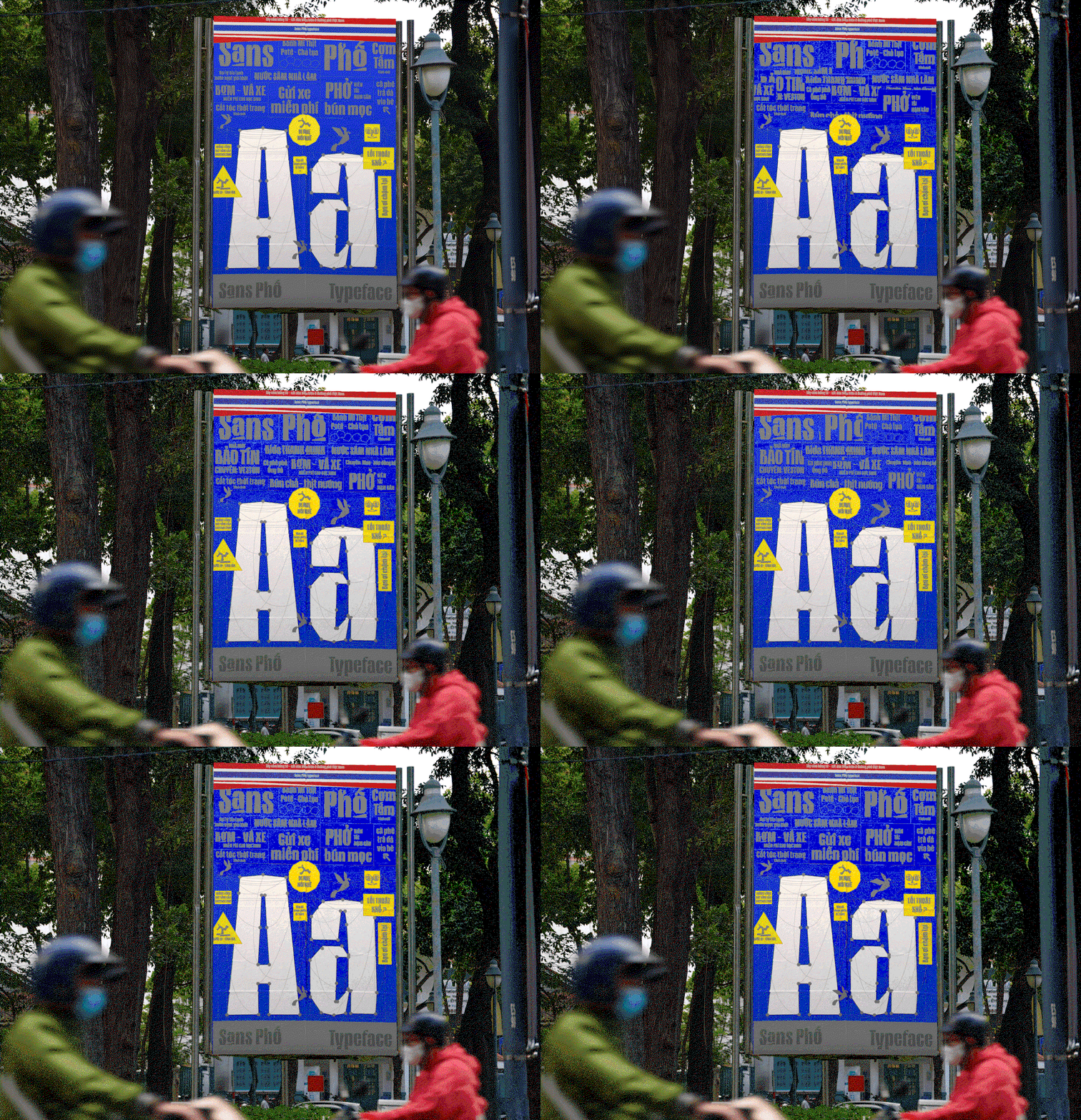
The resulting letterforms for Sans Phố are specially designed for the Vietnamese language and have only one style – condensed bold. A point of functionality for its use on street signs and public spaces, where a lot of information often needs to be crammed into a small space, this distinctive set style aims to “give people the feeling of the bustle and hustle of Vietnam’s streets”. The typeface’s name: Sans-Phố can be interpreted as “‘Sans’ in ‘Sans-serif’ and ‘Phố’ means ‘Vietnamese street’. Sans-Phố also rhymes with the term ‘bước sang phố’ in Vietnamese which means ‘across the street’”, the designer explains.
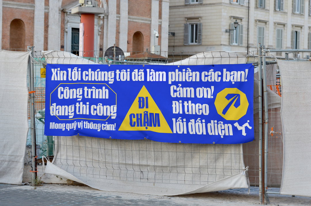
Currently, Sans-Phố is being used as the official typeface for the Saigon Artist Fair in Ho Chi Minh City (an arts and crafts market) and for a street vendors-themed community exhibition in Da Nang. “It’s been incredibly rewarding to see how well-received Sans-Phố has been”, Nguyện concludes. “With all this positive feedback, I’m confident that Sans-Phố is being used in a way that reflects the community-focused goals I set out in my original type design brief.”
GalleryNguyện Trương: Sans-Phố (Copyright © Nguyện Trương, 2024)
Hero Header
Nguyện Trương: Sans-Phố (Copyright © Nguyện Trương, 2024)
Share Article
About the Author
—
Ellis Tree (she/her) is a staff writer at It’s Nice That. She joined as a junior writer in April 2024 after graduating from Kingston School of Art with a degree in Graphic Design. Across her research, writing and visual work she has a particular interest in printmaking, self-publishing and expanded approaches to photography. [email protected]
To submit your work to be featured on the site, see our Submissions Guide.