Parallel-Parallel is a platform celebrating graphic design work cancelled during Covid-19
Founded by Dorothee Dähler and Yeliz Secerli, the online platform shows how our social and cultural lives have been affected during the pandemic, through discarded graphic design projects.
Share
When the Covid-19 pandemic hit, designers everywhere found themselves losing work, either through cancelled projects or indefinitely postponed deadlines. It was something both Dorothee Dähler and Yeliz Secerli experienced, as their respective countries of Switzerland and the USA began to shut down. Recognising that it must be a wider issue, the pair set out to create a platform which could celebrate this cancelled or postponed work, and the result is Parallel-Parallel, a space to “not let an enormous amount of thoughtful and talented work go to waste.”
Yeliz is the director of design at the Jewish Museum in New York and had been preparing to open an exhibition on the artist Jonathan Horowitz the week that lockdown was announced. “The entire campaign got cancelled, despite the fact that we had printed the posters and subway ads,” she tells us. For Dorothee, who is a freelance graphic designer, it was a similar story. “I had just finished the posters for two exhibitions and realised that the exhibitions wouldn’t be opening as planned,” she recalls. “I started to see the potential of these posters as proof of another reality. This potential of graphic design has been an interest of mine for some time, but it has never been so obvious and urgent as it is during this time.”
They began reaching out to other designers, finding many if not all shared this experience and brought them together as an online community, launching with over 50 contributions. The name, as Dorothee earlier hinted to, stems from this idea that a parallel world exists where all of these projects went ahead, as if the platform itself could act as a speculative capsule. “Through these works, we began to see how our social and cultural lives have been affected,” they further explain. It’s about the potential of graphic design as a medium, they continue, as “Through these posters, we not only see the effect the virus has on graphic designers but also on institutions, artists, performers, etc.”
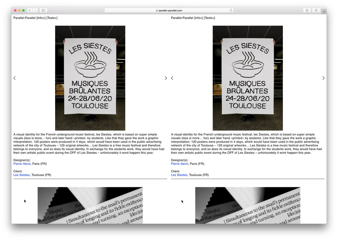
It’s for this reason that the site is designed as a mirror image of itself, programmed by Quentin Creuzet. The split-screen is a “blunt reference” to the project’s name. “We like the directness of it, especially when it is reinforced by the doubled up mouse cursor,” the founders tell us.
On what the response has been to the project, they tell us that it’s been exciting for the founders and their contributors. “We both get very excited every time we receive an email from the designers. Some projects we shared on Parallel-Parallel are really fabulous, and it would have been such a pity if they weren’t published,” they say explaining why the project captured our imagination so much, for its ability to celebrate creative work which would have other been lost. Contributors, they continue to tell us, seemed excited too about the project – happy to be part of a community during this difficult time. “Meanwhile, non-designers who visited our site have been telling us that they have a new appreciation for the work especially when the designer has a chance to explain the thinking behind each piece,” Yeliz and Dorothee add.
Parallel-Parallel is clearly a project with potential stretching far beyond the current crisis and Yeliz and Dorothee recognise that, aiming to continue growing the collection. They conclude by telling us that “In the near future, we are planning on inviting writers, critics, thinkers and artists to reflect on, contextualise, scrutinise and challenge the different aspects of this collection.”
GalleryParallel-Parallel (copyright the designers, 2020)
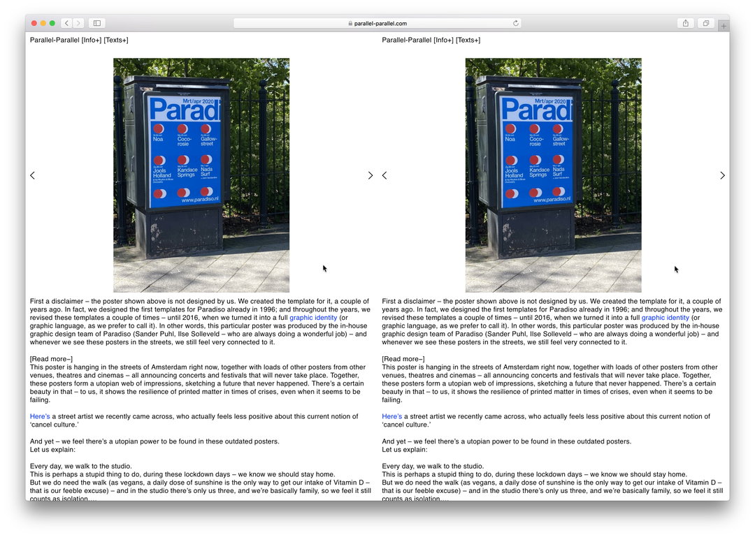
Experimental Jetset
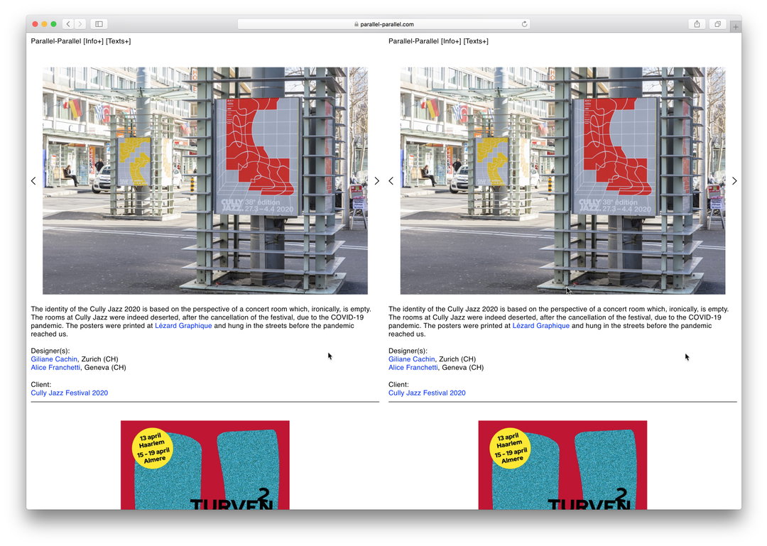
Gillian Cachin and Alice Franchetti
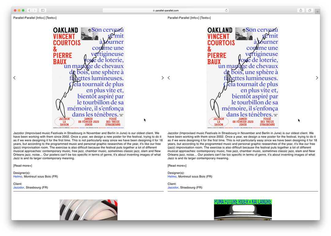
Helmo
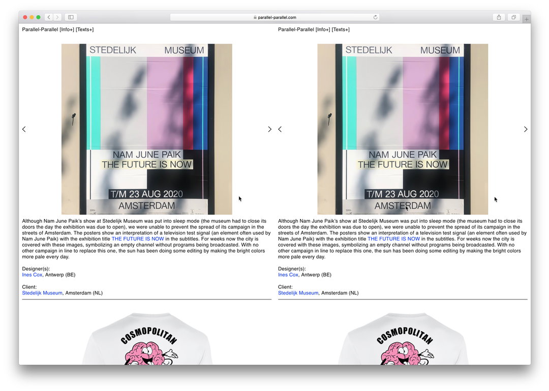
Ines Cox
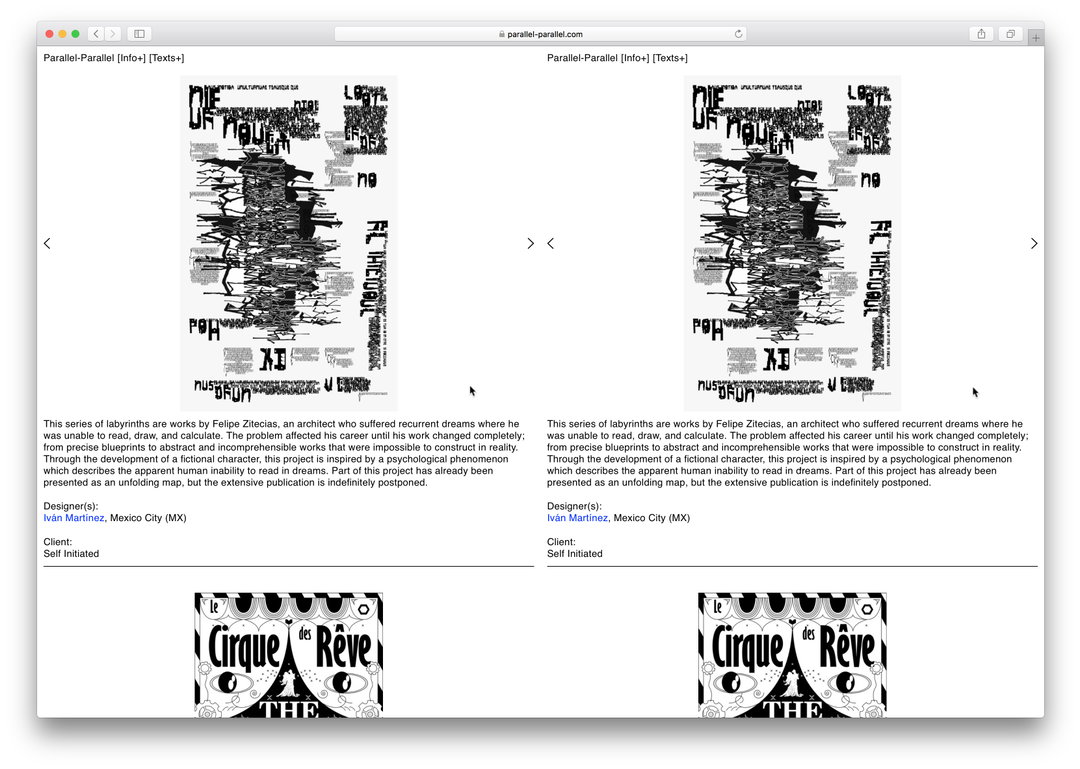
Iván Martínez
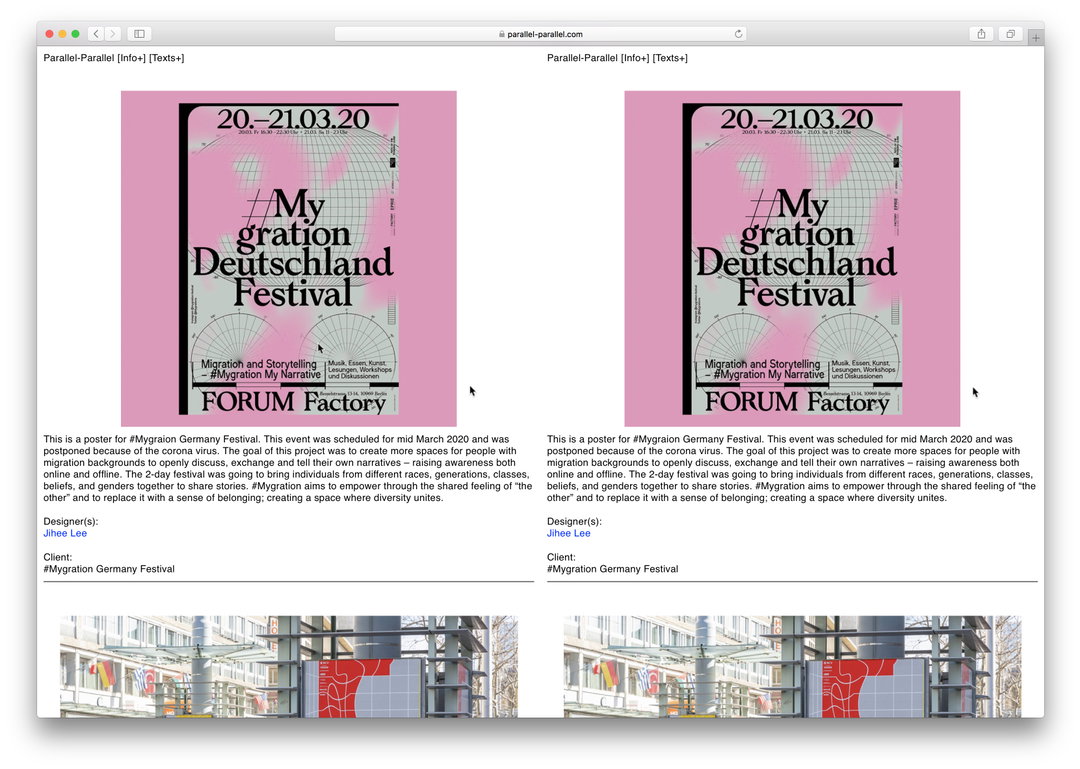
Jihee Lee
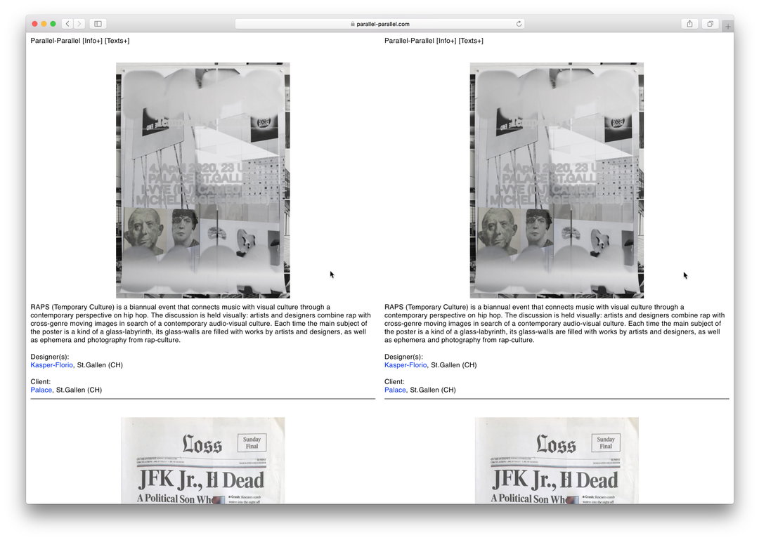
Kaspar-Florio
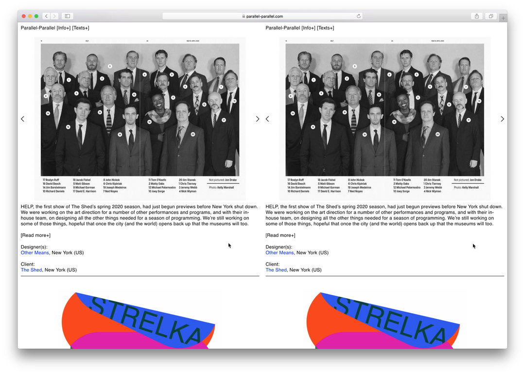
Other Means
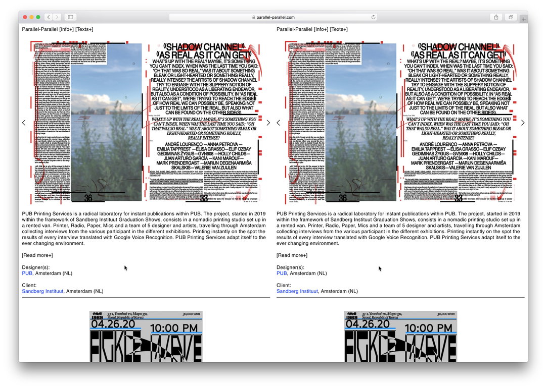
PUB
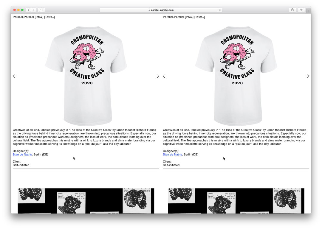
Stan de Natris
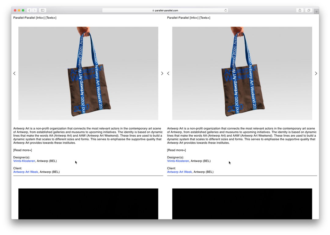
Vrints-Klosteren
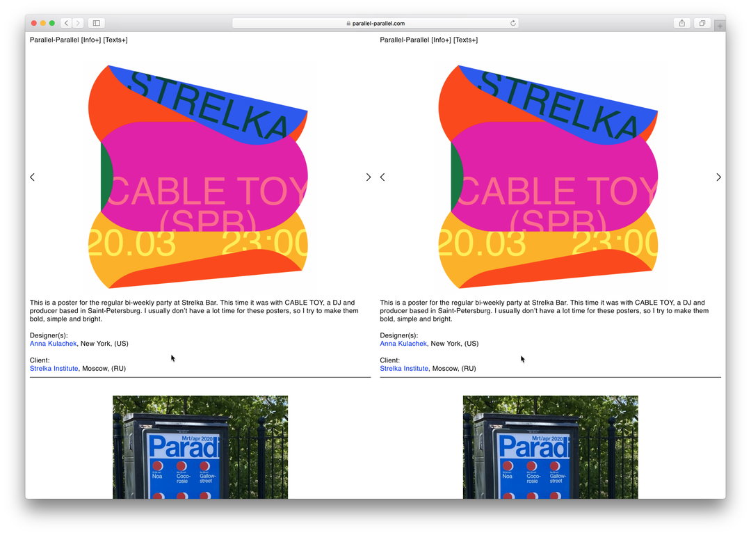
Anna Kulachek
Hero Header
Parallel-Parallel: Pierre Vanni
Share Article
Further Info
About the Author
—
Ruby is Senior Creative at It's Nice That, overseeing our visual output across platforms and projects. Before that, she was associate editor on the editorial team, after joining in September 2017 following graduation from Central Saint Martins.