Take a break from planning your New Year's Eve with the twinkling 20s
We’re getting close to the top ten now. I don’t know about you but my heart’s started to race and my palms are sweating. Do you feel it too, the irrepressible rush of excitement? Brace yourself now, this shizz is hotting up!
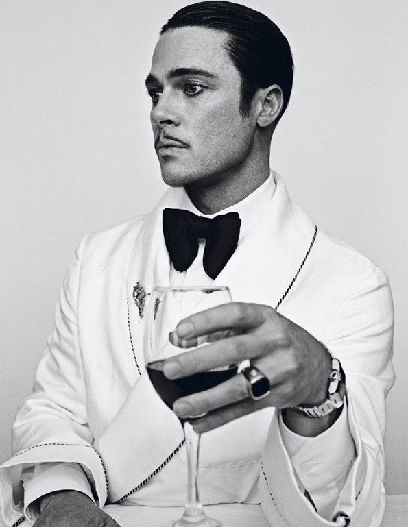
Steven Klein: Brad Pitt for Interview Magazine
These photos were created using a simple recipe: Brad Pitt is beautiful, Steven Klein is an excellent photographer. Combine the two in equal measure and you’ve got a stellar piece of editorial photography. Bosh.
www.itsnicethat.com/articles/brad-pitt-by-steven-klein
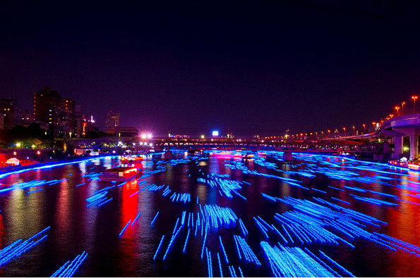
Tokyo Hotaru: 100,000 LEDs
LEDs, like fireworks, possess the inexplicable ability to make the whole of mankind forget itself briefly and just go “Ooooooh!” Float 100,000 of them down a river in Tokyo and you can pretty much guarantee that the response will be HUGE. Which it was!
www.itsnicethat.com/articles/tokyo-hotaru-100-000-leds
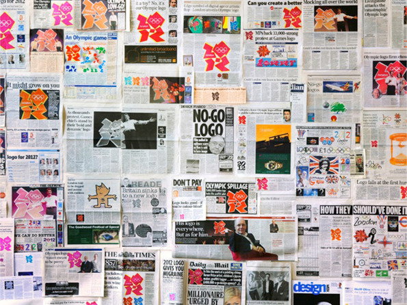
Designing London 2012: The Wolff Olins Logo
In our summer roundup of Olympic design we were slightly worried that people would be sick to death of the Wolff Olins logo and show no interest at all in our extolling of its virtues. But actually it turned out that this much-maligned little beauty looked great dotted around London’s streets and so you all read about it with great enthusiasm. Thanks for that!
www.itsnicethat.com/articles/designing-london-2012-logo
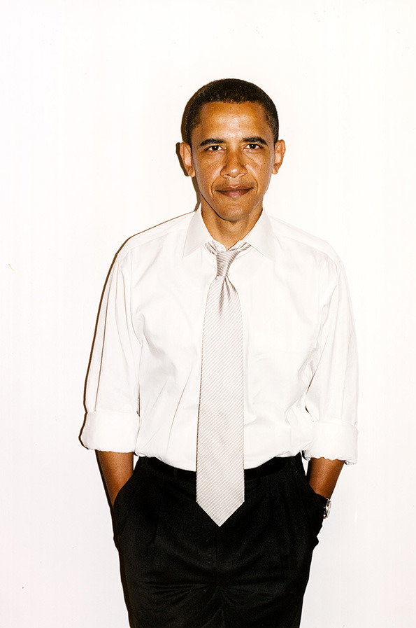
Terry Richardson: Barack Obama
Whether you love him or hate him Terry Richardson has developed a style of photography that’s all his own. He’s photographed the great and the good of the fashion world, countless musicians and now the president of the United States of America. And hasn’t he made Barack look lovely? Just look at those ‘come hither’ eyes…
www.itsnicethat.com/articles/terry-richardson-photographs-obama
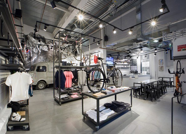
Brinkworth: Rapha Cycle Club
London’s not short of great places to hang out, but up until August this year it did lack an upmarket cycle club where you could go and watch non-stop road racing while getting your bike fixed and enjoying a cup of coffee. Not anymore though as Brinkworth have designed the stunning (trust me, I’ve been) Rapha Cycle Club.
www.itsnicethat.com/articles/rapha-cycle-club
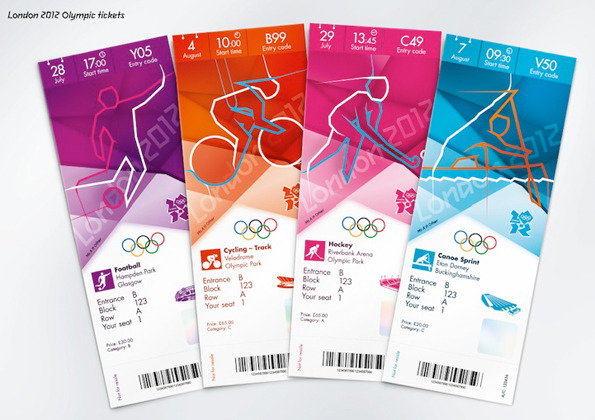
Designing London 2012: The Graphics of the Games
In-depth feature on the comprehensive branding of London’s 2012 Olympic Games? Of course you read it in your thousands you cheeky bunch of design lovers, you!
www.itsnicethat.com/articles/london-2012-brand-identity
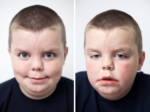
Andy Brown: Being Brave
Even though we’ve looked at these images many hundreds of times since they hit the site in June (they were included in our Annual too so we’ve seen them on countless proofs) these before and after shots of children undergoing dental surgery haven’t lost any of their power. Incredible stuff from Andy Brown.
www.itsnicethat.com/articles/andy-hope-being-brave
When IKEA’s cardboard digital camera first hit the shelves we suggested it might change the way we take photos. We’re prepared to admit that it hasn’t (their meatballs are better), but it’s still a great idea executed with typical IKEA flair.
www.itsnicethat.com/articles/ikea-ps
The Paralympics were responsible for some of our favourite creative content this year and Mark Zibert’s advert for Canadian television is no exception. Shot in a single take it’s got everything you require from a great bit of film.
www.itsnicethat.com/articles/mark-zibert-canadian-paralympic-advert
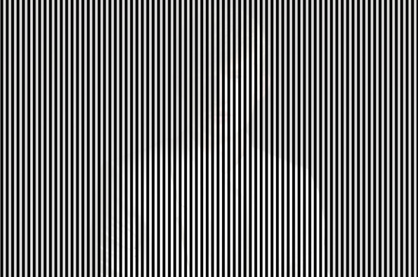
Blommers and Schumm: Hector Magazine Portraits
Blommers and Schumm have had a pretty stellar year creating some superlative editorial imagery. Their abstract erotica for Baron was an absolute knockout, but so too were these trippy portraits for Hector magazine. Be warned though, staring at them for too long seriously distorts your field of vision.
www.itsnicethat.com/articles/blommers-and-schumm-hector-magazine
Share Article
Further Info
About the Author
—
James started out as an intern in 2011 and came back in summer of 2012 to work online and latterly as Print Editor, before leaving in May 2015.