Rikako Nagashima's analytical approach to graphic design makes for satisfying results
From looking at the vast portfolio of Rikako Nagashima, it’s clear the Japanese designer has an analytical eye for graphic form. Since graduating from Musashino Art University and establishing her studio village® in 2014, Rikako has jumped off the graphic design springboard to work on “branding, CI, VI, product design, package design, editorial design, sign planning, art direction and so on,” she says.
Rikako’s work for Tohoku Youth Orchestra caught our eye in particular for its ability to encompass both branding and editorial design with a subtle graphic edge. The youth orchestra was set up by treasured Japanese musician and composer Ryuichi Sakamoto following the great east Japan earthquake in 2011. An astonishing project which has continued annually since, the orchestra is comprised of children from the six afflicted prefectures says Rikako. “Through music, one can learn to open his or her mind and be flexible towards new perspectives,” she continues.
Building upon the self explorative qualities of music as inspiration for the graphic design of Tohoku Youth Orchestra’s branding and printed ephemera, Rikako took influence from “contemporary musicians like John Cage who broke down established concepts of music," creating "a logo that represents flexibility using the five lines of a music staff [a musical notation made of five horizontal lines representing a different musical pitch],” the designer tells It’s Nice That.
Rikako’s interpretation of a musical staff takes alternate shapes throughout the identity she’s been gradually building upon since 2016. “At times the staff lines are used to organise information, at other times the lines are used to represent a song, and at other times the lines can be used to create a textile pattern,” he explains. Repeatedly layered so the lines become a separate graphic entity to the musical element that originally inspired Rikako’s logo, the designer has formed a visual look for all information about the orchestra to sit under, year on year.
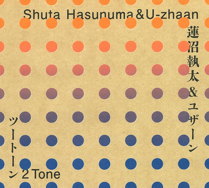
Pattern continues in Rikako’s music-focused projects, including 2 Tone, an album sleeve design for a collaborative record made by Shuta Hasunuma and tabla player U-zhaan. Considering the partnership between the two musicians was at the heart of the project, Rikako chose a colour palette “from opposite sides of the spectrum,” to visualise this “collision of two musicians of opposing styles,” she explains. Gradually blending her chosen deep red into a purple-y darker blue, the record sleeve’s design highlights the moderate change in colour palette with an overlaid dot pattern, “taken from a traditional Japanese wrapping cloth called furoshiki,” Rikako points out. As with all Rikako’s work, the choice in pattern has been applied for a systematic reason, utilising a traditional form of packaging to not only keep the papered sleeve safe, it adds “a slightly rough and flexible” texture.
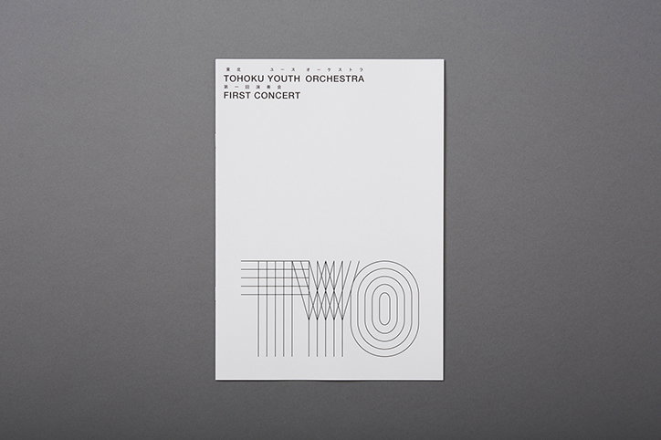
Rikako Nagashima: Tohoku Youth Orchestra
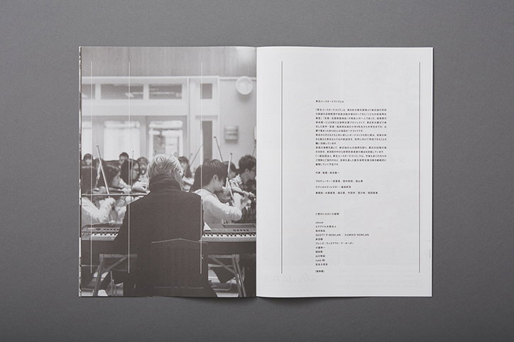
Rikako Nagashima: Tohoku Youth Orchestra
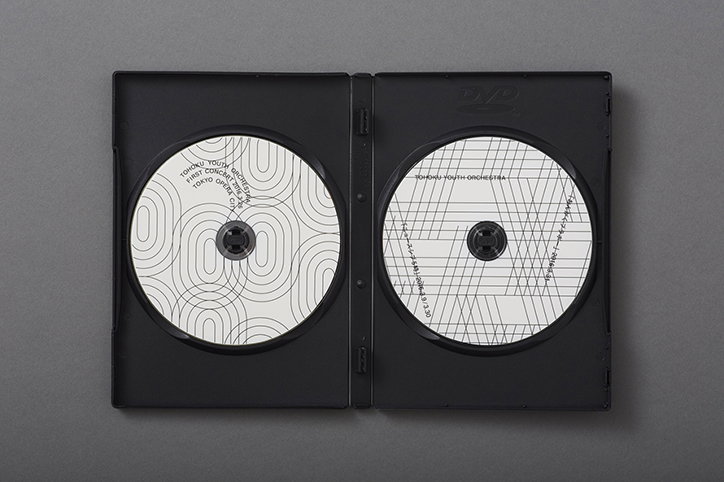
Rikako Nagashima: Tohoku Youth Orchestra
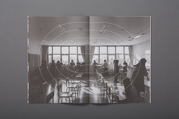
Rikako Nagashima: Tohoku Youth Orchestra
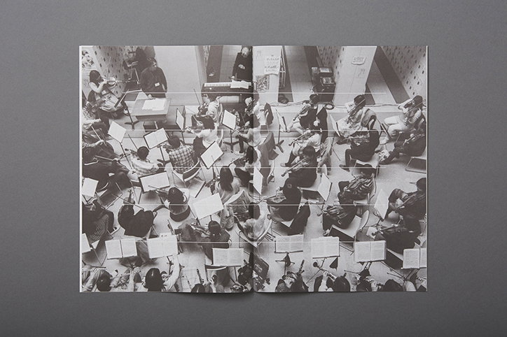
Rikako Nagashima: Tohoku Youth Orchestra
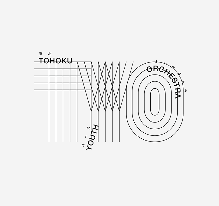
Rikako Nagashima: Tohoku Youth Orchestra
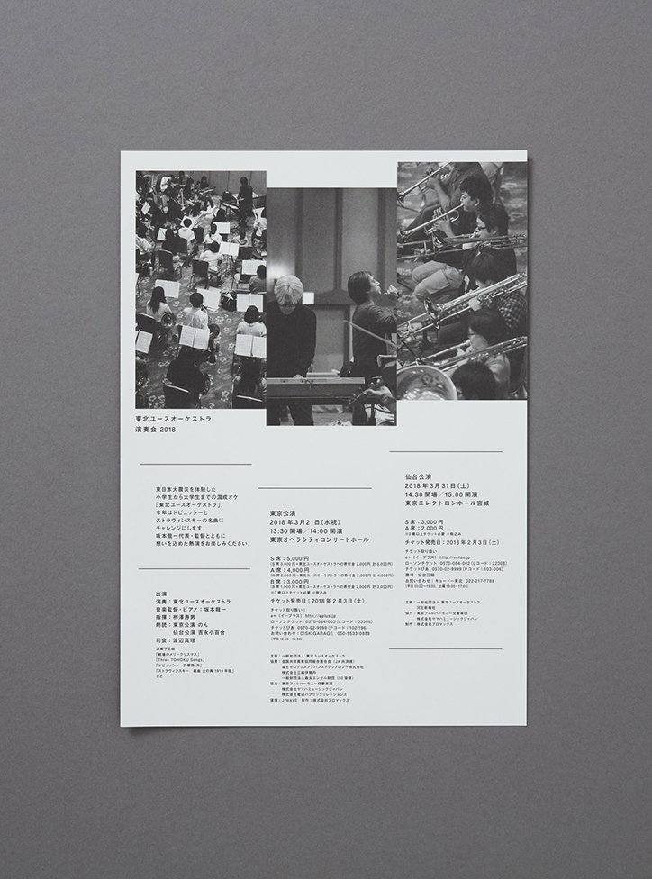
Rikako Nagashima: Tohoku Youth Orchestra
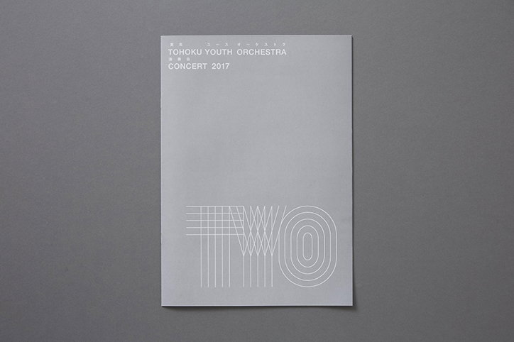
Rikako Nagashima: Tohoku Youth Orchestra
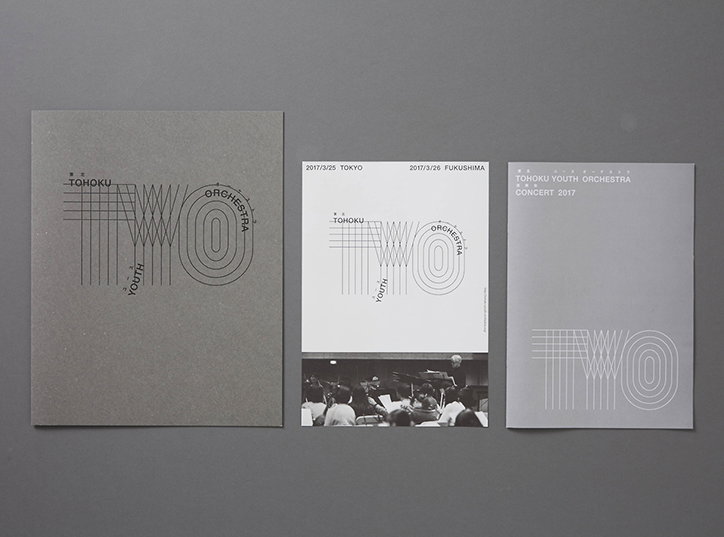
Rikako Nagashima: Tohoku Youth Orchestra
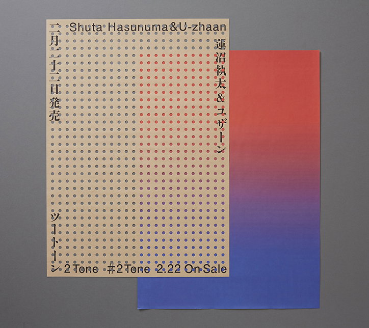
Rikako Nagashima: 2 Tone
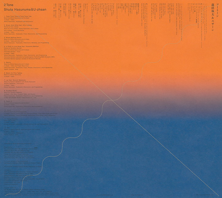
Rikako Nagashima: 2 Tone
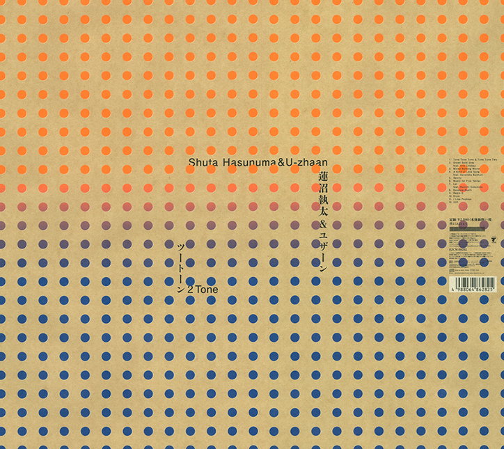
Rikako Nagashima: 2 Tone
Share Article
Further Info
About the Author
—
Lucy (she/her) was part of the It’s Nice That team from 2016–2025, first joining as a staff writer after graduating from Chelsea College of Art with a degree in Graphic Design Communication, eventually becoming a senior editor on our editorial team, and most recently at Insights, a research-driven department with It’s Nice That.