




For designer Robin Guillemin books are a playground “where everything is possible”
This recent graphic design graduate believes any project can be interesting – but even better if it can utilise typography interestingly.
Share
Robin Guillemin has always held an obsession for “the power of typography”. Books, posters or any kind of editorial design – anything that might use type it seems – has fed this obsession, leading him to study graphic communication, and later typography specifically. But despite narrowing his interest to this area of graphic design, Robin’s “always felt freedom of expression in this field,” leading him to create many a project, even though he’s only just finished his studies.
Consistently working on projects for himself as well as smaller clients while studying, Robin has also developed an approach he describes as “my own vision and way of working,” he tells It’s Nice That. Usually operating within books and “all kinds of publications”, the designer burrows deep into the possibilities of this medium, which he believes are pretty much infinite. Describing this area of design as “a performative play space where the content influences the way of thinking, the medium and the graphic choices,” books have become a self-described “plastic laboratory” for the designer, “where everything is possible”.
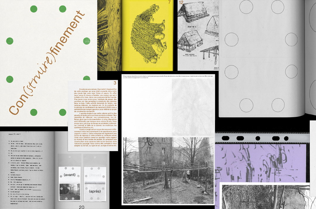
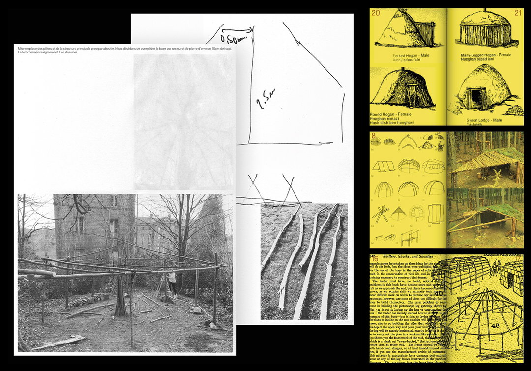
An example of this approach within Robin’s portfolio is Con(stuire)finement, a recent self-initiated editorial project which retraces the construction of a cabin in the woods in a printed format. Portraying the numerous ways in which a cabin can be built through a series of “cheap editions” in order to display the construction project, the finished book features myriad printing styles, jumping between illustrated instructions, texts on the subject, and archival photographs. One section of the book also appears to just be sketches of possible constructions, a way of showing the “several alternatives of geometrical visualisation and spatialisation of the edification,” as Robin describes. A niche project by any means, Robin’s enthusiasm for displaying the subject of cabin-building is palpable in the final edition of Con(stuire)finement, and a true example of his belief “that any project can be interesting”.
That said, those projects which centre around or pay special attention to typography tend to be where Robin can found. Knowingly admitting that “I think I have a visual and typographic language that remains common in each of my projects,” Robin explains that “of course I have references and preferences in graphic design that define my vision.” However in knowing his tastes (which he terms as “raw, de-structured or monospace typography”) so well, Robin also always asks himself “why I do things, and why I refuse to go towards preconceived solutions.”
This can be seen in his own type designs too, notably a recent rework of Jugendstil, a typeface he started while living between Lisbon and Paris. Inspired by Art Nouveau architecture, each of the letters “is very floral and rich in ornamentation, inspired by trees, flowers and insects,” describes Robin. Adding this flair in minute detail as letters round in the typeface, it has “a kind of excessive sensitivity,” he adds.
Having just graduated from Estienne school, “a community of people who share their work and knowledge,” Robin has now found himself “in this strange transition period between finishing school and looking for work,” he tells us. However, with his love for detailed design driving his momentum, we suggest keeping an eye on what he does next. “I am taking this opportunity to realise all the personal graphic projects I have been dreaming about doing for years,” he concludes.
GalleryRobin Guillemin
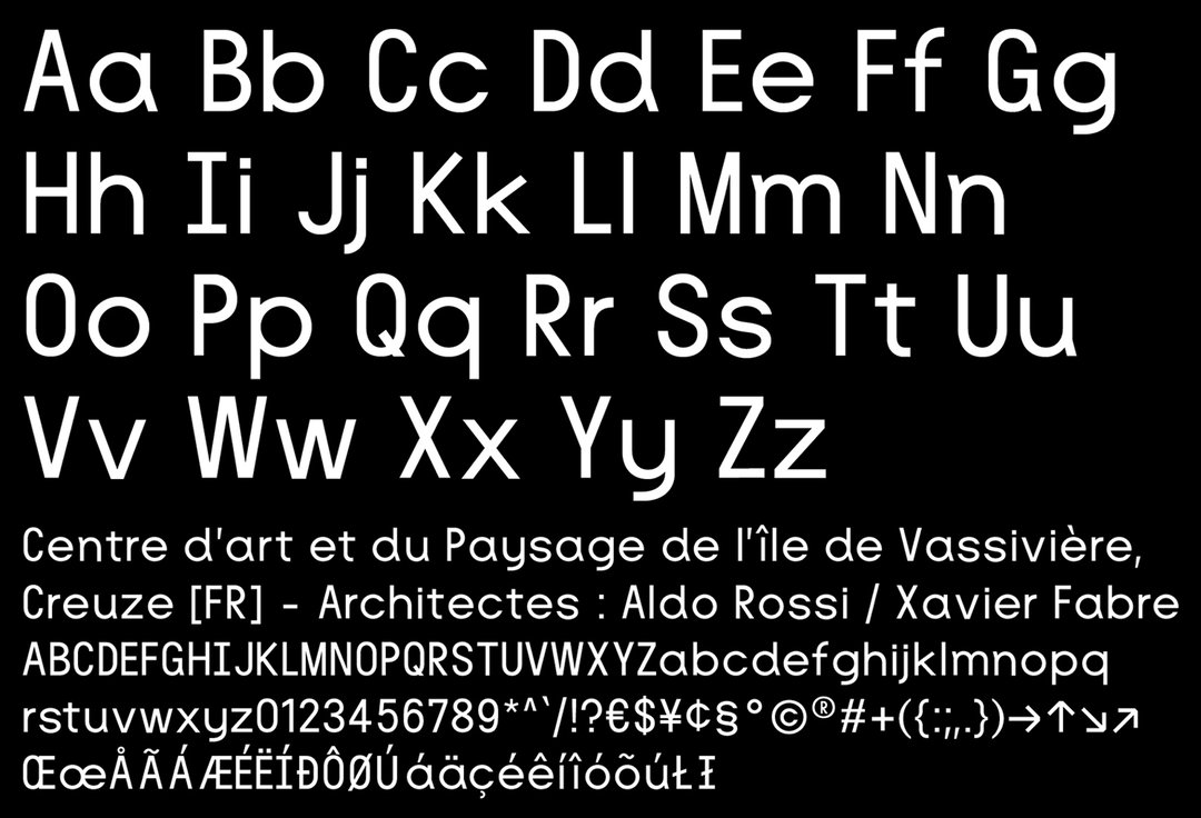
Aldo Typeface (Copyright © Robin Guillemin, 2020)
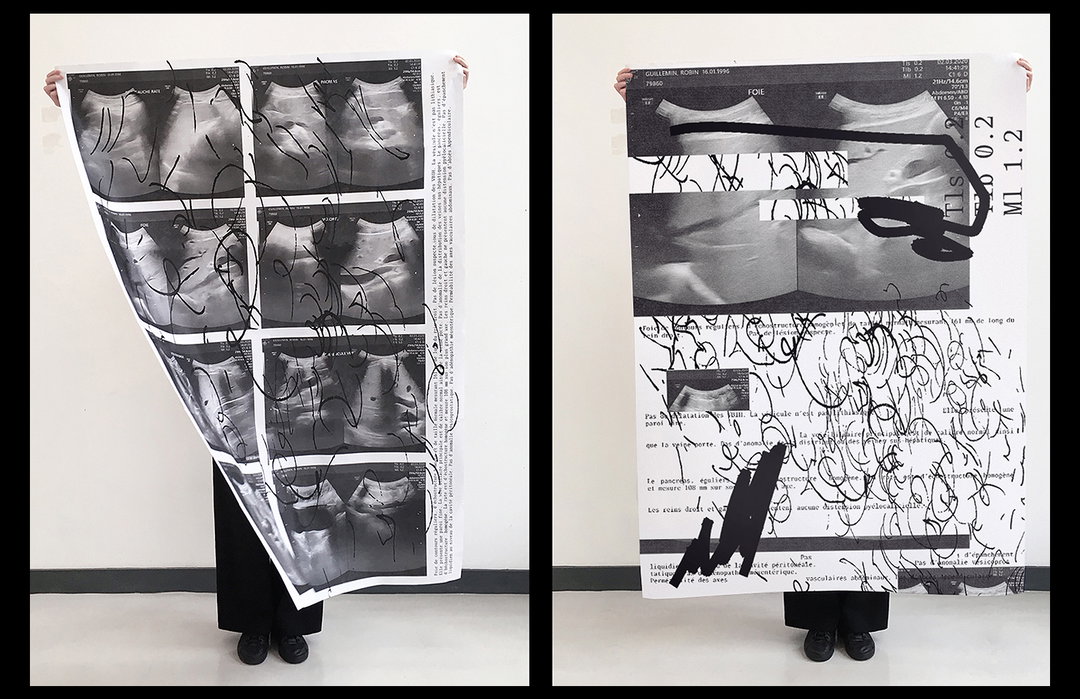
Specimen Posters (Copyright © Robin Guillemin, 2020)
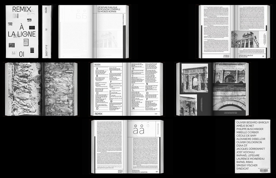
Remix (Copyright © Robin Guillemin, 2020)
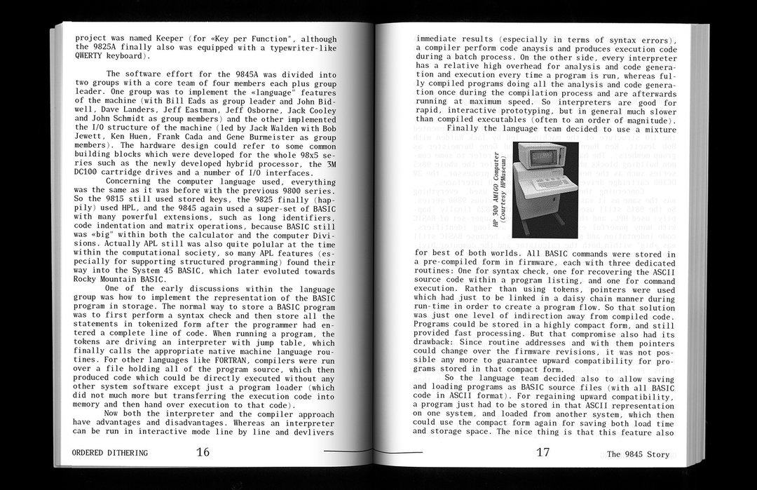
Zweig Book (Copyright © Robin Guillemin, 2020)
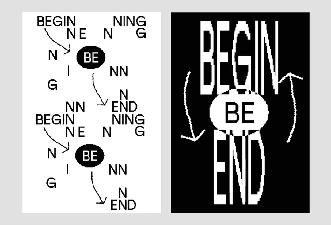
Begin / End (Copyright © Robin Guillemin, 2020)
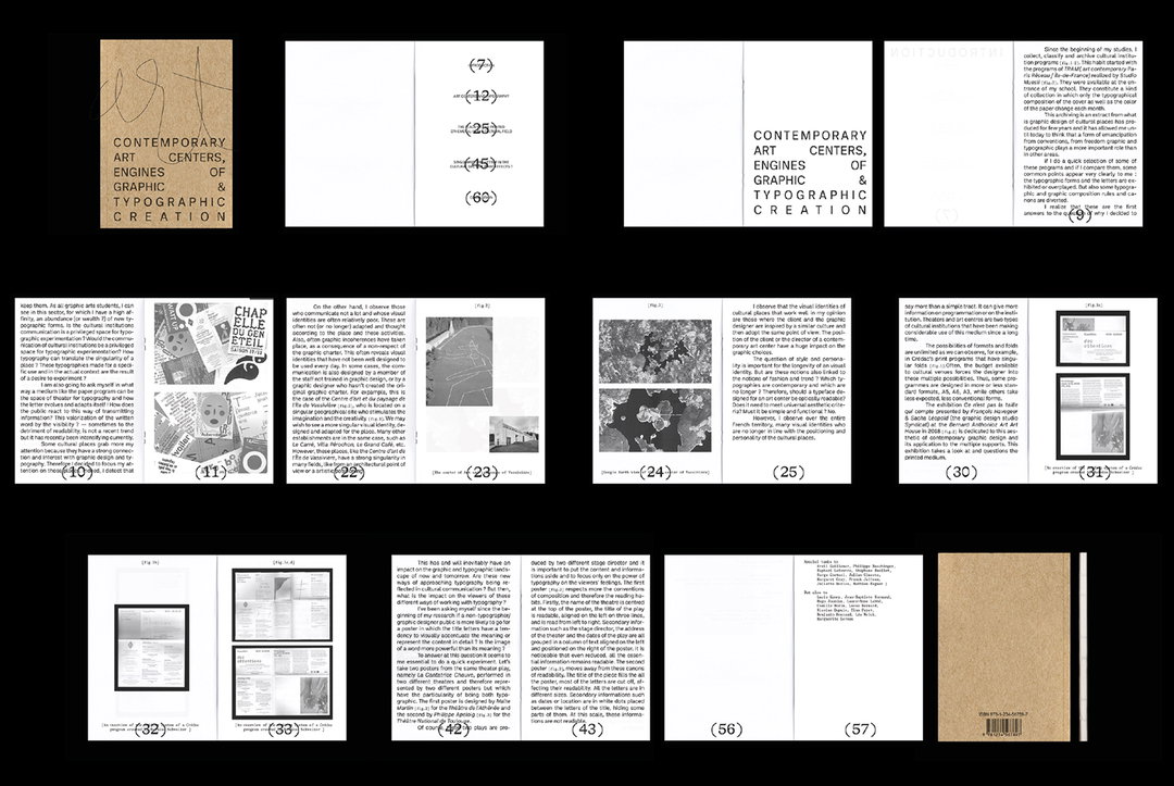
Memoir (Copyright © Robin Guillemin, 2020)
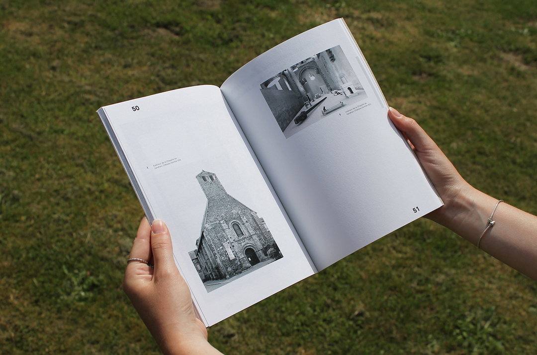
Memoir (Copyright © Robin Guillemin, 2020)
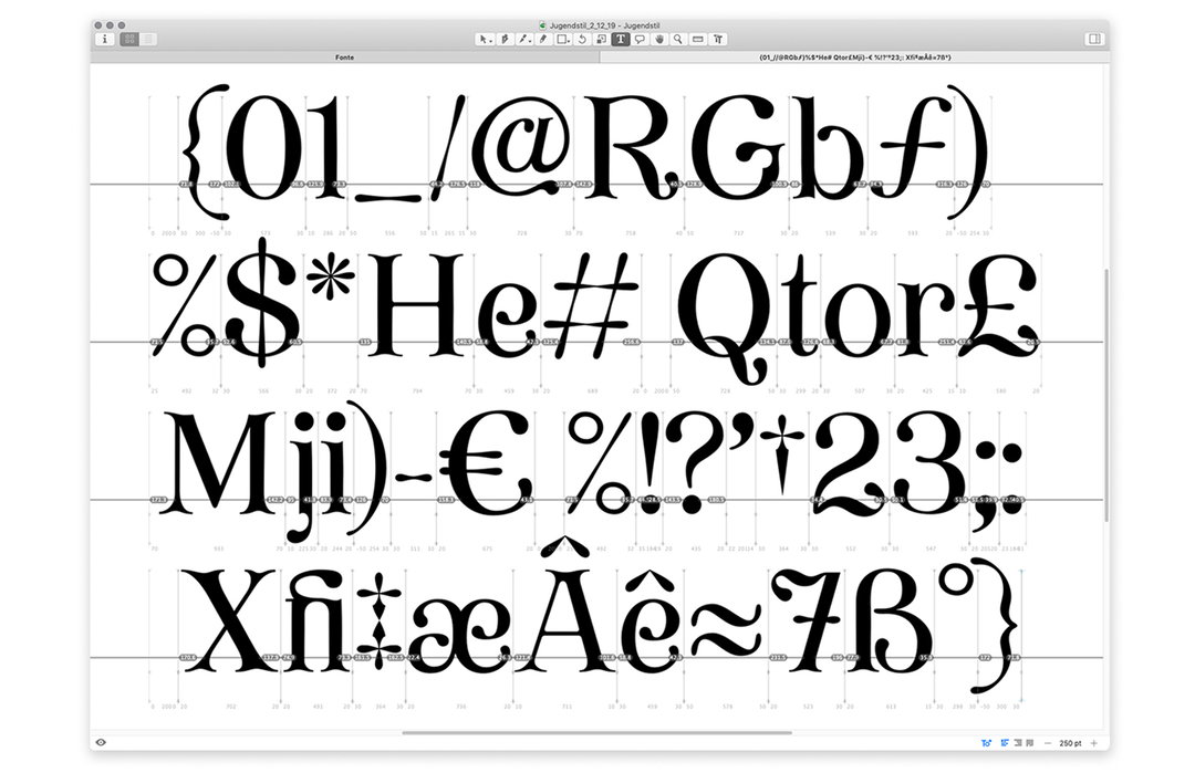
Judgendstil Typeface (Copyright © Robin Guillemin, 2020)
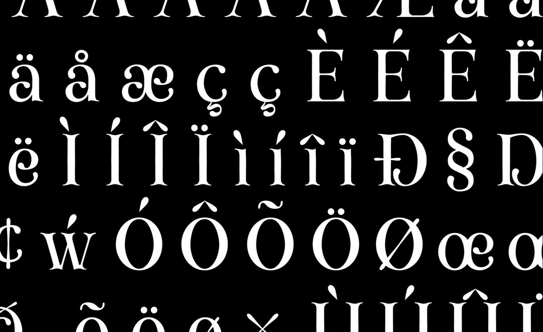
Judgendstil Typeface (Copyright © Robin Guillemin, 2020)
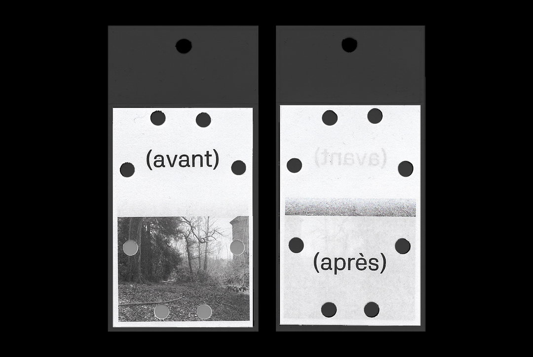
Con(struire)finement (Copyright © Robin Guillemin, 2020)
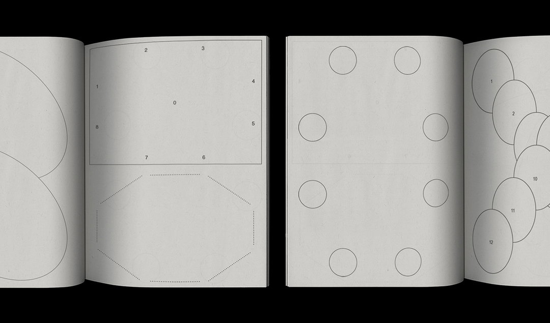
Con(struire)finement (Copyright © Robin Guillemin, 2020)
Con(struire)finement (Copyright © Robin Guillemin, 2020)
Hero Header
Robin Guillemin: Con(struire)finement (Copyright © Robin Guillemin, 2020)
Share Article
Further Info
About the Author
—
Lucy (she/her) was part of the It’s Nice That team from 2016–2025, first joining as a staff writer after graduating from Chelsea College of Art with a degree in Graphic Design Communication, eventually becoming a senior editor on our editorial team, and most recently at Insights, a research-driven department with It’s Nice That.


